BARE Soap | Branding Identity
تفاصيل العمل
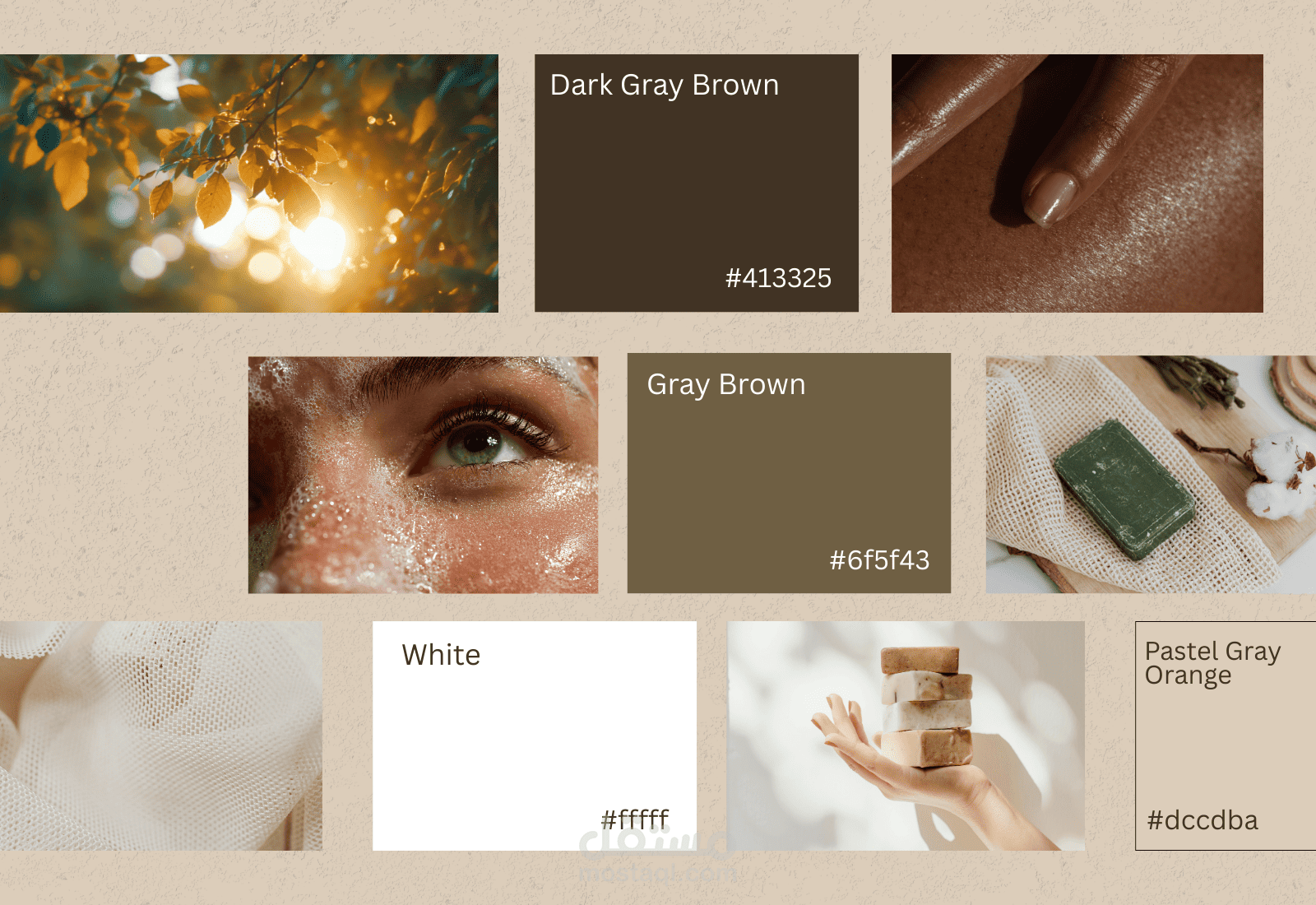
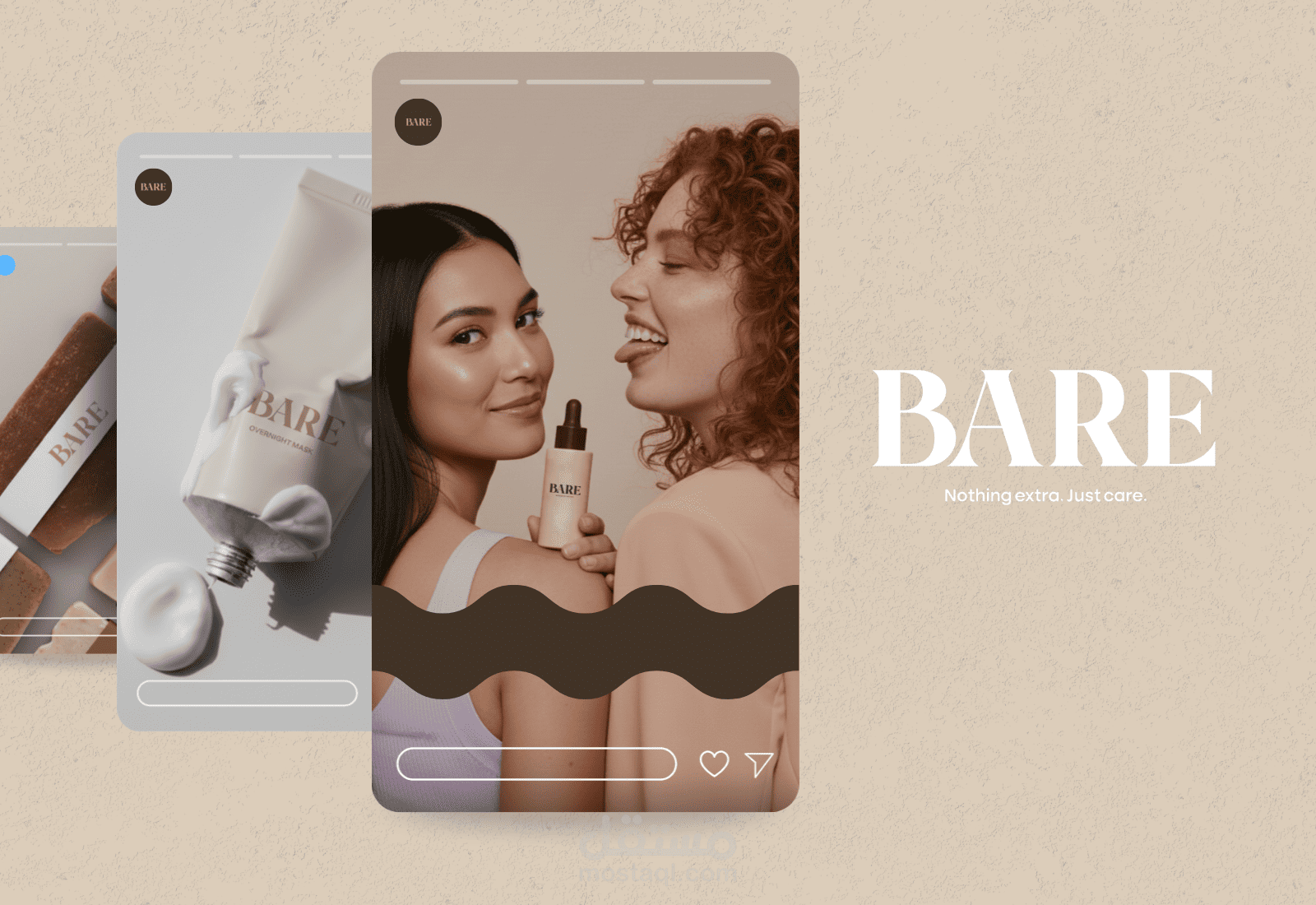
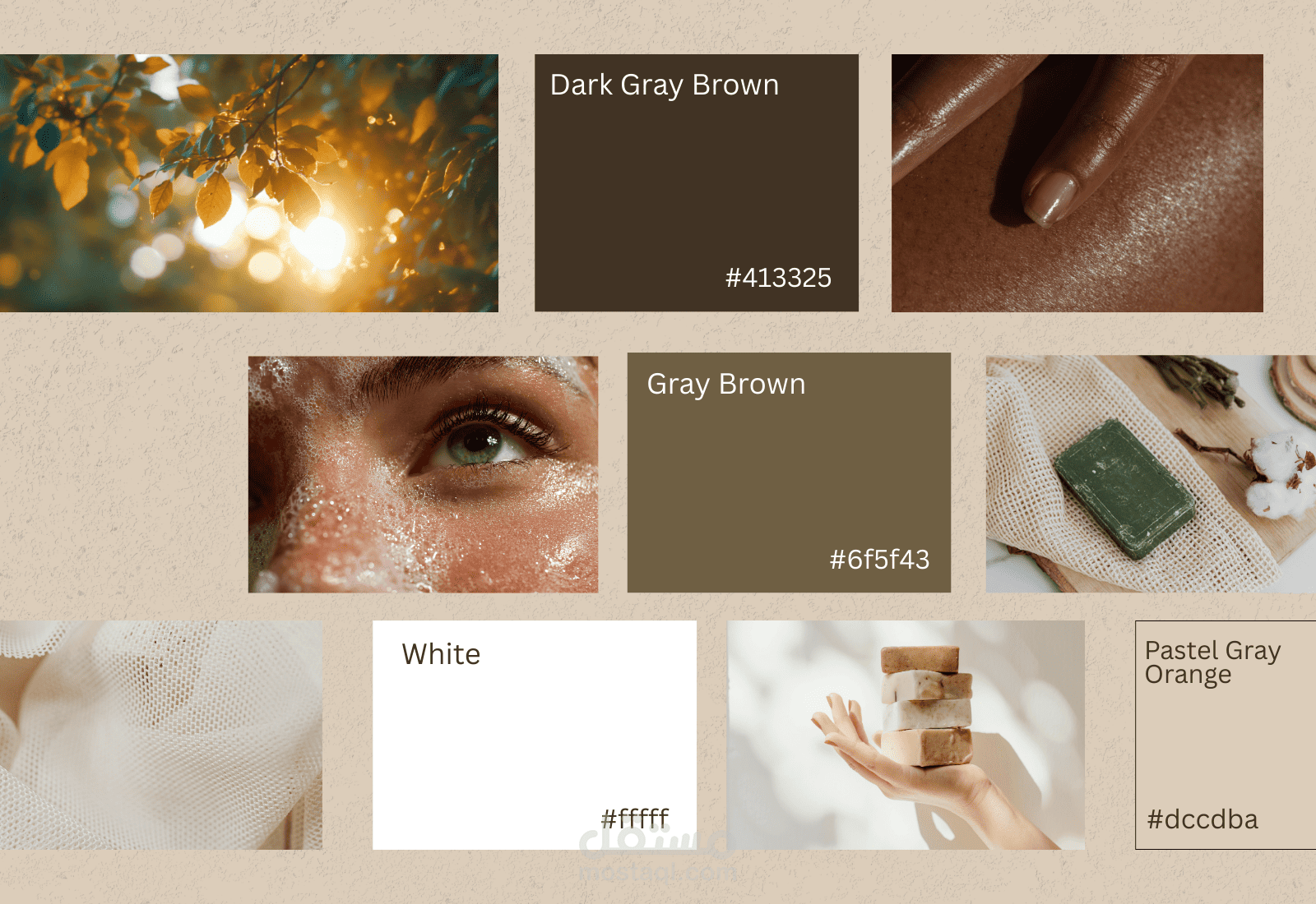
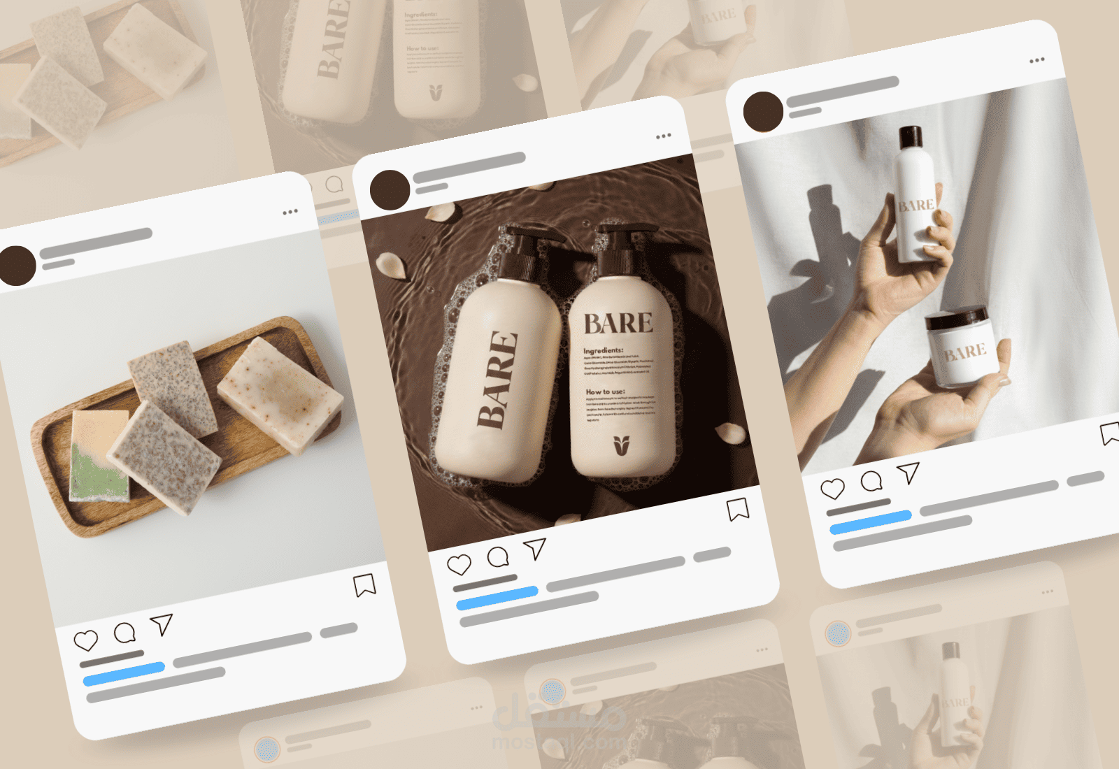
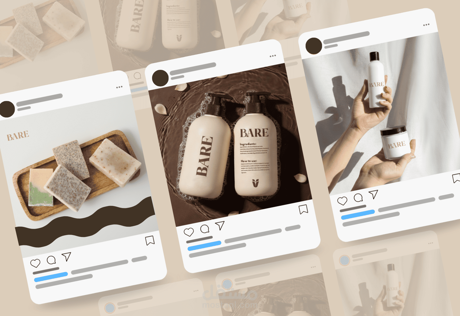
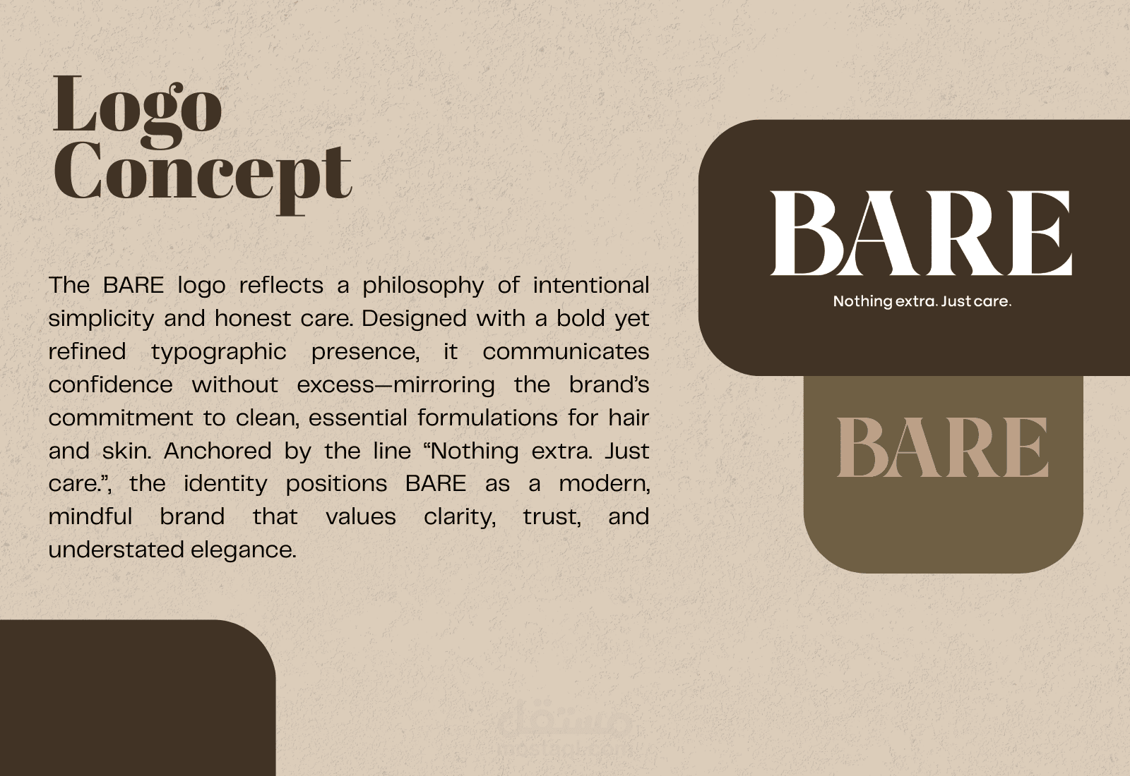
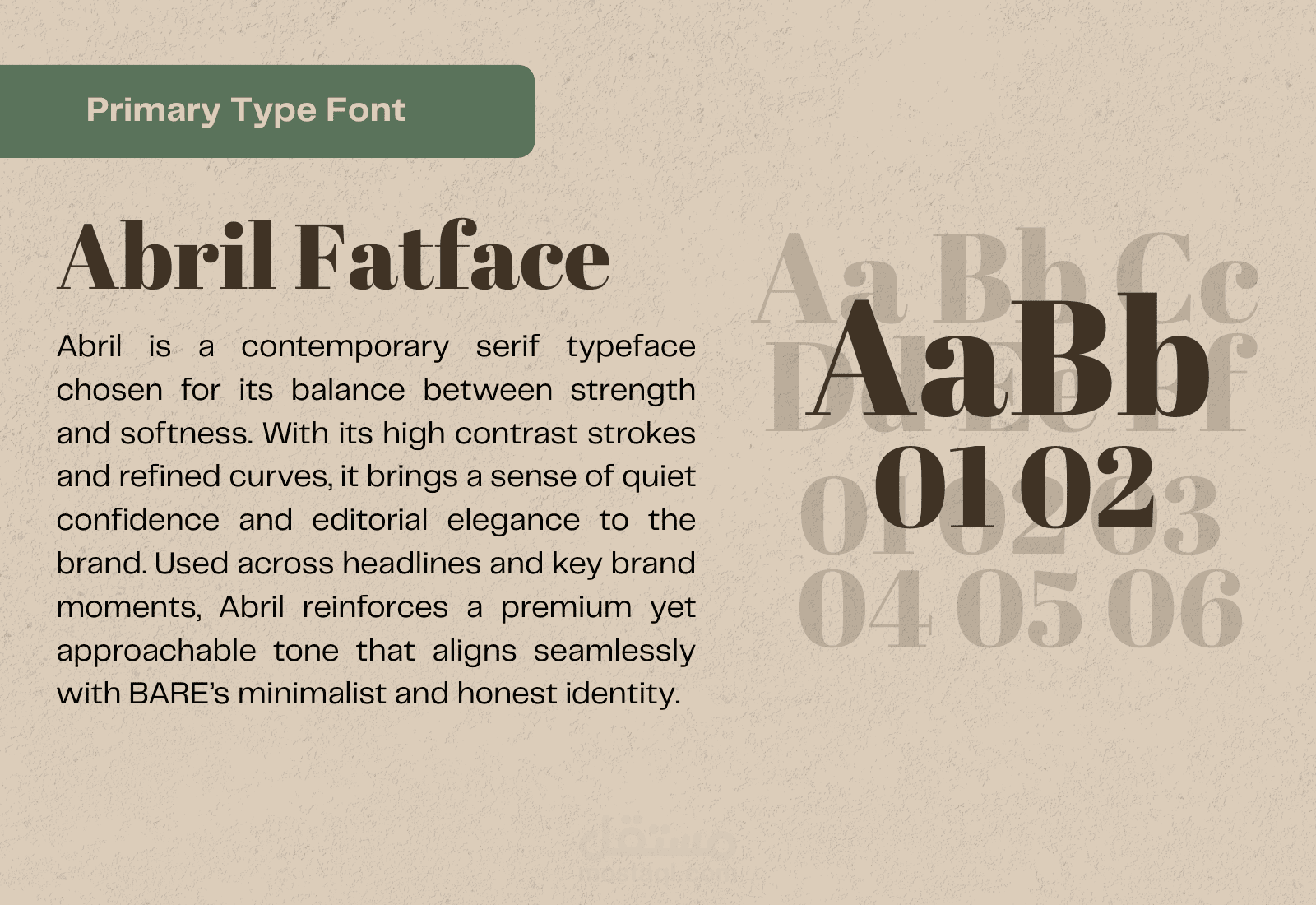
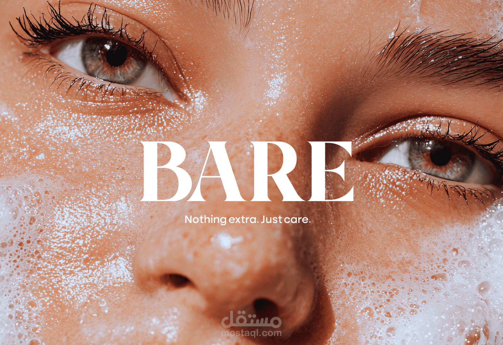
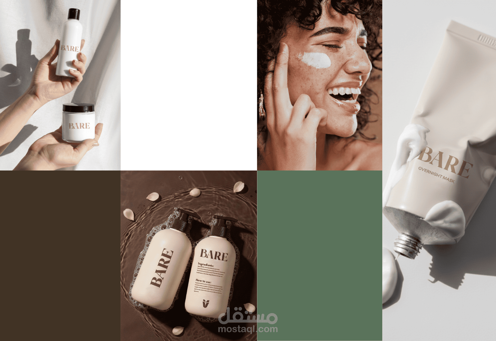
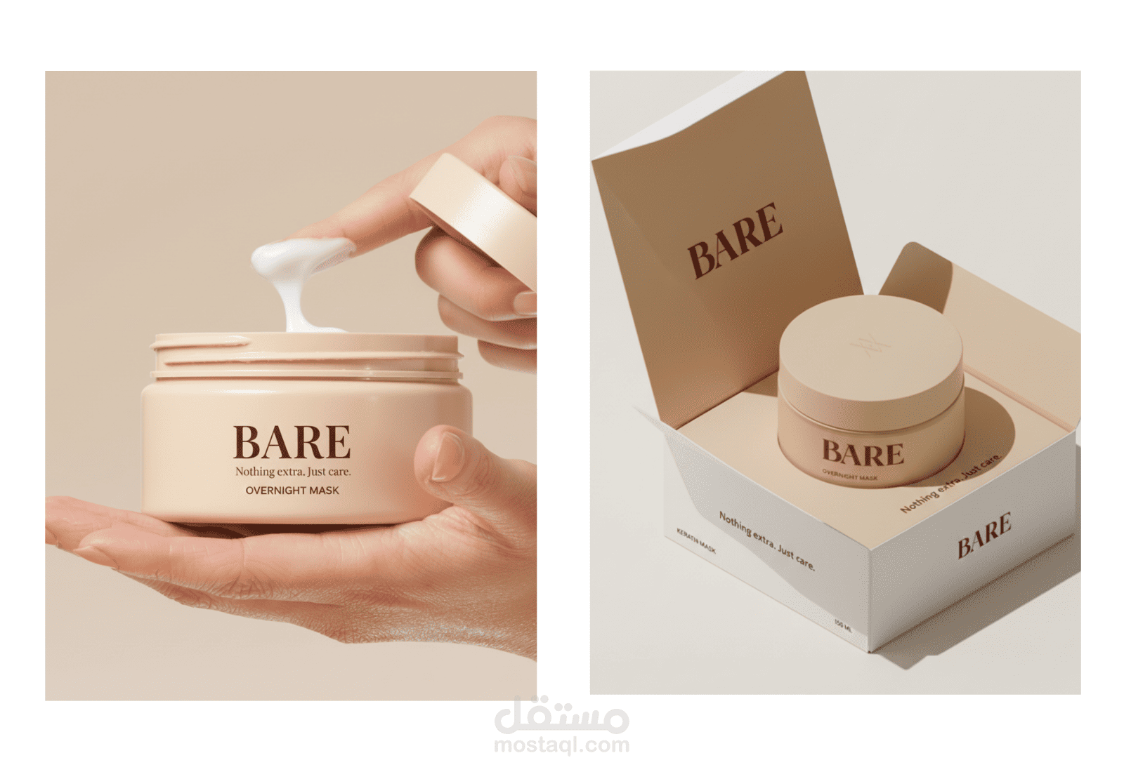
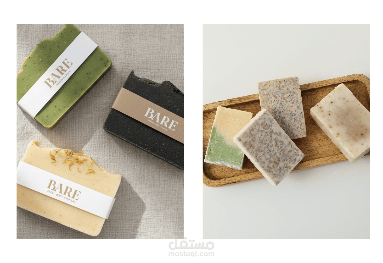
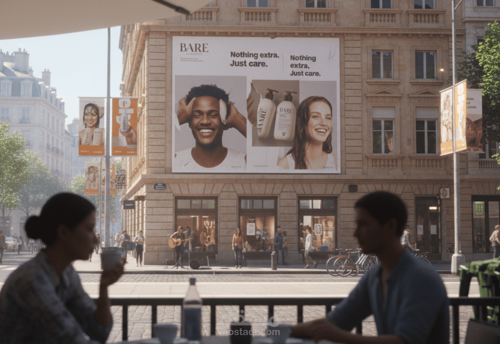
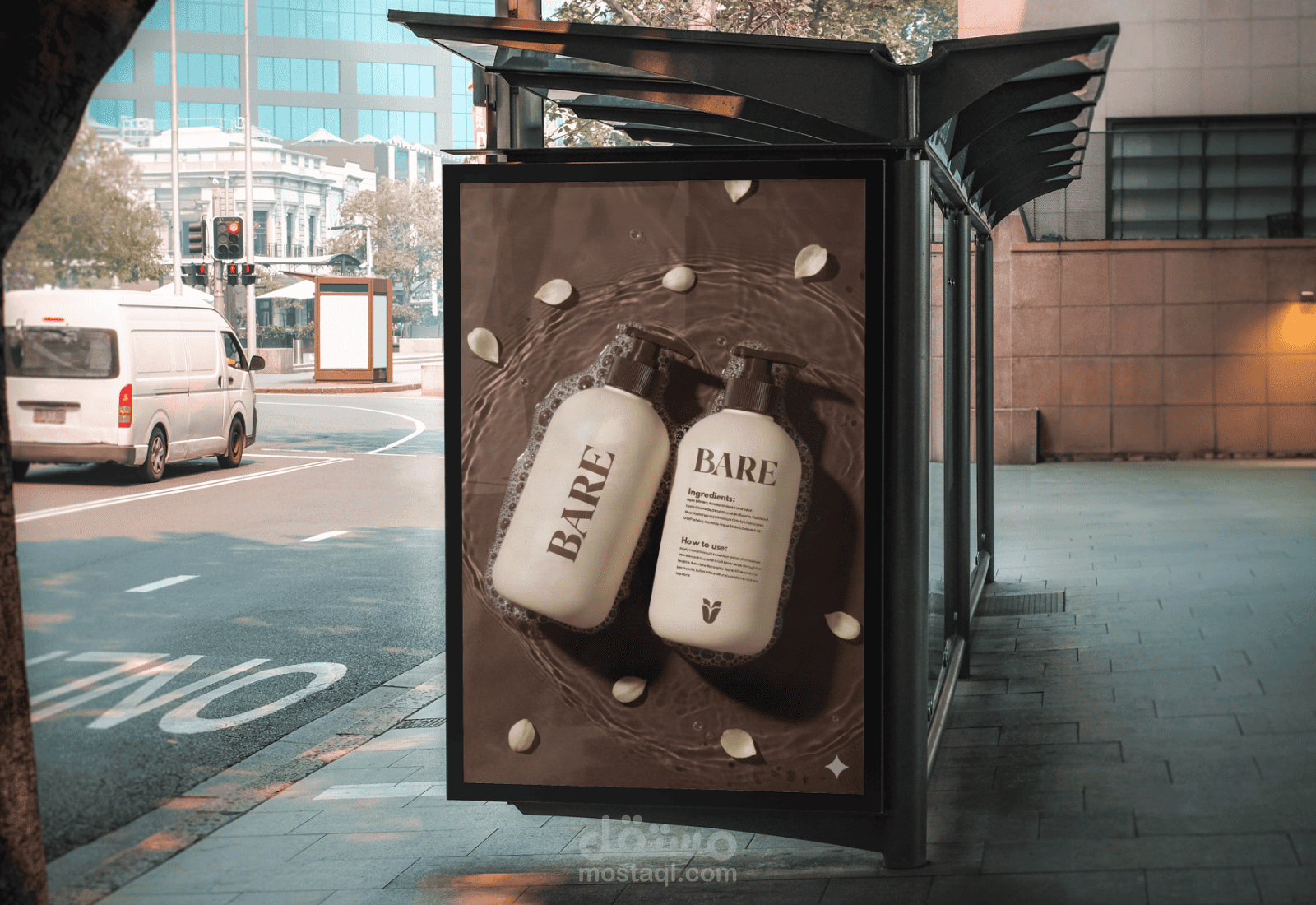
BARE is a conceptual branding project for a natural skincare and haircare brand rooted in simplicity, honesty, and intentional care. The brand is built around the idea of stripping personal care back to its essentials—removing excess, noise, and unnecessary complexity to focus purely on what the skin and hair truly need. The visual identity reflects this philosophy through a minimalist yet warm aesthetic. A refined serif logotype anchors the brand with confidence and quiet elegance, while the typography system balances strength and softness, reinforcing BARE’s premium yet approachable tone. The color palette draws inspiration from natural materials and human skin tones—earthy browns, muted greens, soft neutrals—creating a sense of calm, trust, and organic authenticity. Imagery plays a key role in the identity, focusing on real textures, natural light, and human details to emphasize care as a ritual rather than a routine.