VeloPay Fintech Brand Identity Design
تفاصيل العمل

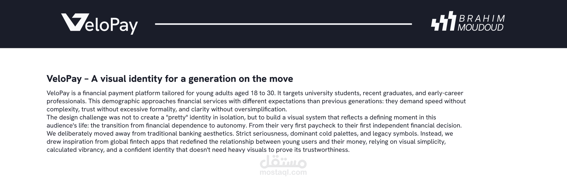

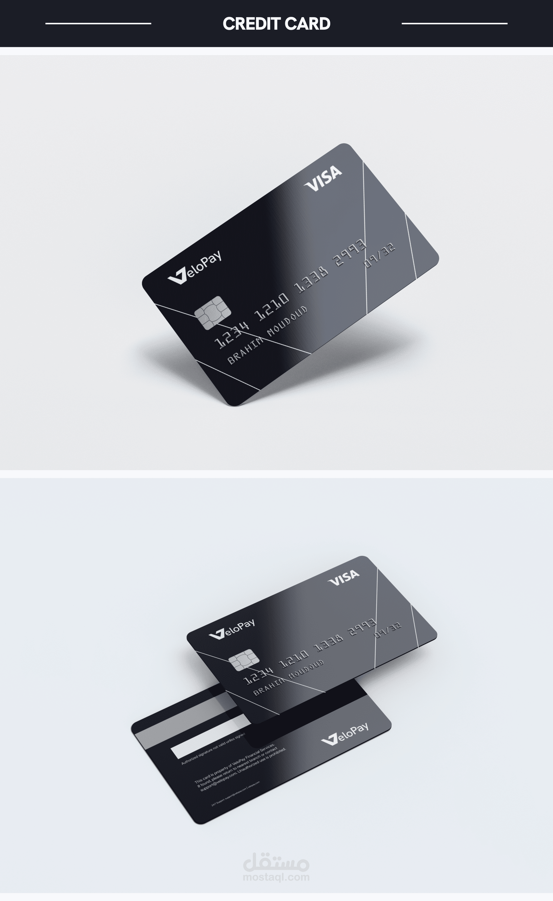

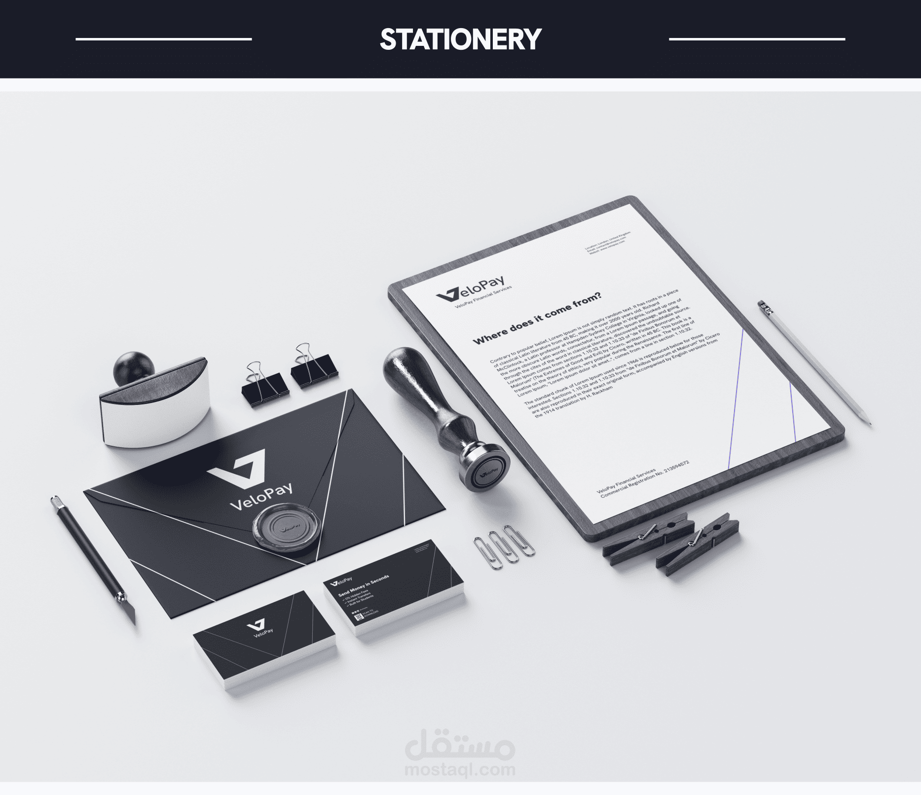
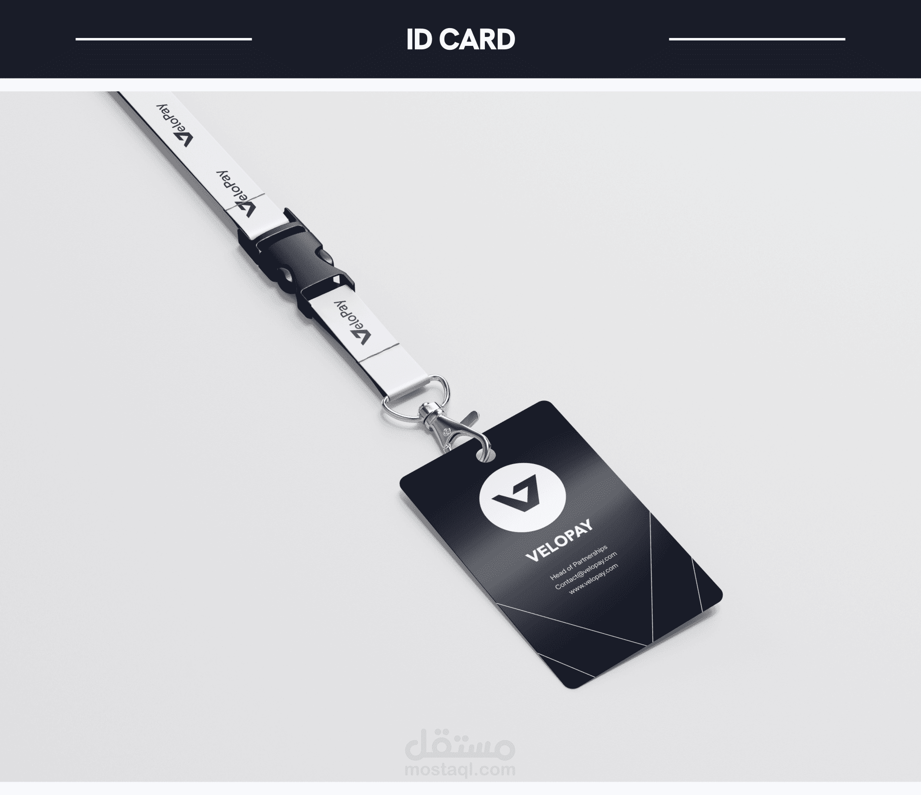
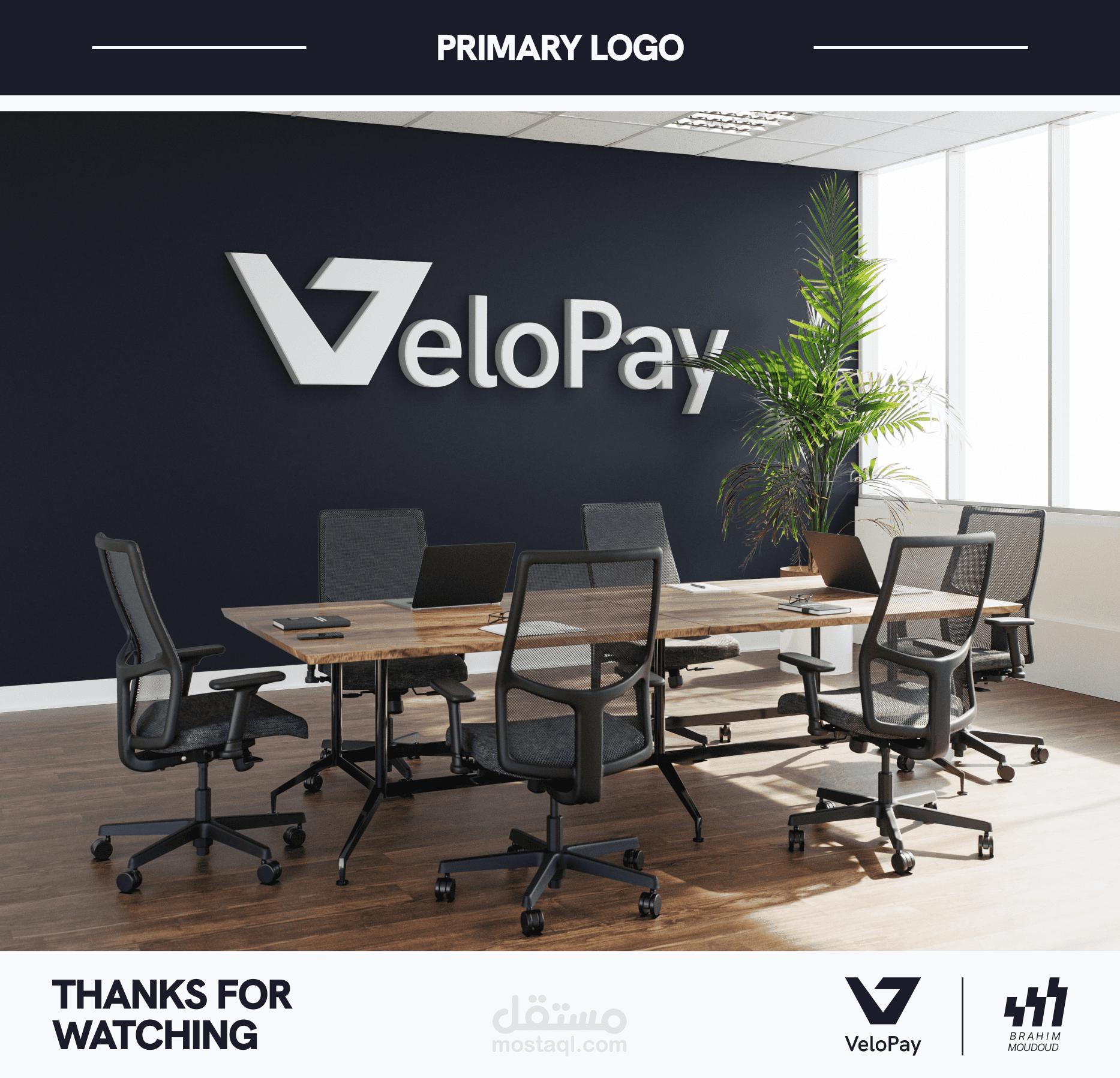
VeloPay is a concept brand identity for a financial payment platform
built for young adults aged 18-30, university students, recent
graduates, and early-career professionals.
The design challenge was to move away from traditional banking
aesthetics, cold palettes, heavy formality, and build a visual
system that reflects speed, trust, and clarity without complexity.
The identity system includes:
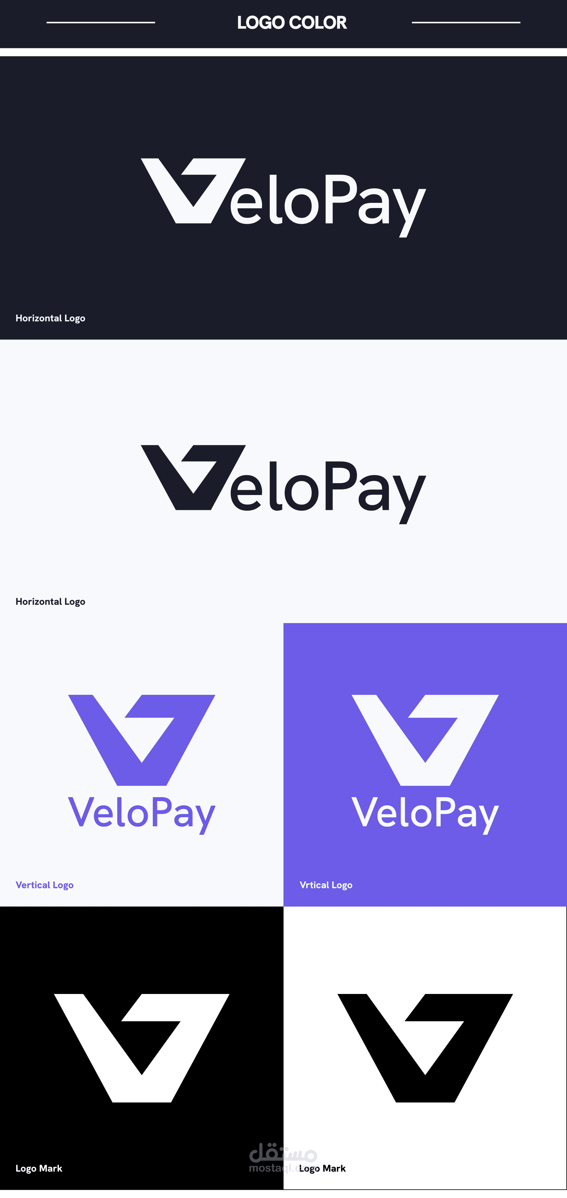
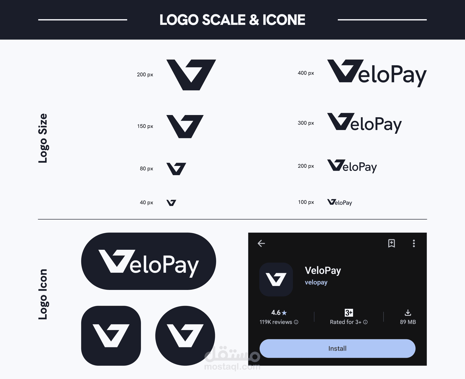
• A geometric logomark built on a golden-ratio grid, with the "V"
form referencing raised hands and forward motion
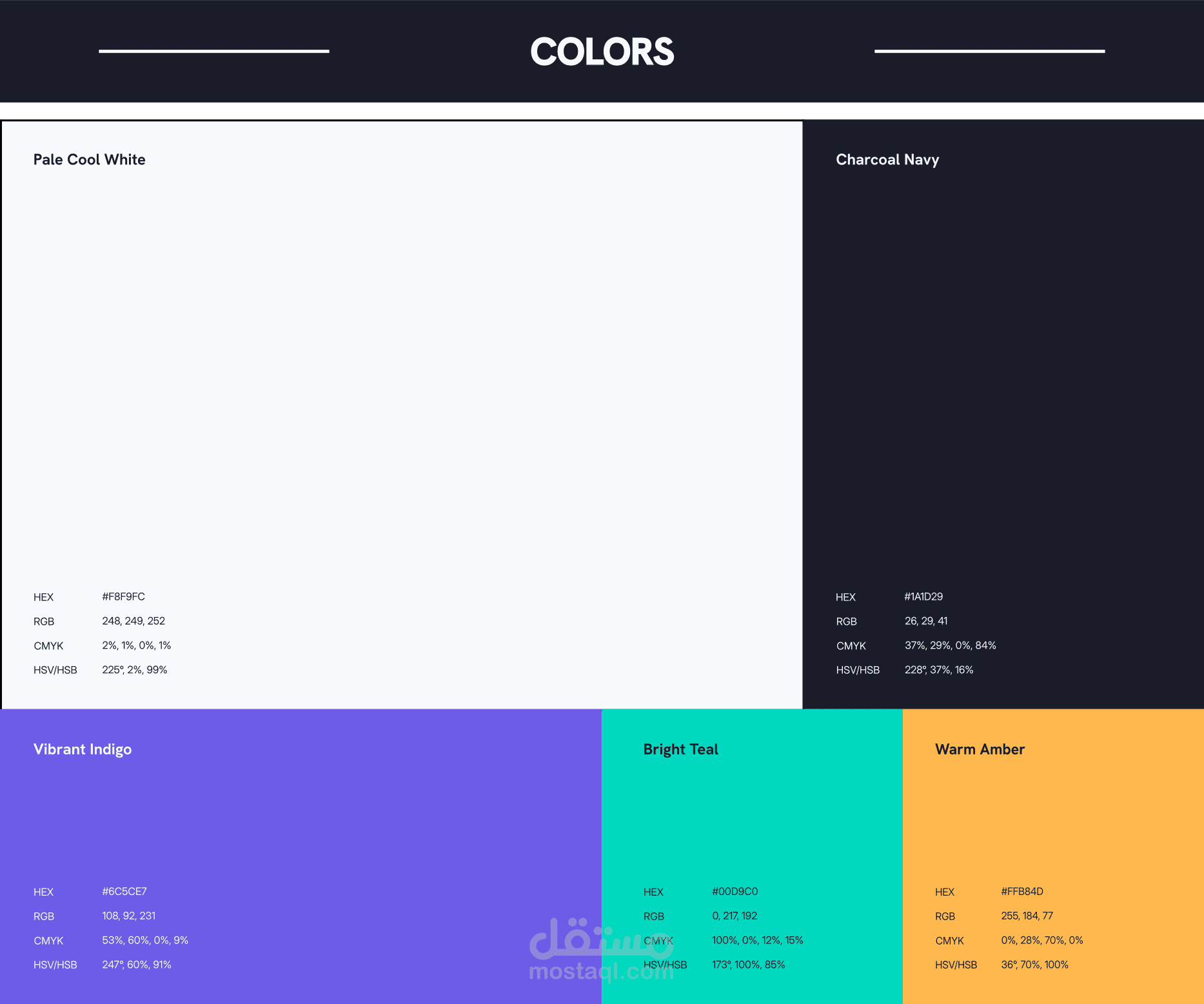
• A vibrant color palette combining charcoal navy, indigo, teal,
and warm amber
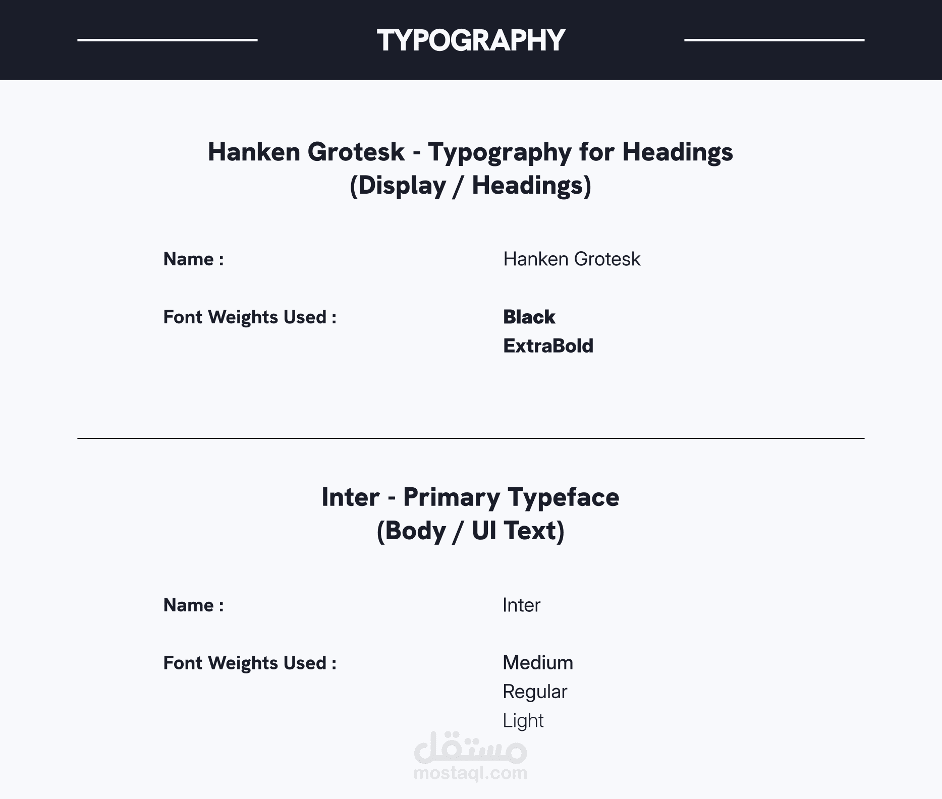
• Typography pairing: Hanken Grotesk for display, Inter for body
and UI text
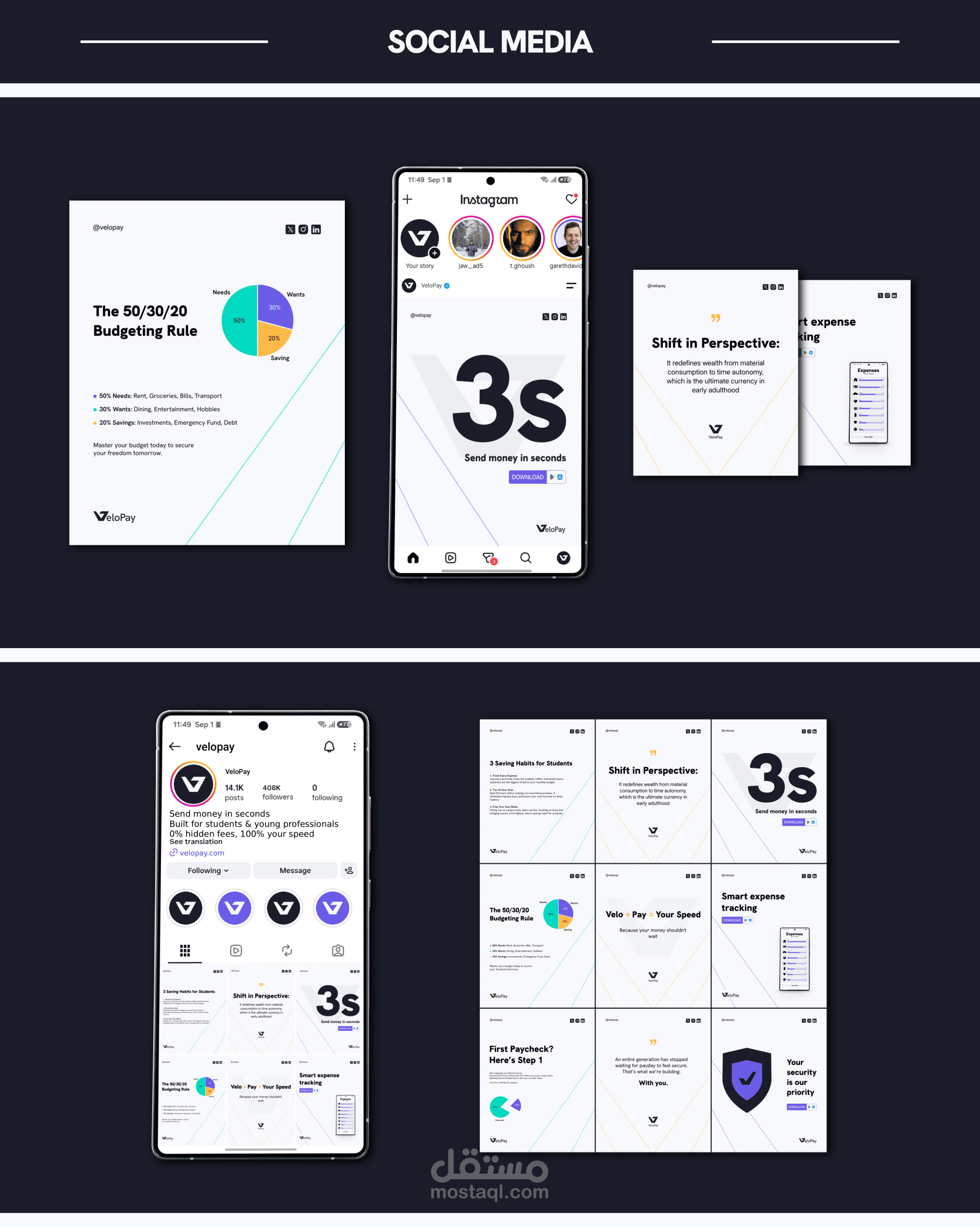
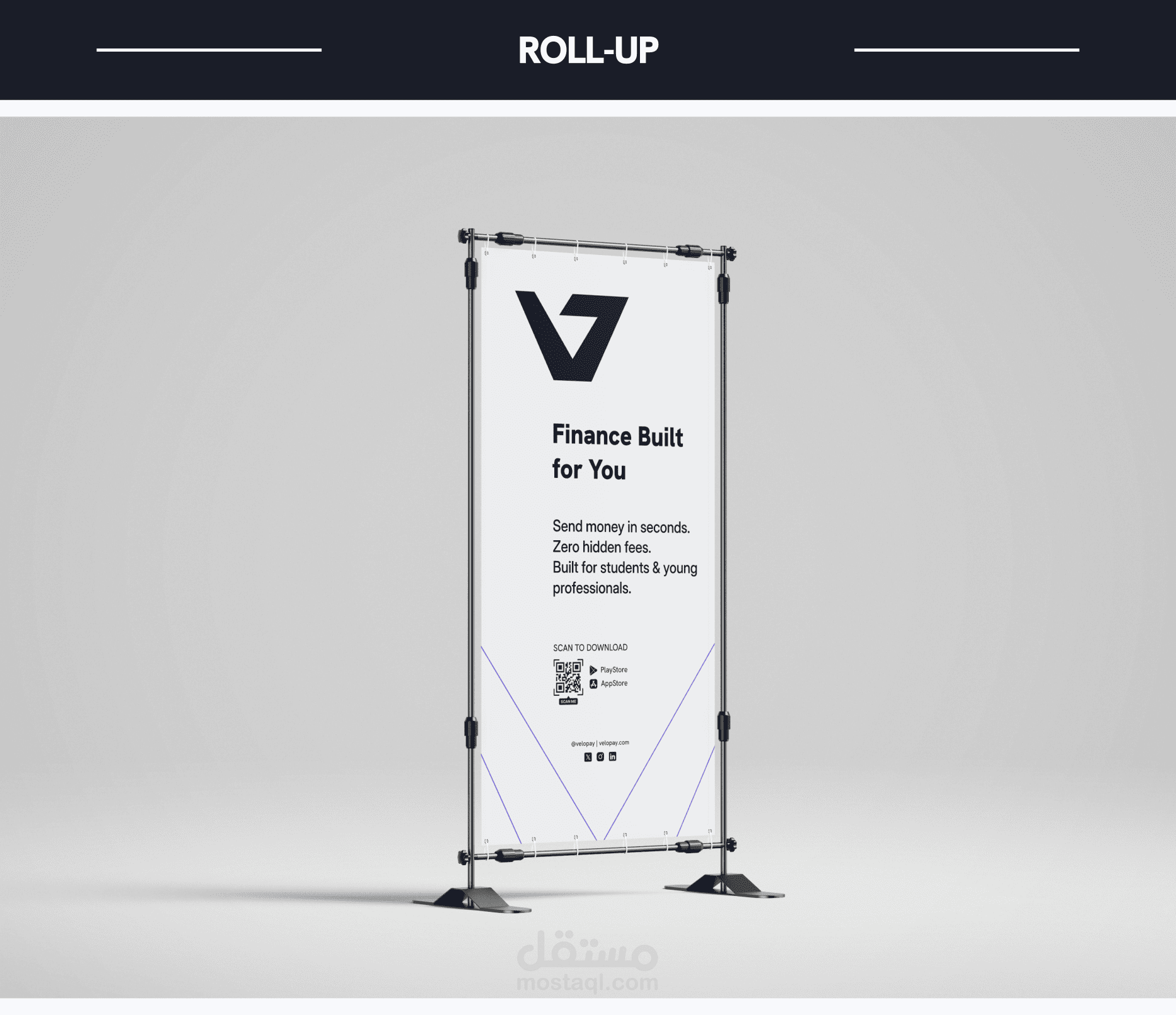
• Full brand application across stationery, ID cards, signage,
mobile app UI, and outdoor advertising