Oceandro Brand Identity
تفاصيل العمل
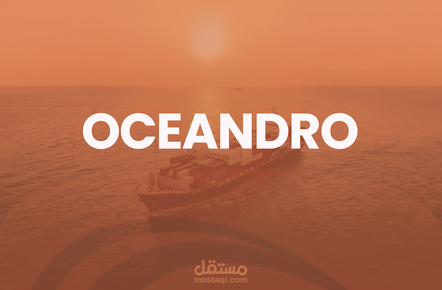
OCEANDRO
This project focused on expanding Oceandro’s visual identity for digital use by developing a supporting color palette, defining typography, and establishing a visual system for social media that reflects the brand’s industrial and maritime character.
Company Overview
Oceandro works across the marine and offshore sector, providing technical services that support vessel construction, repair, and operational efficiency. Through its engineering capabilities and industry expertise, the company contributes to maintaining and supporting maritime operations.
Its positioning centers on reliability, technical competence, and adherence to safety and operational standards within the maritime industry.
Color Concept
The color palette was developed to translate Oceandro’s maritime and industrial identity into a cohesive visual system.
The primary orange was reinterpreted as a symbol of energy, movement, and operational activity. It draws inspiration from elements such as a sunrise over the sea, navigation signals, and industrial operations, transforming color into a dynamic element of the brand identity.
Supporting the primary color, the palette introduces tones inspired by the maritime environment:
Deep Navy: representing strength, depth, and reliability associated with the ocean and heavy industry.
Sky Blue: reflecting openness, horizon lines, and the maritime landscape.
Neutral tones: providing balance and clarity across digital compositions.
Together, these colors build a visual system that reinforces Oceandro’s maritime character while maintaining flexibility across digital platforms.