dotti donuts
تفاصيل العمل
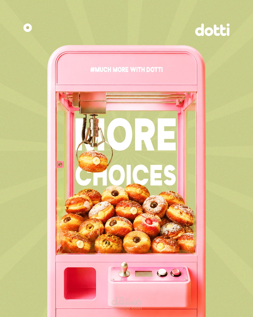
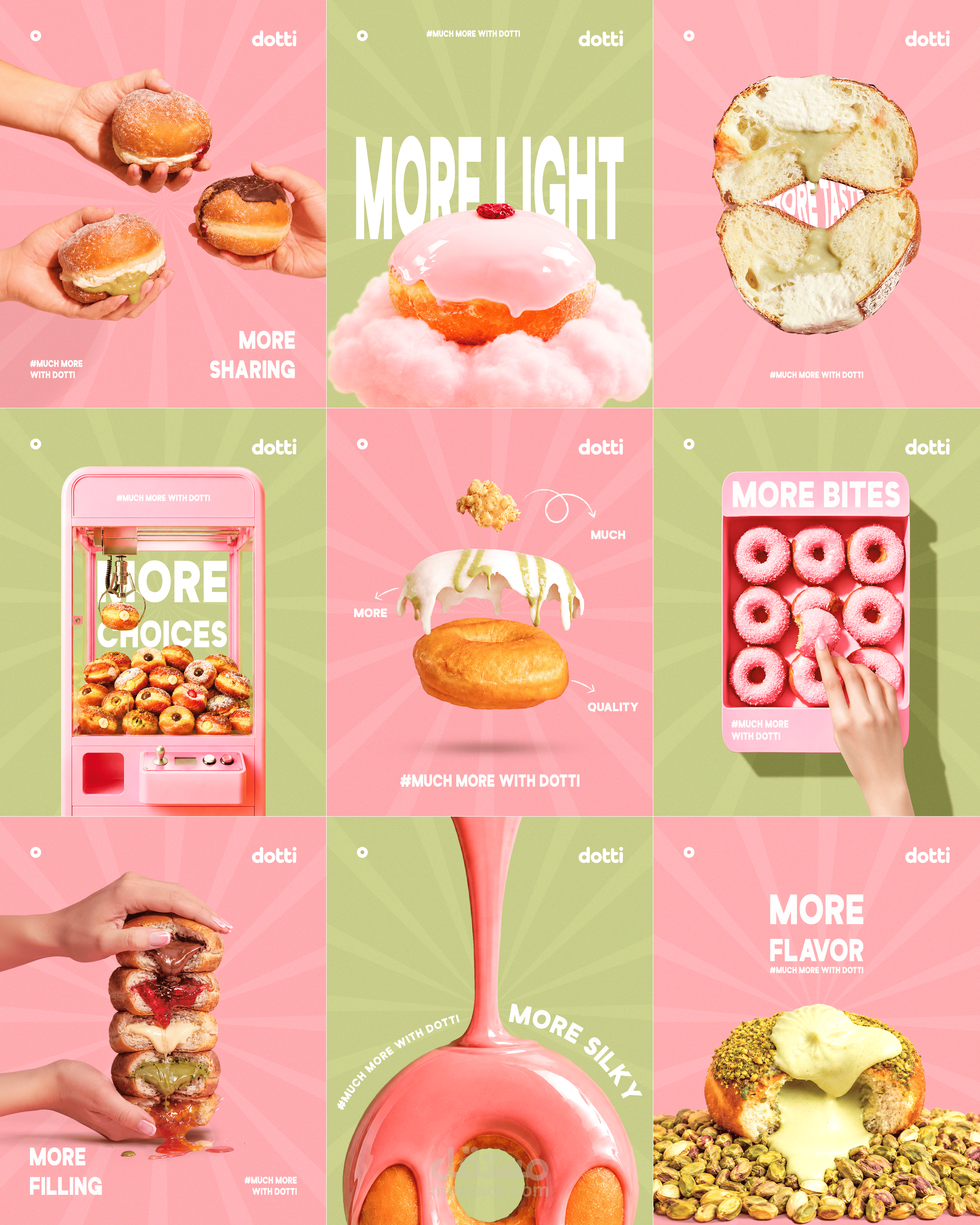
For DOTTI, I wanted to build a campaign around one simple word: MORE.
The idea was to explore all the things that make a donut experience better — more flavor, more filling, more choices, more bites, and more moments to share.
I translated each one into a different playful visual, using exaggerated food photography, bold pink & green colors, and surreal compositions to make the idea of “more” feel tangible and fun.
At the heart of every visual, the donut is always the center of attention. This reinforces the idea of “MORE THAN ANYONE COULD GIVE”, positioning the donut as the hero of every scene. The radial lines in the background always converge towards the main product, naturally guiding the eye back to the donut and creating a strong visual hierarchy.
The result is a visual system where every execution has its own story, while still feeling like part of the same campaign.