لوجو لشركة عطور
تفاصيل العمل
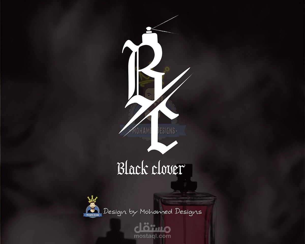
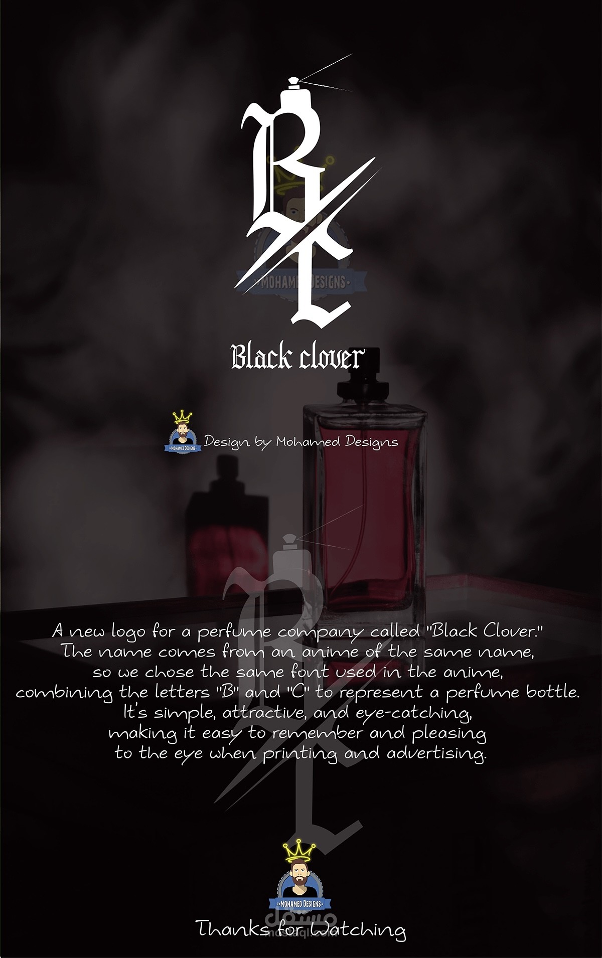
A new logo for a perfume company called "Black Clover.!
The name comes from an anime of the same name, so we chose the same font used in the anime, combining the letters "B" and "C" to represent a perfume bottle.
It's simple, attractive, and eye-catching making it easy to remember and pleasing to the eye when printing and advertising