MORK Logo Concept The logo is built around the concept: Slow Coffee
تفاصيل العمل
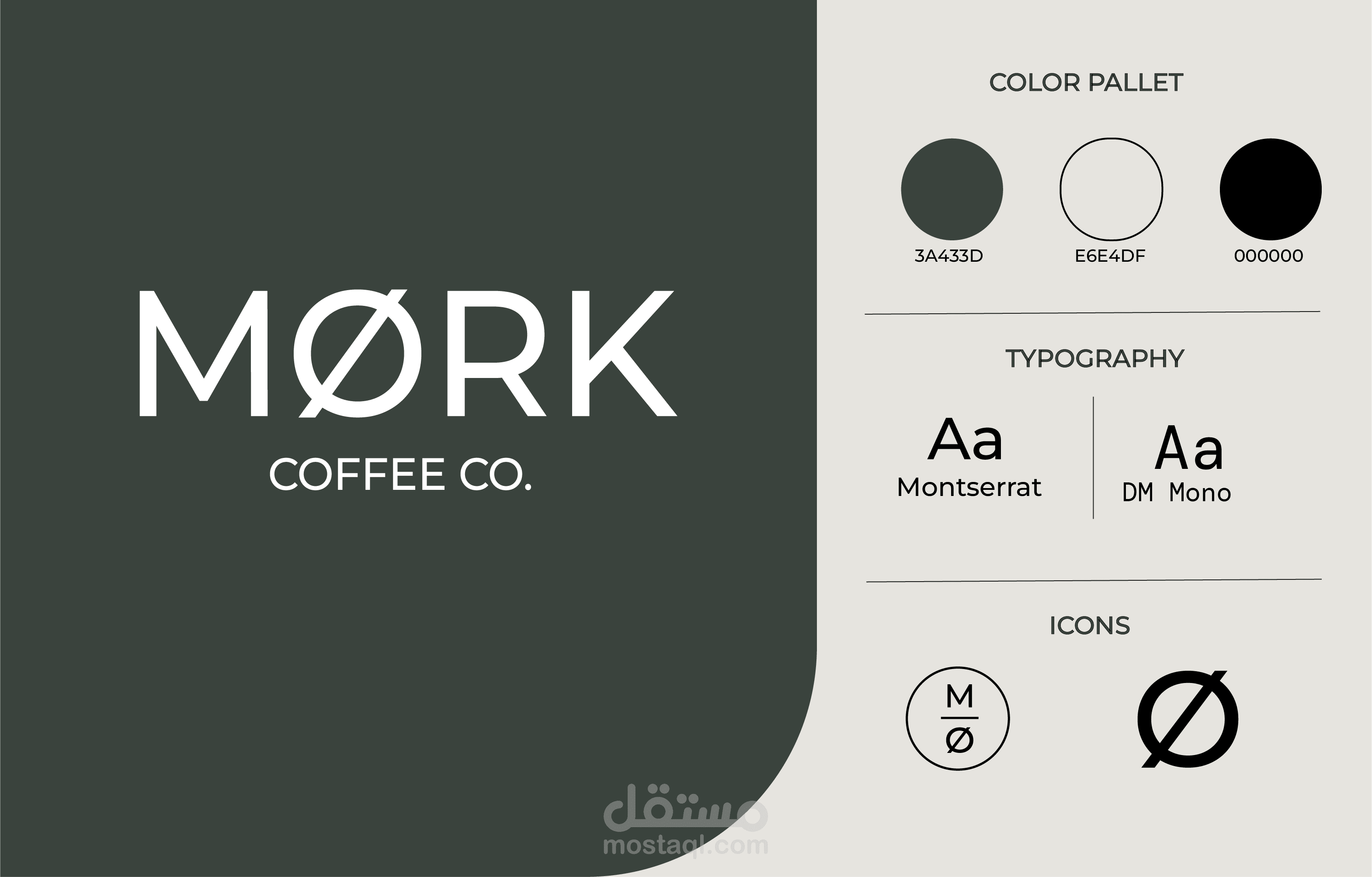
Logo Concept The logo is built around the concept: Slow Coffee. Dark Mood. The core idea is that MORK is not merely a coffee shop, but a mood—an experience. Consequently, the logo relies on a sense of calm, negative space, and clean, geometric typography, eschewing traditional coffee imagery like beans or cups. The key element of the logo is the character: O. The letter O serves as the brand’s visual signature. The slash within the O acts as a distinctive visual element, allowing the letter itself to function as the logo mark, eliminating the need for a separate coffee icon. This ensures the logo is: Distinctive Minimalist Memorable Easily recognizable