Sales Performance Dashboard | Power BI
تفاصيل العمل
Power BI Sales Performance Dashboard
Turning raw sales data into actionable business insights with Power BI.
I'm excited to share one of my latest Power BI projects, where I transformed the DataCo Smart Supply Chain dataset into an interactive dashboard designed to support business decision-making.
Before building the dashboard, I explored and analyzed the dataset to understand its structure, identify the most meaningful KPIs, and define the key business questions the report should answer. Based on that analysis, I designed a three-page interactive dashboard that provides a comprehensive view of sales performance from different perspectives.
Dashboard Pages
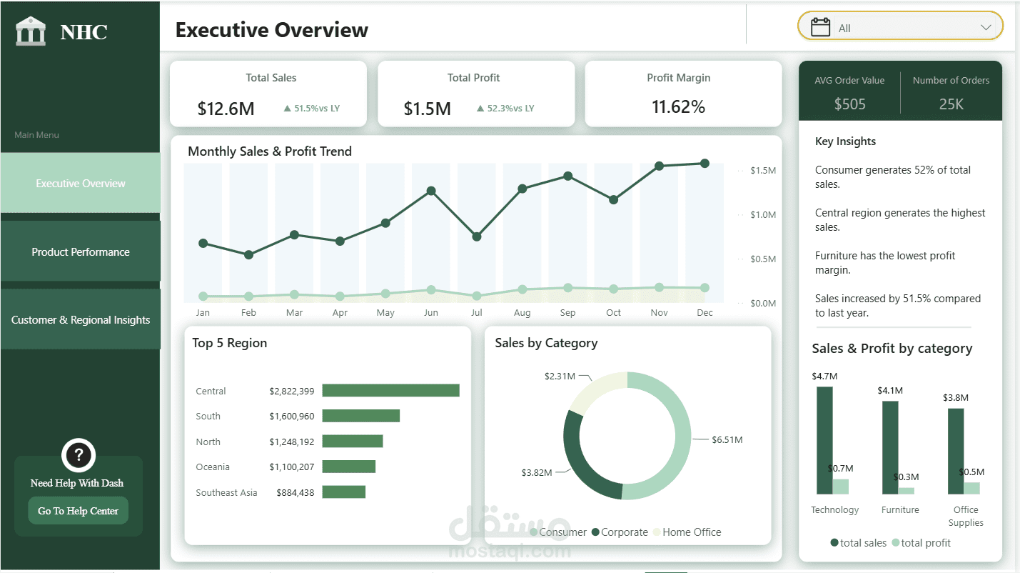
• Executive Overview
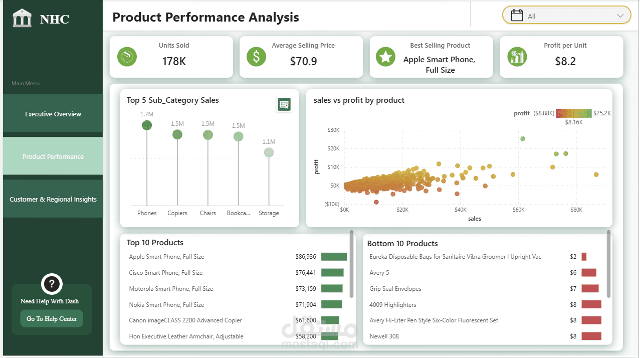
• Product Performance
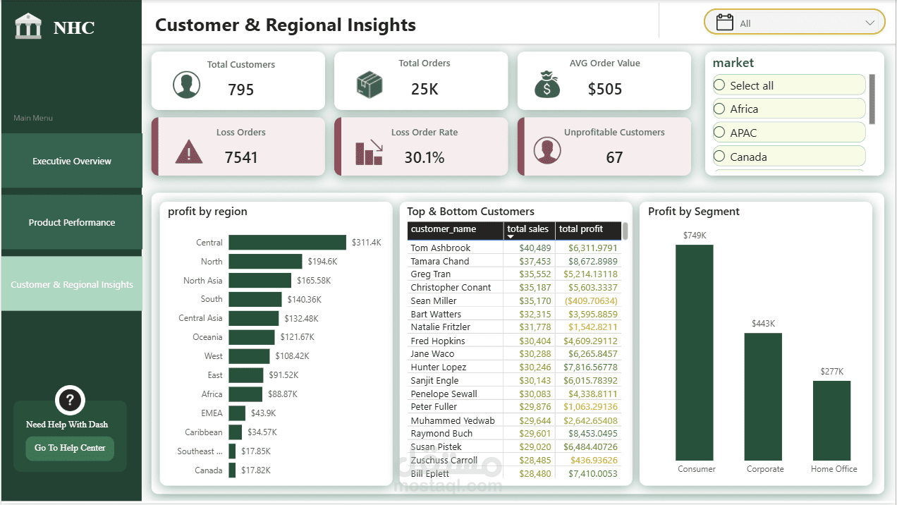
• Customer & Regional Insights
The dashboard enables users to:
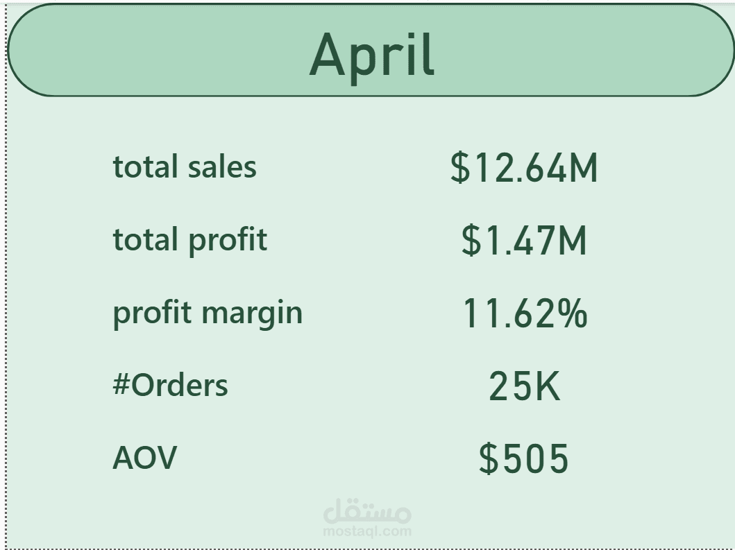
• Monitor Sales, Profit, and Profit Margin.
• Track Year-over-Year (YoY) and Month-over-Month (MoM) performance.
• Analyze sales trends over time.
• Identify top-performing and underperforming products.
• Compare regional performance.
• Evaluate customer and market performance.
• Navigate seamlessly between report pages through interactive page navigation.
• Support business decisions through clear and interactive visualizations.
Skills & Technologies Used
• Power BI
• Power Query (Data Cleaning & Transformation)
• Data Modeling (Star Schema)
• DAX Measures
• Time Intelligence (YTD, YoY & MoM)
• Interactive Reports
• Slicers & Filters
• Page Navigation
• Conditional Formatting
• Figma (Dashboard UI Design)
This project strengthened my ability to transform raw data into meaningful insights by combining data preparation, analytical thinking, data modeling, and dashboard design to create a clean, intuitive, and user-friendly reporting experience.
Dataset: DataCo Smart Supply Chain Dataset (Kaggle)
I'm always open to feedback and would love to hear your thoughts on the dashboard.