Perception Distance - AI & Web3 Company
تفاصيل العمل
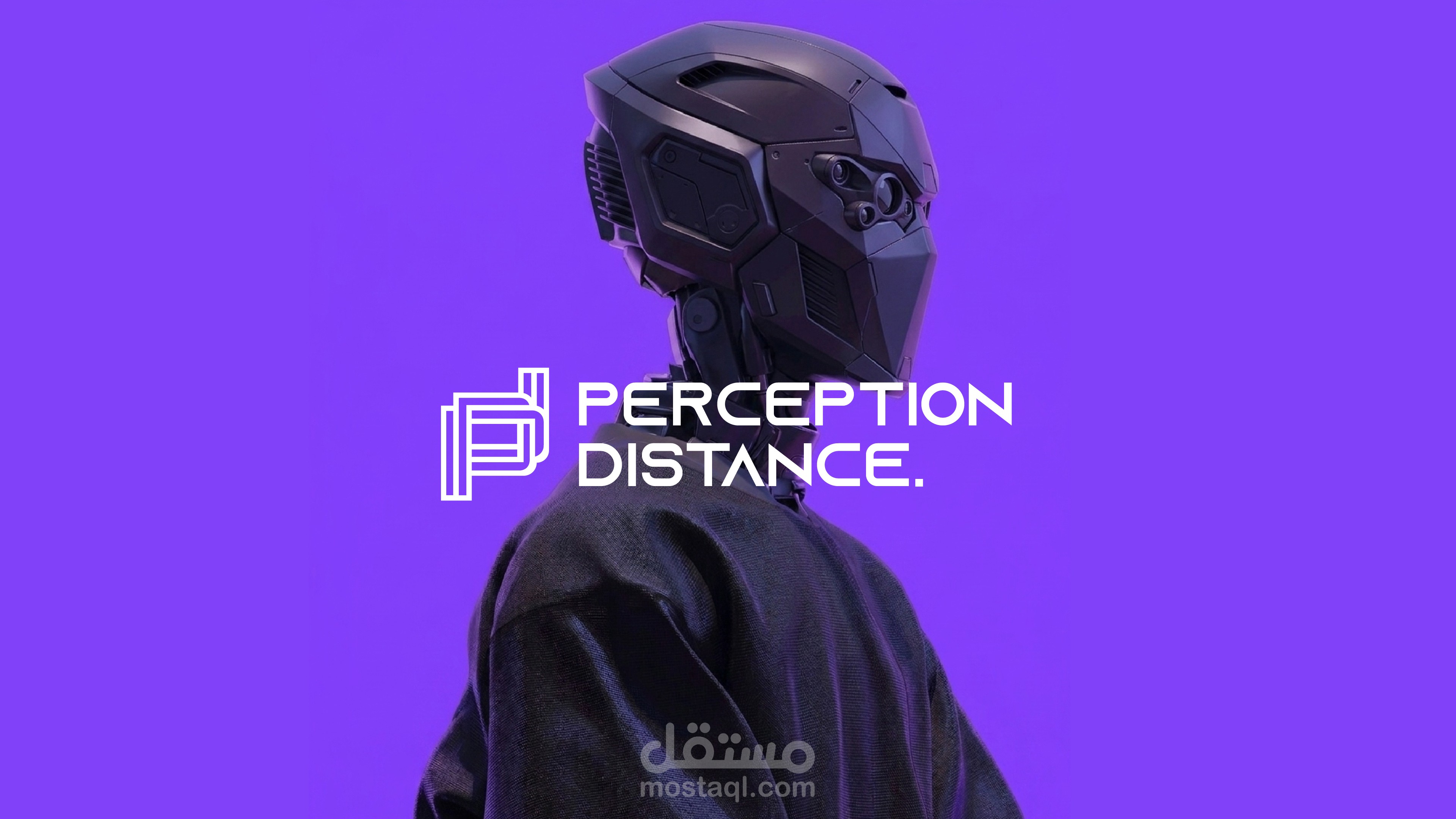
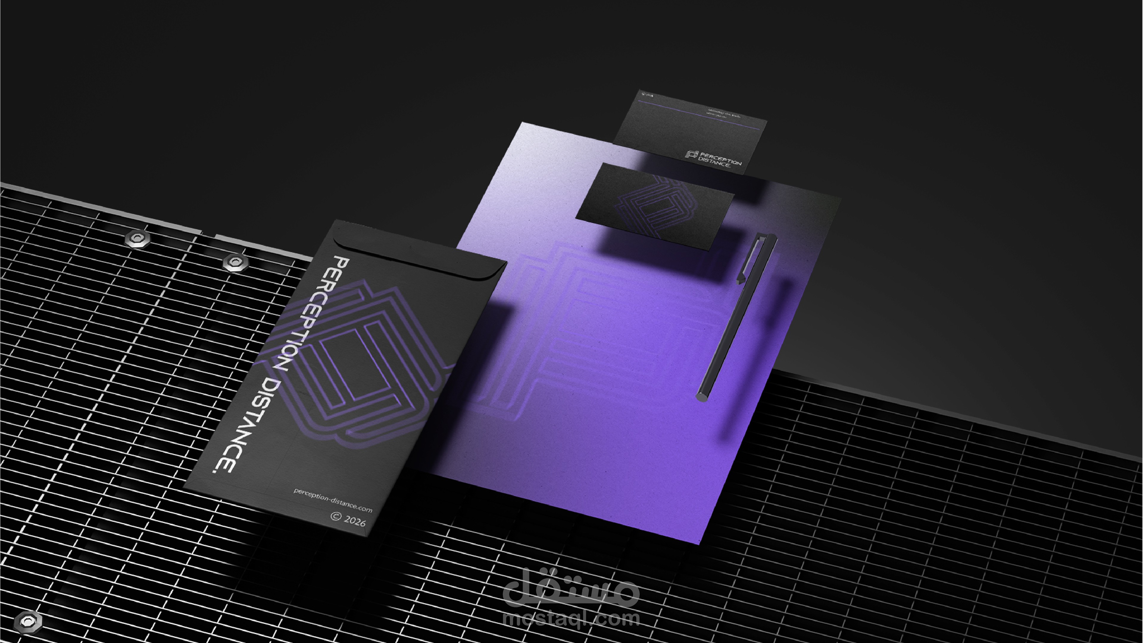
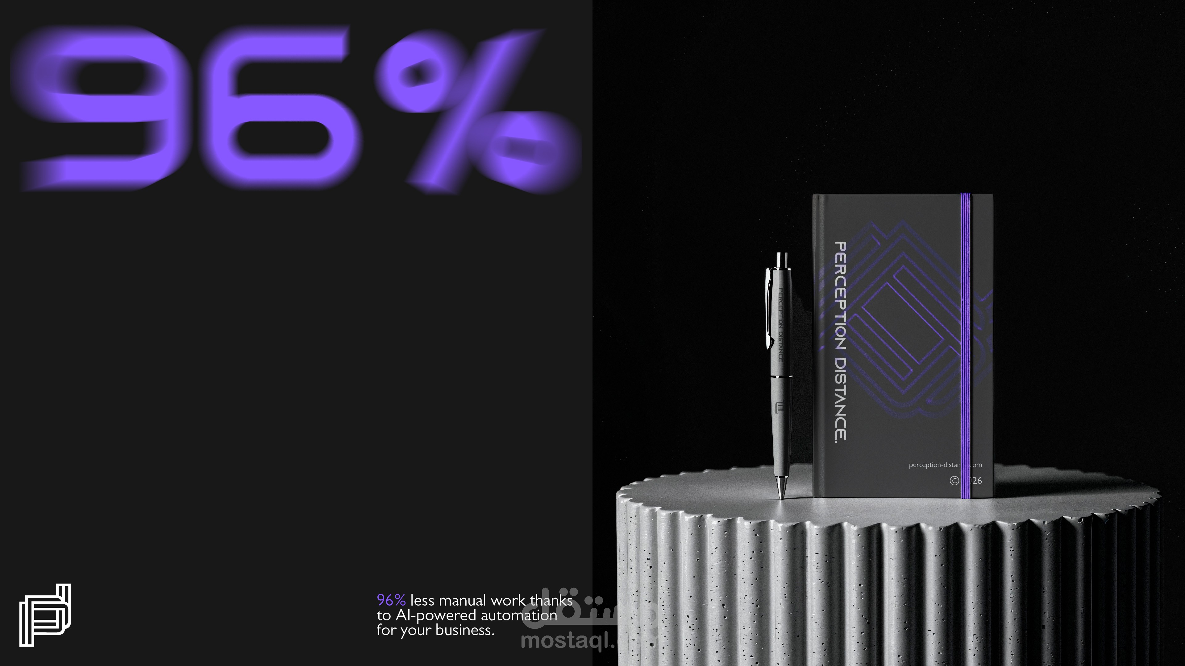
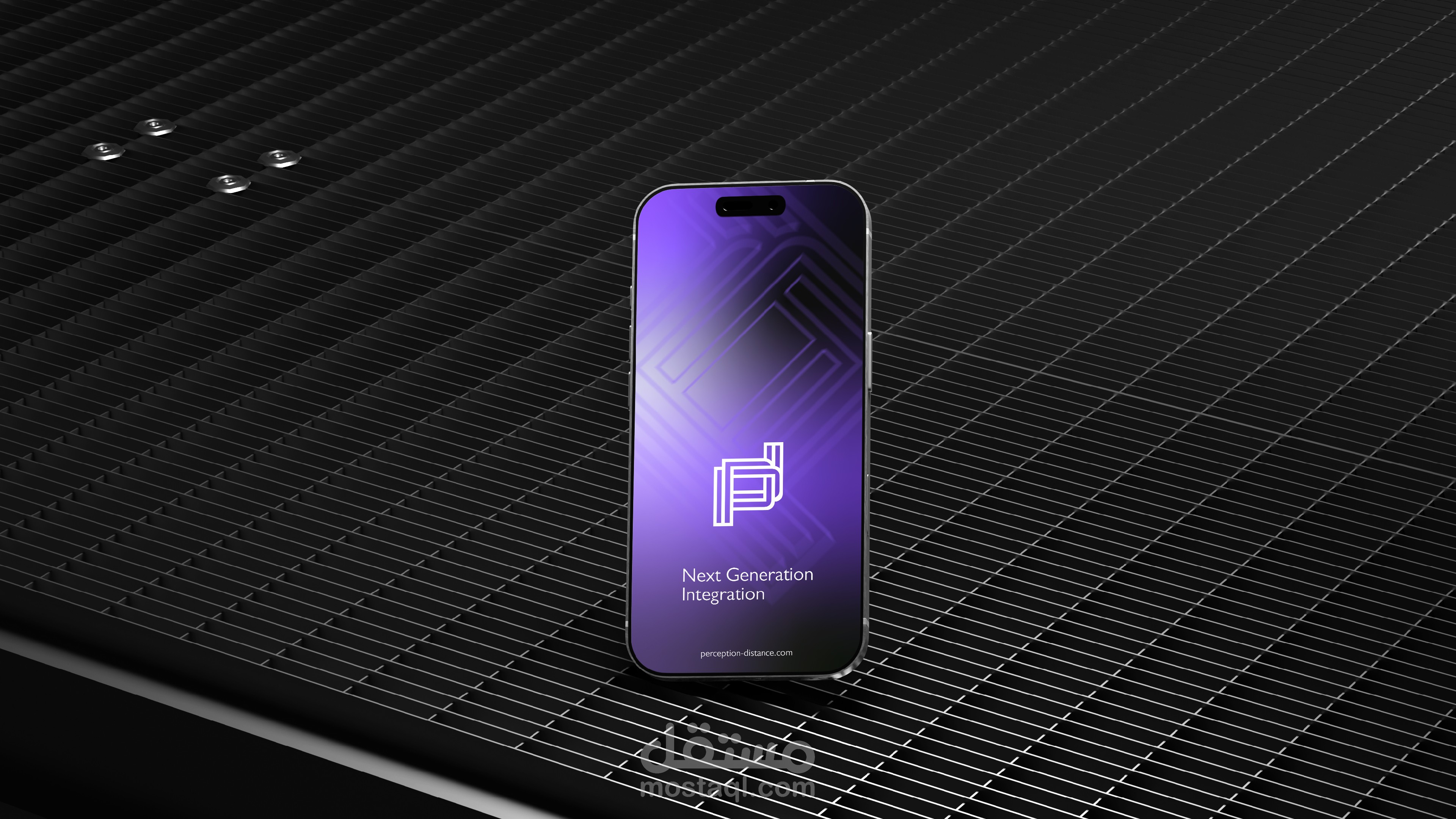
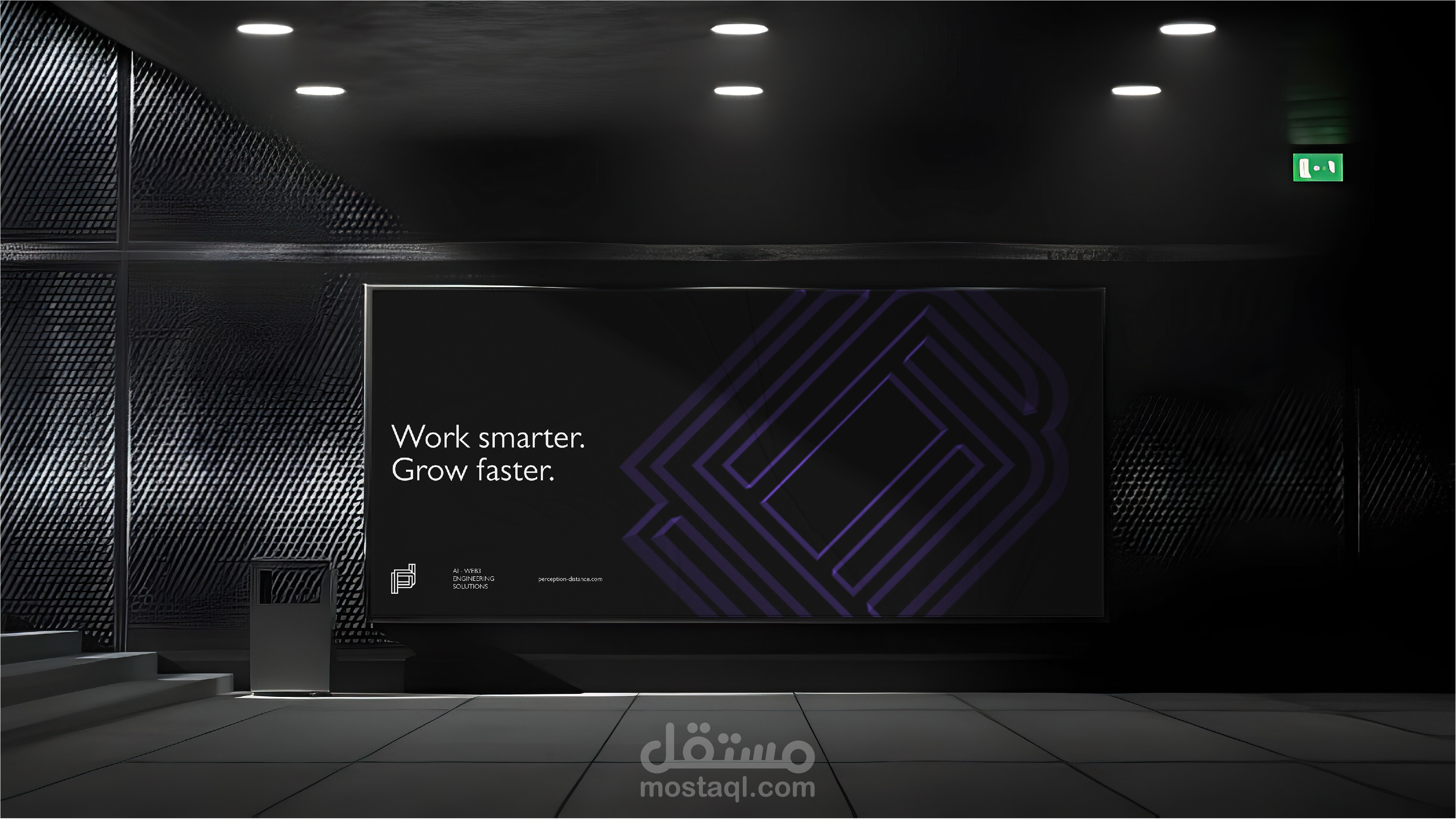
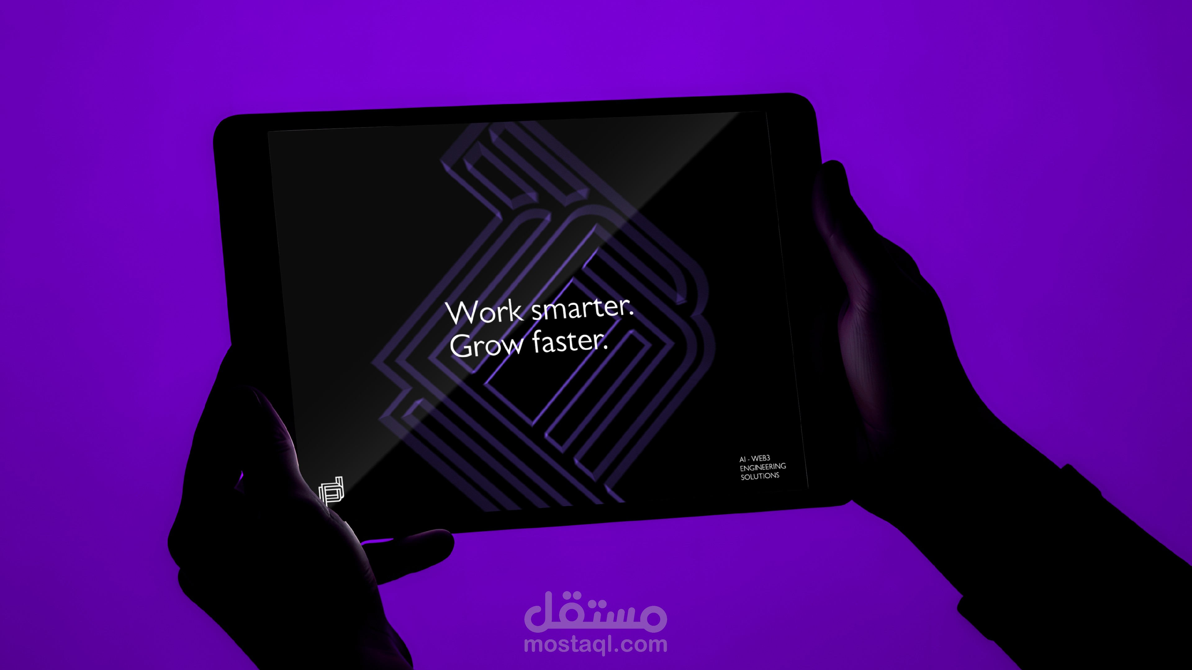
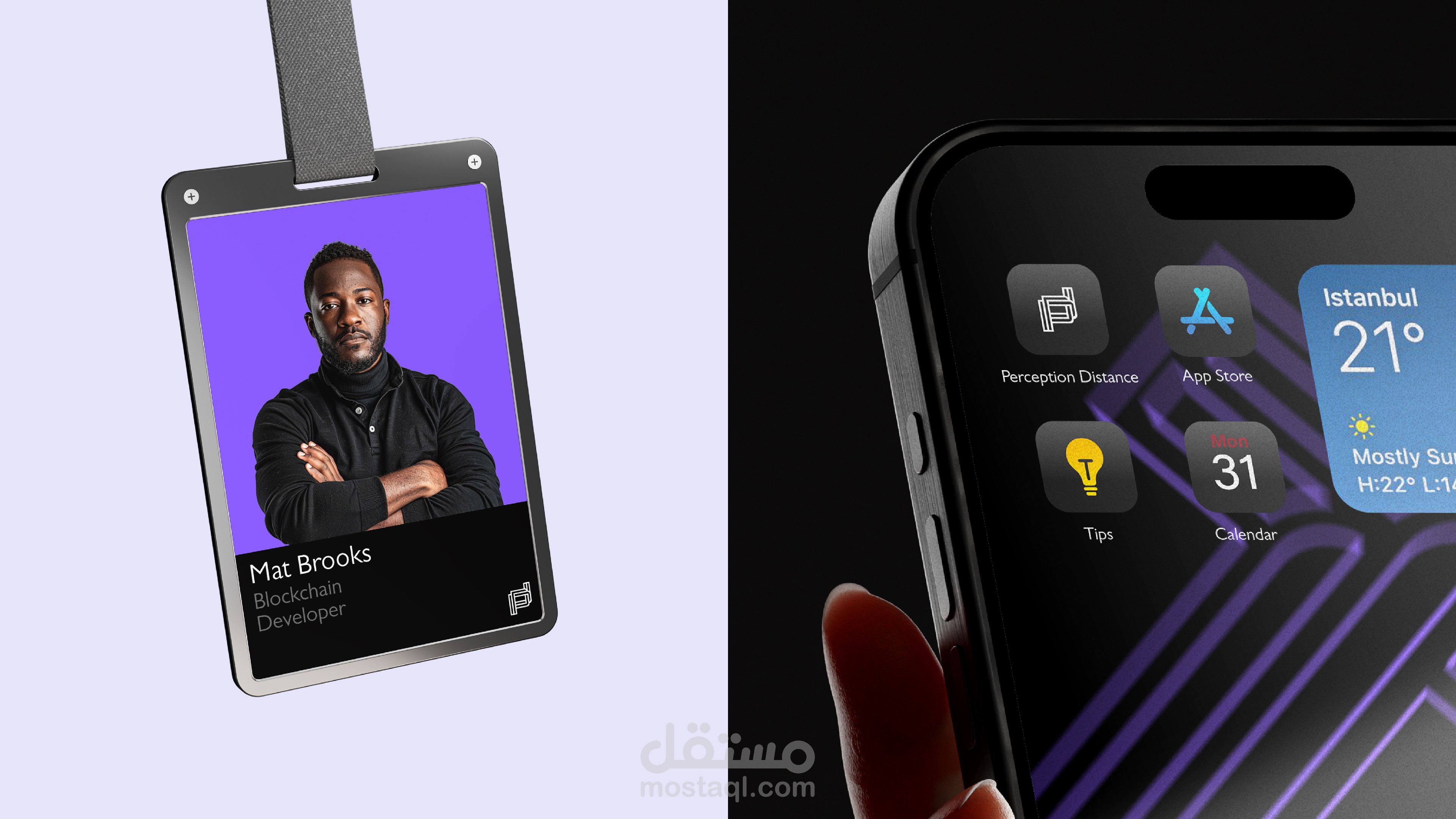
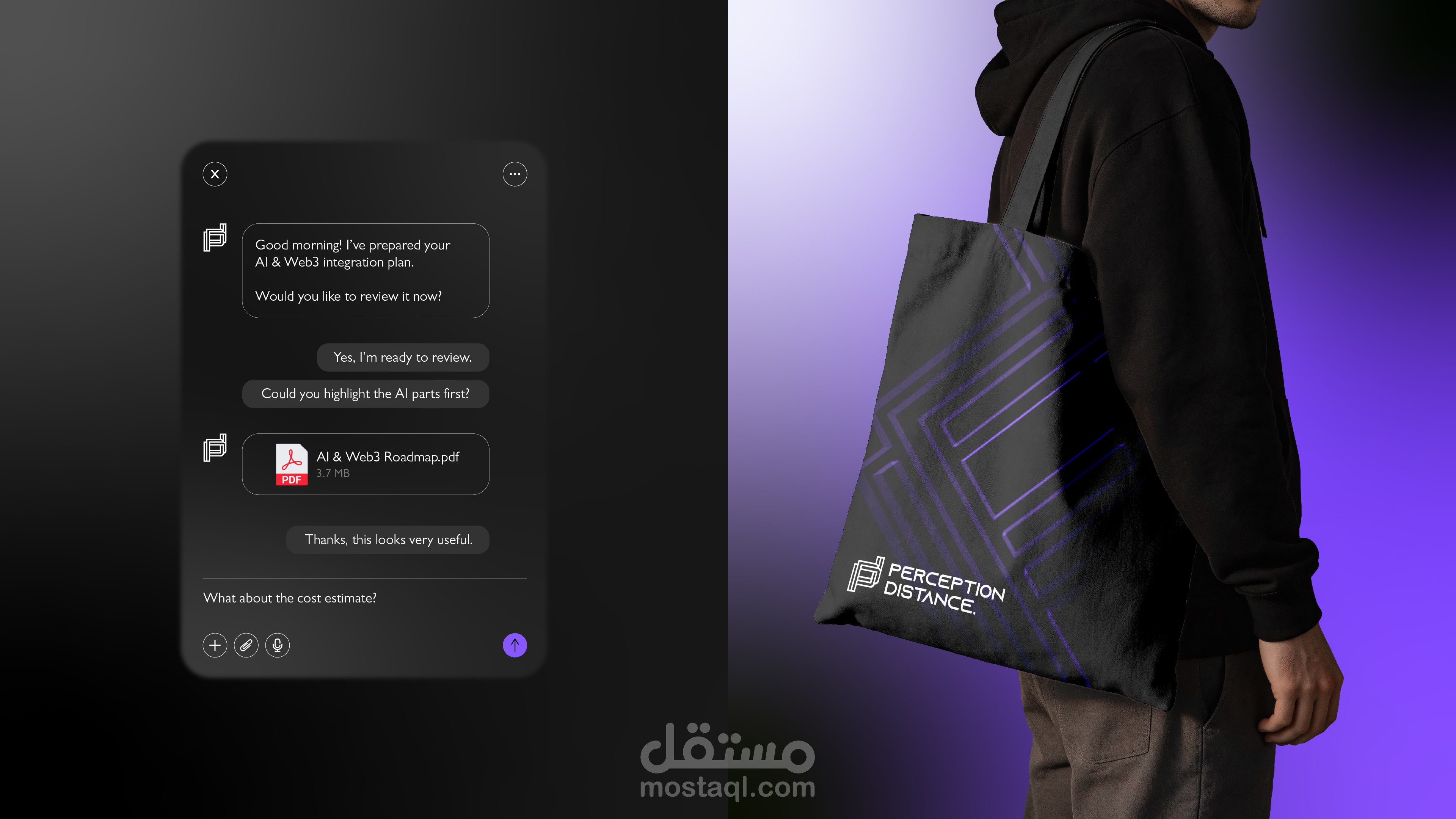
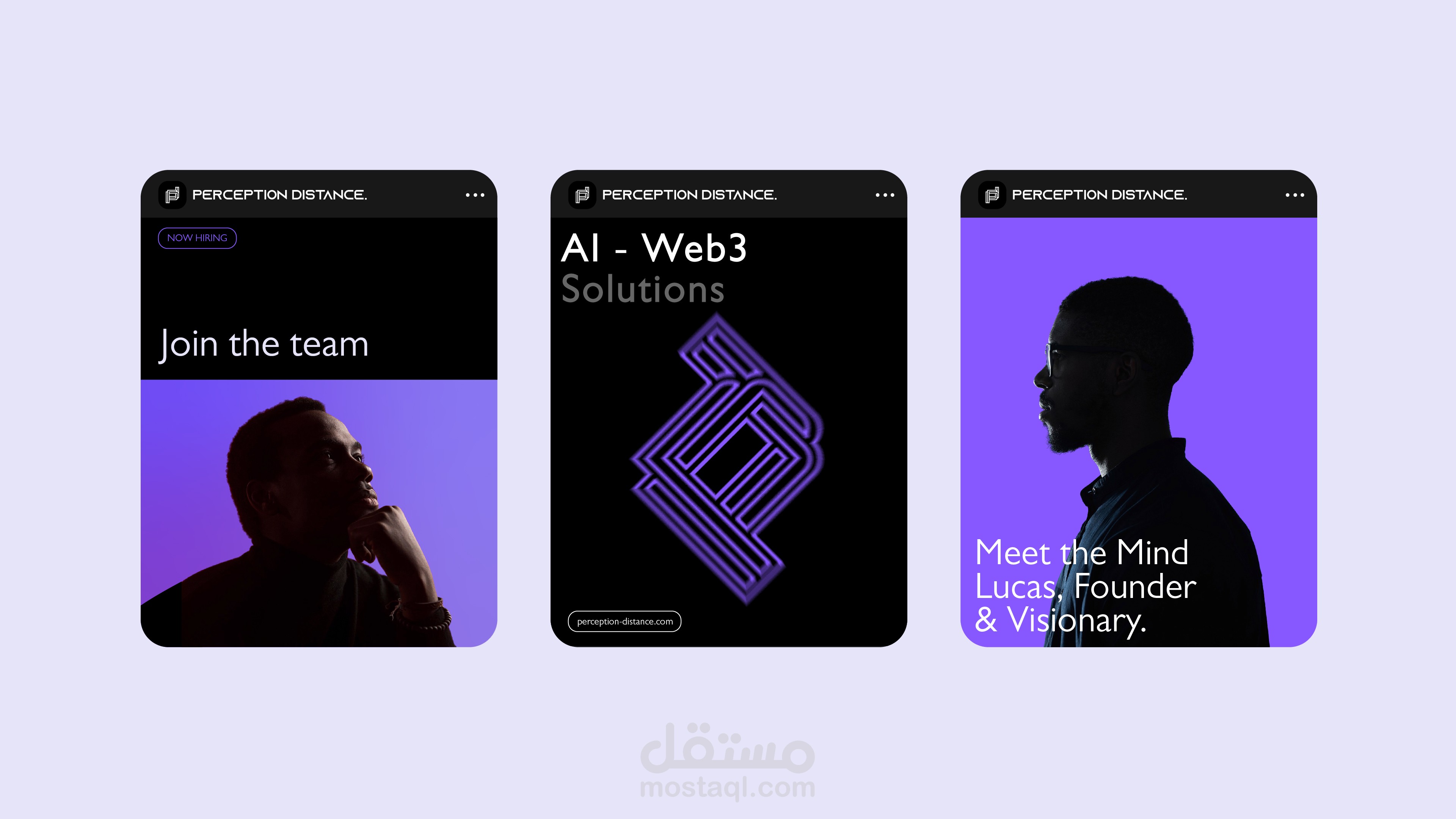
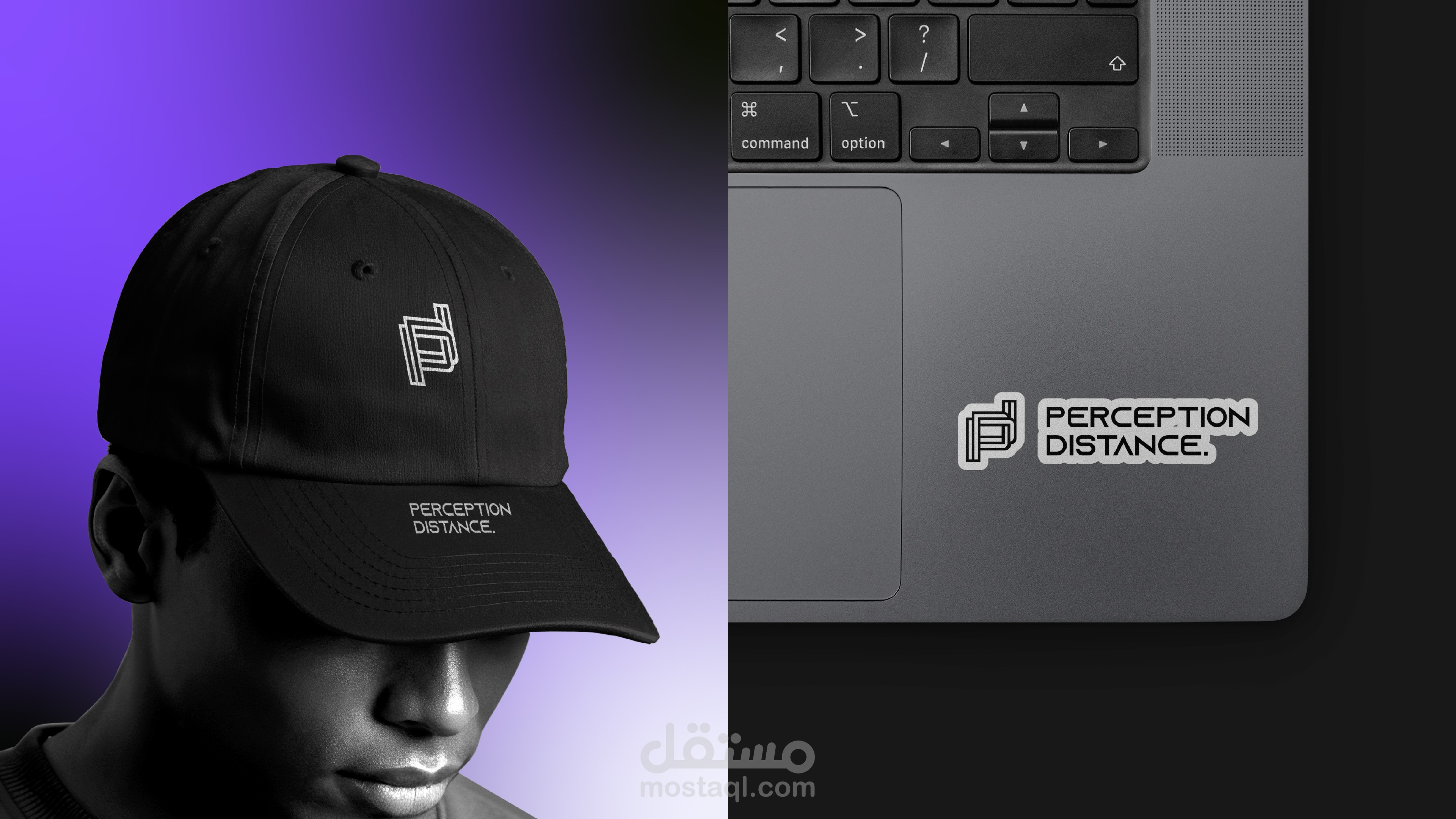
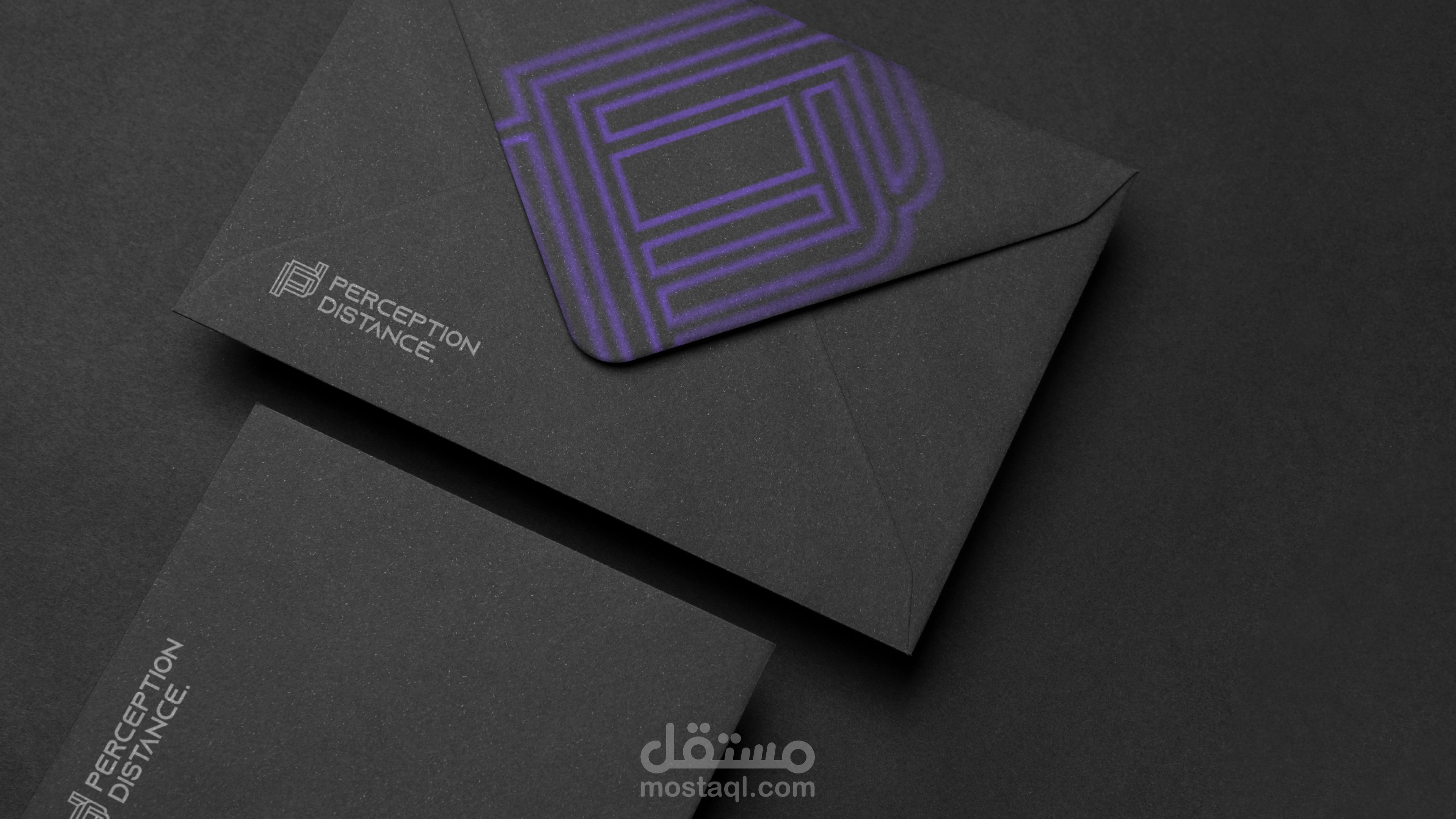
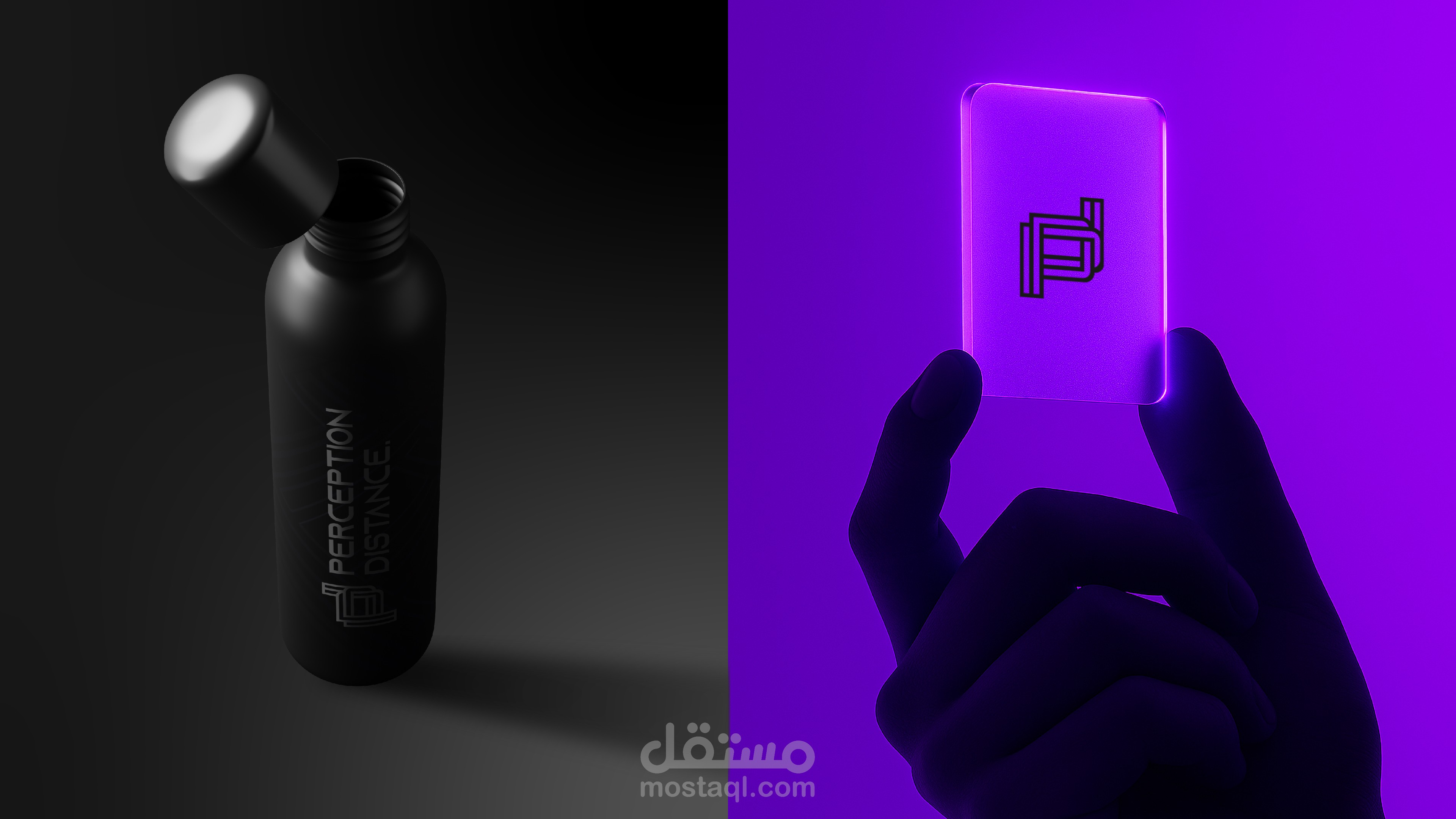
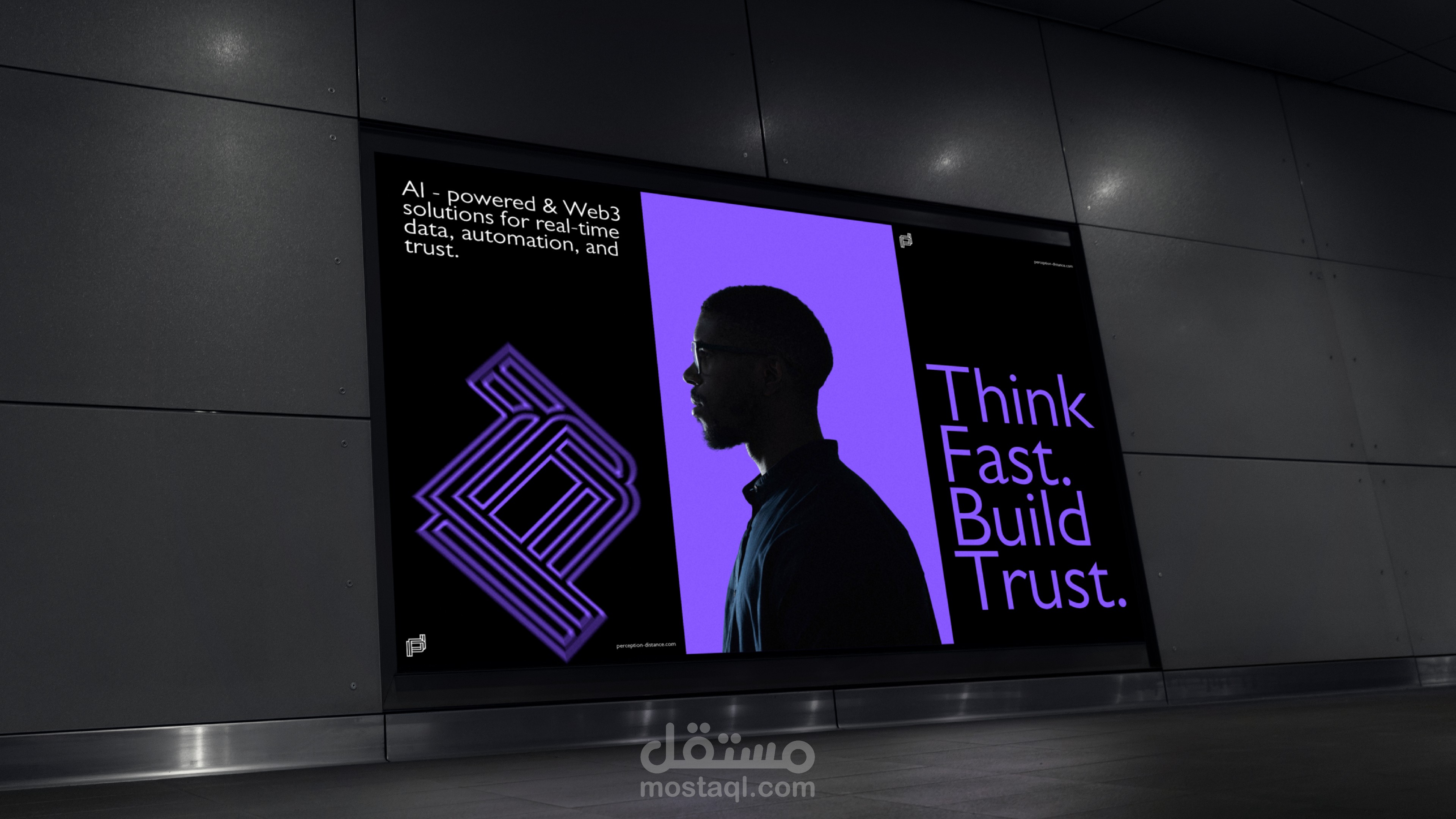
Welcome to the brand identity showcase for Perception Distance. In a rapidly evolving digital landscape, artificial intelligence is no longer just a tool; it is an extension of human capability. This project presents a comprehensive visual identity designed for a cutting-edge AI company.
The goal was to create a brand that feels futuristic, highly intelligent, and deeply technological, while maintaining a sleek, modern visual language. Dive into the design process, from the core conceptualization to the final execution.
The Logotype
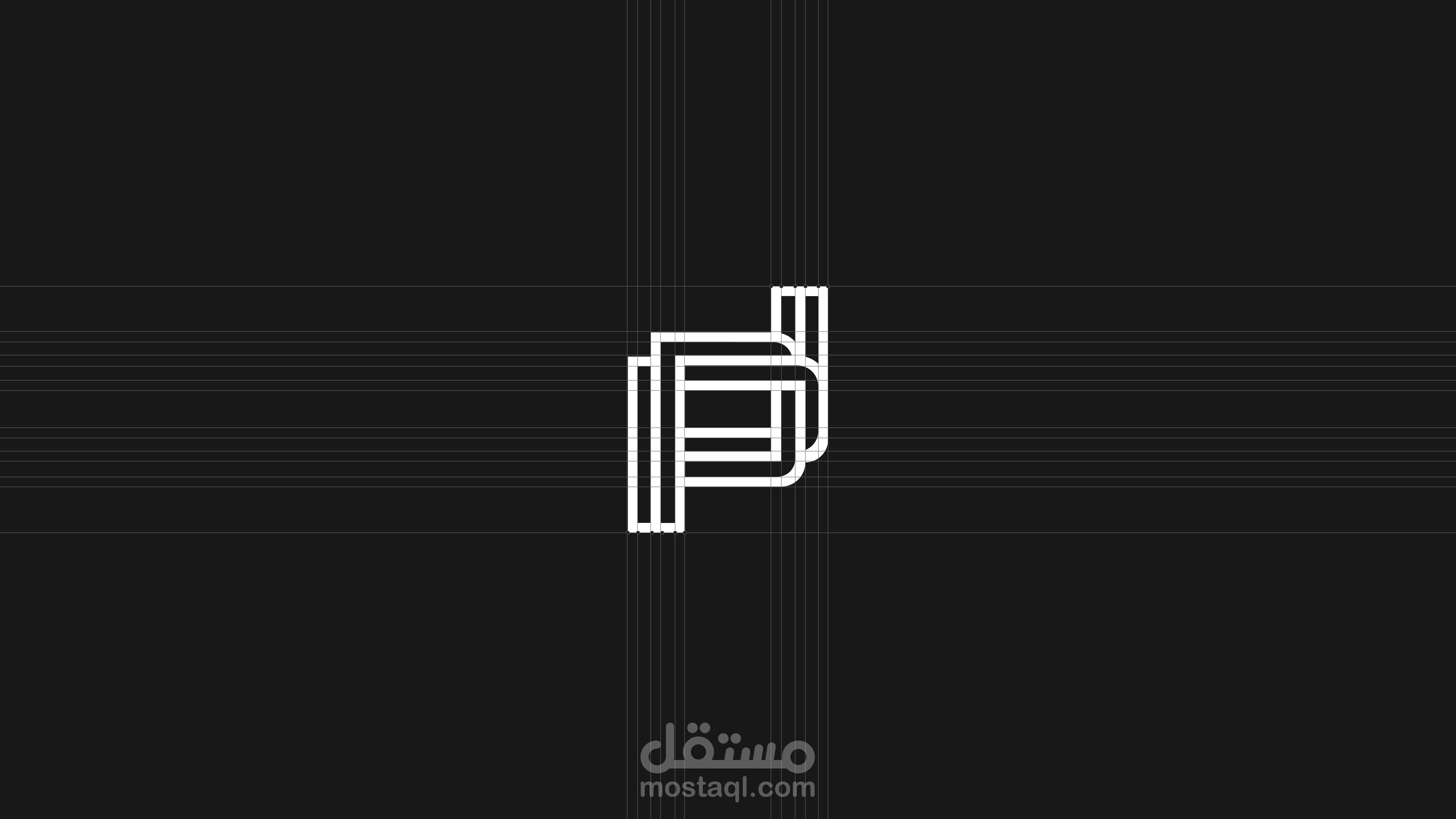
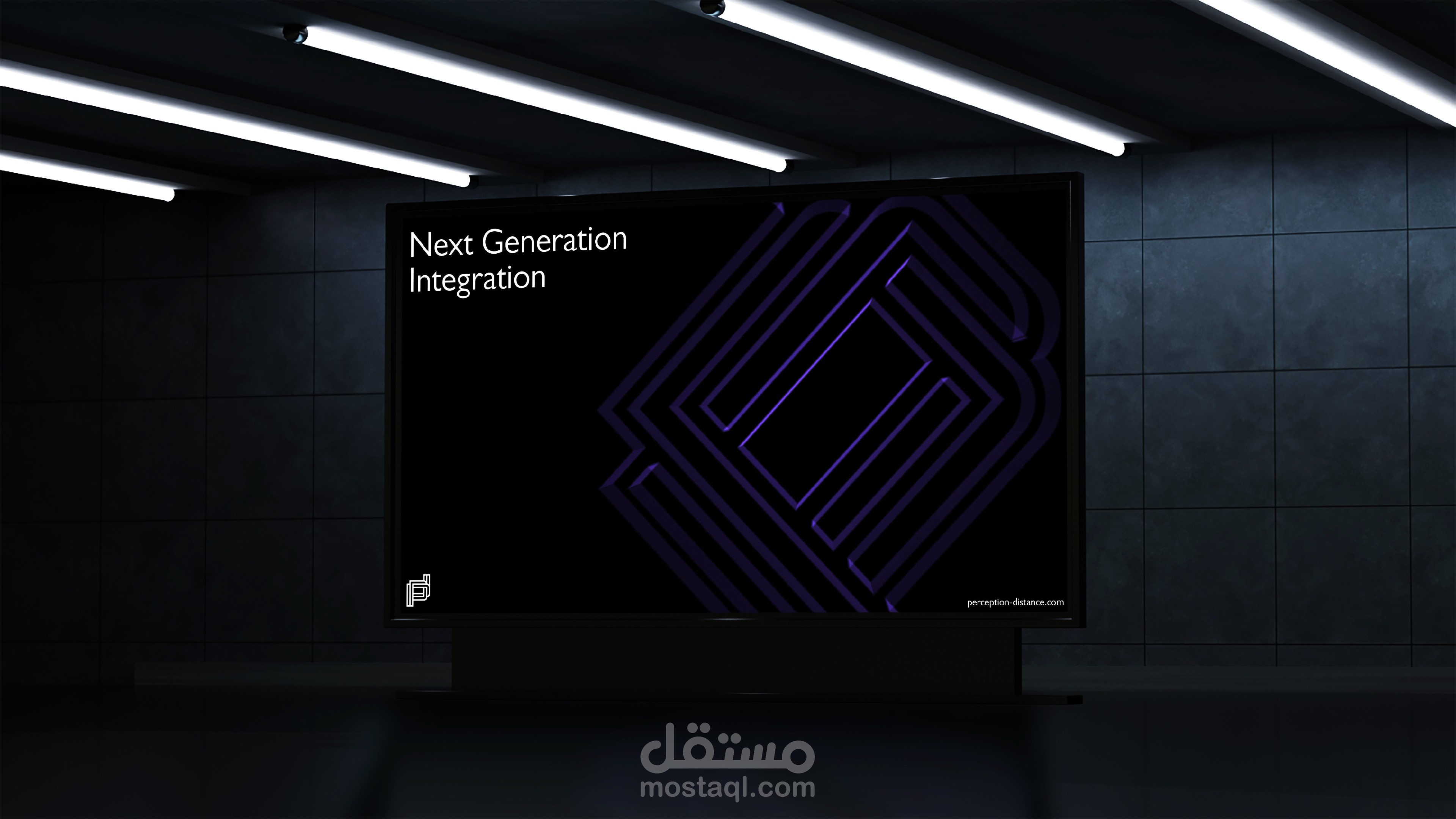
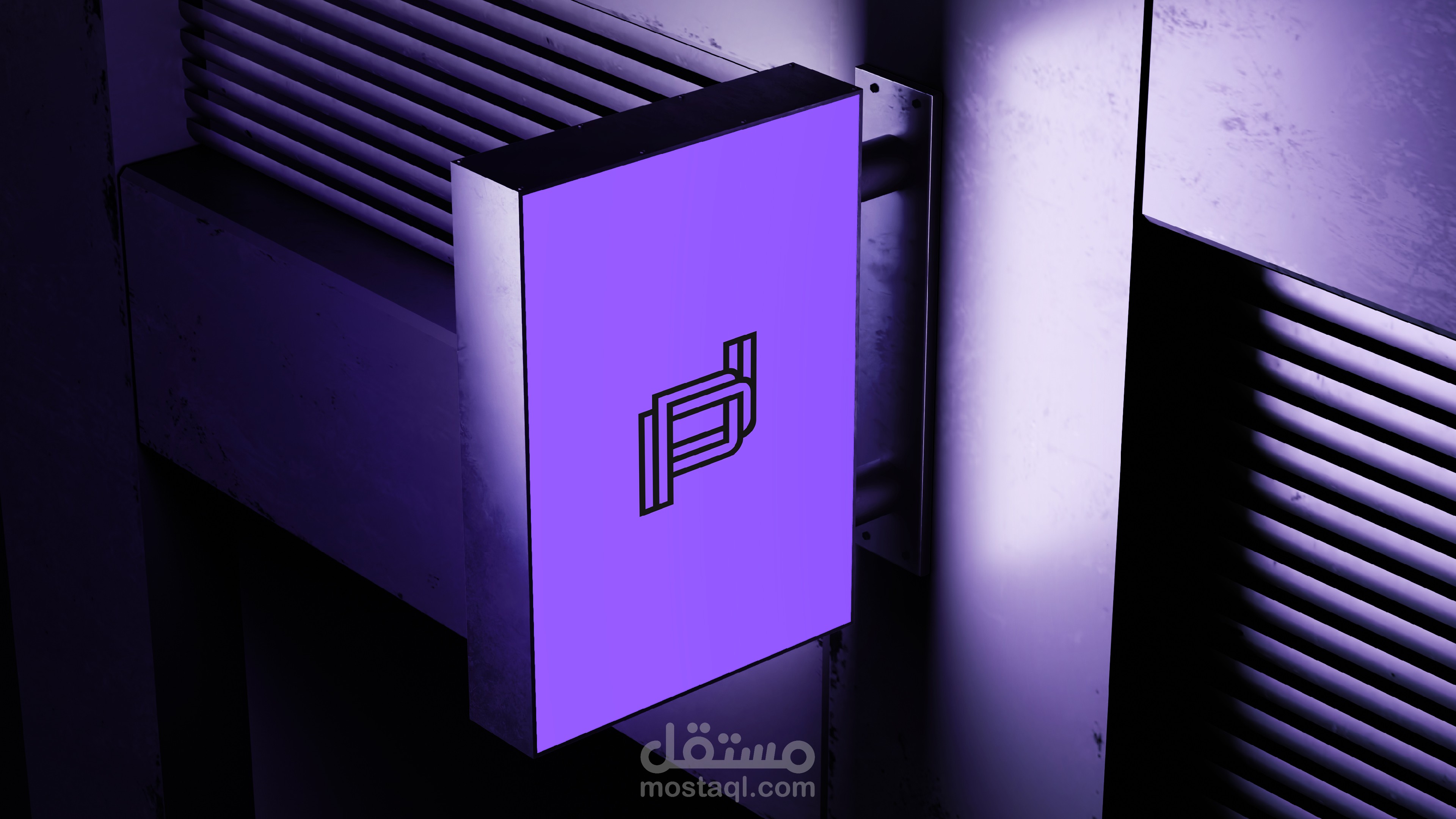
The visual cornerstone of the brand is its custom monogram, designed to reflect the fluid, interconnected, and infinite nature of artificial intelligence.
The Monogram: The icon cleverly merges the company's initials, "P" and "D", into a single, cohesive geometric mark.
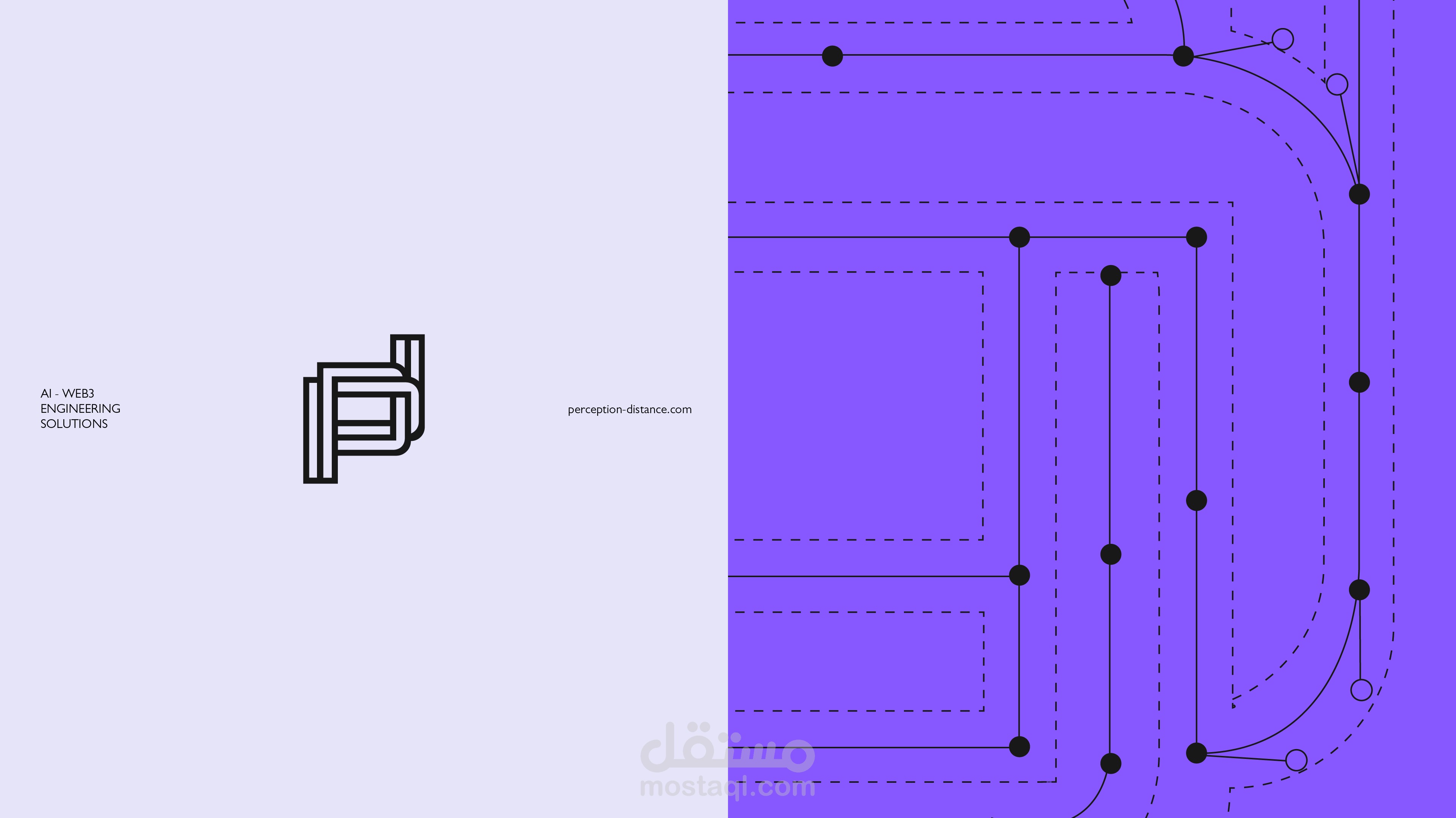
The Design Language: Inspired by the interlocking, continuous-loop structures seen in modern AI branding (such as the node-based geometry of the ChatGPT logo), the design utilizes parallel, circuit-like lines that fold into one another.
The Meaning: This continuous flow of lines represents infinite data processing, complex neural pathways, and the seamless communication between human and machine. The structured, maze-like form gives the brand a highly technical, modern, and authoritative presence.
Typography
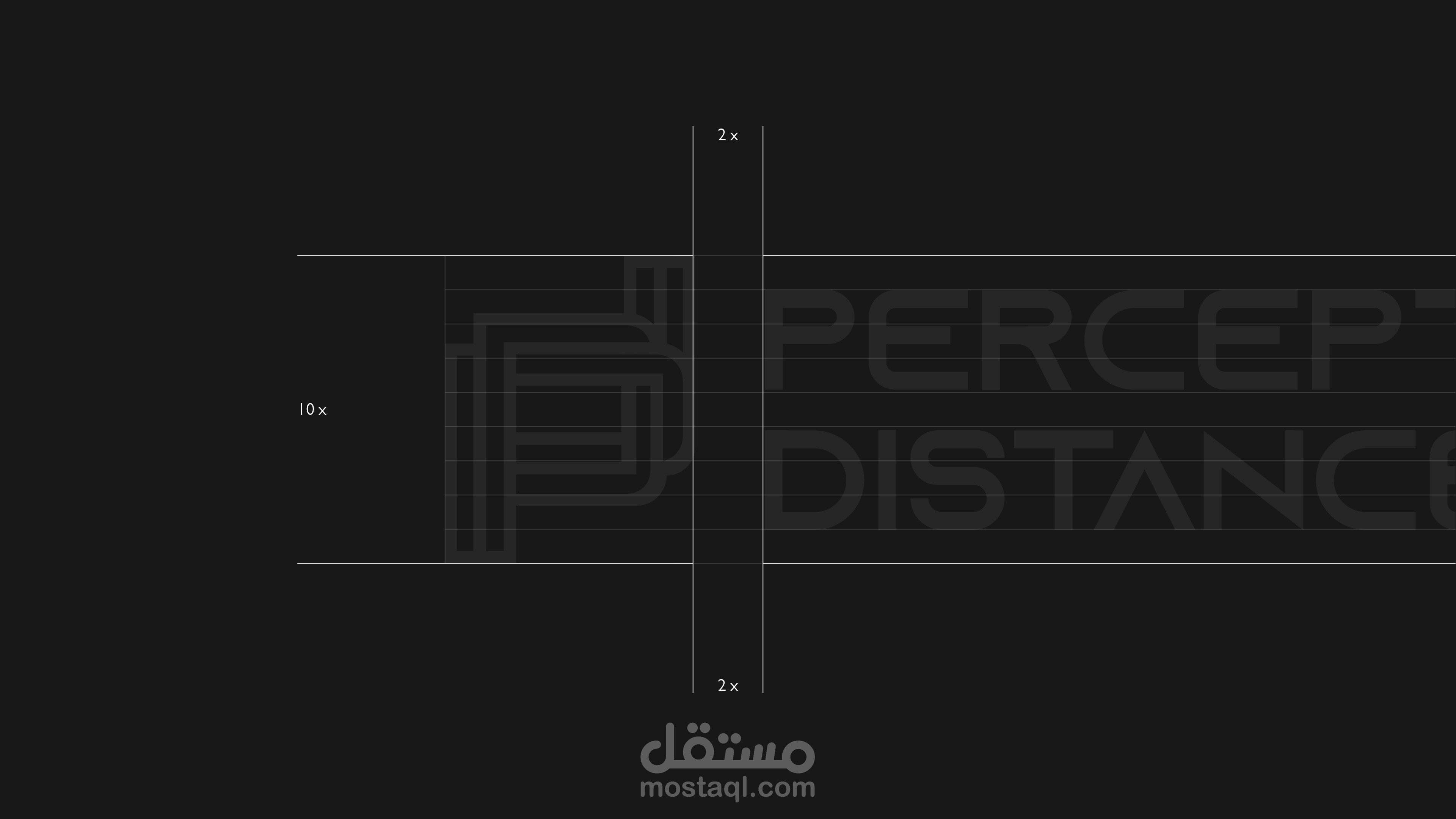
The typographic approach for Perception Distance was carefully selected to echo the company's futuristic and highly technical nature.
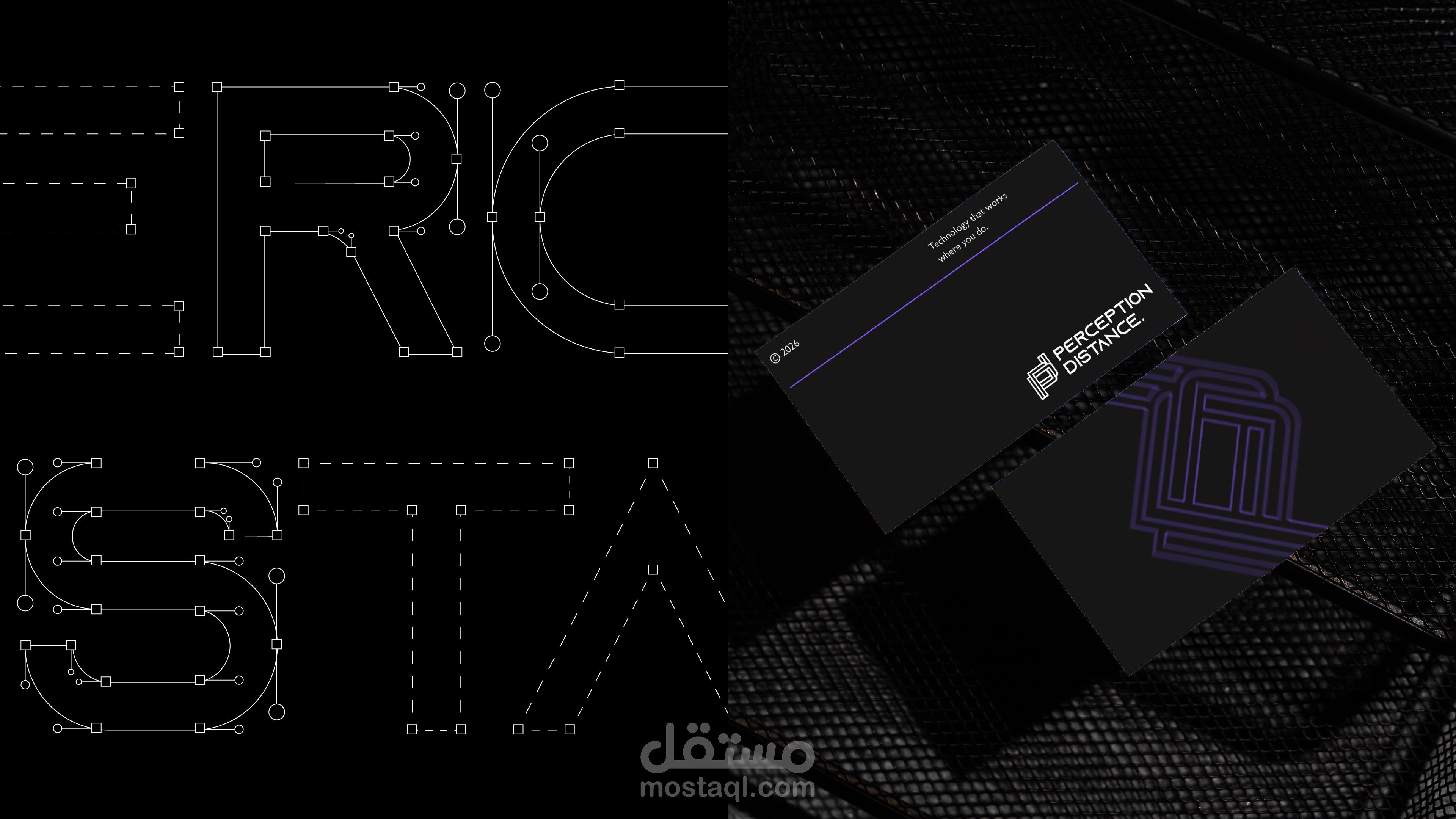
The Primary Typeface: We utilized a modern, wide, geometric sans-serif font. The clean, unembellished letterforms communicate clarity, efficiency, and precision—essential traits for an industry-leading AI firm.
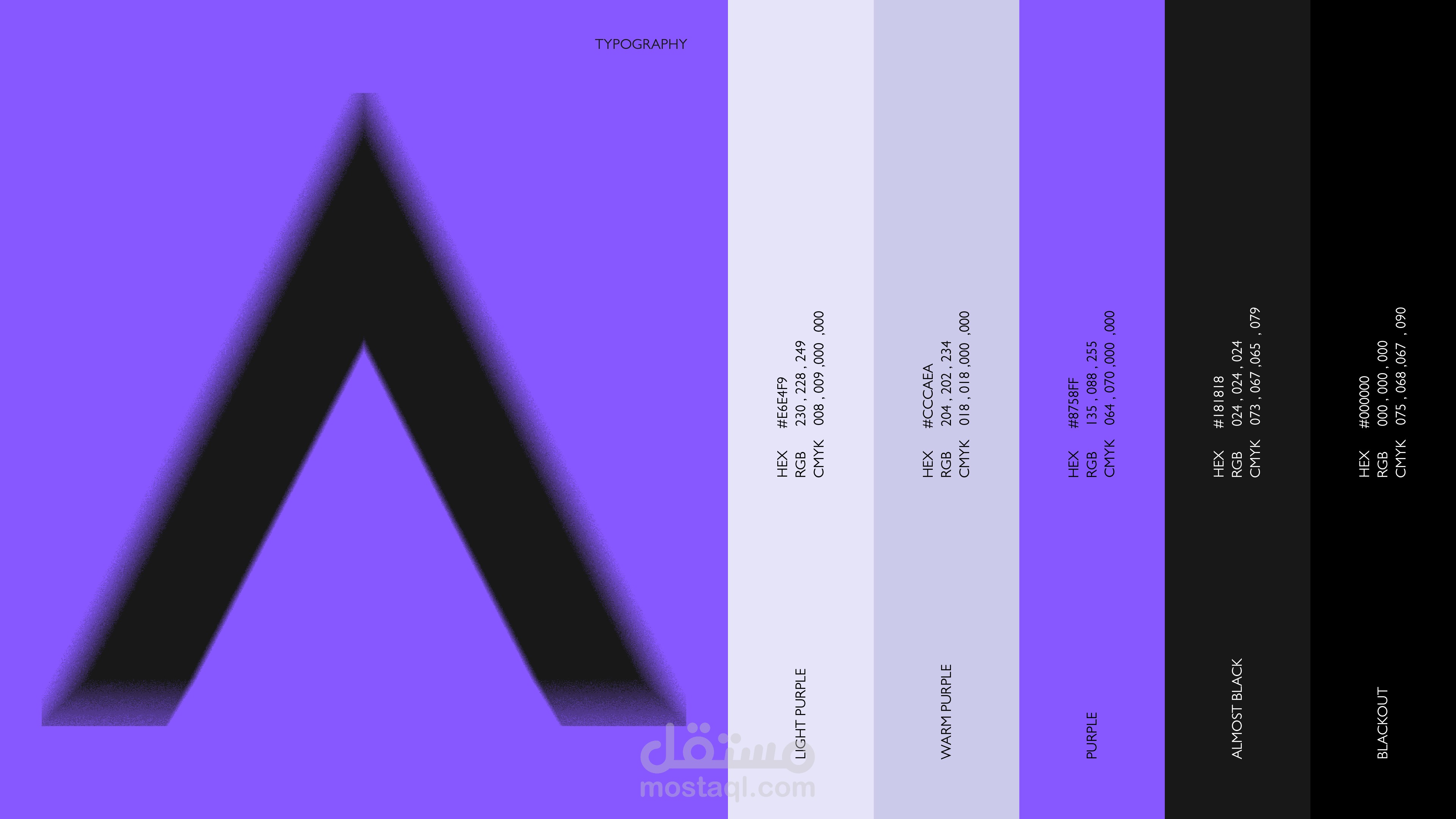
Custom Details: Subtle customizations, such as the stylized letter "A" without the traditional crossbar, inject a distinct sci-fi aesthetic into the wordmark. This makes the typography feel less like traditional text and more like a digital code or a forward-facing technological statement.
Hierarchy and Balance: The wide tracking (letter-spacing) gives the brand name room to breathe, establishing a bold, authoritative, and stable presence on any digital or physical medium.
Color Palette
The color system is designed to break away from the traditional, overused "tech blue," opting instead for a palette that feels energetic, imaginative, and distinctly next-generation.
Cyber Violet (Primary): The defining color of the brand is a vibrant, electric purple. In digital psychology, purple represents imagination, the future, and the unknown. Here, it signifies the limitless potential of artificial intelligence, neural networks, and the cutting-edge of the digital realm.
Stark White (Secondary): Used primarily for the logo mark and typography, pure white provides maximum contrast against the vivid background. It represents transparency, pure data, and the illuminating clarity that AI brings to complex problems.
Onyx Black & Deep Charcoal (Accents): Grounding the bright neon tones, deep blacks and metallic greys (as seen in the 3D robotics and imagery) introduce a sense of depth, premium quality, and the physical hardware that powers the software.