Project Tracking & Performance Dashboard
تفاصيل العمل
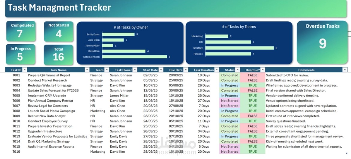
# **My Task Management Dashboard Project 📊✨**
### **What’s this project about?**
I wanted a simple, visual way to understand how a team is performing across multiple projects without digging through endless rows of tasks. So, I built this interactive **Task Management Dashboard** in Excel to track progress, spot overdue tasks, and see how work is distributed across teams and task owners.
The goal was to turn scattered task lists into a clear, organized view that helps managers make faster, smarter decisions.
## **How I built it (My Process):**
- **First, I cleaned the data:**
I reviewed all task entries, checked dates, removed duplicates, and made sure every task had the correct owner, team, and status.
- **Calculated key fields:**
I added useful columns like task duration and an automatic “Overdue?” indicator using logical formulas to instantly flag tasks that passed their due date.
- **Summarizing with Pivot Tables:**
Once the data was ready, I used Pivot Tables to break everything down tasks by owner, tasks by team, and tasks by status making it easy to see patterns at a glance.
- **Designing the dashboard:**
I transformed the summaries into clean bar charts, added KPI cards for total tasks, completed tasks, overdue tasks, and more. I also used consistent colors and layout to make the dashboard easy to read and navigate.
## **Key Insights 💡**
- **Overdue tasks are a major concern:**
The dashboard shows **9 overdue tasks**, which signals that some teams may need support or better scheduling.
- **Sarah Johnson stands out:**
She owns **6 tasks**, most of which are completed making her one of the strongest performers in the group.
- **Strategy team carries the heaviest load:**
With **6 tasks**, including several overdue ones, this team appears to be under the most pressure.
- **Workload isn’t balanced:**
Some team members have multiple tasks, while others have only one or two. This insight helps highlight opportunities to redistribute work more fairly.