Sales Performance Monitoring Dashboard
تفاصيل العمل
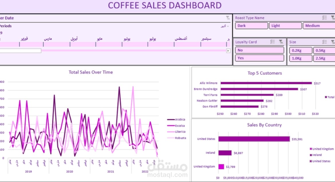
### **My Coffee Sales Dashboard Project ☕✨**
**What’s this project about?**
So, I wanted to see how a coffee business was doing over a 4 year period (from 2019 to 2022). I built this interactive dashboard in Excel to easily track which coffee beans are hitting the charts, who our top customers are, and which countries love our coffee the most. It’s all about turning messy numbers into clear answers that help the business grow!
**How I did it (My Process):**
- **First, I cleaned the data:** I started by checking the raw data to make sure everything was complete. I cleared out any duplicates because, honestly, nobody wants messy numbers messing up their insights!
- **Fixed the missing gaps with XLOOKUP:** Some important info was scattered across different sheets. So, I used XLOOKUP to fetch those missing columns and bring everything into one main table.
- **Crunching numbers with Pivot Tables:** Once the data was ready and looking good, I created Pivot Tables to summarize thousands of rows into clean, bite-sized numbers.
- **Designing the Dashboard:** Finally, the fun part! I turned those Pivot Tables into neat charts, picked a nice color theme, and added slicers (filters) and a timeline.
### **Key Insights 💡**
- **The US is leading the market:** Hands down, the United States is our biggest market by far! It brought in over **$35,500** in sales, leaving Ireland and the UK way behind.
- **Meet our top fan, Allis!** Allis Wilmore is our number one customer, spending **$317**. The top 5 customers are actually pretty close in spending, all ranging between $278 and $317.
- **Sales are a bit of a roller coaster:** Looking at the "Total Sales Over Time" chart, sales fluctuate a lot every year. **September 2021** was a massive peak month for Arabica , while some types like Robusta stay a bit more quiet but steady.