ForgeFit - Gym Brand Identity
تفاصيل العمل
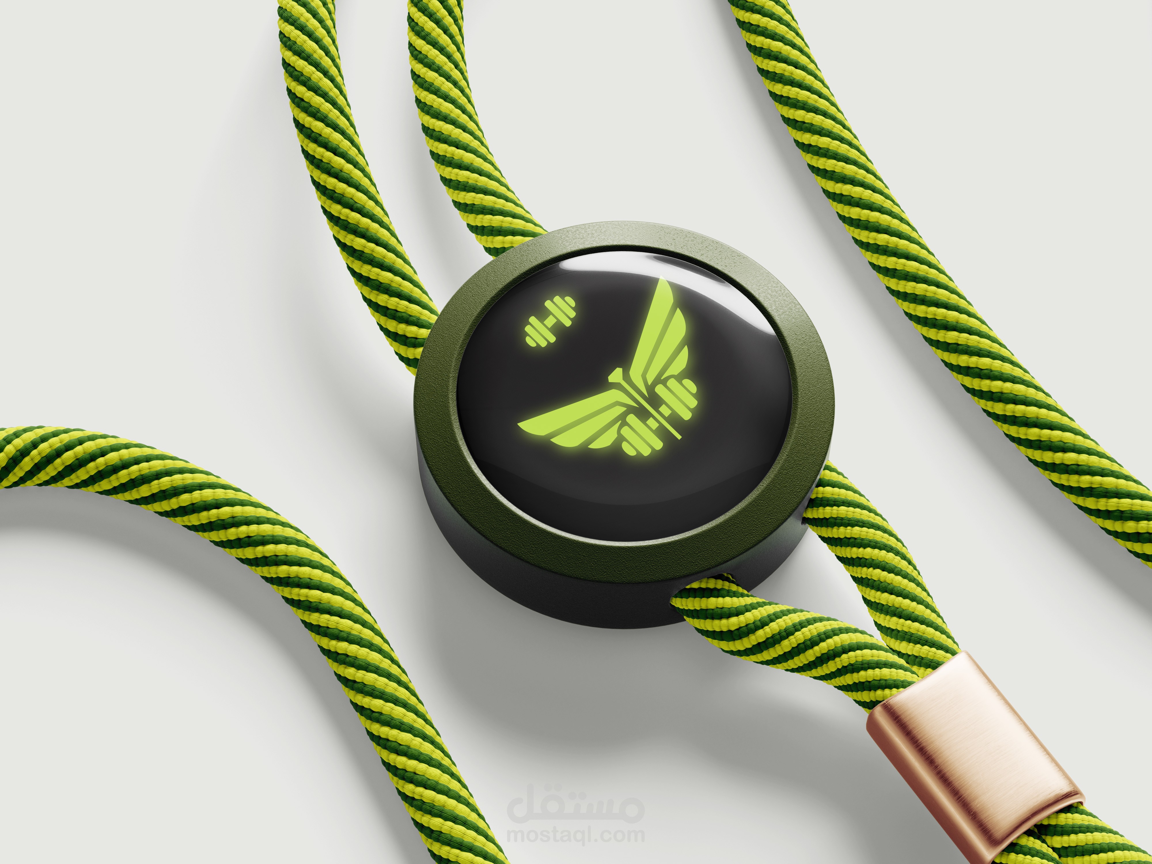
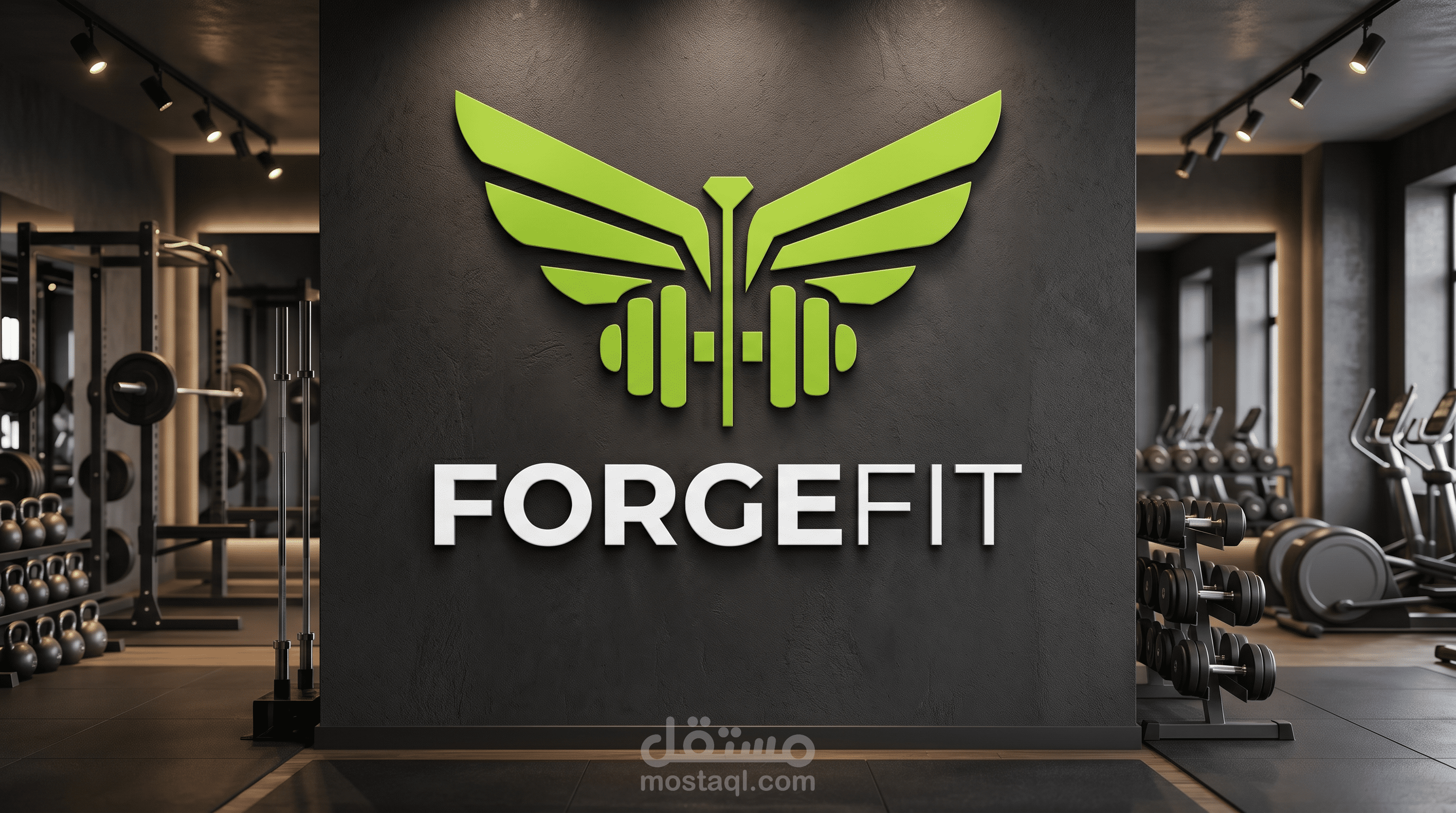
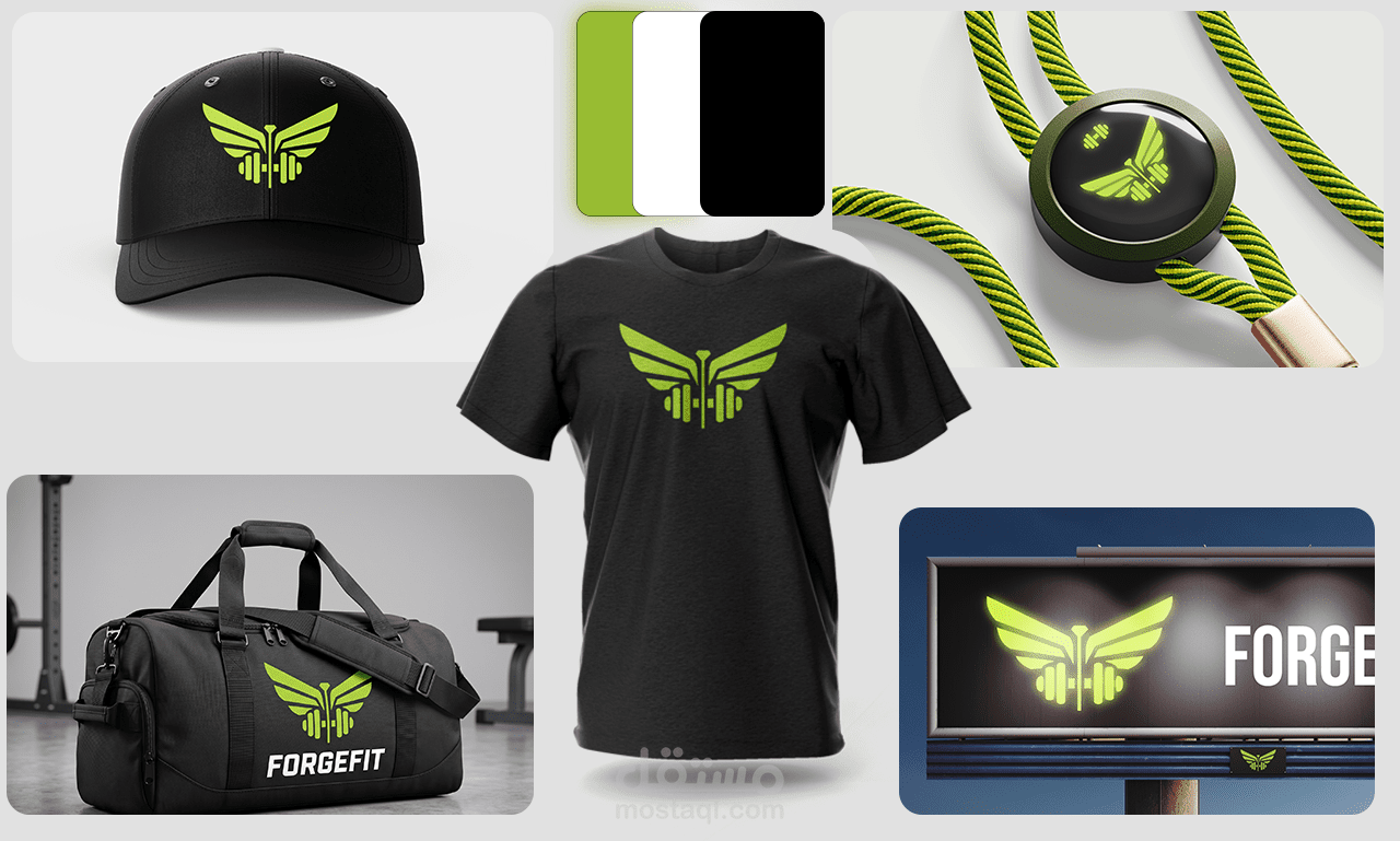
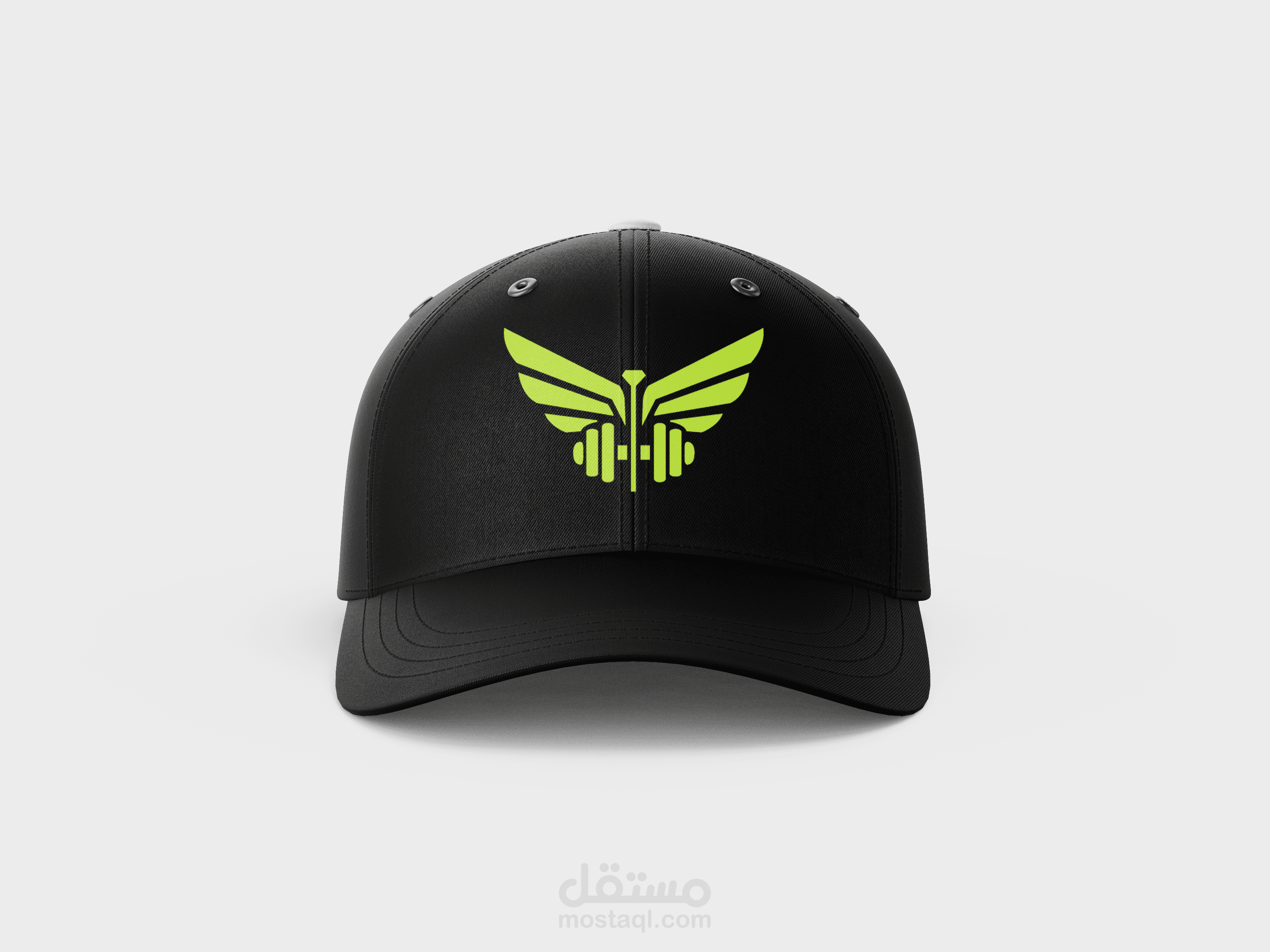
"The custom lettering was drawn from scratch to feel grounded and bold, while the neon green on deep black palette keeps the brand feeling modern and high-energy without being loud. Forge Fit is a fitness brand built around the idea that strength has a shape. The logomark fuses wings and a dumbbell into a single symbol — speed and power in one mark.
The identity was tested across gym signage, apparel, accessories, and digital screens to ensure it holds up at every scale."