From lab bench to dashboard: my first HR Analytics project 📊
تفاصيل العمل
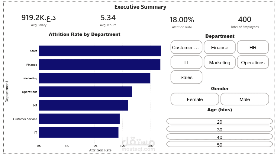
A few years ago, I was running lab tests and analyzing samples as a Medical Laboratory Technician. Today, I built my first HR Analytics dashboard in Power BI — and honestly, the skills transfer more than I expected. Precision, structured thinking, and not trusting a result until you've verified it? Same mindset, different data.
For this project, I worked with an HR dataset covering 400 employees and built a 4-page interactive dashboard:
🔹 Executive Summary — key workforce KPIs at a glance 🔹 Attrition Deep Dive — who's leaving, by role, gender, and age 🔹 Attrition Trends — patterns across tenure, performance, and hire date 🔹 Compensation & Performance — how pay and overtime relate to performance ratings
A few lessons that stuck with me:
→ Always ask "rate or count?" A raw count of attrition by department can be misleading — a bigger department will naturally show more departures. Switching to a calculated Attrition Rate (%) gave a much fairer comparison.
→ Check your units before you trust your numbers. My average salary KPI showed a suspiciously huge figure — turned out the currency formatting was wrong, not the data. A good reminder to always sanity-check what a number is actually telling you.
→ Structure tells a story. Reorganizing scattered charts into a clear page-by-page flow made the whole dashboard easier to read and far more professional.
Still learning, still building — but proud of how this one turned out.