cottonil
تفاصيل العمل
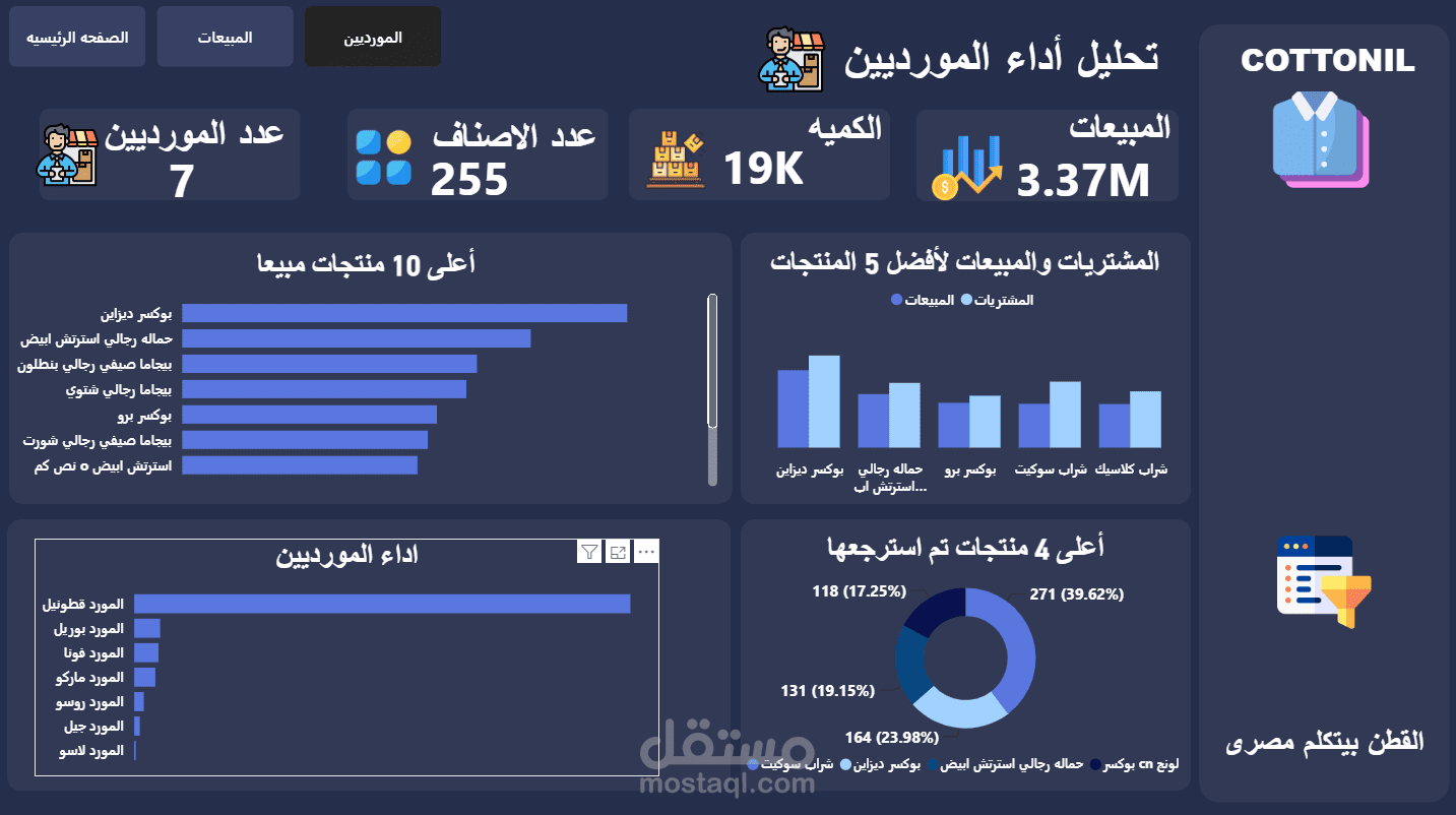
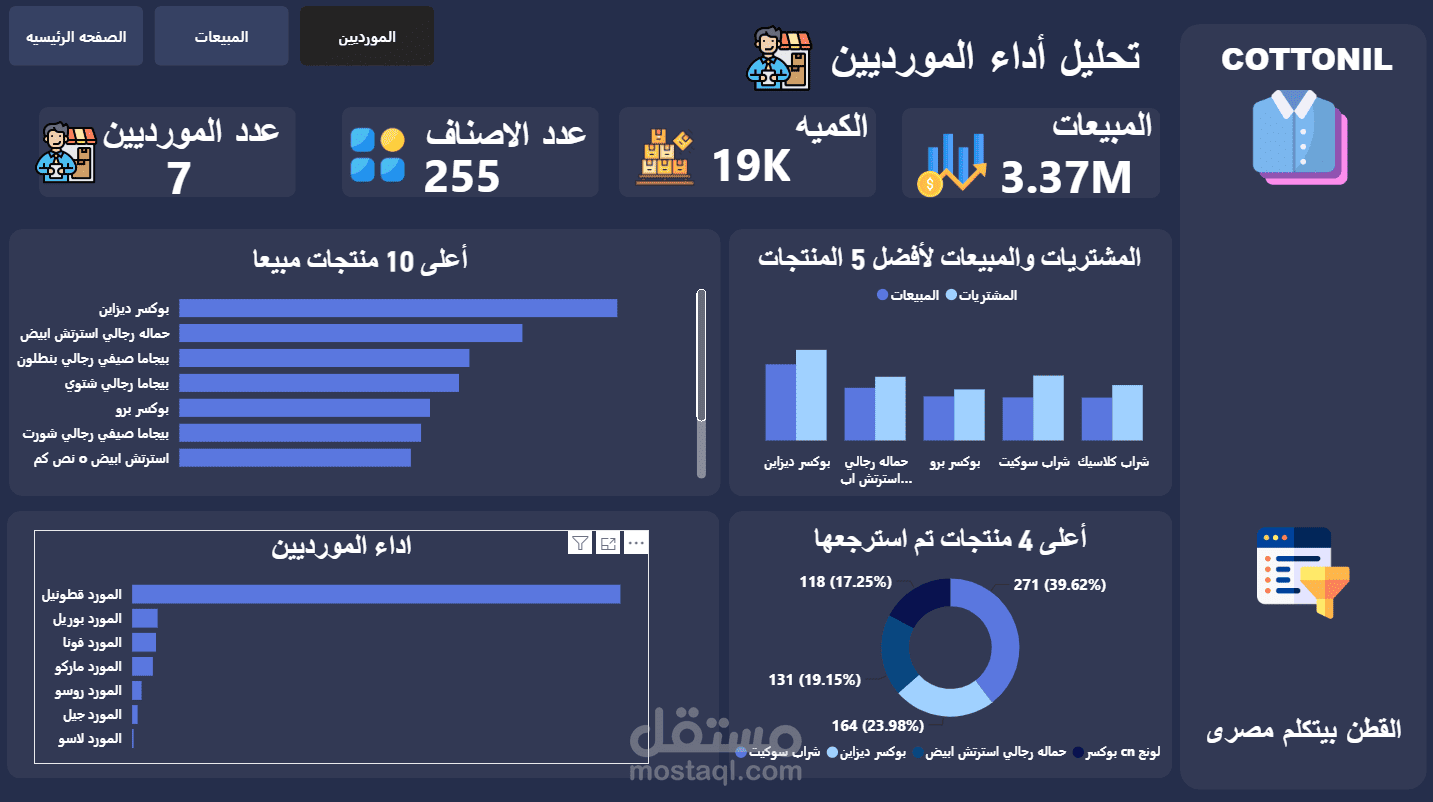
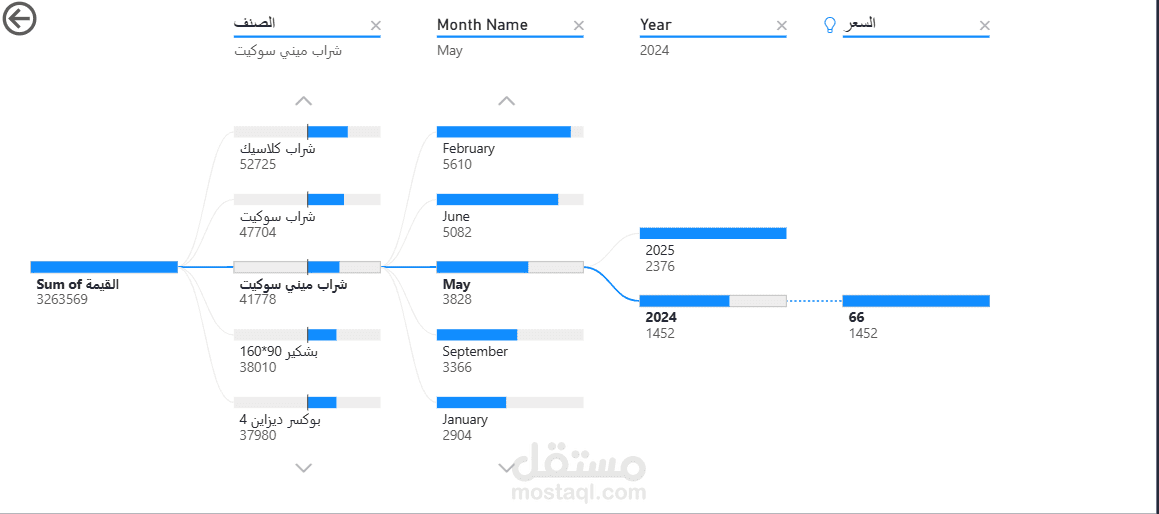
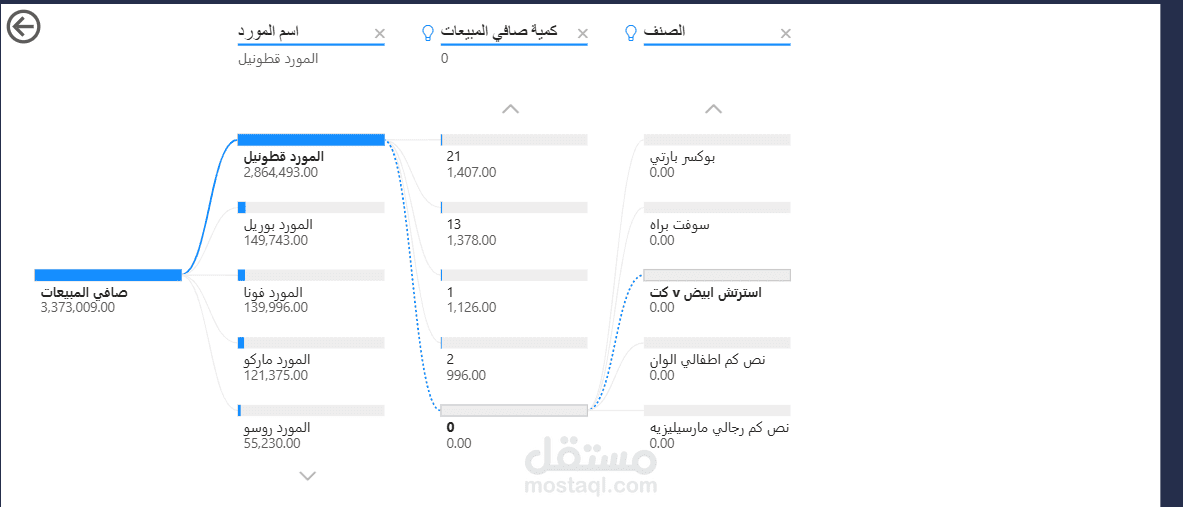
I designed and built a comprehensive, interactive sales performance dashboard for a clothing brand (COTTONIL) using Power BI, transforming raw sales data into clear visual insights that help decision-makers understand business performance at a glance.
Key Components:
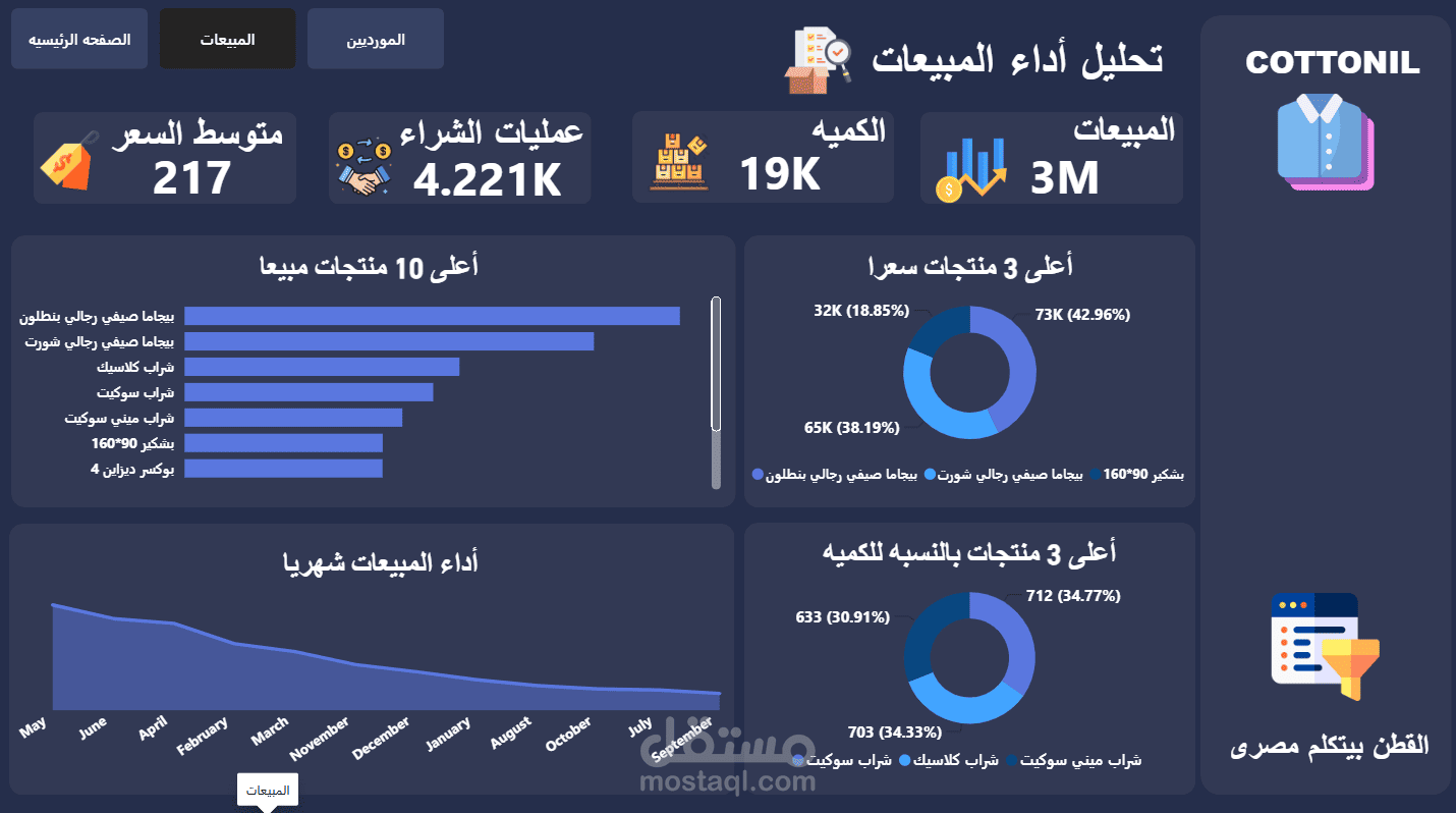
KPI Cards: Total Sales, Quantity Sold, Number of Purchase Transactions, and Average Price — displayed prominently at the top for instant visibility.
Top Products Analysis: A horizontal bar chart highlighting the top 10 best-selling products.
Price & Quantity Breakdown: Donut charts showing the top 3 products by price and top 3 products by sales quantity share, each with calculated percentages.
Monthly Sales Trend: An area chart tracking sales performance over time to identify trends and seasonality.
Multi-Page Navigation: Seamless navigation across multiple pages (Home, Sales, Suppliers) to organize data by category.
Technical Highlights:
Fully right-to-left (RTL) Arabic UI with a sleek, on-brand dark theme.
Custom DAX measures for KPIs and percentage calculations.
Fully interactive filters and drill-down capabilities for deep data exploration.
Custom icons and visuals for quick, intuitive readability.
Tools Used: Power BI | Power Query | DAX | Data Modeling