Shower Gel Packaging Design | Zenflow Healing Pharam
تفاصيل العمل
The Objective:
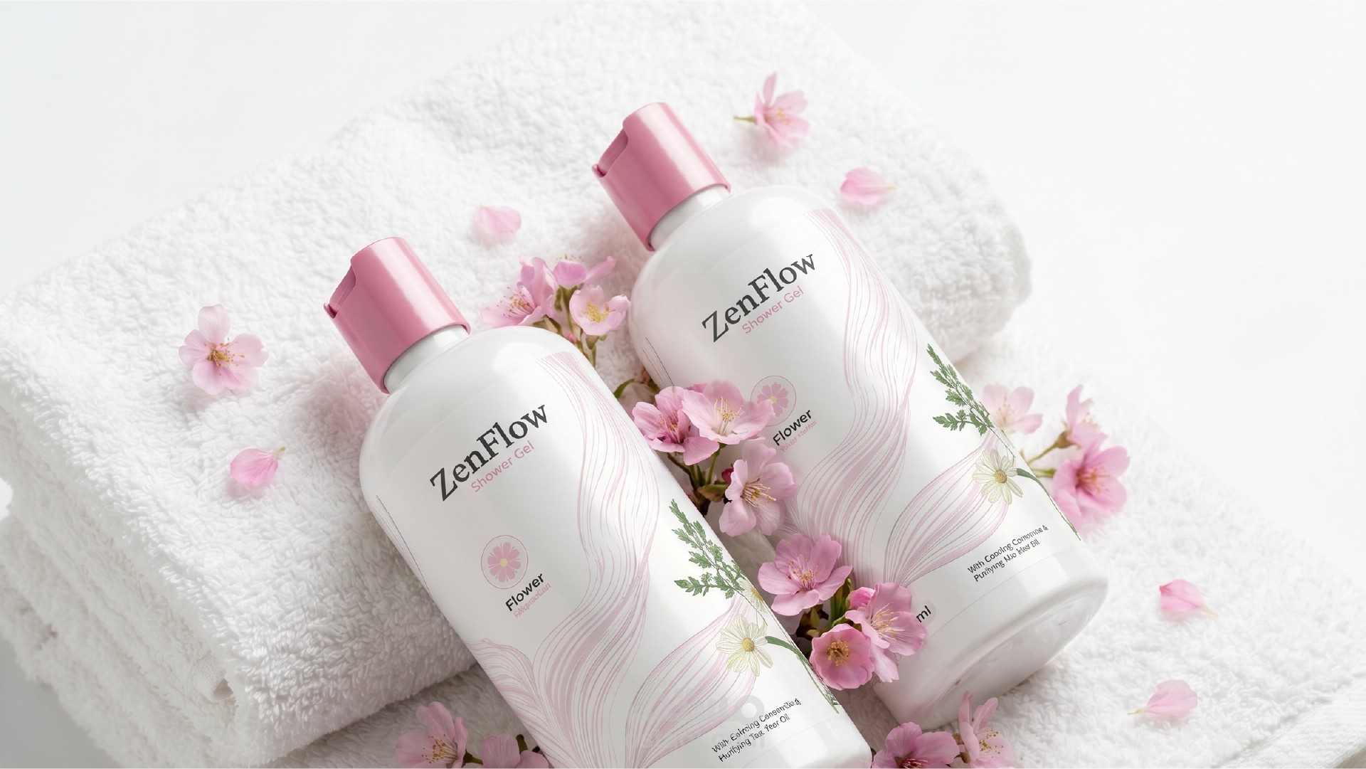
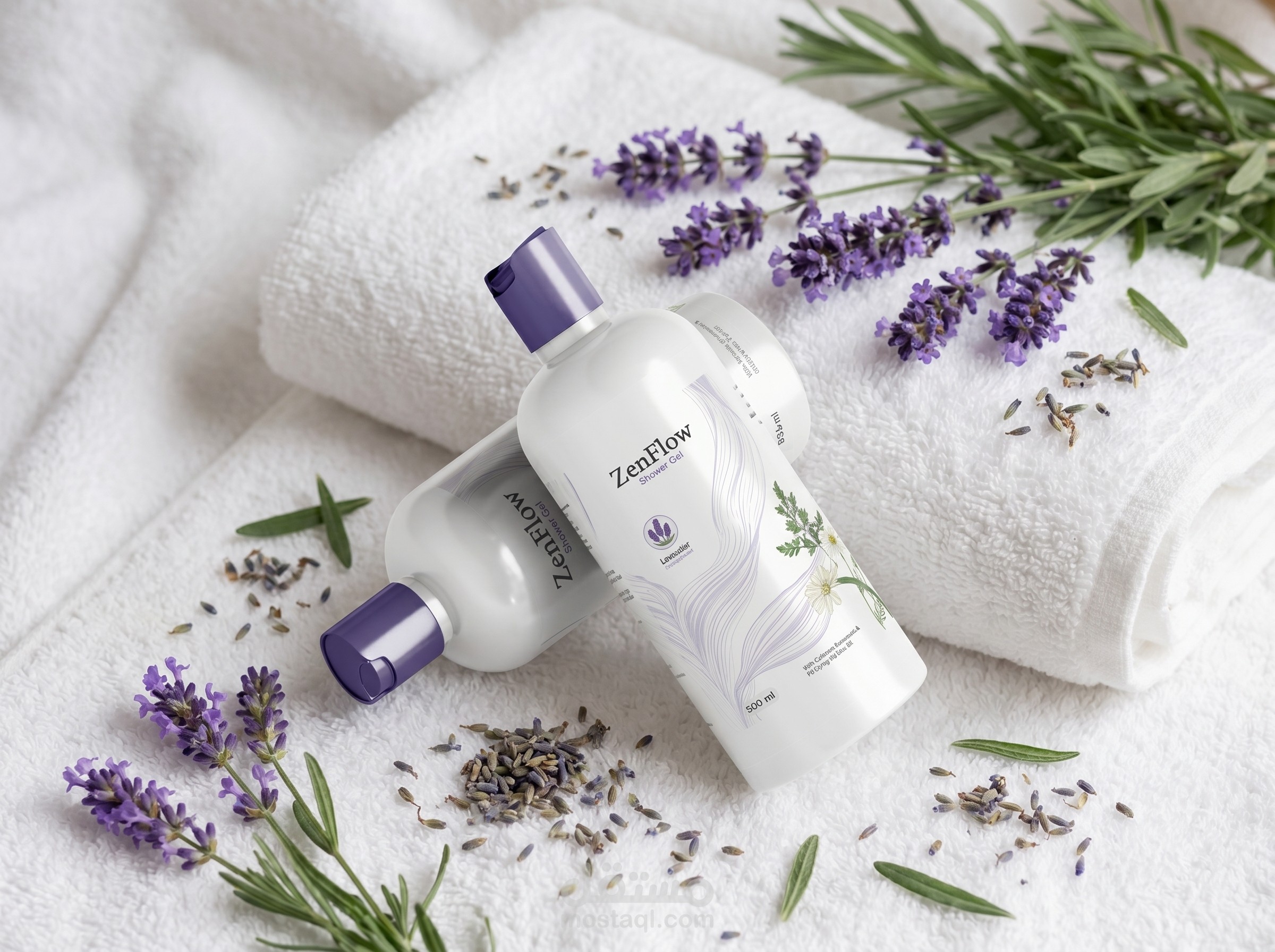
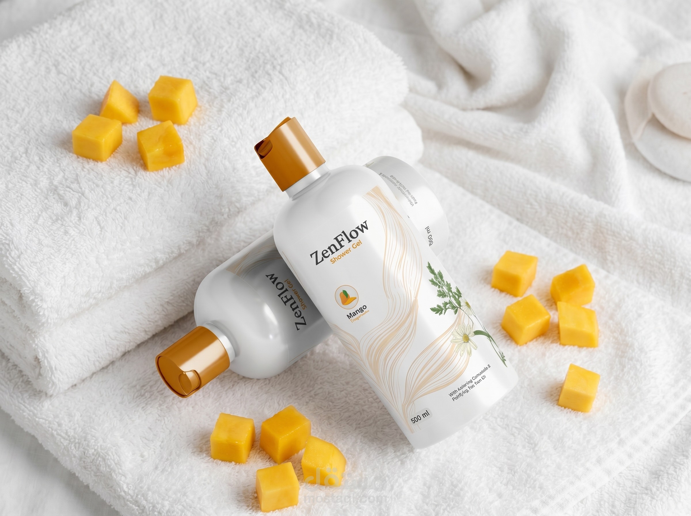
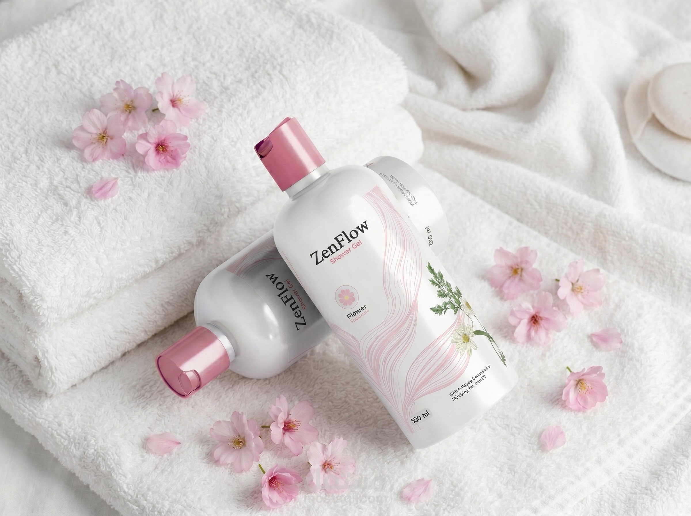
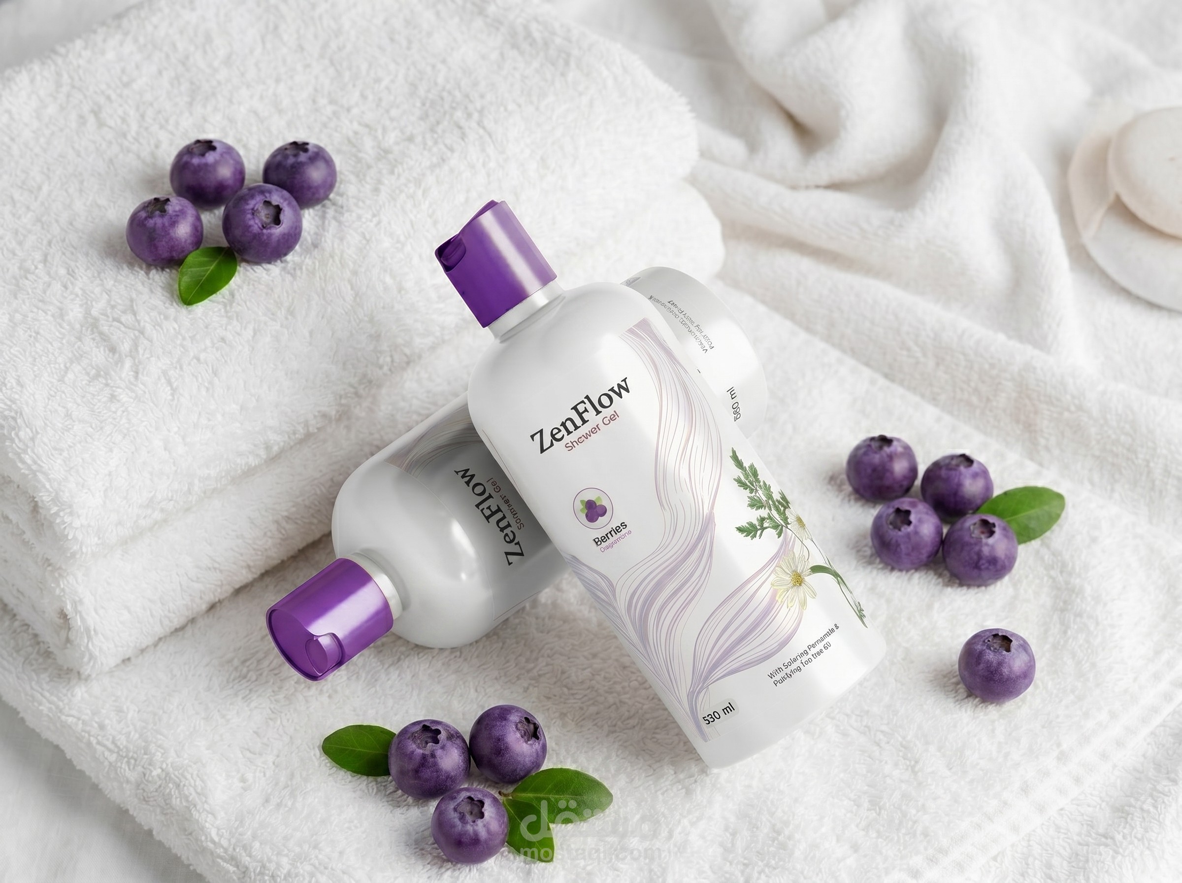
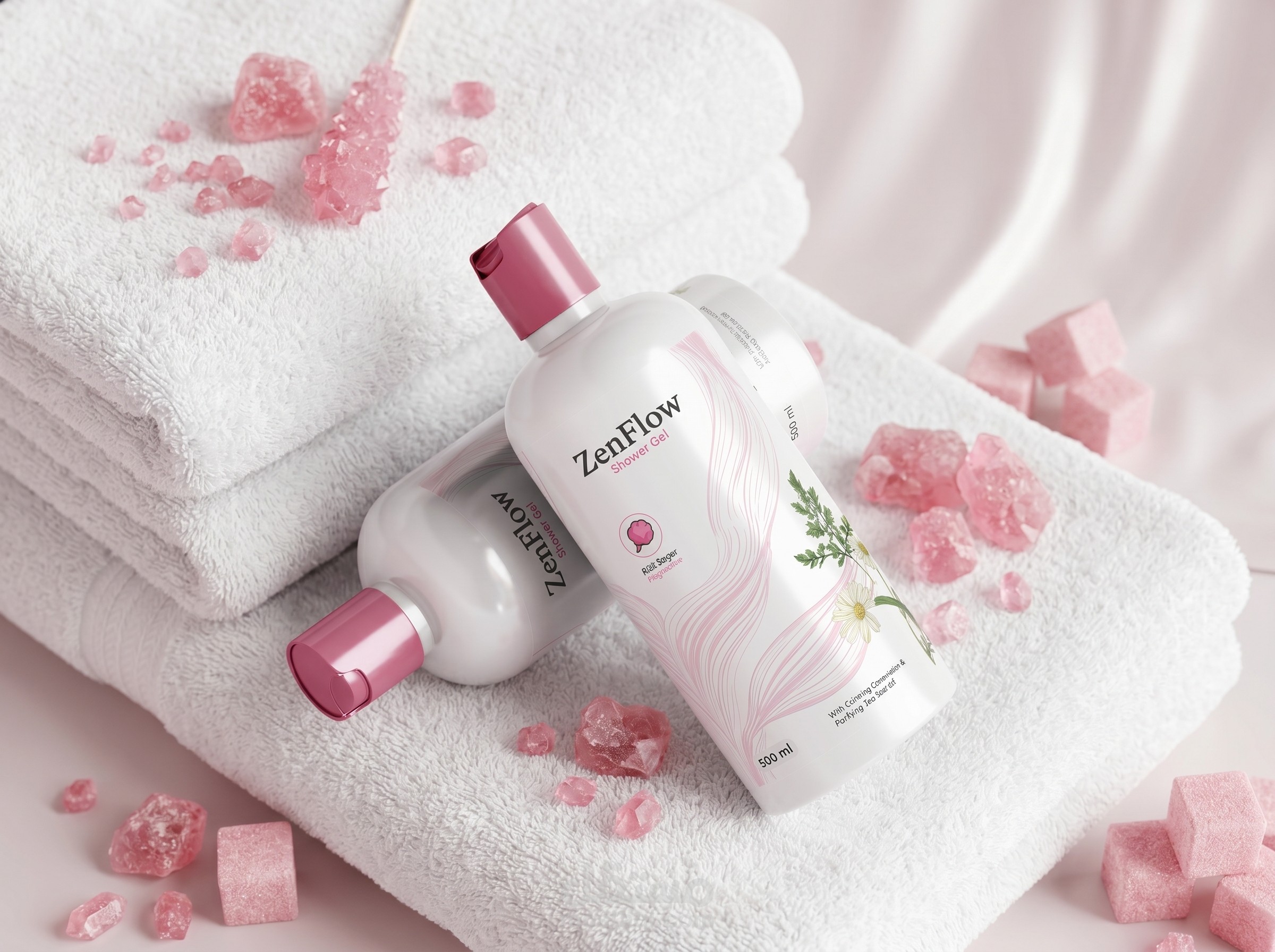
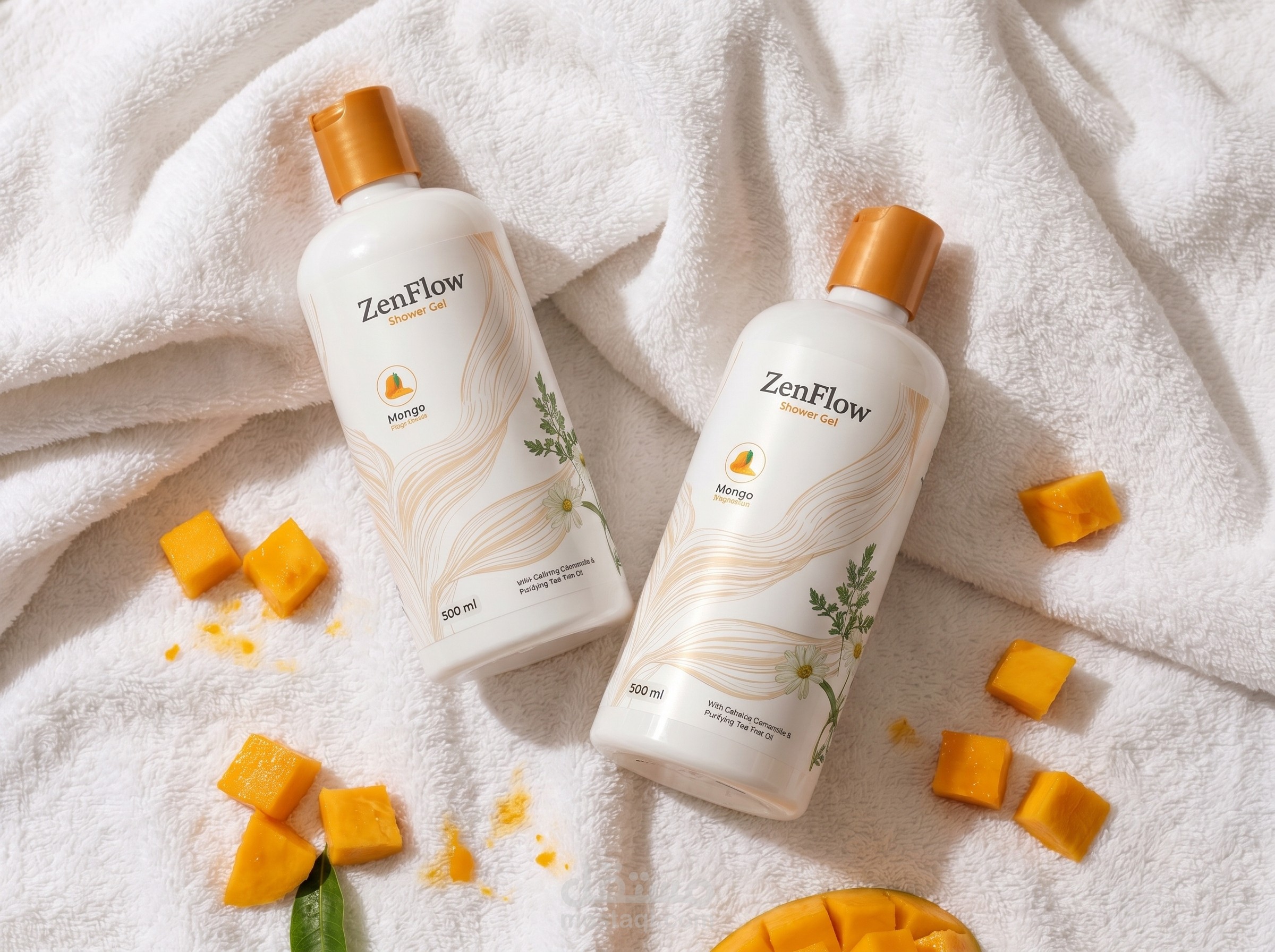
To design a serene and natural packaging identity for the ZenFlow body care line, effectively bridging the gap between clinical reliability and organic beauty for a pharmaceutical parent company.
The Art Direction:
The label design employs a minimalist white canvas to project clinical purity, elevated by delicate, flowing line art and subtle botanical illustrations that highlight the product's natural ingredients. To ensure seamless consumer navigation across the product line, a cohesive color coding strategy was applied utilizing distinct cap colors and matching typographic accents in purple, pink, and yellow to differentiate between various scents and formulations. The label architecture maintains a strict, readable hierarchy, beautifully balancing the front facing aesthetic with the structured back panel ingredient information.
The Deliverables:
Scalable cosmetic label architecture, botanical illustration integration, color coded variant differentiation system, and photorealistic bottle mockups.