STORIA Coffee & Pastry Campaign
تفاصيل العمل
STORIA Coffee & Pastry Campaign
Local Brand Activation & Minimalist Advertising Layout
1. Overview
STORIA is an artisanal local coffee and pastry brand focusing on delivering a joyful morning ritual. The primary objective of this project was to establish a high-end, clean social media and promotional campaign asset that bridges the brand's local identity ("Wazeer El Saada") with an elegant, international design language, targeting urban coffee lovers who value premium daily experiences.
2. The Creative Direction & Layout Strategy
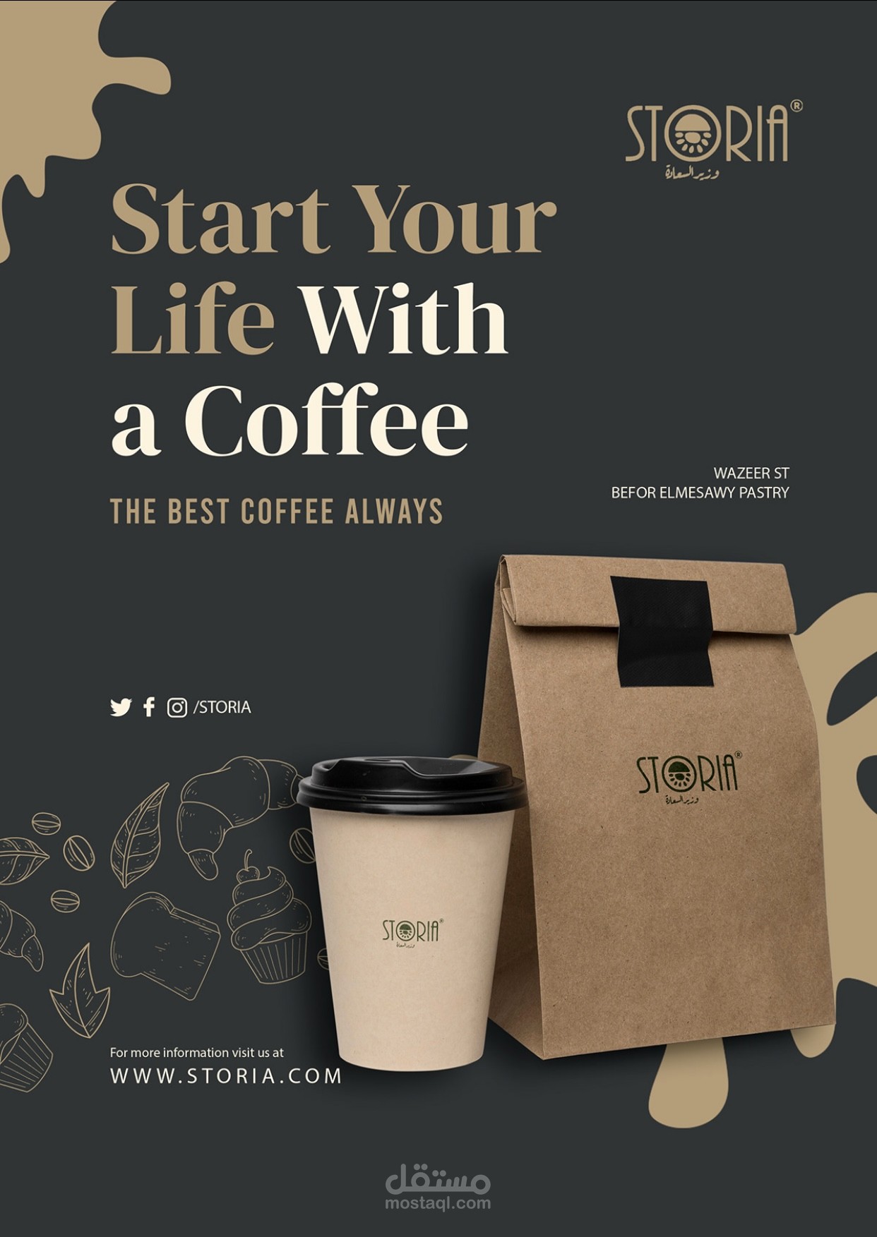
The layout is built around the headline narrative: "Start Your Life With a Coffee / THE BEST COFFEE ALWAYS." The challenge was to maintain a smooth, welcoming, and warm aesthetic while adhering to a strict corporate grid. By dividing the canvas into a deep, premium background and utilizing large, high-legibility typography, the layout immediately guides the viewer's eye from the motivational headline directly down to the physical product assets.
3. Visual Strategy & Campaign Assets
The visual ecosystem presented in storia.jpg highlights an elegant balance of high-contrast minimalism:
The Logo & Branding: A custom corporate wordmark ("STORIA") accompanied by its localized baseline subtitle ("وزير السعادة"), maintaining a registered corporate trademark presence.
Color Palette: A highly sophisticated, organic, and warm color palette designed to evoke coffee heritage and luxury comfort:
Matte Charcoal Gray: Acting as the deep, premium canvas background to provide depth and high text contrast.
Warm Cream / Almond Gold: Used for primary headline accents and abstract background splash shapes to evoke the smoothness of milk and coffee crema.
Natural Kraft Paper Texture: For the physical packaging elements, adding an organic, eco-friendly feel to the brand.
Typography & Graphics:
Primary Headline Typography: A bold, elegant, high-contrast serif typeface that commands immediate attention and delivers a classic editorial look.
Secondary Copy: A clean, uppercase sans-serif font for subtitles, addresses, and call-to-actions.
Illustrative Elements: Minimalist, fine-line organic doodles of coffee beans, croissants, toast, and cupcakes subtly layered in the bottom-left corner to quickly communicate the brand's diverse menu offerings without cluttering the frame.
4. Physical Touchpoints & Real-World Mockups
The campaign seamlessly visualizes how the STORIA identity transitions into practical takeaway consumer goods:
The Takeaway Coffee Cup: A minimal, sustainable kraft-paper-toned cup featuring a sleek black lid and a central, clean placement of the green-stamped STORIA emblem.
The Pastry & Coffee Carrier Bag: A heavy-duty, classic brown kraft paper bag sealed with a bold, matte black security tape closure, ensuring a premium and secure unboxing experience for takeaway orders.
Localization & Operational Utility: The advertisement acts as a functional wayfinding asset by incorporating clear operational details, including a specific geographic location marker ("Wazeer St. Before Elmesawy Pastry"), unified social handles (/STORIA), and the official corporate landing URL (WWW.STORIA.COM).
5. Conclusion
The STORIA campaign asset showcases how local commercial branding can be elevated using international design principles. By swapping chaotic, saturated food advertisements for a disciplined matte charcoal and cream aesthetic, the design shifts the perception of a daily coffee order into a premium lifestyle necessity.