NOIR BEANS Packaging & Brand Identity
تفاصيل العمل
NOIR BEANS Packaging & Brand Identity
Premium Coffee Branding & Luxury Packaging System
1. Overview
NOIR BEANS is a premium coffee brand crafted for true coffee connoisseurs who appreciate exceptional quality, sensory depth, and sophistication. The creative objective was to build an entire brand universe from scratch—spanning a high-end visual identity, custom icon design, and a luxury packaging architecture that commands an immediate premium presence on retail shelves and digital storefronts.
2. The Creative Challenge & Strategy
The core design philosophy reflects boldness, heritage, and pure elegance. The challenge was to balance a dark, mysterious aesthetic with warm, luxurious metallic accents without creating visual noise. By utilizing deep textures, organic coffee plant line art, and strong geometric framing, the identity establishes a timeless, high-end sensory experience before the consumer even opens the product.
3. Visual Strategy & Brand Assets
The visual system leverages strict minimalist frameworks, editorial layouts, and a sophisticated material finish:
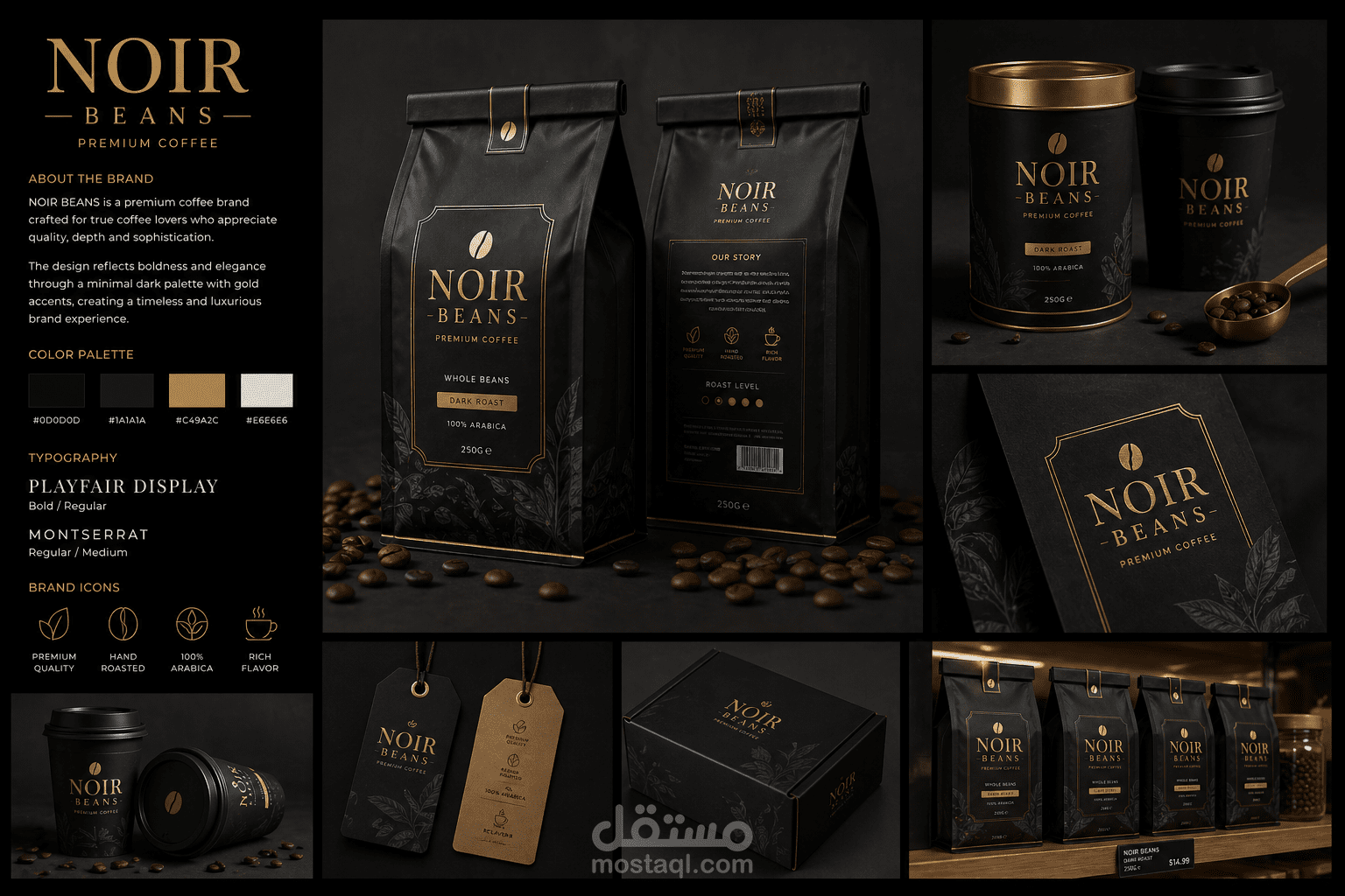
The Logo & Identity: A clean, high-contrast serif wordmark paired with an elegant, minimalist coffee bean emblem that acts as the primary mark of authenticity.
Color Palette: A highly refined, high-contrast luxury palette emphasizing depth and metallic warmth:
Obsidian Black (#0D0D0D) – For rich, deep backgrounds.
Matte Charcoal Gray (#1A1A1A) – For secondary structural elements and texturized leaf motifs.
Premium Metallic Gold (#C49A2C) – For luxury typography framing, badges, and focal accents.
Off-White / Light Gray (#E6E6E6) – For clean, high-legibility secondary text.
Typography Hierarchy:
Primary Serif Font (Playfair Display): Used in Bold and Regular weights for main headings and the central brand mark, conveying classic elegance and artisanal heritage.
Secondary Sans-Serif Font (Montserrat): Used in Regular and Medium weights to deliver ultra-clean, legible layouts for details like origin, roast levels, and technical weights.
Custom Brand Icons: A cohesive set of minimalist linear icons designed to quickly convey product transparency: Premium Quality, Hand Roasted, 100% Arabica, and Rich Flavor.
4. Comprehensive Packaging System & Applications
The identity scales seamlessly across an array of premium touchpoints and physical packaging formats:
The Flagship Coffee Bags: A 250g whole bean dark roast gusseted bag featuring an exquisite matte black texture, a gold-foiled border label, intricate tone-on-tone coffee leaf illustrations, and a detailed reverse side containing a minimalist roast level chart, barcode, and "Our Story" layout.
Premium Metal Tins & Takeaway Cups: Luxury cylindrical tin canisters with contrasting gold metal lids alongside matching matte black paper takeaway coffee cups featuring gold-foiled logos.
Retail Hang-Tags: Dual-tone product tags (in pure charcoal and organic kraft textures) featuring high-end string attachments for premium merchandise or limited-edition batches.
E-commerce & Shipping Box: A heavy-duty, minimalist cardboard mailer box stamped with the gold emblem and wrapped in organic leaf line art for an elevated unboxing experience.
Retail Shelf Presentation: A real-world merchandising concept showing consecutive product placement on high-end wooden shelving, proving the brand's immense shelf impact and unified corporate presence.
5. Conclusion
The NOIR BEANS identity demonstrates how a disciplined, dark minimal aesthetic can create an intense emotional connection with a premium target audience. By merging classic typography with rich gold foils and structural layouts, the brand transitions from a everyday commodity into a luxury ritual, positioning itself at the absolute top tier of the specialty coffee market.