Workforce Distribution Experience Analysis
تفاصيل العمل
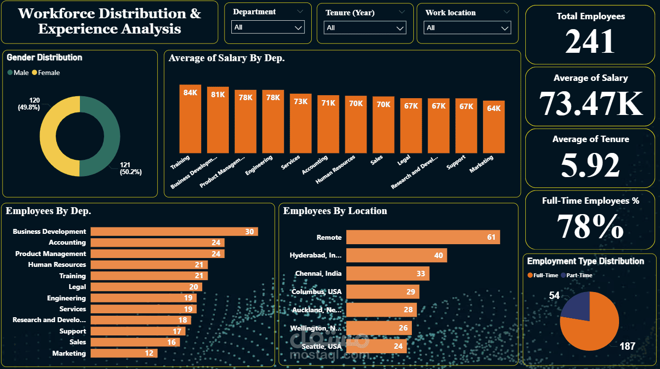
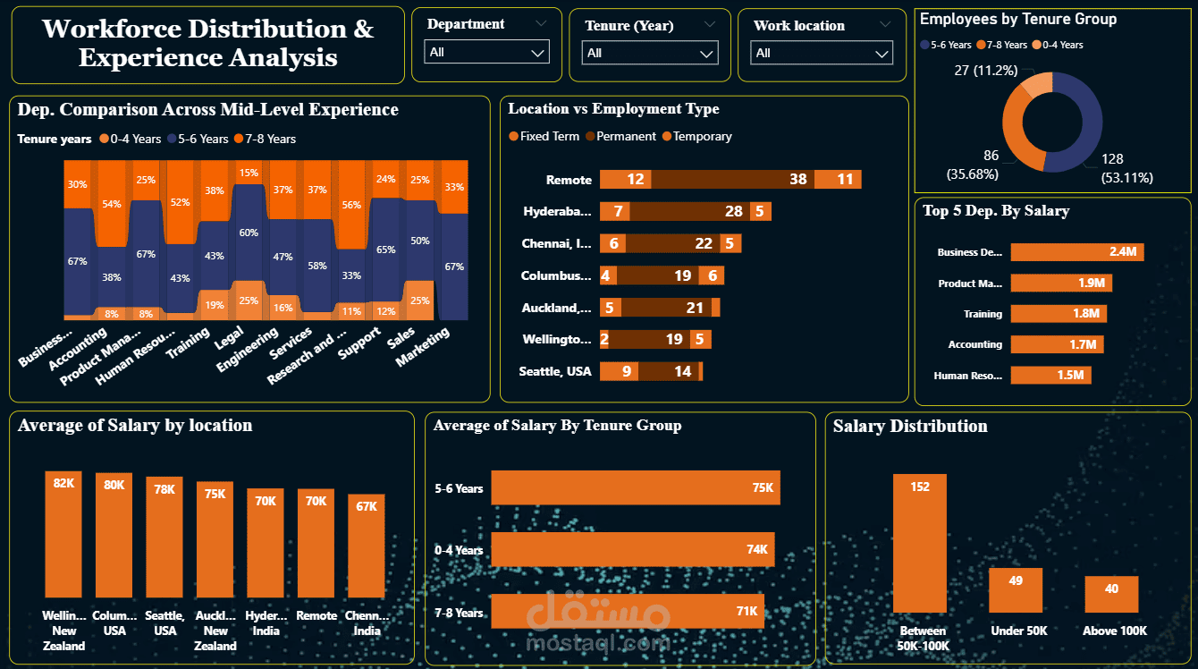
Workforce Distribution & Experience Analysis Dashboard This project wasn’t just about visualization—it was about turning HR data into clear, actionable insights that support better decision-making.
What I delivered:
Comprehensive analysis of workforce distribution across departments, locations, and gender
Deep dive into salary trends to identify top-performing departments
Tenure analysis to better understand workforce experience
Clear comparison between Full-time and Part-time employees across locations
Key Insights:
Nearly balanced gender distribution across the organization
Training & business development leads in average salaries
Remote work stands out as the dominant work model
Employees with 5–6 years of experience have the highest average salary
Dashboard Features:
Fully interactive slicers (Department, tenure, and Location)
Clear KPIs (Total Employees, Avg Salary, Avg Tenure)
Clean, business-focused design for better usability