Appexy – Responsive Landing Page
تفاصيل العمل

Short Project Summary
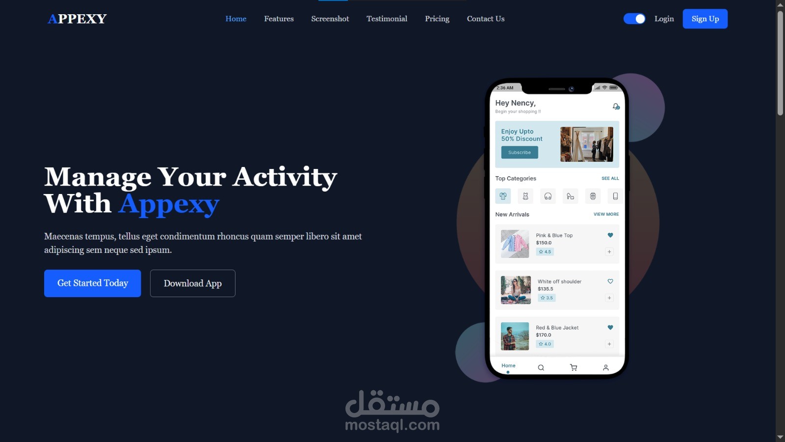
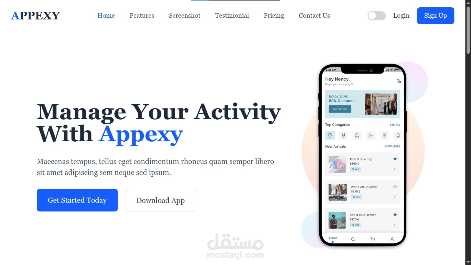
A modern, fully responsive landing page developed for "Appexy," a mobile application management platform. The design emphasizes clean UI, clear call-to-action (CTA) points, and professional aesthetics.
Detailed Project Description
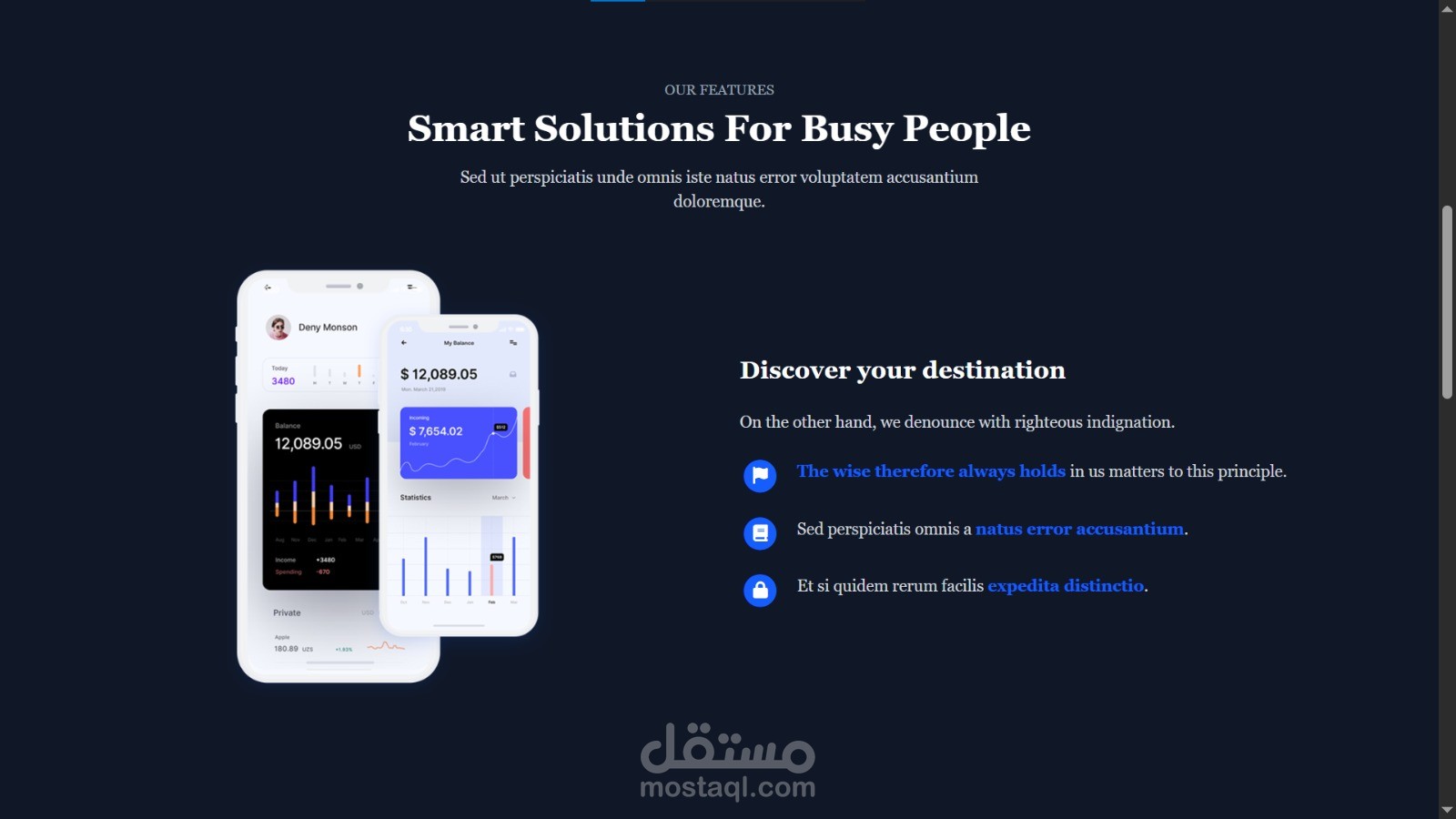
Appexy is a front-end web development project designed to showcase a software-as-a-service (SaaS) application. The project focuses on creating a high-conversion landing page that effectively communicates the app's features, pricing models, and contact information. The design utilizes a sophisticated dark-mode aesthetic (with a light-mode variant) to ensure readability and a modern corporate look. The layout is structured to guide the user seamlessly from the introduction to the feature highlights, pricing selection, and finally, the contact section.
Key Features
- Dynamic Navigation: Clean, intuitive header menu for easy user navigation.
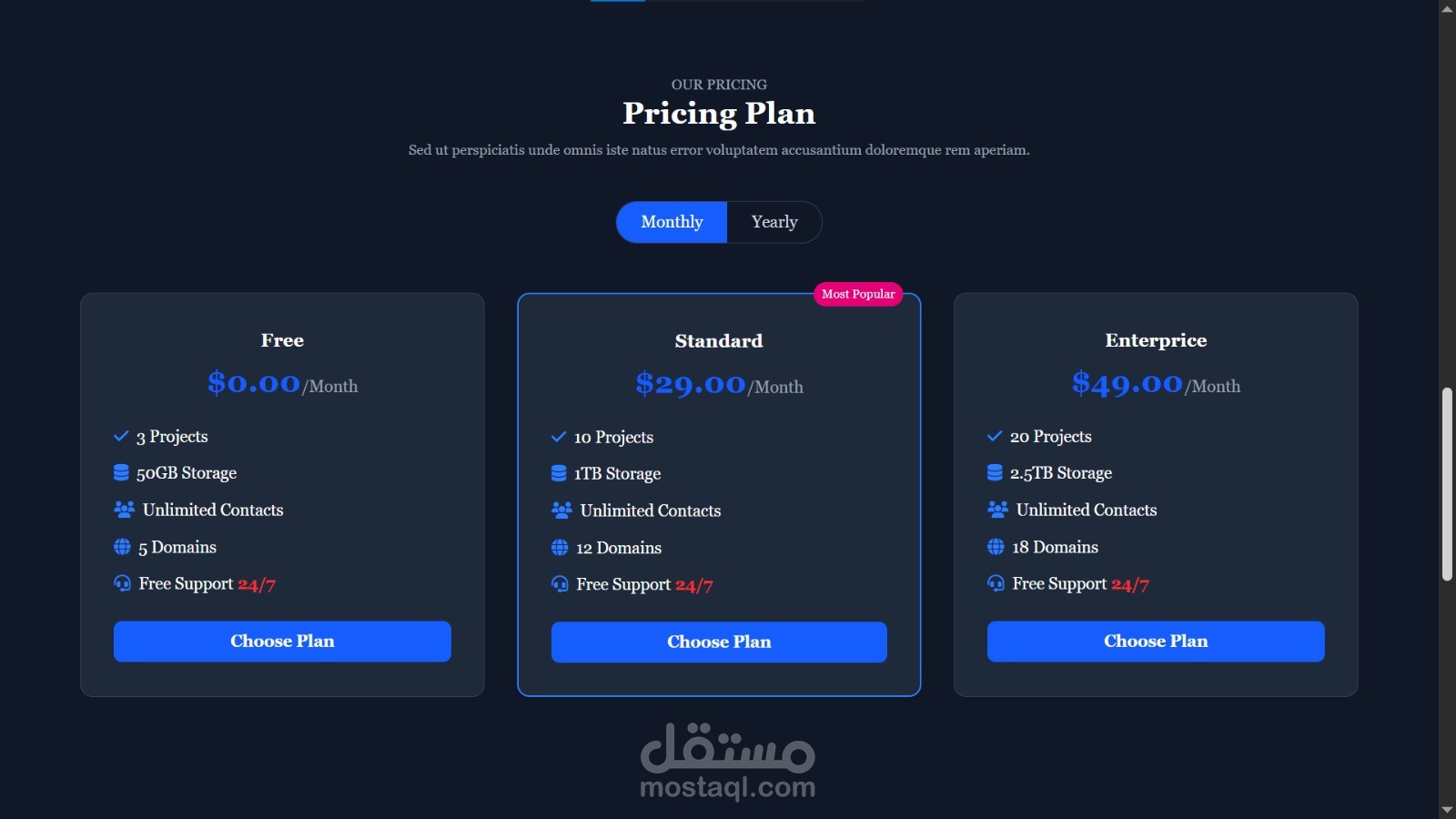
- Pricing Tiers: Clearly defined "Free," "Standard," and "Enterprise" pricing plans with a highlighted "Most Popular" option.
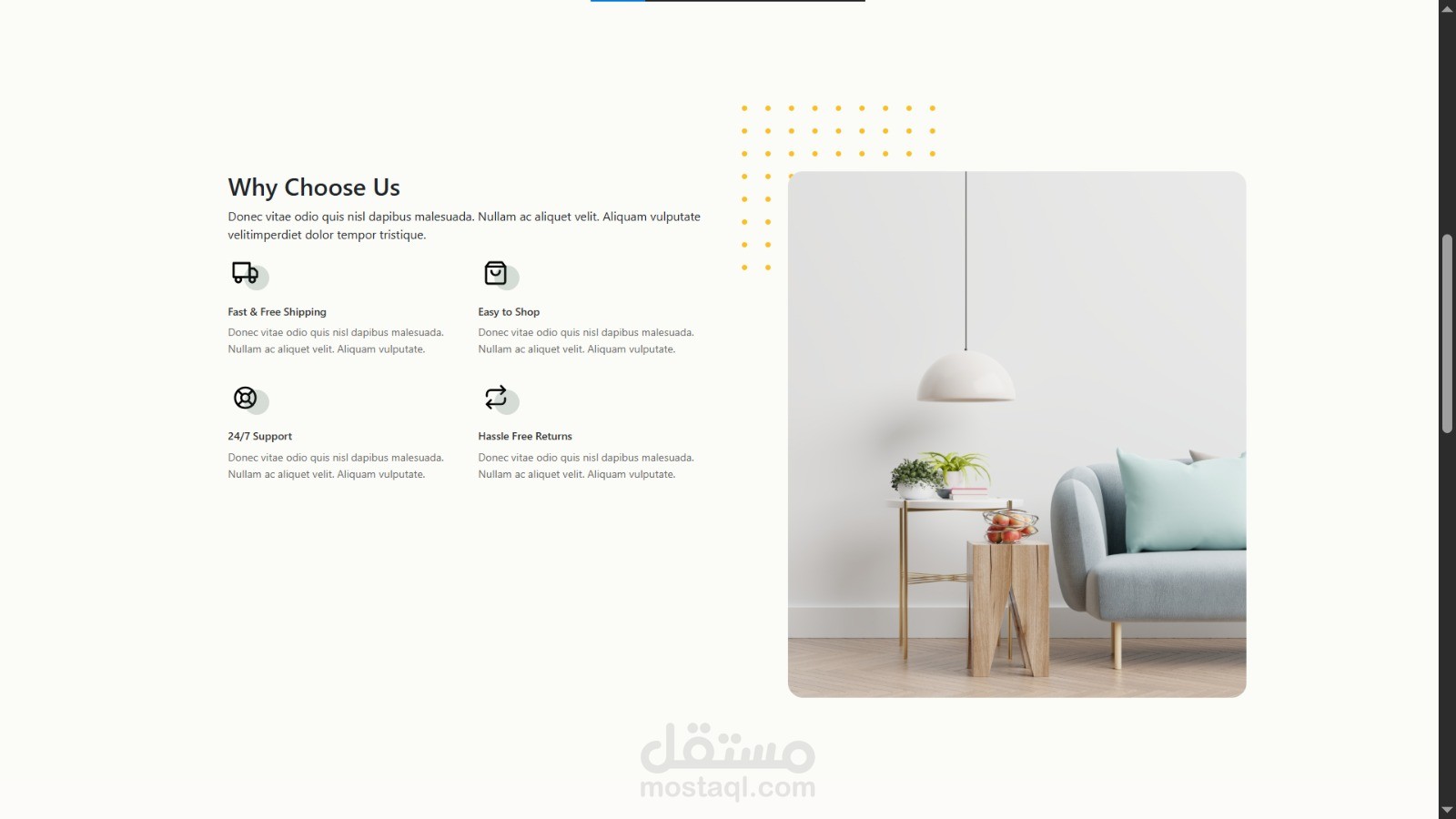
- Feature Showcase: Visual presentation of core features, supported by mobile app interface mockups.
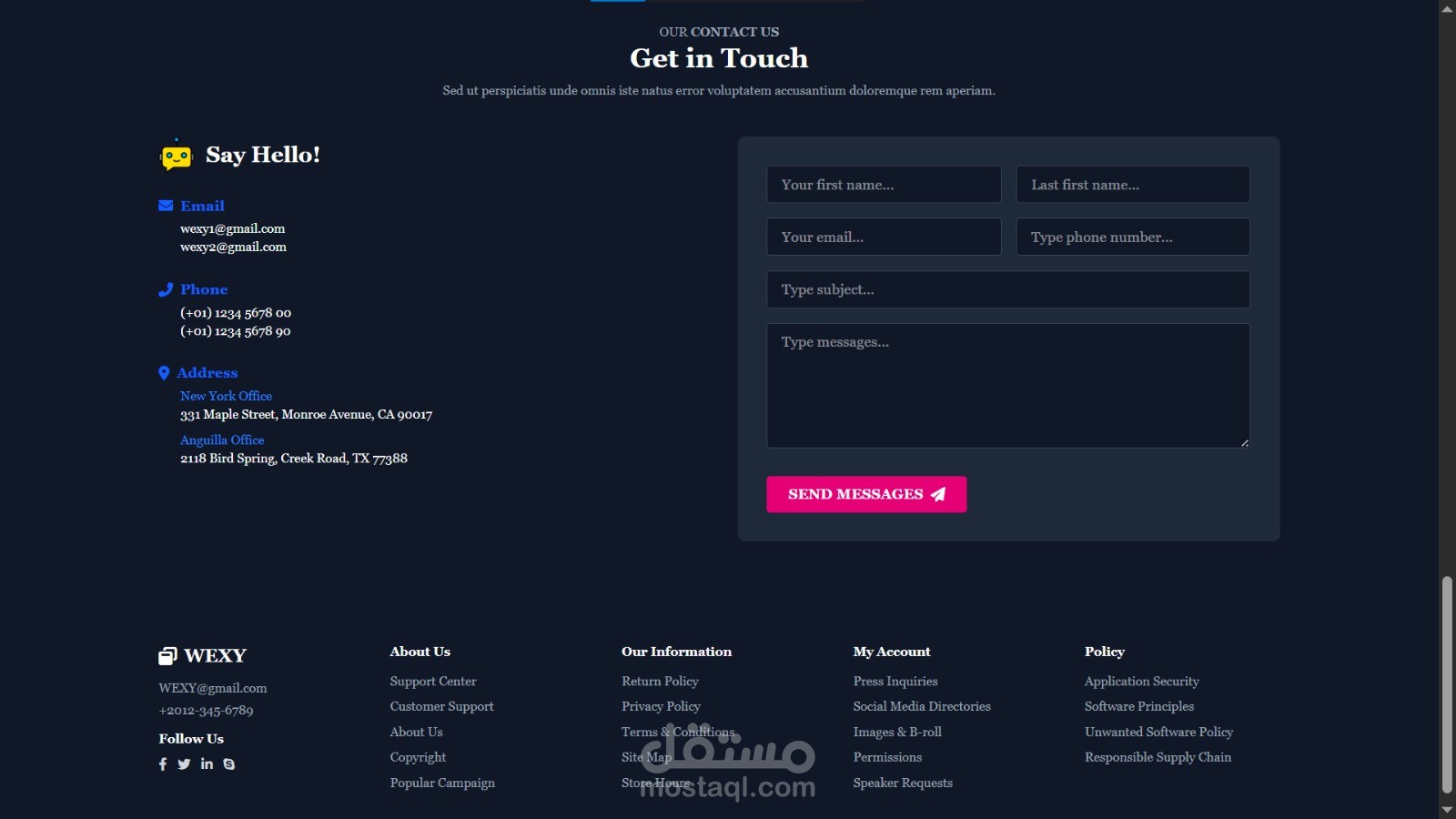
- Interactive Contact Section: Integrated inquiry form and clear contact details (Email, Phone, Address).
- Responsive Design: Optimized layout that adjusts seamlessly for desktop displays.
- Call-to-Action (CTA) Strategy: Strategically placed buttons (e.g., "Get Started," "Download App") to drive user engagement.
Technologies Used
- HTML5: Structured semantic markup.
- CSS3: Custom styling for layout, animations, and color palettes.
- JavaScript: Implemented for interactive elements (such as the monthly/yearly pricing toggle).
Development Process / Implementation Method
The project was developed following a modular approach. I began by creating a wireframe to map out the user journey, followed by building the core structure using semantic HTML. Styling was applied using CSS to achieve a modern SaaS look, with careful attention to spacing, typography, and contrast. I used basic JavaScript to handle the toggle functionality between monthly and yearly pricing plans, ensuring the user experience remains interactive.
Challenges Solved
- Visual Hierarchy: Successfully balanced text-heavy sections with visual elements like screenshots to ensure the user isn't overwhelmed.
- Color Consistency: Maintained a cohesive look across sections while implementing the dark theme to make the interface elements pop.
Client Benefits / Project Goals
- Helps potential users quickly understand the app's value proposition through a clean, distraction-free interface.
- Encourages sign-ups by clearly presenting flexible pricing structures.
- Provides a professional web presence that fosters trust for a new product.
One-Line Portfolio Description
Developed a modern, responsive landing page for a SaaS mobile app, focusing on clean UI/UX and interactive pricing elements.