Bio source Identity
تفاصيل العمل
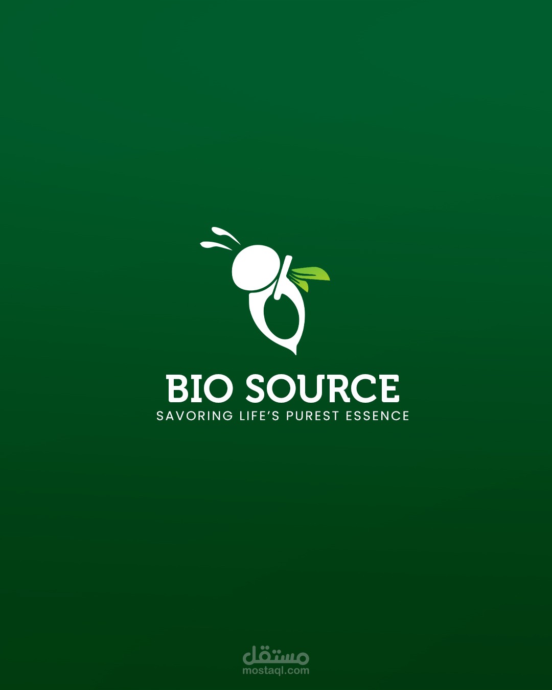
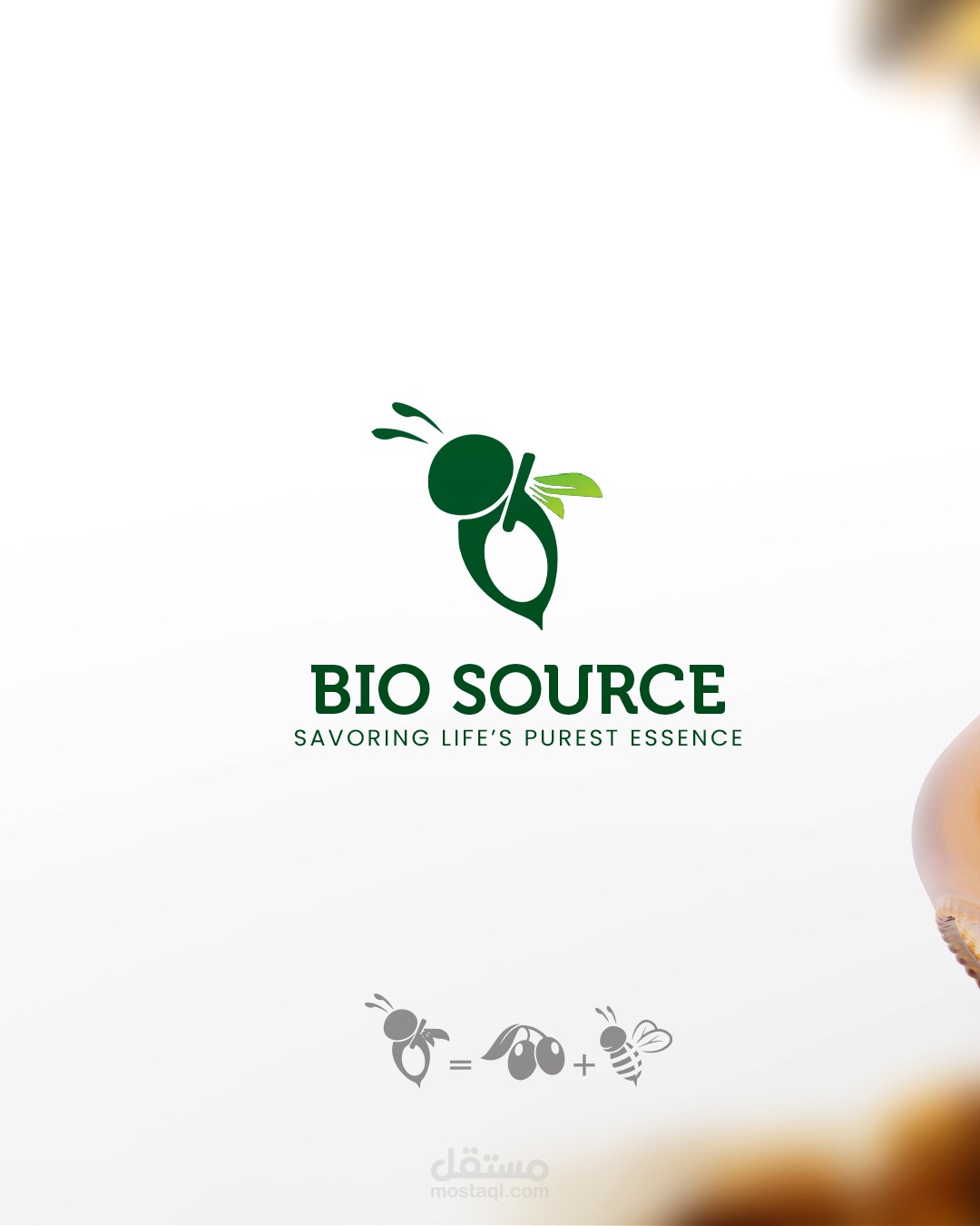
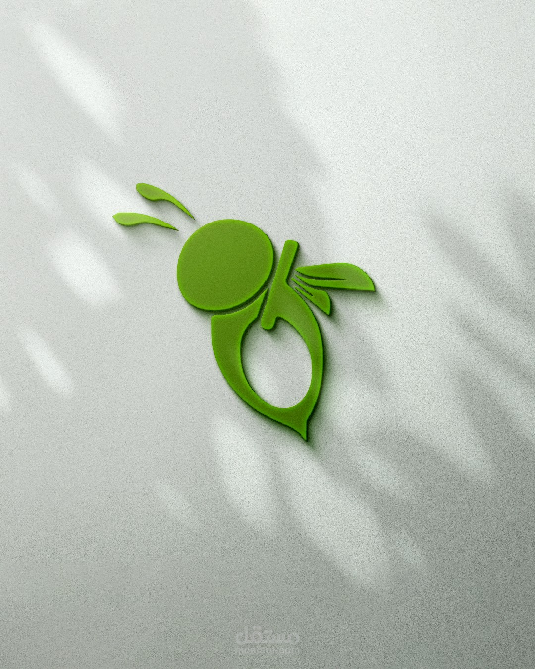
I've meticulously crafted a distinctive logo for your client's organic store, Bio Source, offering 100% natural products such as olive oil and honey. The centerpiece of the logo is an ingeniously designed bee silhouette, serving as a symbolic representation of nature's pollinators. Within the cleverly utilized negative space of the bee's body, I've seamlessly incorporated the image of an olive, emerging from an intricately detailed olive tree branch. The branch gracefully extends from the bee's abdomen to the tip of its body, forming a seamless connection that signifies the store's commitment to natural and organic offerings. The bee's wings take on a unique form, artfully shaped by two leaves, evoking a sense of organic fluidity. The typography of the logo is thoughtfully designed with smooth edges, echoing the liquid nature of the store's primary products. This holistic combination of the bee, olive, and typography not only encapsulates the ethos of Bio Source but also communicates a visual narrative of purity, authenticity, and the harmonious blend of nature's bounty. It's a logo that not only resonates with the brand but also invites customers to experience the genuine and organic essence of Bio Source.