Simple Dashboard - Foodify Food Website
تفاصيل العمل
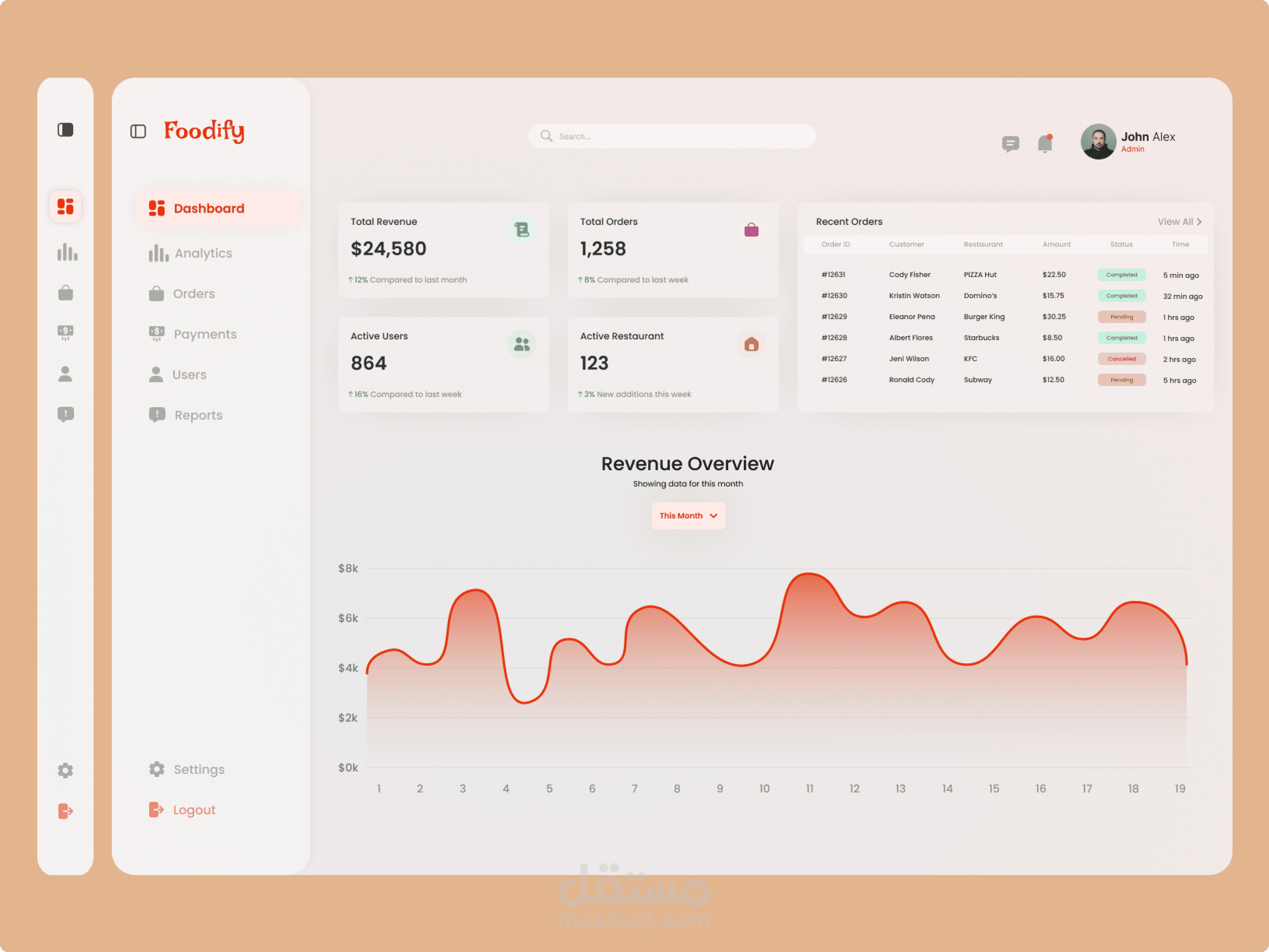
Foodify Dashboard UI Design
A modern and intuitive admin dashboard designed for a food delivery platform, focused on clarity, usability, and effective data visualization.
The dashboard provides a comprehensive overview of key business metrics, including total revenue, total orders, active users, and active restaurants. The layout is structured to help administrators quickly monitor performance and make informed decisions.
Key Features:
Clean sidebar navigation for easy access to main sections such as Dashboard, Analytics, Orders, Payments, Users, and Reports
KPI cards highlighting essential statistics with a clear visual hierarchy
Recent orders table displaying real-time activity with status indicators
Revenue overview chart for tracking performance trends over time
Minimal UI style with soft colors, subtle shadows, and rounded elements
Integrated user profile and notification area in the top bar
Design Approach:
The design follows a minimal and user-centered approach, reducing visual clutter while maintaining strong readability. A soft color palette combined with a focused accent color helps guide user attention to important elements.
Goal:
To create a seamless dashboard experience that allows users to quickly understand data and take action efficiently.