Lyran – Premium Landing Page Framer site for B2B SaaS Web
تفاصيل العمل
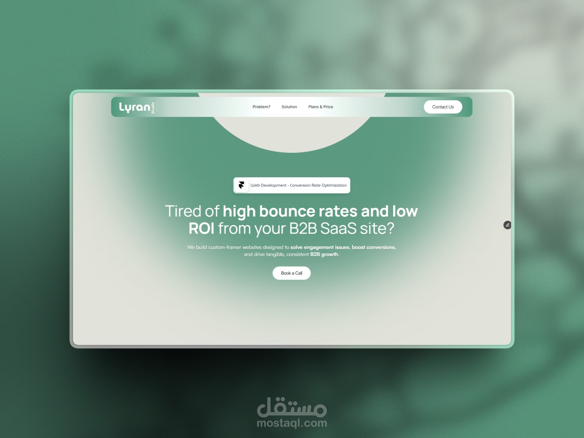

The design vibe of the Lyran template is clean, corporate-minimalist, and aggressively results-focused — think a no-nonsense B2B SaaS consultant who shows up in a sharp suit, skips small talk, and immediately starts pointing at your metrics with a red pen.
It leans heavily into professional trust + urgency without any flashy gimmicks. The overall feel is:
Color palette: Mostly neutral and restrained — dark or near-black backgrounds (or very deep grays) for depth and seriousness, crisp white/off-white text for maximum readability, and strategic pops of a bright accent color (likely a vivid blue or teal-green) on CTAs, stats highlights, and key metrics like "20% More Clicks". No rainbow vibes here; it's high-contrast, corporate-safe, and designed to feel like enterprise software marketing rather than a creative agency playground.
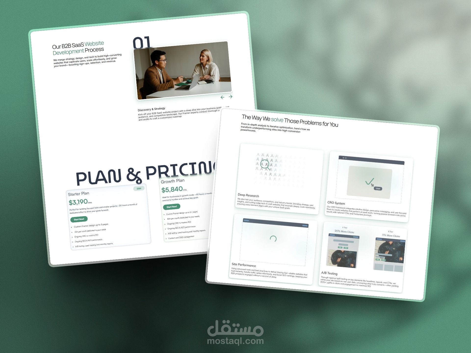
Layout & spacing: Generous whitespace everywhere — sections feel airy and separated, no crammed content. It's a classic single-page scroll with clear visual breaks (big section dividers, numbered steps like "01 Discovery & Strategy"). The flow guides the eye downward in a logical funnel: pain → proof → fix → price → CTA. Buttons and "Start Now!" blocks are repeated strategically so you never forget the next action, but they're not obnoxious — just persistent.
Desktop vs mobile: Fully responsive with no awkward breaks — text stacks cleanly, sections reflow without losing hierarchy, CTAs stay thumb-friendly. On mobile it still reads as "serious business partner" rather than shrinking into something cute.