Link Development
تفاصيل العمل
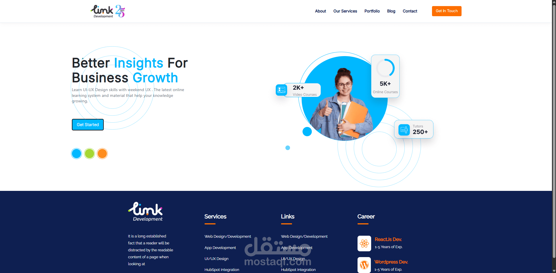
هذا المشروع عبارة عن موقع ويب حديث ومتجاوب تم بناؤه باستخدام HTML5، و CSS3، و Bootstrap، و JavaScript، و jQuery. الهدف من المشروع كان إنشاء واجهة أنيقة وسهلة الاستخدام تعمل بسلاسة على مختلف الأجهزة ومقاسات الشاشات.
تم تصميم تخطيط الموقع باستخدام نظام الشبكة الخاص بـ Bootstrap (Grid System)، مما يضمن تكيف المحتوى بشكل مثالي مع شاشات الهواتف المحمولة، الأجهزة اللوحية، وأجهزة الكمبيوتر. كما تم استخدام (Media Queries) لتحسين التجاوب والحفاظ على تناسق التصميم.
تركز الواجهة على البساطة، ووضوح المحتوى، وسرعة الأداء، مع كتابة كود برمجي منظم ومهيكل ليسهل صيانة المشروع وتطويره مستقبلاً.
أهم المميزات:
تصميم متجاوب بالكامل مع جميع مقاسات الشاشات.
واجهة مستخدم عصرية وأنيقة.
كود برمجي منظم وسهل الصيانة.
توافق تام مع متصفحات الويب المختلفة.
تخطيط محسّن باستخدام نظام شبكة Bootstrap.