Transactions Analysis Dashboard
تفاصيل العمل

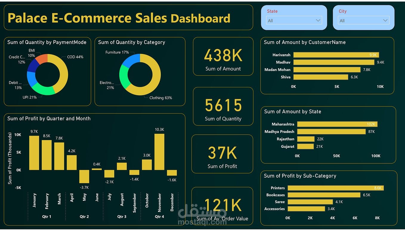
This dashboard analyzes e-commerce sales performance to help understand customer behavior, product performance, and business profitability.
The dashboard highlights key metrics such as Total Sales Amount, Total Quantity Sold, Total Profit, and Average Order Value. It also provides insights into sales distribution by category, payment method, state, and customer.
Interactive filters allow users to explore data by state and city, making it easier to identify regional sales trends and top-performing customers.
Key Insights
Clothing category contributes the highest share of sales.
COD is the most commonly used payment method.
Maharashtra and Madhya Pradesh generate the highest revenue.
Profit varies across months, showing seasonal trends.
Tools Used
Power BI • Data Visualization • Data Analysis
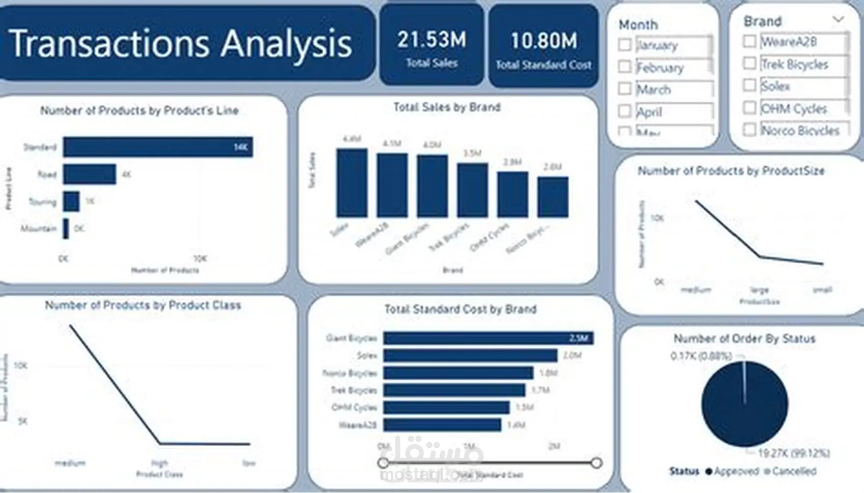
2. Transactions Analysis Dashboard
Description
This dashboard provides a comprehensive analysis of product transactions and brand performance. It focuses on understanding sales distribution across product lines, brands, product sizes, and order status.
The dashboard allows users to filter data by month and brand, helping businesses track product demand and brand performance over time.
Visualizations highlight top-performing brands, product distribution by size and class, and order status trends.
Key Insights
Certain brands generate significantly higher sales compared to others.
Medium-sized products represent the largest share of transactions.
Most orders are successfully accepted with a very small cancellation rate.
Tools Used
Power BI • Data Visualization • Data Analysis