Logo Design: ARISE - Anime Store
تفاصيل العمل
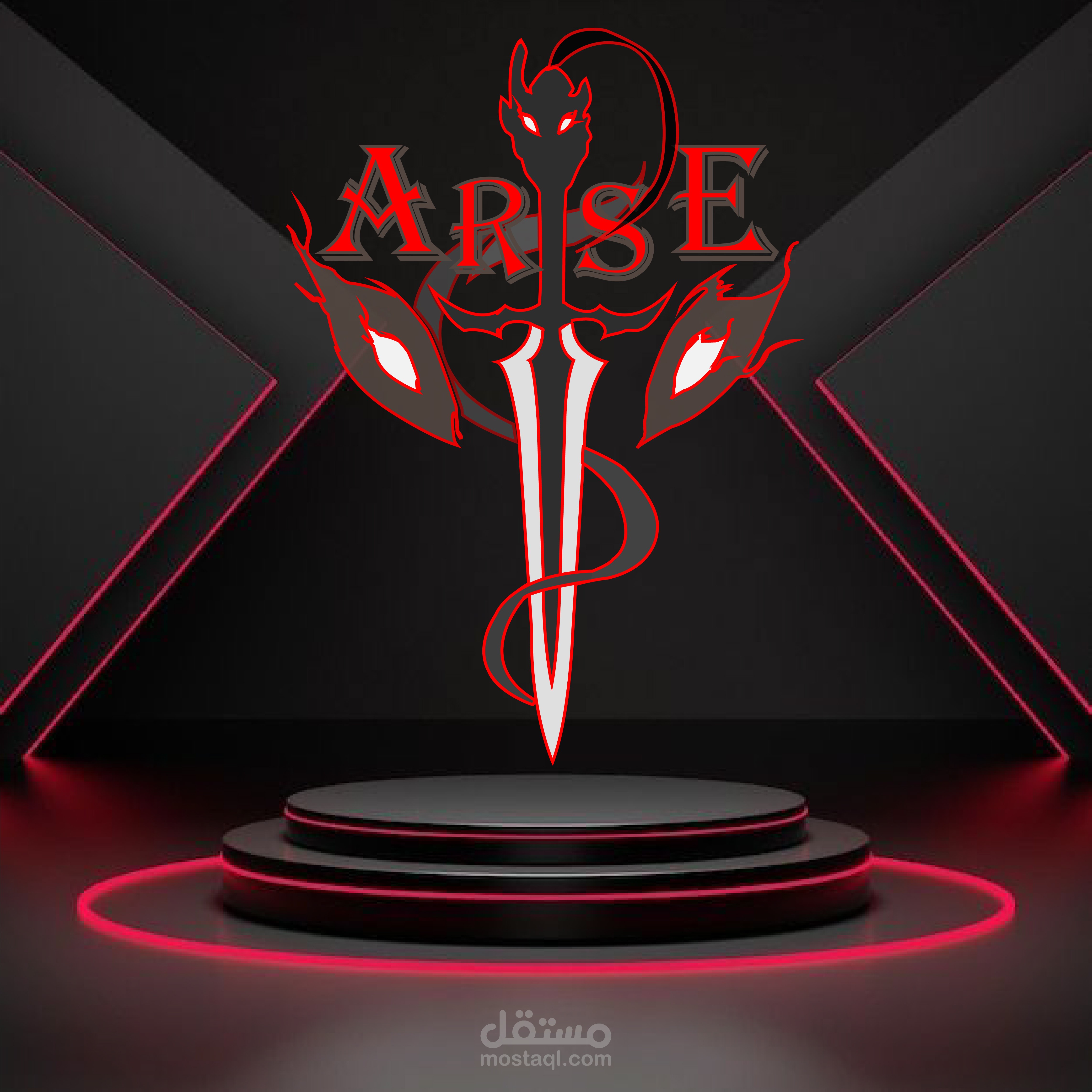
Design Concept & Symbolism:
Core Elements:
• Dual Shadow Swords – Crossed blades representing power & the Shadow Monarch's arsenal
• Dragon/Tiger Silhouette – The creature wrapping around the swords (Ashborn's essence)
• Gothic Typography – Custom letterforms with sharp edges matching the anime aesthetic
• Wing Accents – Symbolizing ascension & the "leveling up" concept
Color Variants:
• Crimson Red – Primary brand color (passion, danger, power)
• Cyan Blue – Secondary variant (shadow energy, ice aura)
?️ Technical Execution in Adobe Illustrator:
Vector Construction Process:
• Pen Tool Mastery – Manual bezier curve plotting for sword geometry (no auto-trace)
• Shape Builder Tool – Combining primitive shapes for the dragon silhouette
• Pathfinder Panel – Unite/Minus Front/Intersect for complex negative space (sword cutouts in dragon body)
• Anchor Point Editing – Direct selection tool for precise curve adjustments on letterforms
Typography Development:
• Custom "S" Spine – Modified to wrap around the central sword (Path → Offset Path for parallel curves)
• Serif Modification – Sharp terminals added via Pen Tool to match blade aesthetics
• Kerning Adjustments – Manual letter-spacing for visual balance around central icon
Color & Effects:
• Gradient Meshes – Metallic silver on blades (3 color stops: white → gray → dark gray)
• Global Swatches – Red/Cyan variants saved as global colors for instant brand switching
• Appearance Panel – Multiple fills: Base color + Inner glow (white, 20% opacity) for 3D depth
3D Mockup (Photoshop):
• Smart Object Workflow – Vector logo linked for non-destructive scaling
• Neon Glow Effects – Outer glow (red/cyan, spread: 10%, size: 30px) + Color Dodge blend mode
• Perspective Grid – Manual alignment to match podium vanishing points
• Ambient Lighting – Gradient overlays (multiply/screen) for shadow integration
? Brand Application:
Designed as a versatile system for:
• Store signage & packaging (vector scalability)
• App icons & social media (simplified mono versions)
• Merchandise (embroidery-ready single color)
• Digital platforms (SVG for web, PNG for UI)
The challenge was balancing anime fan recognition (Solo Leveling vibes) with commercial brand readability – making it appeal to fans while remaining professional for business use.
Key Learning: Vector construction is all about patience with anchor points – every curve affects the whole composition. The dragon silhouette alone took 40+ anchor point adjustments to get that "wrapping" feel around the swords.