HR Analytics Dashboard
تفاصيل العمل

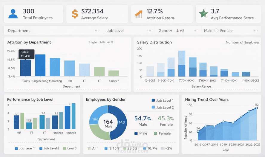
I created this HR Analytics Dashboard in a Power BI style to help HR teams visualize and analyze employee data easily. I wanted it to be realistic, clean, and professional, just like a real corporate dashboard.
What I did in this project:
Designed KPI cards for Total Employees, Average Salary, Attrition Rate %, and Performance Score.
Built interactive charts:
Attrition by Department (Bar Chart)
Salary Distribution (Column Chart)
Performance by Job Level (Clustered Bar)
Employees by Gender (Donut Chart)
Hiring Trend Over Years (Line Chart)
Added filters/slicers for Department, Job Level, and Gender to make it look like a real Power BI dashboard.
Used a clean design with soft shadows, professional colors (blue, green, orange), and readable fonts.