high-fidelity UI/UX design mockup for a specialized Cardiology patient management system.
تفاصيل العمل
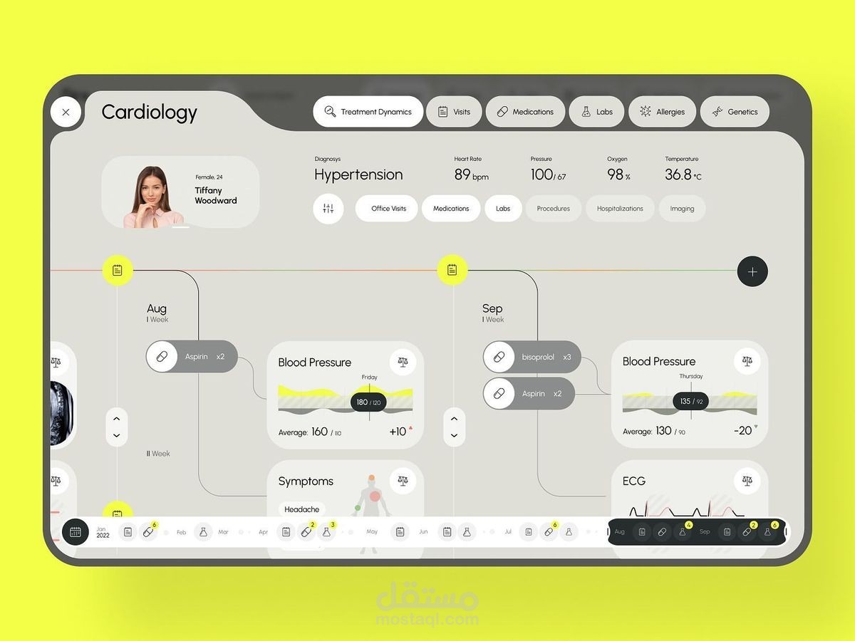
Key Interface Features
The dashboard is structured to provide a comprehensive chronological overview of a patient's care:
Patient Profile and Current Status: The top-left corner displays the patient's identity (Tiffany Woodward, 24) and primary diagnosis, which is listed as "Hypertension".
Real-time Vitals: A summary bar at the top provides quick access to current clinical data, including:
Heart Rate (89 bpm)
Blood Pressure (100/67)
Oxygen saturation (98%)
Body temperature (36.8°C)
Treatment Timeline: The main body of the screen uses a horizontal, timeline-based layout to track medical history across months like August and September. It integrates:
Medication logs: Shows prescriptions like Aspirin and bisoprolol.
Clinical events: Tracks Blood Pressure fluctuations and specific symptoms, such as headaches.
Visual diagnostics: Displays ECG (electrocardiogram) results and blood pressure charts.
Navigation: A top navigation bar allows the user to switch between categories like "Visits," "Medications," "Labs," "Allergies," and "Genetics".
Design Observations
The aesthetic is clinical and clean, using a neutral color palette to ensure the data is the primary focus. The use of a timeline interface effectively maps the "Treatment Dynamics," allowing a practitioner to quickly correlate changes in medication with shifts in blood pressure or patient-reported symptoms.