Application Created By me
تفاصيل العمل
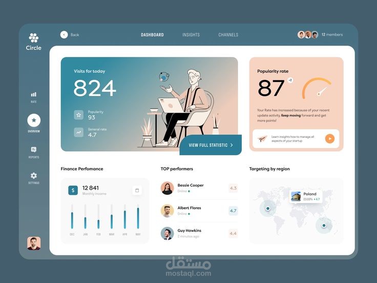
Core Functionality
The dashboard is designed for high-level monitoring, focusing on quick insights rather than granular data entry. Based on the interface, it tracks:
User Engagement: Real-time visibility into daily site visits, popularity trends, and a gauge for "popularity rate."
Financial Health: A visual bar chart tracking monthly income performance.
Member Management: A leader-board style module for "Top Performers," showing individual user ratings and online status.
Geographic Insights: A simplified map overlay for monitoring regional targeting.
Design Observations
Visual Style: The aesthetic is modern and minimalist, utilizing a soft blue-grey color palette with high-contrast, warmer accent colors (peach/coral) to draw the eye to key metrics.
Layout: The interface follows a classic grid-based admin dashboard layout, using card-based widgets to separate disparate data types (finance vs. social metrics).
Usability: The sidebar navigation is straightforward, keeping the primary focus on the main workspace to prevent user overwhelm.