Hajj 2021 Aviation & Passenger Analysis Dashboard
تفاصيل العمل
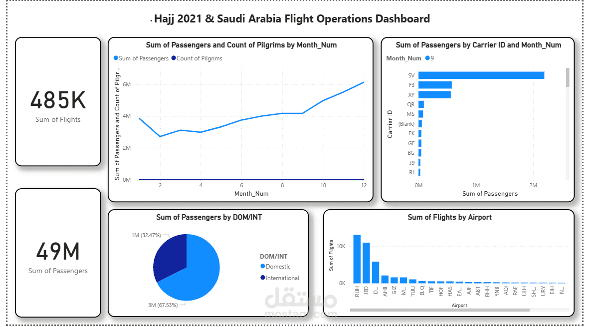

This project presents an analytical dashboard examining Hajj 2021 flight operations and passenger movement in Saudi Arabia. The goal of the analysis was to understand air traffic performance, passenger distribution, and airline activity during the Hajj season.
The dashboard was developed using Power BI to provide interactive insights and clear performance indicators.
Total Flights: 485K
Total Passengers: 49M
Monthly passenger trends analysis
Passenger comparison (Domestic vs International)
Airline carrier performance analysis
Flight distribution by airport
Analysis Process:
Data cleaning and preprocessing
Aggregation of flight and passenger metrics
Creation of calculated measures (KPIs)
Trend analysis by month
Comparative analysis by airline carrier
Visualization of airport performance
Key Insights:
Passenger traffic showed seasonal variation across months.
Major airlines carried the highest proportion of Hajj passengers.
Domestic travel represented a larger share compared to international travel.
Major airports handled the majority of flights during the season.
Tools Used:
Power BI
Data Modeling
DAX Measures
Interactive Dashboard Design
This project demonstrates my ability to transform aviation and operational data into actionable insights through interactive business intelligence dashboards.