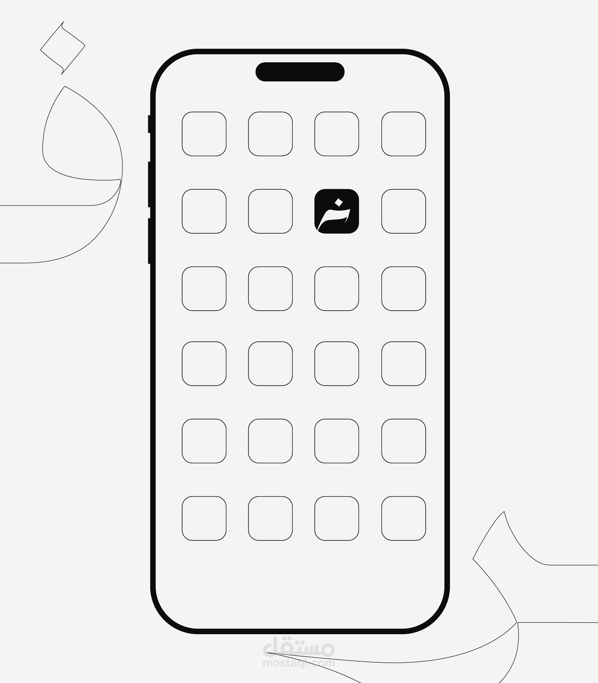
فخر logo branding
تفاصيل العمل
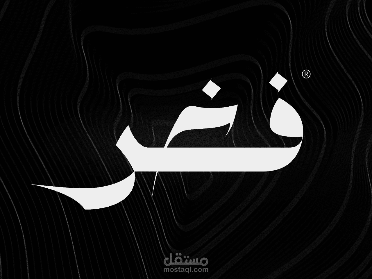
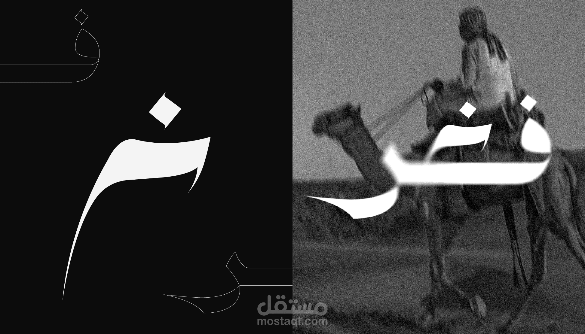
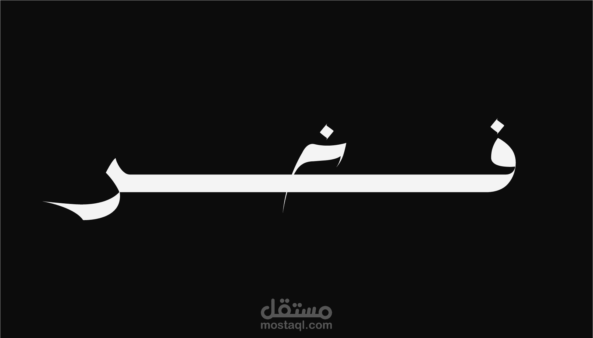
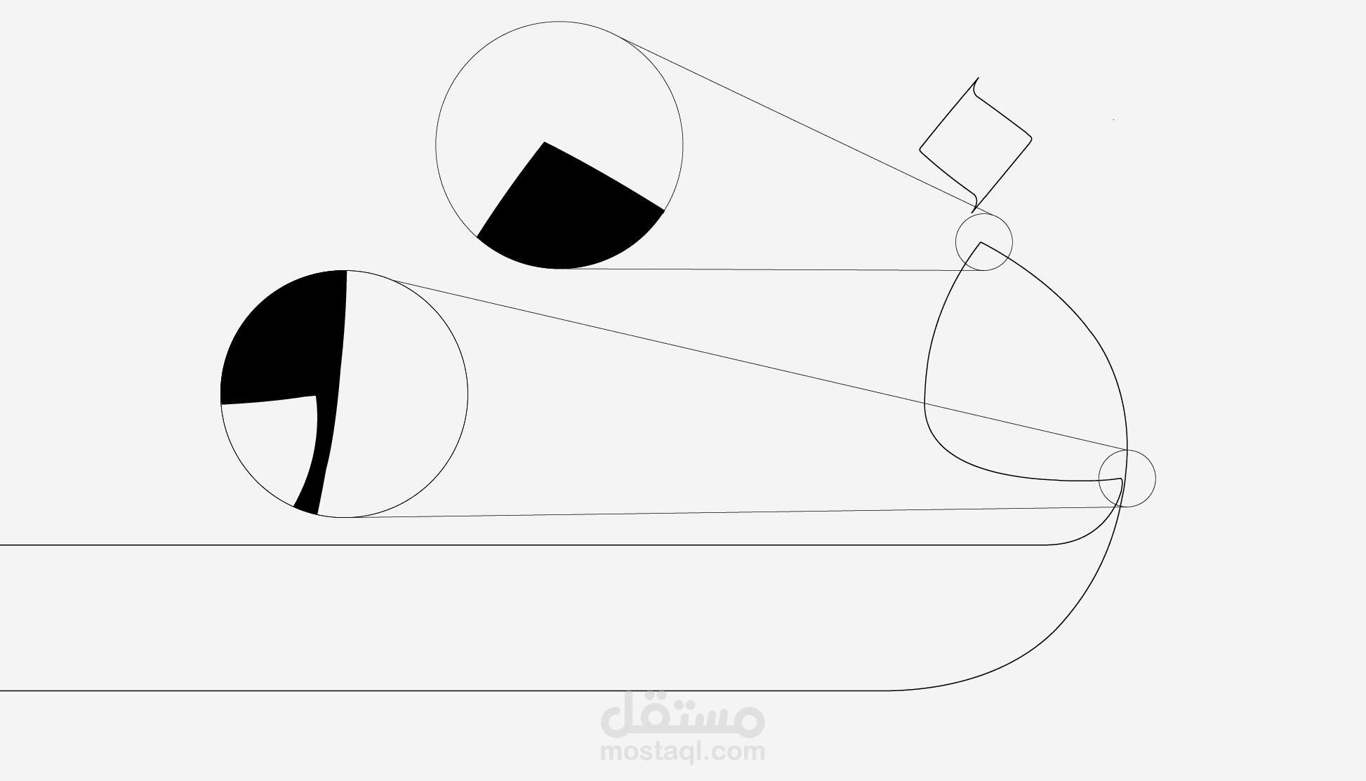
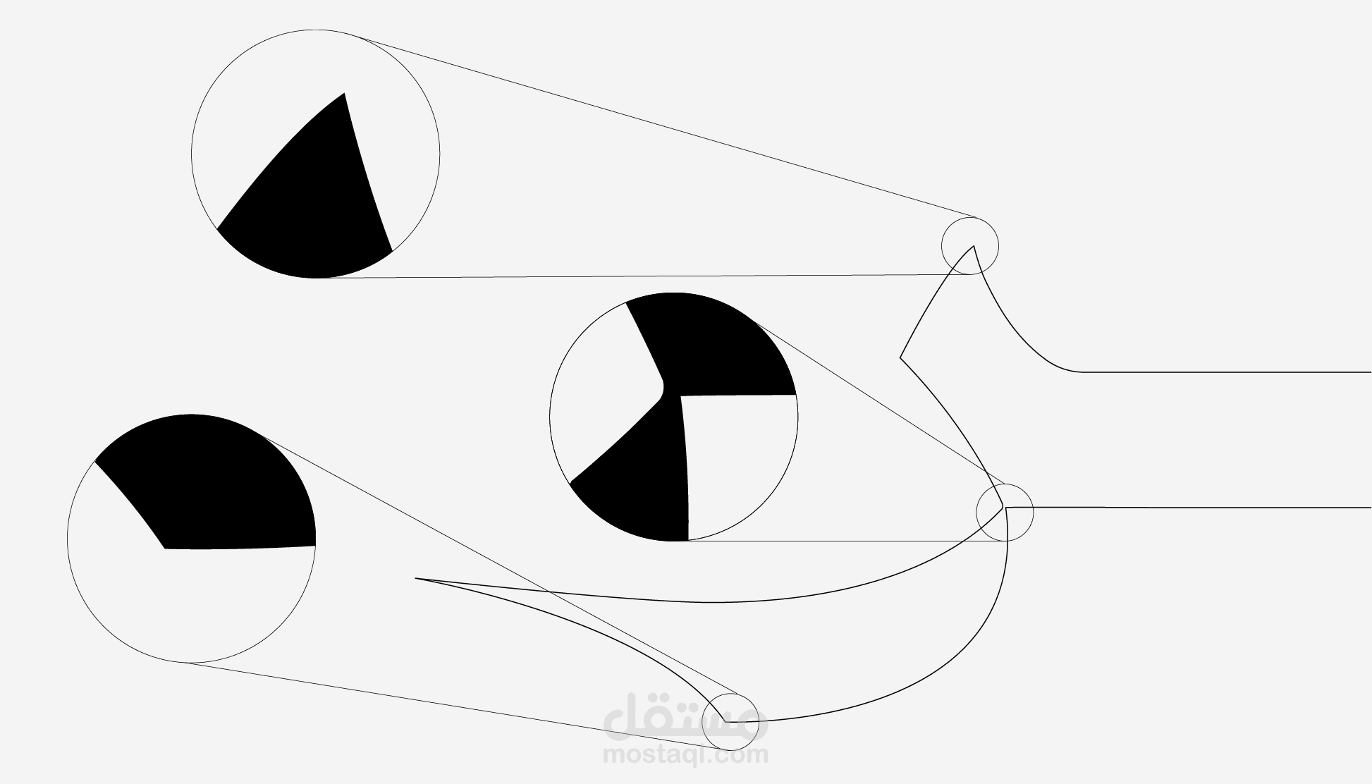
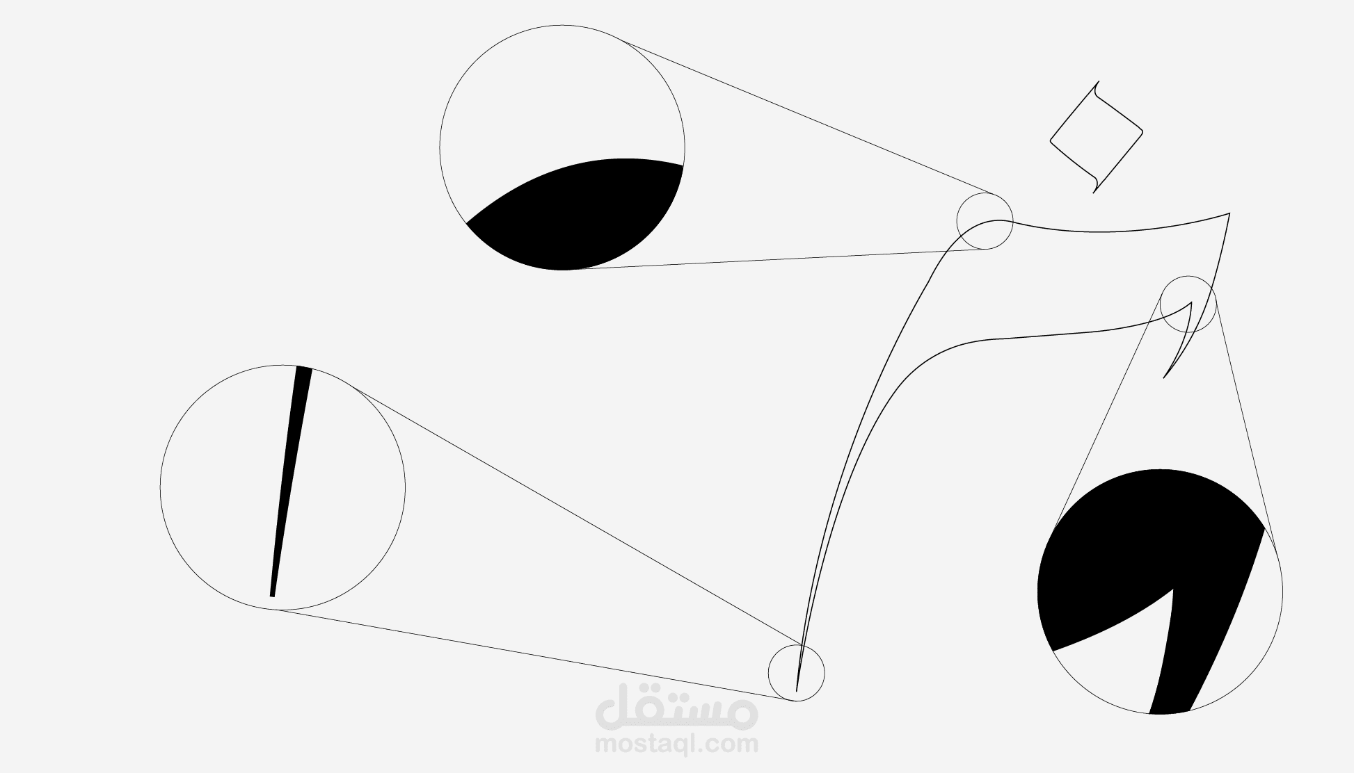
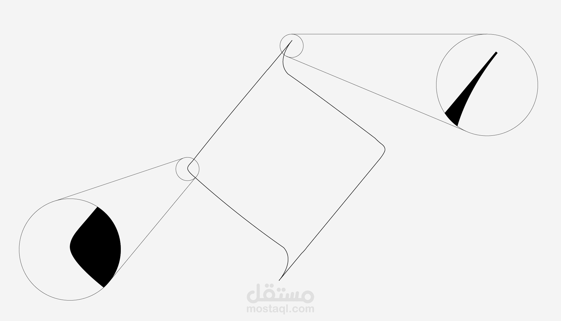
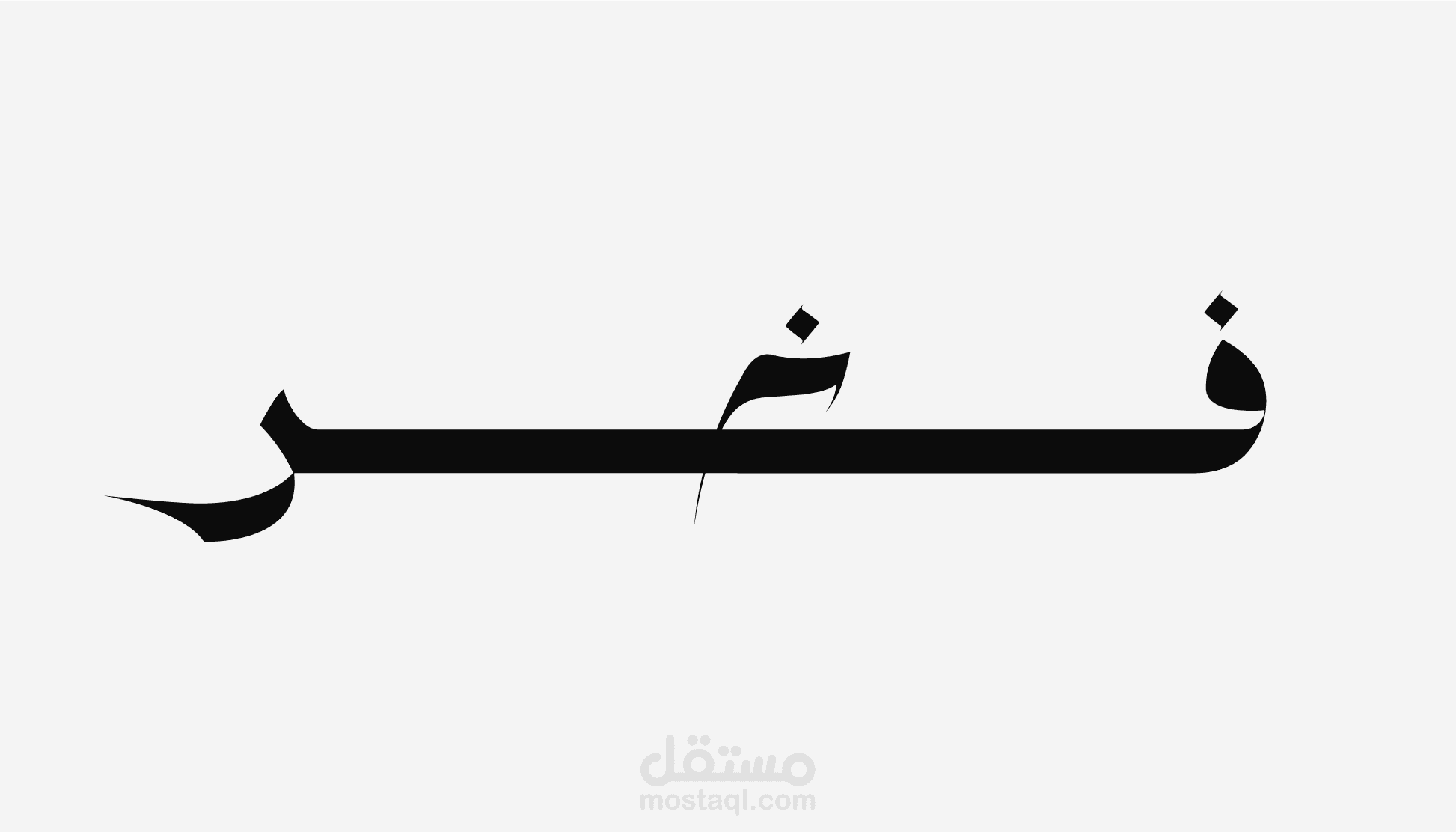
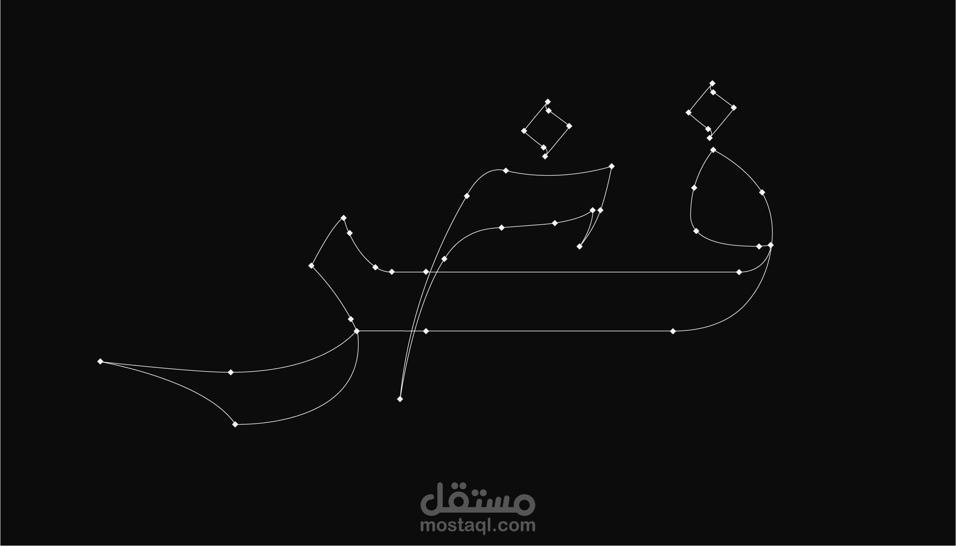
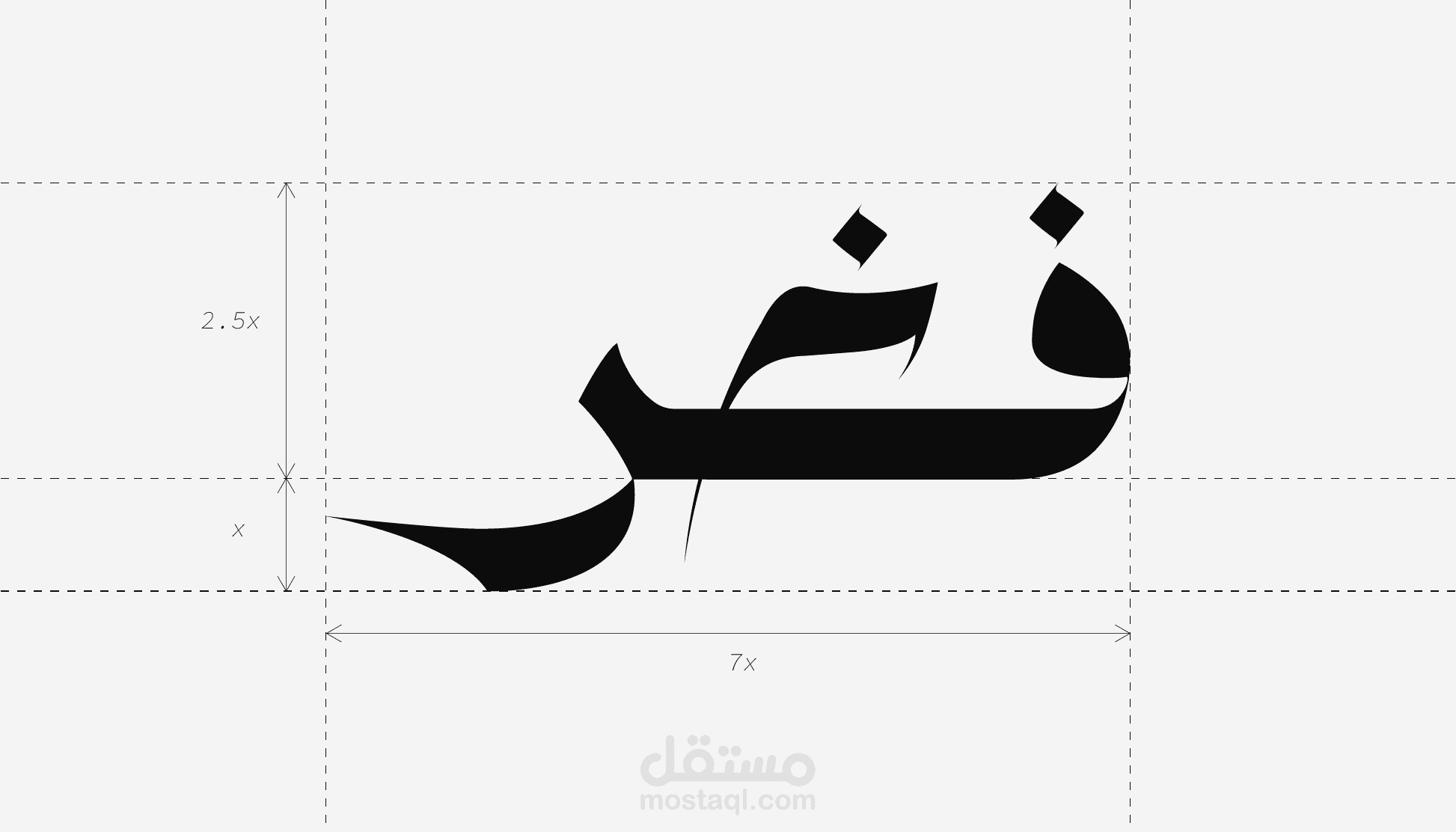
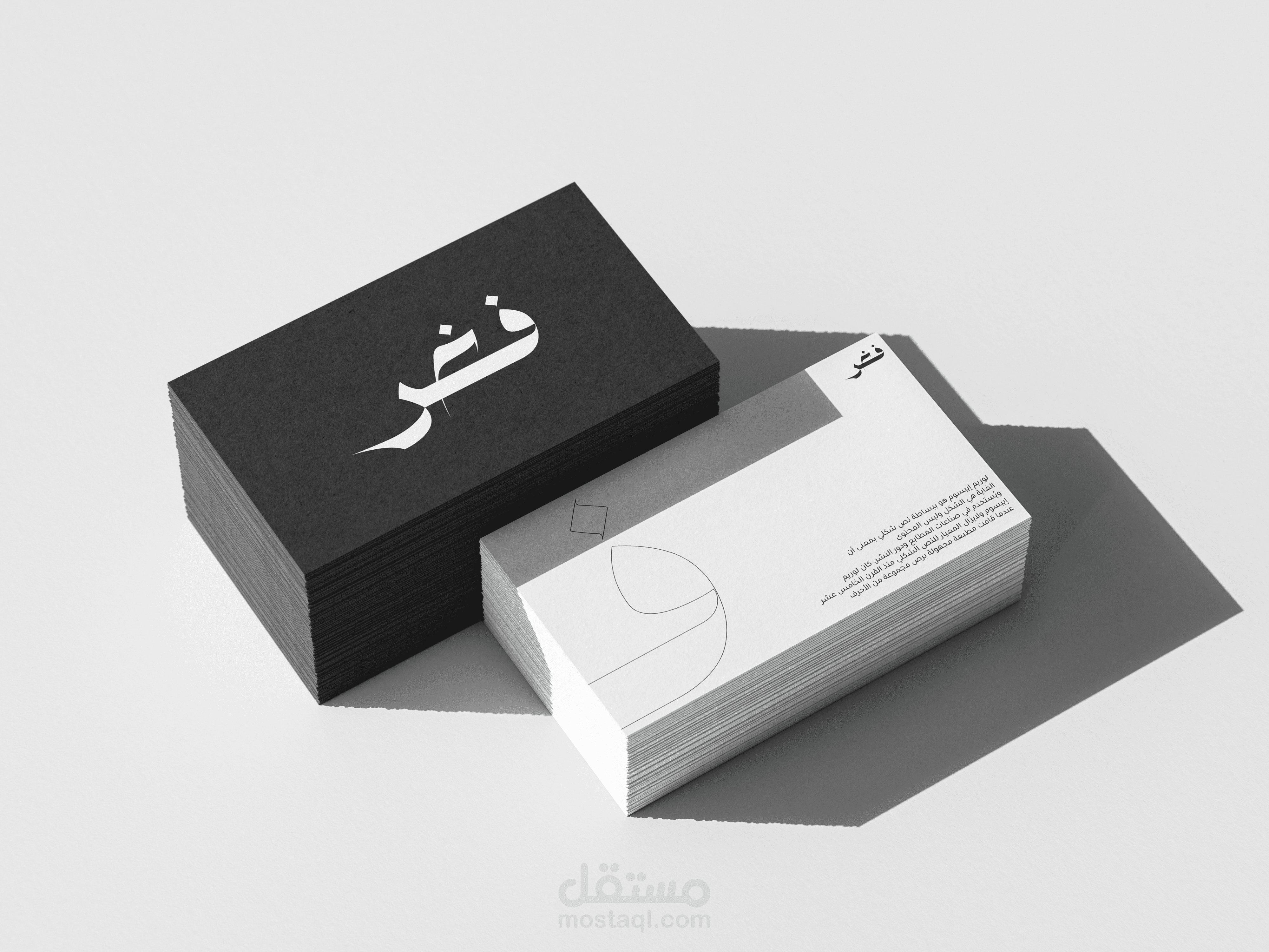
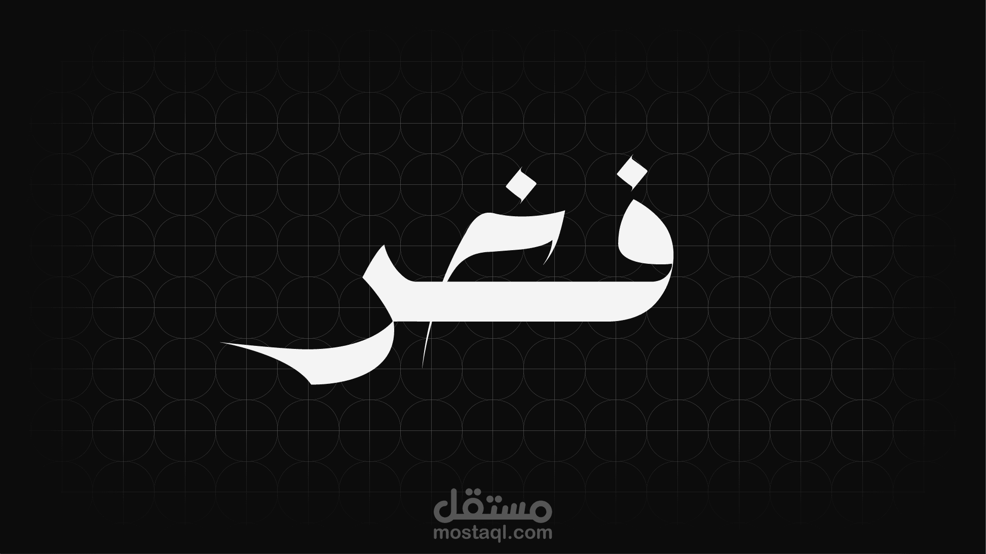
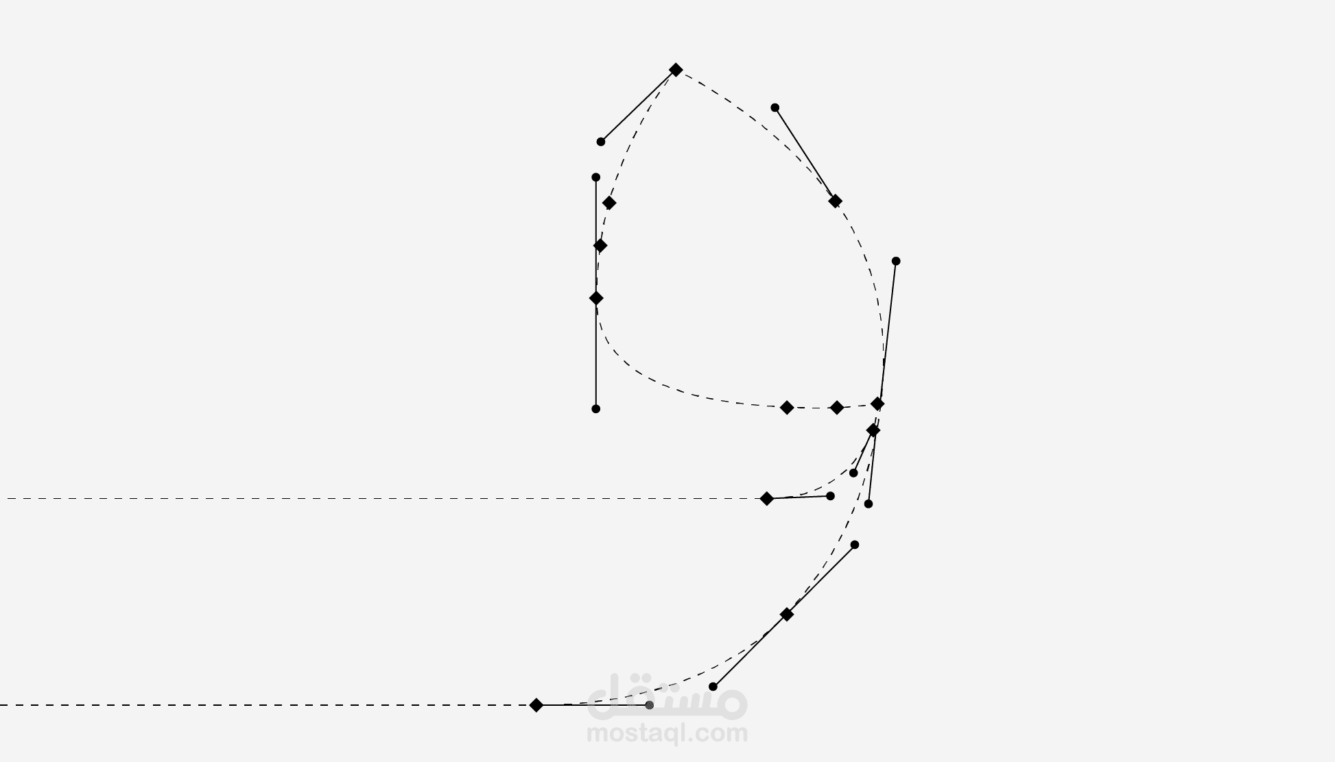
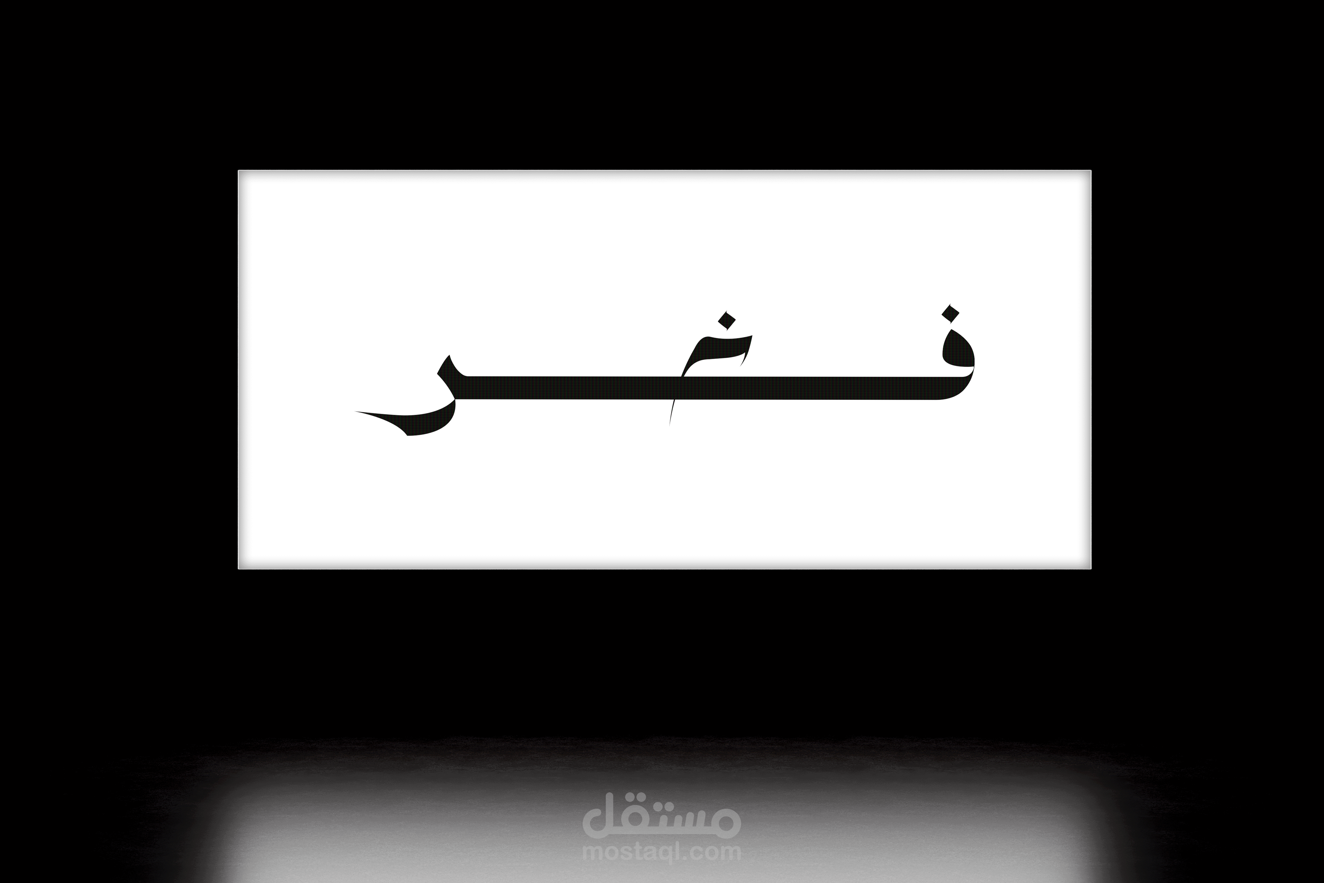
This project explores the power of simplicity through custom Arabic typography. The logo is entirely hand-crafted, not based on any pre-existing or modified font. Every letterform was intentionally constructed to create a bold, direct, and unapologetic visual identity.
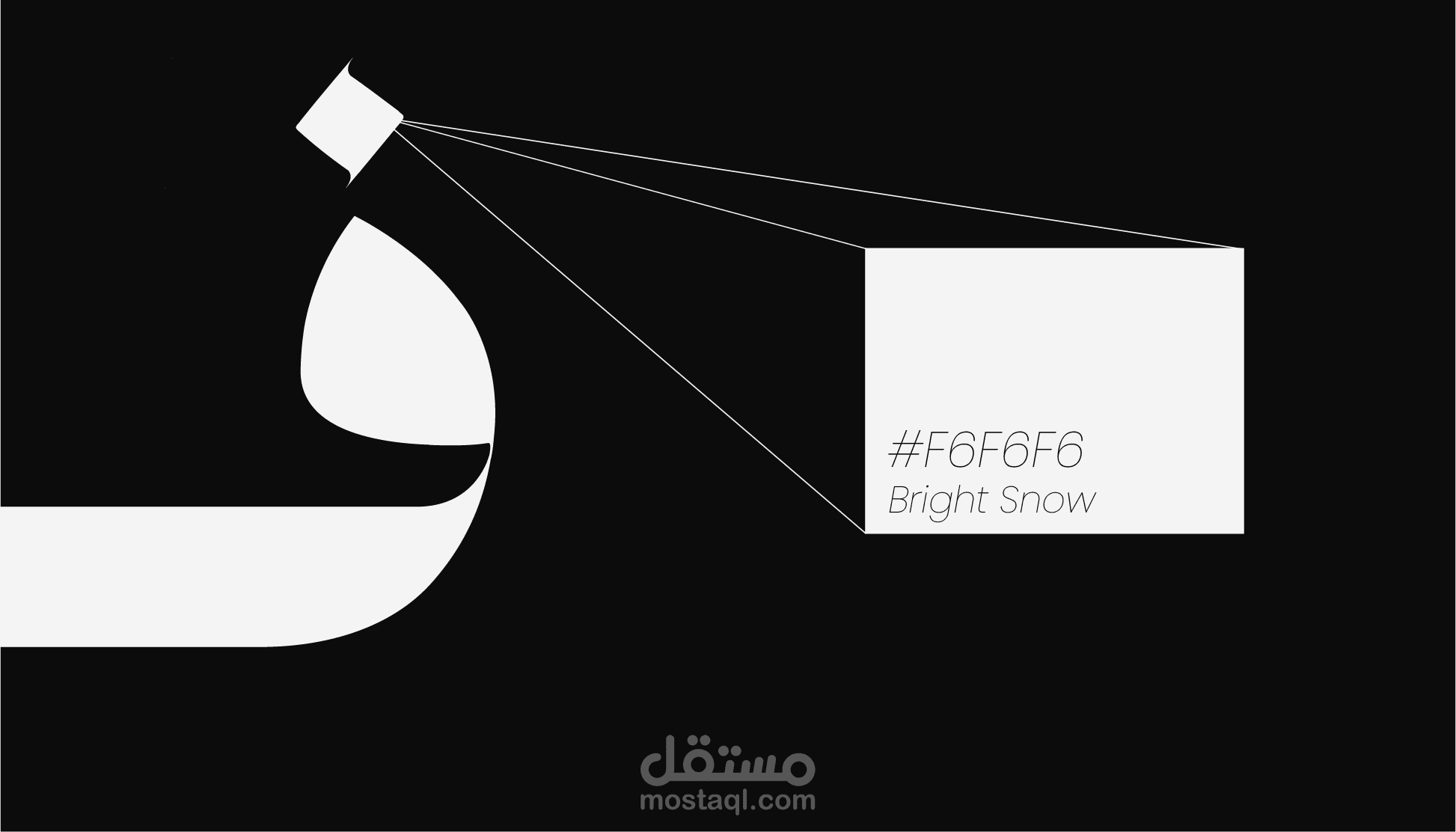
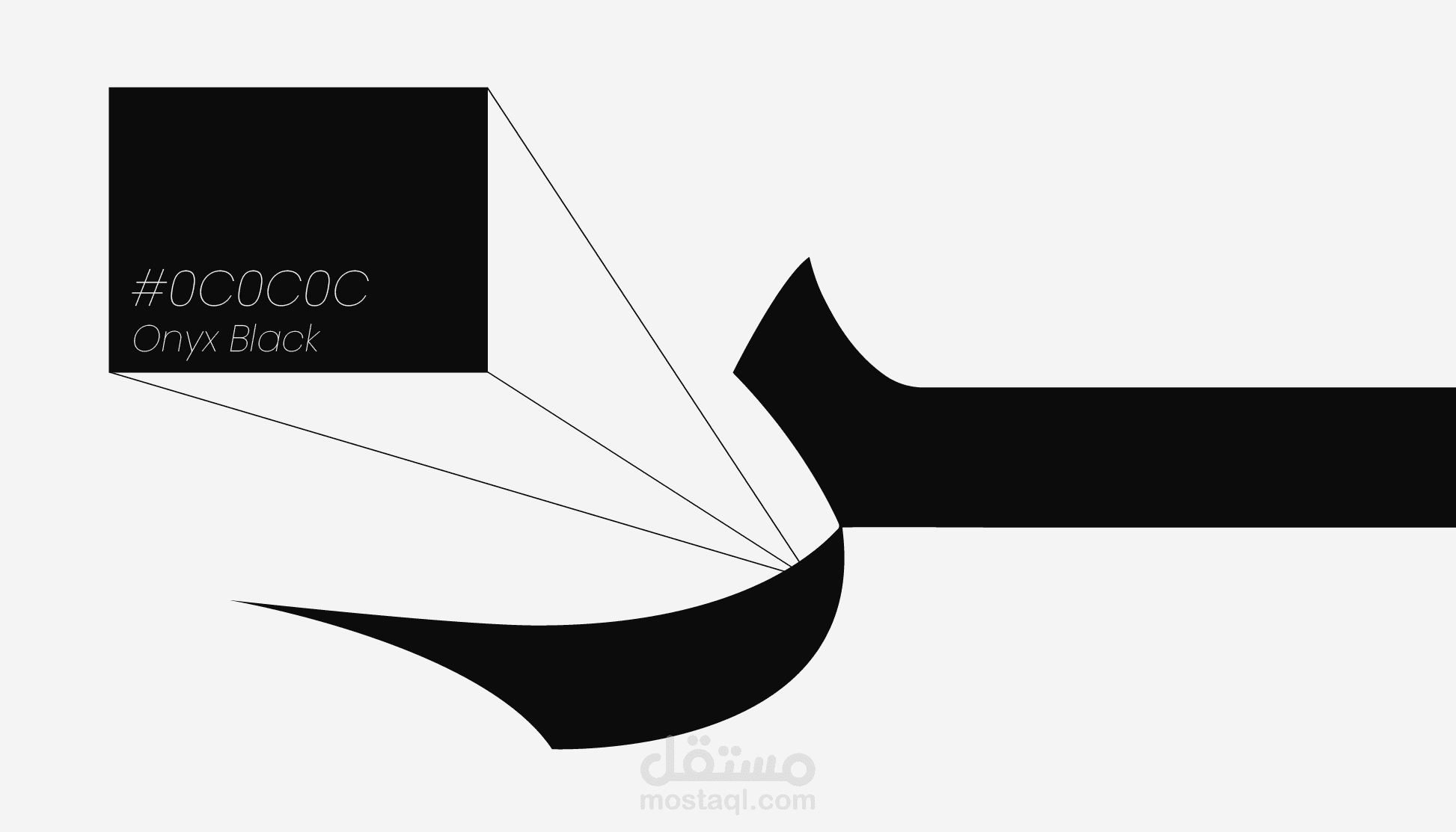
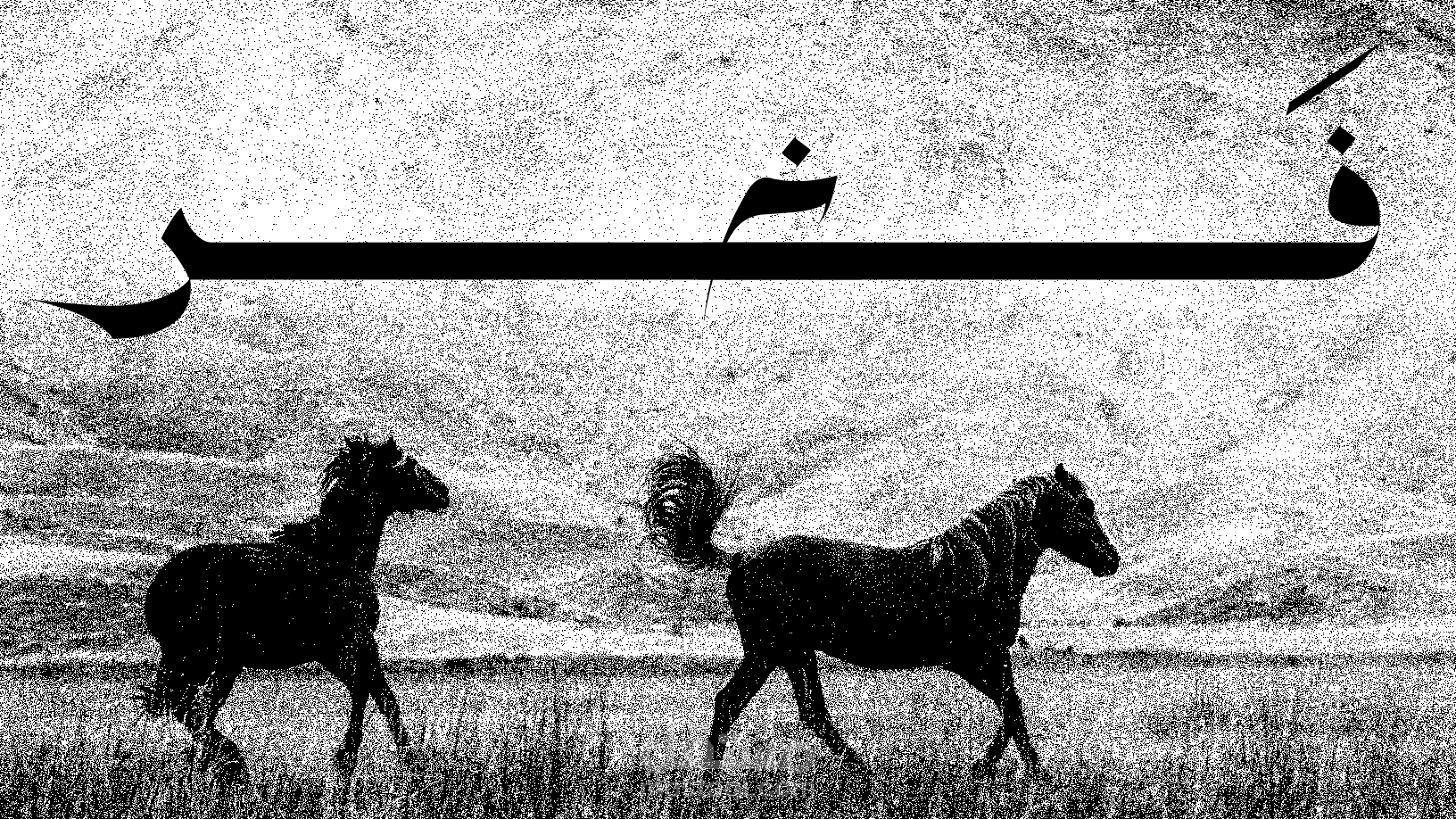
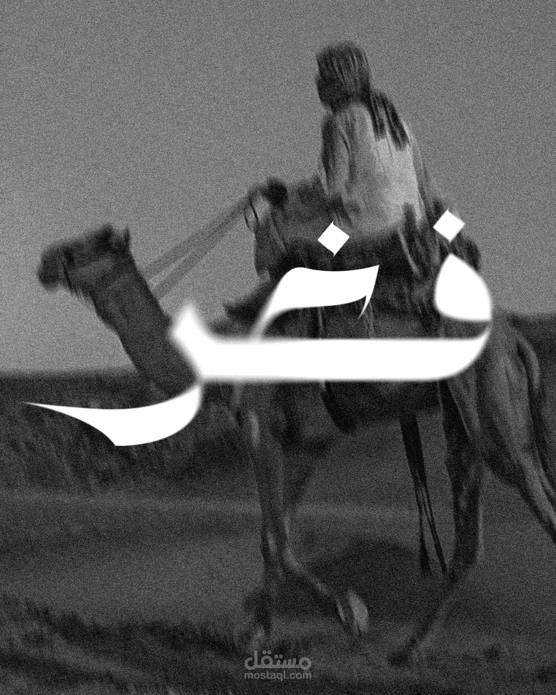
The design embraces a minimal black-and-white approach, stripping away unnecessary elements to focus purely on structure, weight, and presence. There are no decorative details or ornamental additions — the strength of the logo lies in its thickness, balance, and clarity.
The typography is straight-forward and assertive. It communicates confidence through solid forms and strong geometry, allowing the composition to stand firmly without relying on visual effects or embellishments.