Logo design
تفاصيل العمل

Project Description
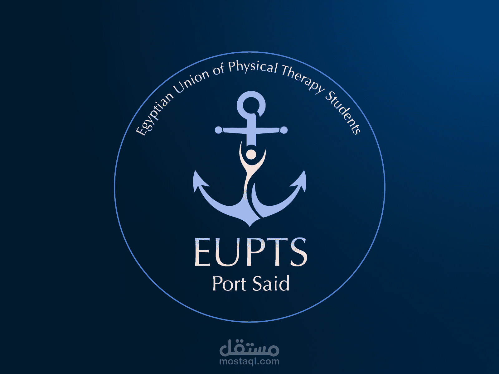
I am proud to present the official logo design for the Egyptian Union of Physical Therapy Students (EUPTS) | Port Said branch. This project was a deep dive into visual storytelling, representing both the medical profession and the unique identity of the city.
The goal is to create a timeless identity that resonates with students and reflects the strength and stability of our union.
The Creative Journey
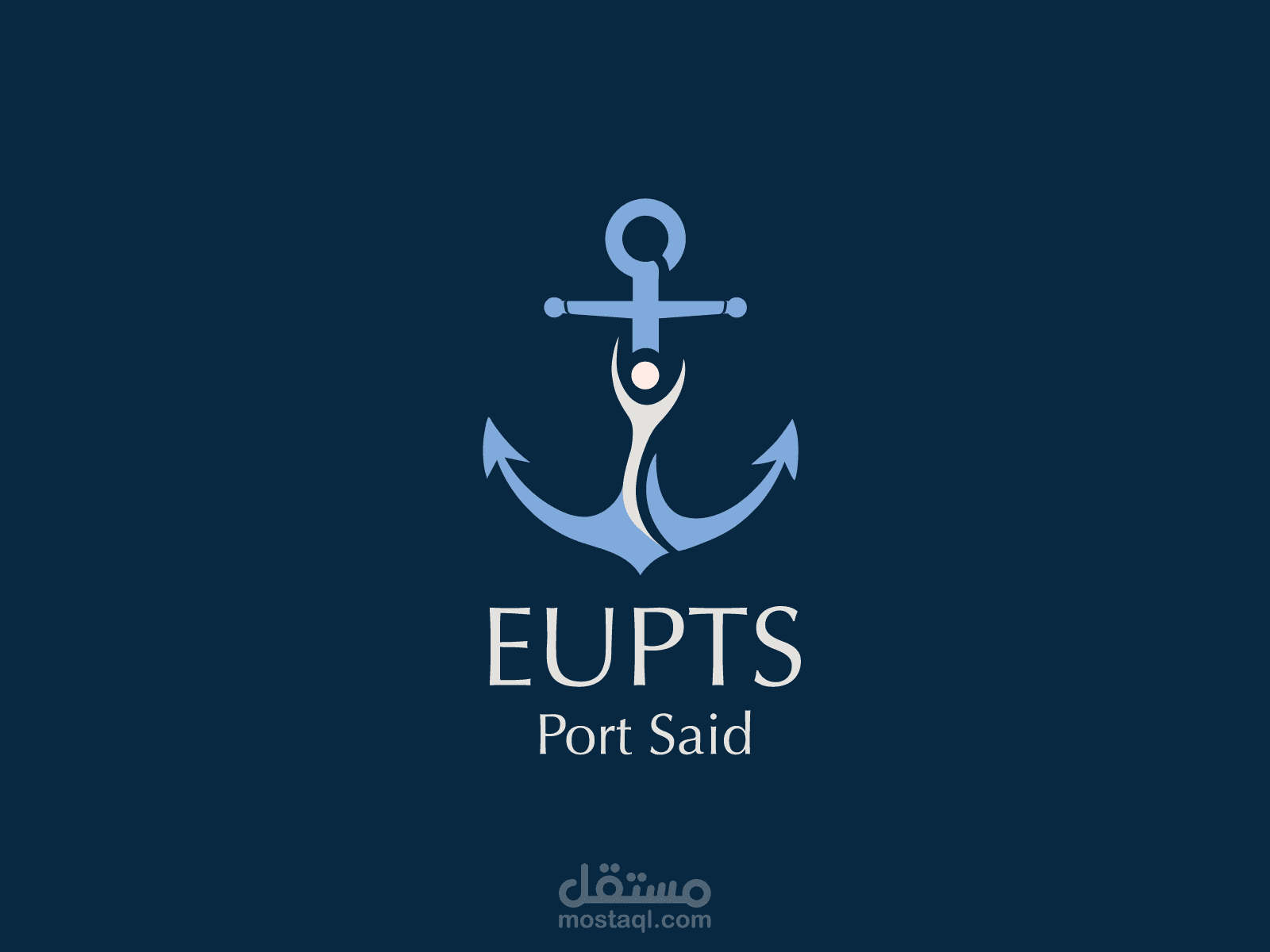
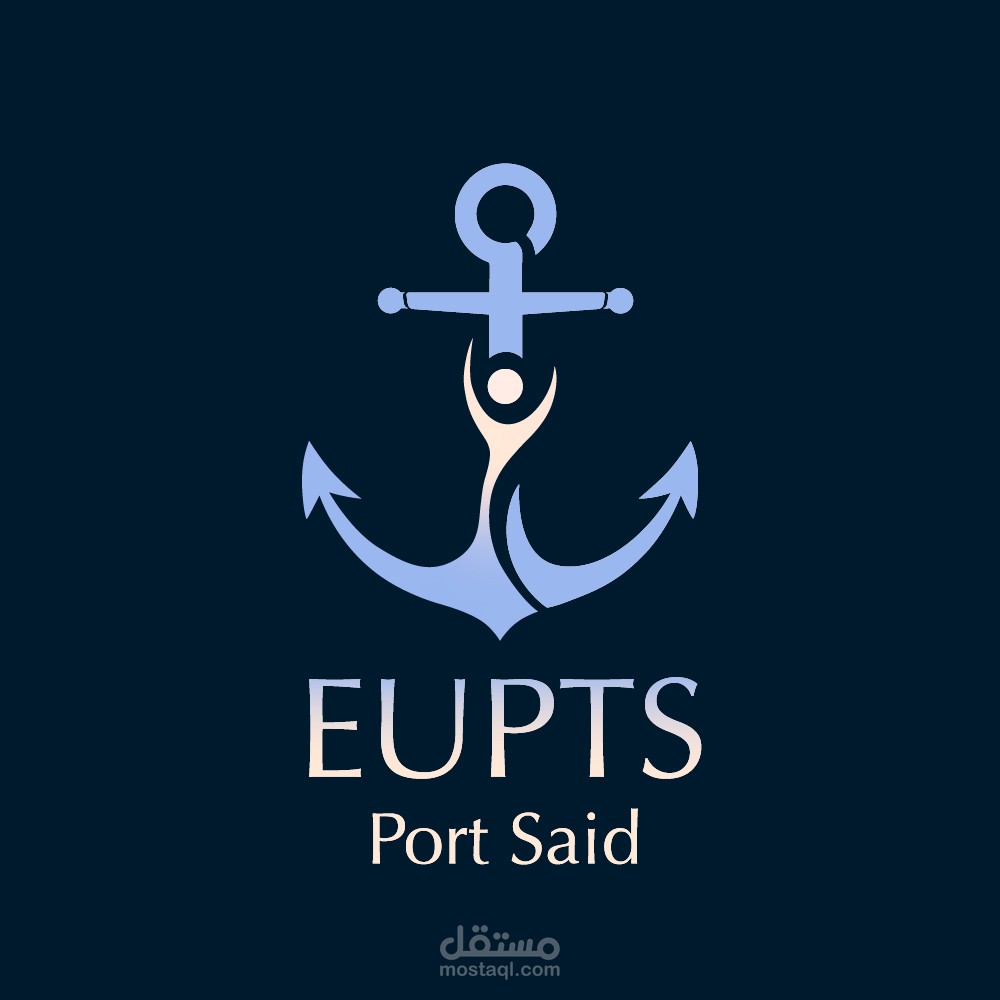
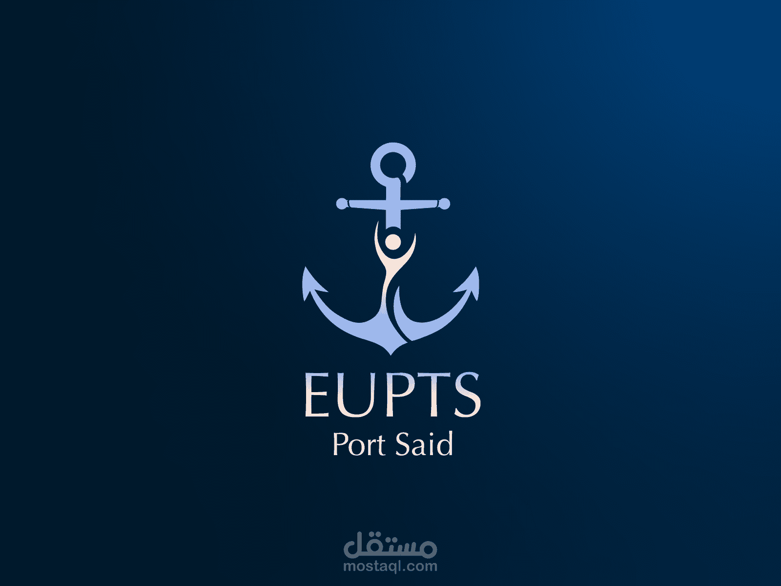
The final result is the outcome of an extensive design process. It wasn’t just about creating a mark, but about finding the perfect balance between two worlds. I spent a significant amount of time sketching and iterating—moving from complex concepts to this refined, minimalist execution. The challenge was to integrate the anchor, symbolizing Port Said’s maritime heritage, with a dynamic human figure, representing the vitality and movement central to physical therapy.
Color Strategy & Evolution
One of the most time-consuming yet rewarding phases was the color exploration. I experimented with numerous palettes to find shades that evoke trust, professionalism, and the sea.
The Palette: I eventually landed on a sophisticated blend of deep navy and sky blue, accented with a soft cream/skin tone.
Gradients: The transition of colors and the subtle gradients were meticulously crafted over time to ensure the logo has depth and feels modern, whether on screen or in print.
The project showcases the entire evolution—from the very first rough draft to the polished, final brand identity.