Interactive GDP vs Life Expectancy Dashboard using Python (Dash & Plotly)
تفاصيل العمل
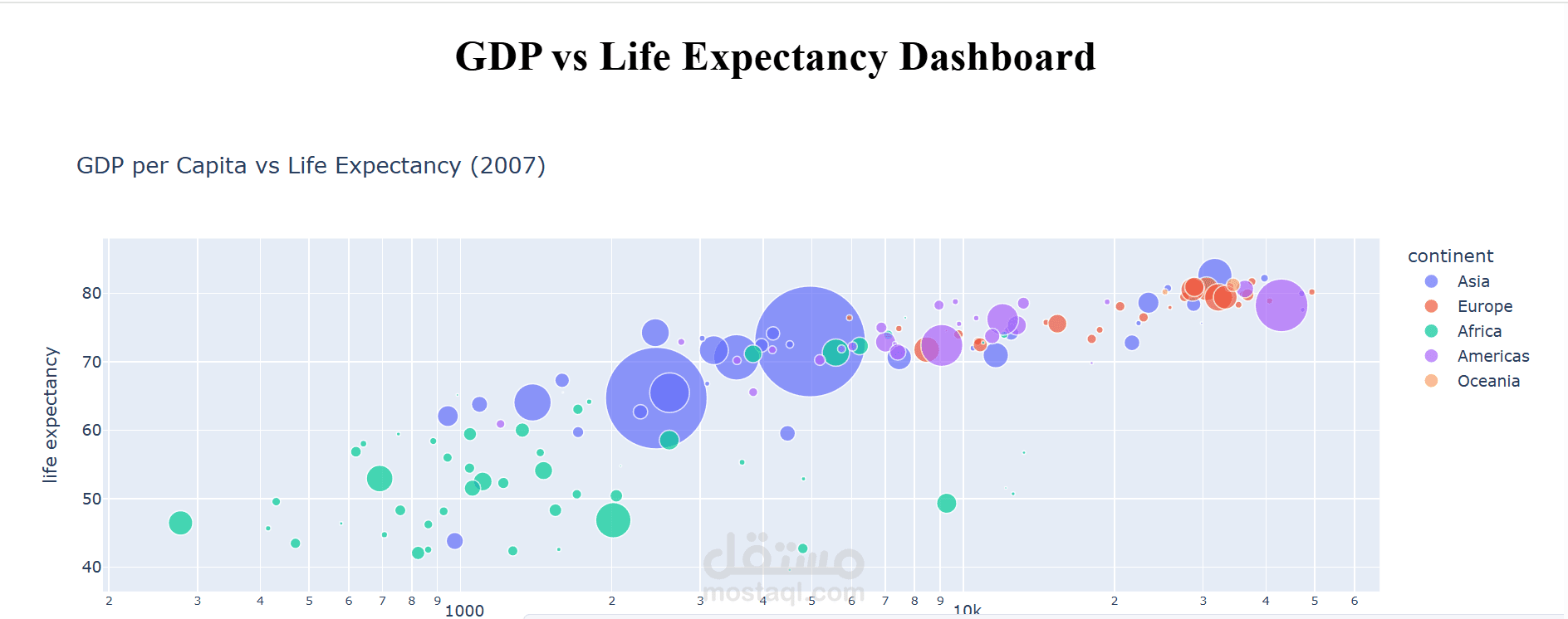
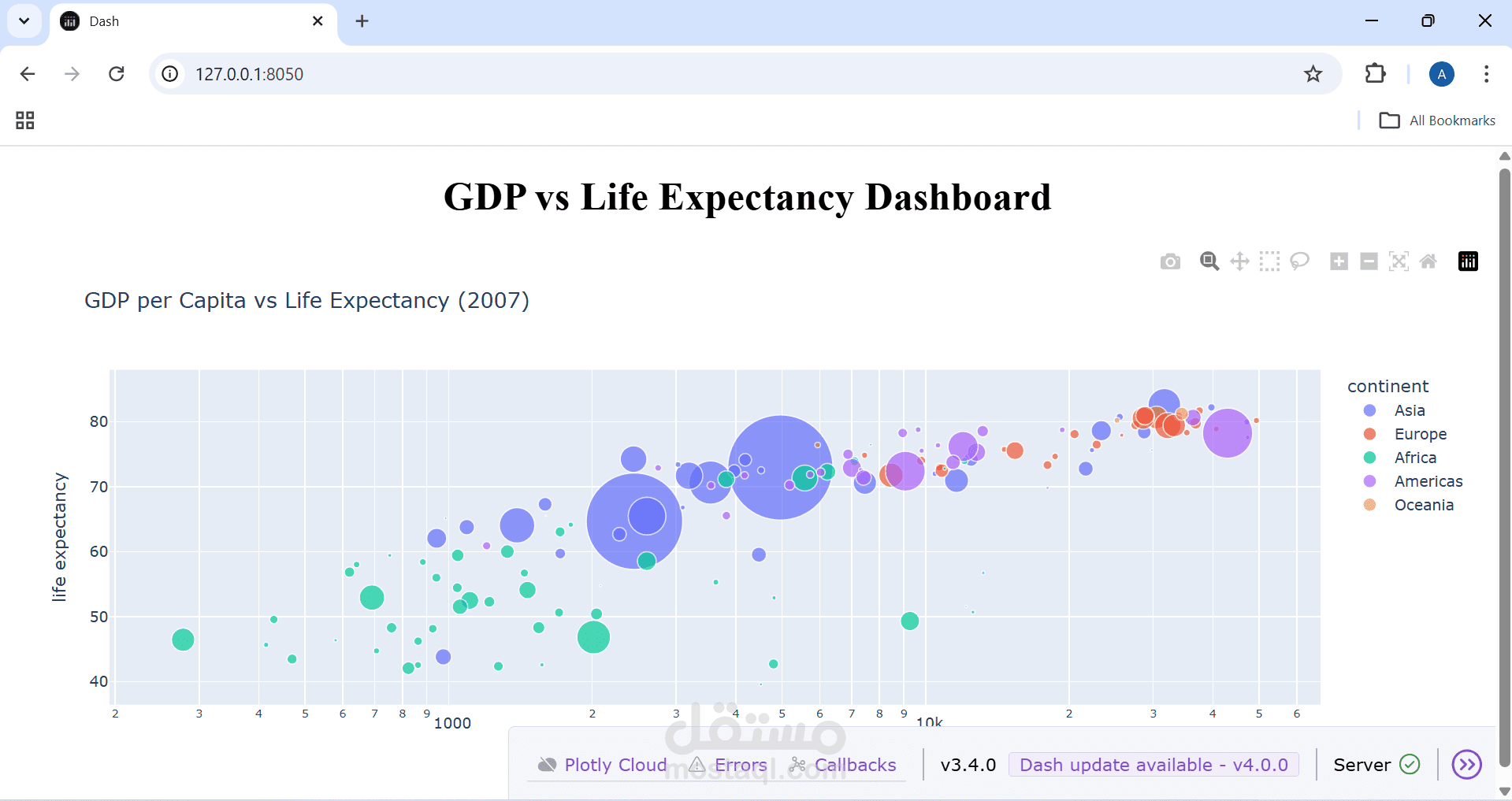
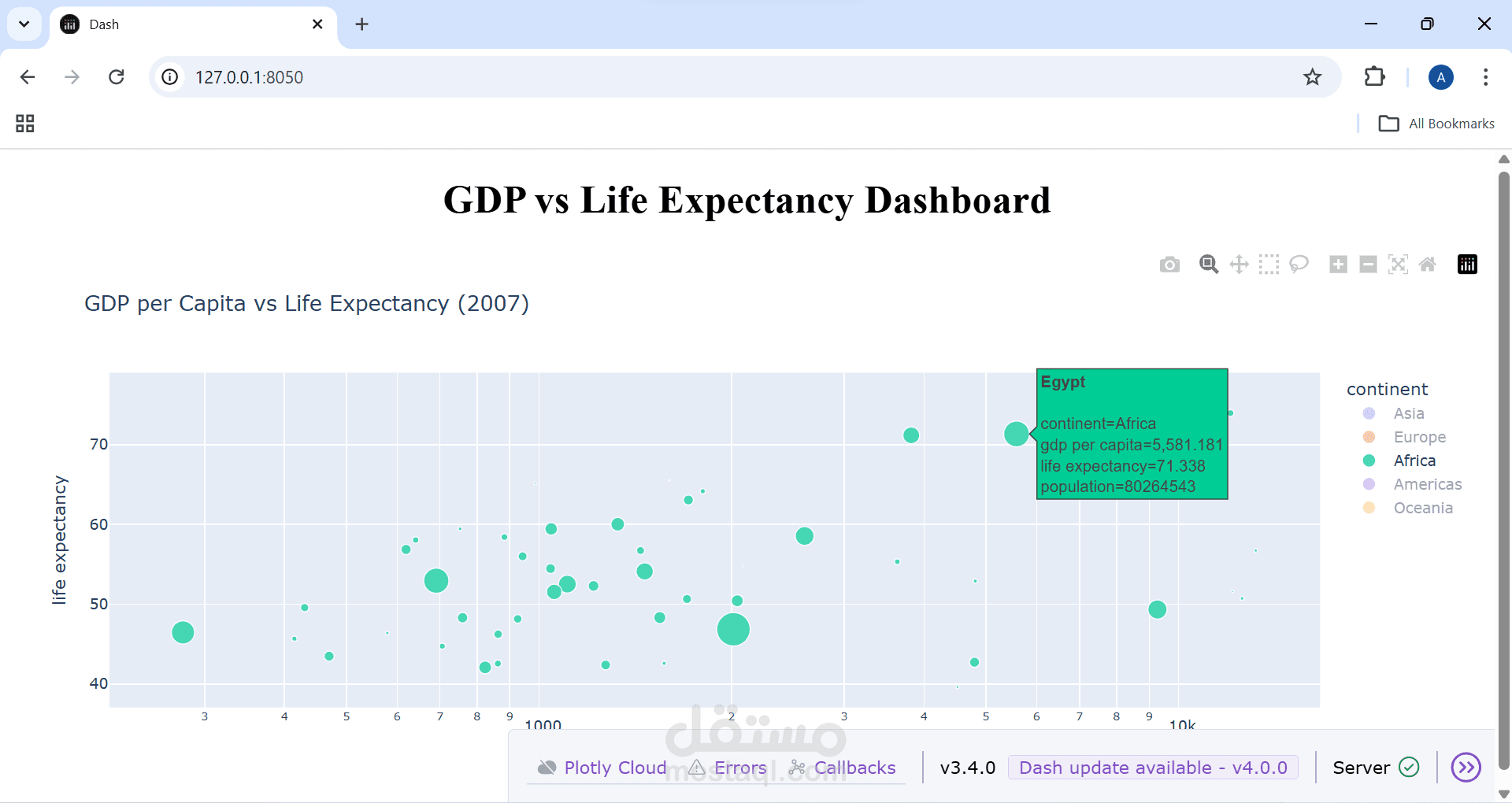
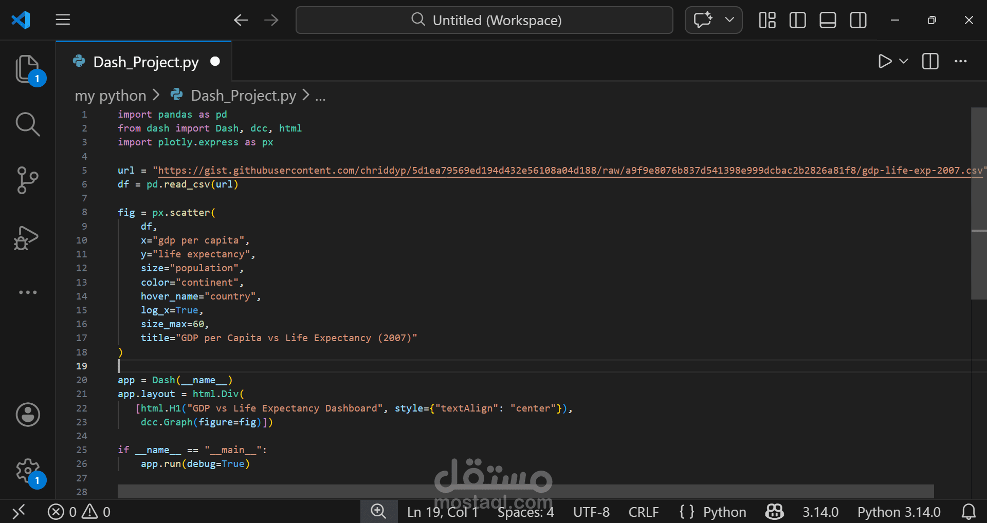
Developed an interactive data visualization dashboard using Python, Dash, and Plotly Express.
The dashboard analyzes the relationship between GDP per capita and life expectancy across countries in 2007.
Features include bubble size representing population, color segmentation by continent, and interactive hover details for each country.