TUC BISCUIT
تفاصيل العمل
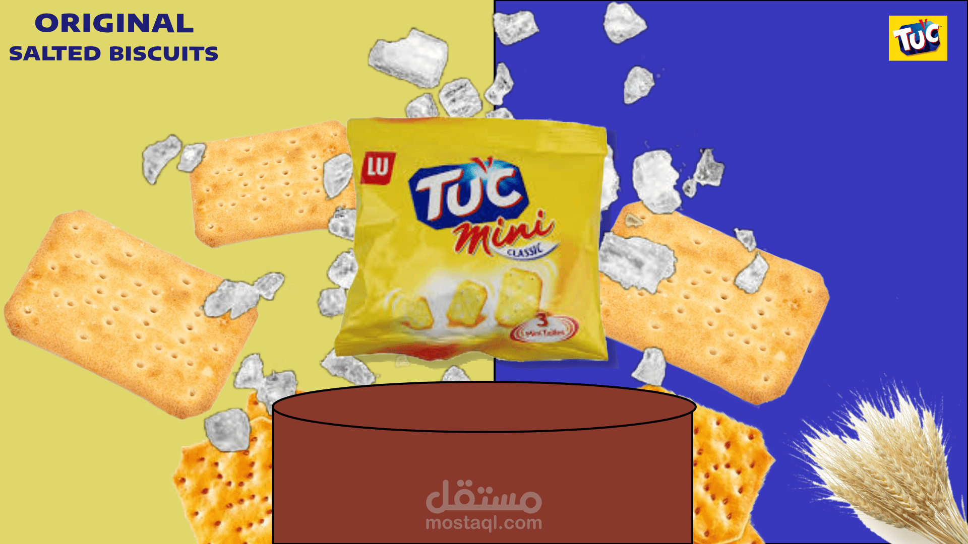
هذا العمل الإعلاني يقدّم منتج TUC Mini Original Salted Biscuits بأسلوب بصري جذّاب وحيوي. تم اعتماد تقسيم الخلفية إلى لونين متباينين (الأصفر والأزرق) لخلق توازن بصري قوي يعكس هوية العلامة التجارية ويشدّ انتباه المشاهد منذ النظرة الأولىوُضعت علبة المنتج في مركز التصميم لتكون نقطة التركيز الأساسية، محاطة بقطع البسكويت المتطايرة وحبيبات الملح، ما يعطي إحساسًا بالحركة والطزاجة ويبرز الطابع المقرمش والمملّح للمنتج. وجود سنبلة القمح يرمز إلى المكوّنات الطبيعية وجودة البسكويت.
القاعدة السفلية المرسومة تضيف عمقًا للتكوين وتدعم فكرة العرض، بينما يساهم التوزيع الديناميكي للعناصر في خلق مشهد إعلاني حديث ومناسب للحملات الرقمية أو المطبوعة.
العمل ككل يعكس هوية مرئية قوية، ويجمع بين البساطة، التباين اللوني، والحركة لإيصال رسالة المنتج بطريقة واضحة وجذابة.
This advertisement presents TUC Mini Original Salted Biscuits in a visually appealing and vibrant style. The background is divided into two contrasting colors (yellow and blue) to create a strong visual balance that reflects the brand identity and immediately captures the viewer's attention. The product's packaging is placed at the center of the design as the focal point, surrounded by floating biscuits and salt granules, conveying a sense of movement and freshness and highlighting the product's crunchy and salty character. The presence of a wheat stalk symbolizes the natural ingredients and quality of the biscuits.
The painted base adds depth to the composition and reinforces the concept, while the dynamic arrangement of elements contributes to a modern advertising scene suitable for both digital and print campaigns.
As a whole, the advertisement reflects a strong visual identity, combining simplicity, color contrast, and movement to deliver the product's message clearly and engagingly.