Topioptic: Minimalist Optical Brand Identity & Logo Design Project Overview
تفاصيل العمل

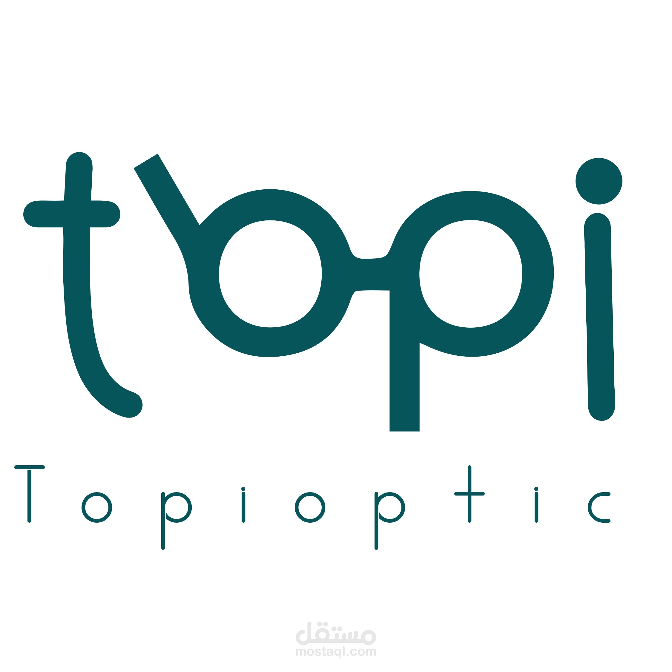

We were commissioned to create a fresh, modern, and highly conceptual brand identity for Topioptic, a new brand specializing in [Describe what Topioptic does—e.g., modern eyewear, optical care, etc.]. The core challenge was to design a unique and memorable logotype that cleverly integrates the product within the typography itself.
The Concept: Form Meets Function
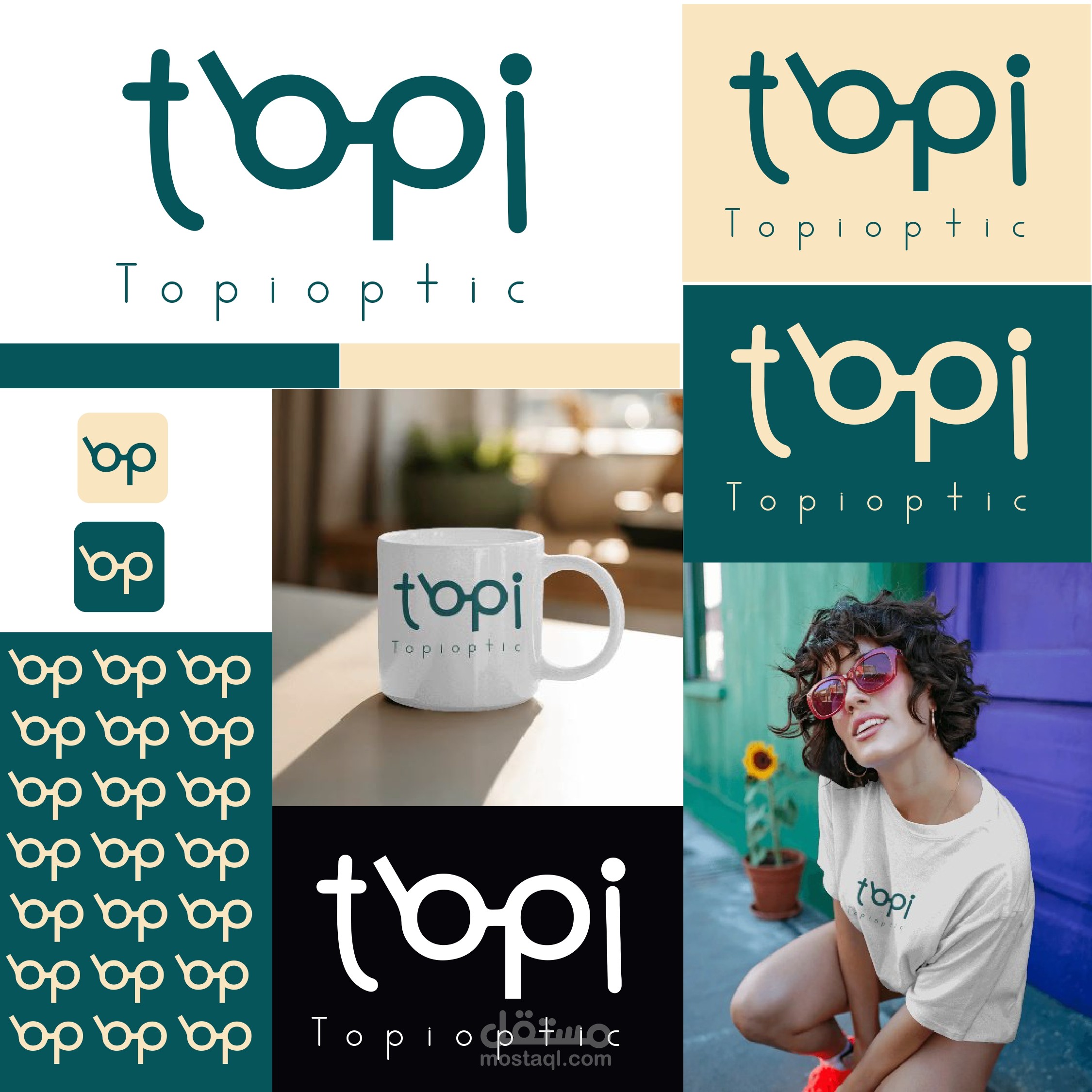
The final logotype is a testament to minimalist design and smart execution. The wordmark "Topi" has been subtly and playfully modified to represent a pair of glasses:
The letter 'p' and 'o' are connected and designed to mimic the exact shape of eyeglass lenses and the bridge connecting them.
The letters 't' and 'i' utilize smooth, rounded curves, giving the overall design a friendly, approachable, and contemporary feel.
The entire logotype retains excellent readability while simultaneously functioning as a strong visual icon.
Color Palette & Typography
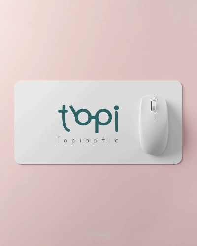
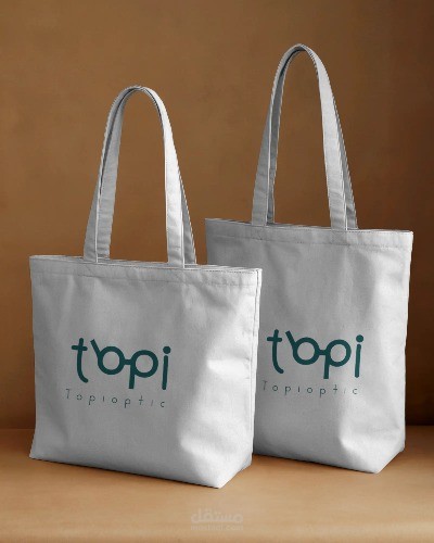
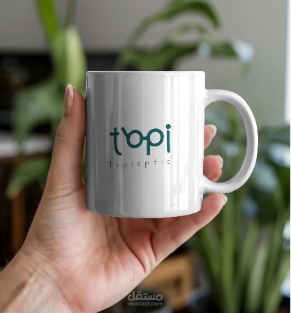
The logo utilizes a sophisticated, deep shade of Teal/Petrol Green , which conveys trust, professionalism, and calmness—qualities essential for an optical brand. The secondary wordmark, "Topioptic," is set in a simple, thin sans-serif font, providing a clean anchor that allows the primary logotype to stand out.
Key Project Outcomes
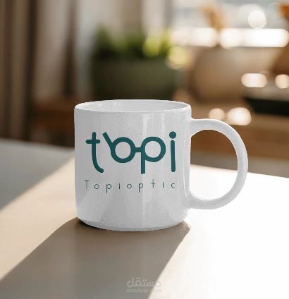
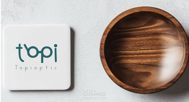
A versatile, scalable, and memorable logotype.
Successful integration of the product icon (glasses) within the brand name.
A premium and trustworthy aesthetic suitable for a modern retail brand.
#LogoDesign #Logotype #BrandIdentity #GraphicDesign
#OpticalDesign #EyewearBranding #GlassesLogo #Optics #MinimalistLogo #MinimalDesign #ConceptualDesign #ModernBranding #VectorArt #AdobeIllustrator #CreativeProcess #DesignInspiration #TealLogo #DeepGreen #ColorPalette .