student academic performance dashboard
تفاصيل العمل
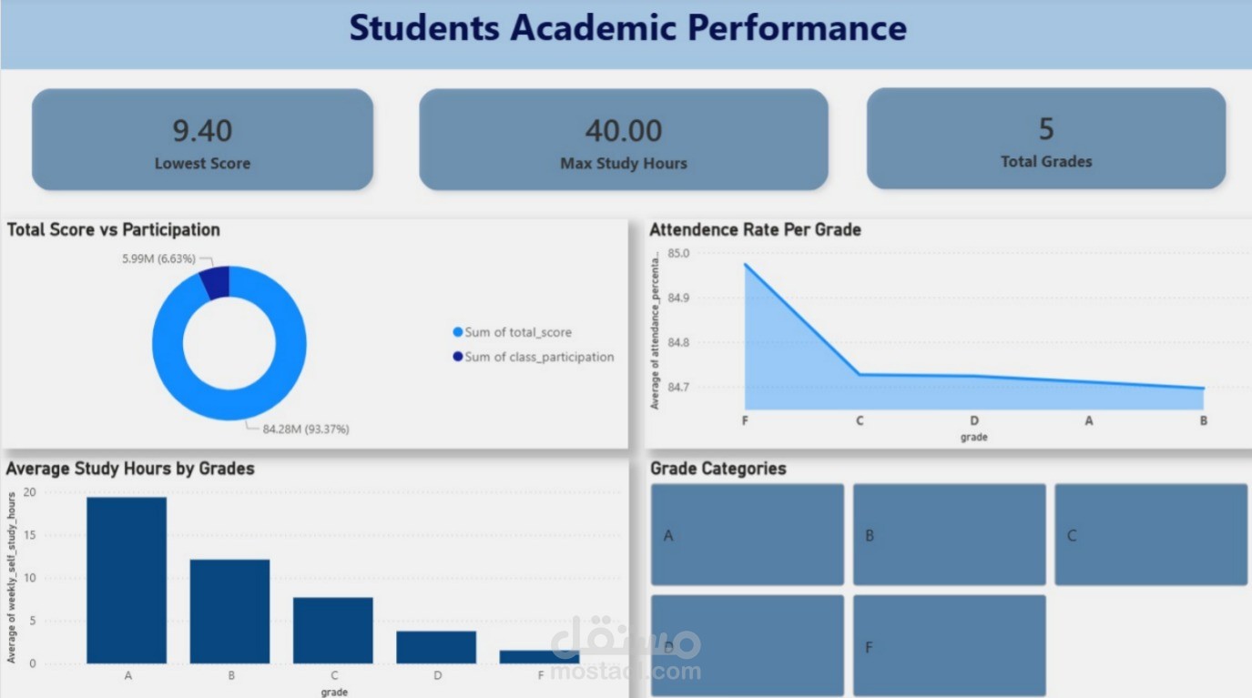
This is a task I worked on during my DEPI(Digital Egypt Pioneers Initiative - DEPI) training. I used Power BI to visualize student performance data and practice creating an interactive dashboard.
Key observations from the visual:
Attendance Insight: Looking at the "Attendance Rate Per Grade" chart, it's interesting to note that the F category actually has the highest average attendance, while the B category has the lowest.
Study vs. Grades: The "Average Study Hours by Grades" bar chart clearly shows a direct correlation: students with A and B grades have significantly higher self-study hours compared to others.
Layout Practice: Used this task to practice organizing KPI cards like "Max Study Hours" and "Lowest Score" alongside the new slicer design.