KPI Analysis
تفاصيل العمل
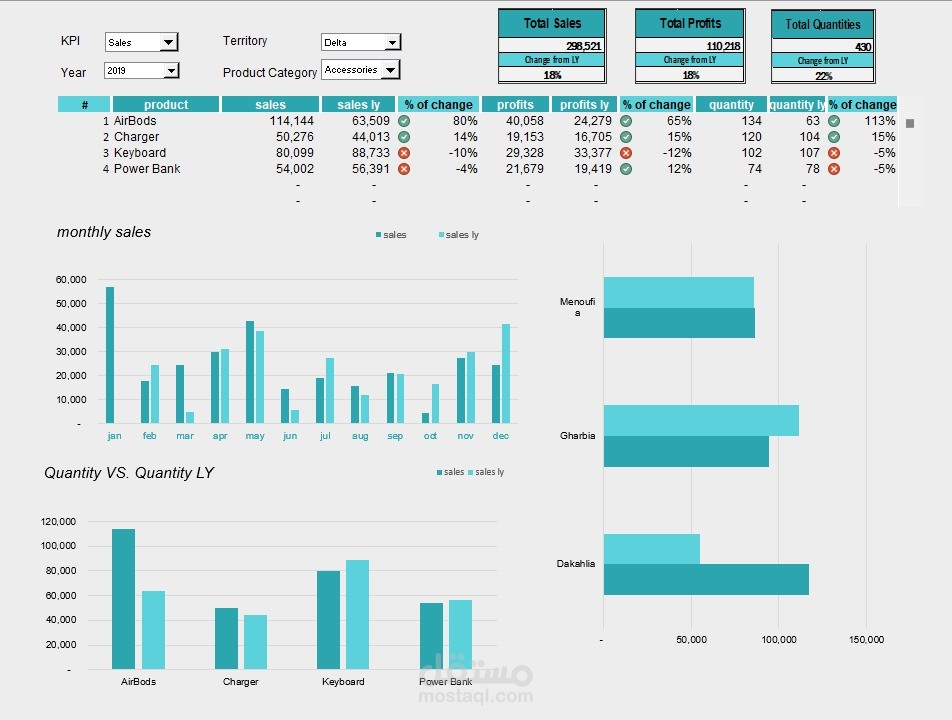
Second Dashboard Project – KPI Analysis
This is my second project out of 4 in the Data Analysis Diploma from El-Araby E-learning.
The challenge here was to move from simple visuals to a fully interactive KPI dashboard:
? Built 4 combo boxes to switch dynamically between:
KPI (Sales / Quantity / Profit)
Territories
Current year vs. Previous year
Product categories
? Added a scroll bar to browse products directly from the selected category.
? Designed two column charts:
One for months
One for products (fully dynamic, with no empty spaces thanks to the OFFSET function).
? For the territory chart, I added sorting logic using the LARGE function — so performance is ranked automatically.
? Added KPI cards at the top to give a quick snapshot of performance before diving into details.
? The result: A dashboard that doesn’t just show numbers, but tells the story of performance across regions, products, and time.