Sallah Call Center Performance Overview Dashboard
تفاصيل العمل
نظرة عامة على التحليل
تمثل هذه الداشبورد الملخص التنفيذي للمشروع بأكمله، وهي مصممة لتزويد الإدارة العليا وصناع القرار برؤية سريعة وشاملة على صحة أداء مركز الاتصالات.
الهدف من هذه الواجهة هو:
تلخيص أهم مؤشرات الأداء الرئيسية (KPIs) في مكان واحد.
السماح بتقييم الأداء العام في ثوانٍ.
تحديد الاتجاهات الشهرية ومقارنة الأداء الفعلي بالأهداف المتوقعة دون الحاجة للغوص في التفاصيل المعقدة.
التحدي: غياب الرؤية الموحدة والشاملة
كان التحدي الأكبر هو تشتت البيانات وعدم وجود مصدر واحد وموثوق للحقيقة.
المشاكل الأساسية كانت:
إعداد التقارير كان يستغرق وقتًا طويلًا، وعندما تصل تكون قيمتها الآنية منخفضة.
غياب أداة مركزية للإجابة الفورية على أسئلة العمل:
ما هو حجم المكالمات المستقبلة؟
هل نلبي هذا الحجم؟
ما مدى جودة الخدمة المقدمة؟
هل تخطيط الموارد متوافق مع الواقع؟
الحل: لوحة معلومات تنفيذية متكاملة
تم تصميم الداشبورد لتكون برج المراقبة للمركز، حيث تجمع أهم المقاييس التشغيلية في واجهة بصرية متماسكة وسهلة الفهم:
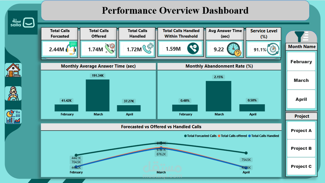
مؤشرات الأداء الرئيسية الفورية (Instant KPIs)
صف من البطاقات في الأعلى لعرض أهم الأرقام:
إجمالي المكالمات المتوقعة، والمستقبلة، والمكالمات التي تم التعامل معها.
مقاييس الجودة والكفاءة مثل متوسط وقت المحادثة ومستوى الخدمة (Service Level).
تحليل الاتجاهات الشهرية (Monthly Trend Analysis)
رسوم بيانية شريطية لمراقبة التغيرات في المقاييس الرئيسية مثل:
وقت المحادثة
معدل التخلي عن المكالمات
تساعد في تحديد أي تدهور أو تحسن في الأداء بمرور الوقت.
مقارنة الأداء بالتخطيط (Performance vs. Planning)
رسم بياني خطي متعدد المحاور لمقارنة:
المكالمات المتوقعة (Forecasted)
المكالمات الفعلية (Offered)
المكالمات التي تم التعامل معها (Handled)
أداة قوية لكشف الفجوة بين التخطيط والواقع.
النتائج الرئيسية والرؤى القابلة للتنفيذ
تحديد شهر مارس كنقطة حرجة
أعلى معدل للتخلي عن المكالمات (2.15%) وأعلى متوسط لوقت المحادثة.
مكن الإدارة من تركيز تحقيقاتها على هذا الشهر لفهم الأسباب الجذرية.
كشف فجوة خطيرة بين التخطيط والواقع
الرسم البياني الخطي أظهر فجوة كبيرة بين حجم المكالمات المتوقعة والفعلية.
اكتشاف أن نموذج التنبؤ يبالغ في تقدير حجم العمل → يؤدي إلى عدم كفاءة توزيع الموارد وتكاليف تشغيلية أعلى.
تقييم شامل للكفاءة والجودة
عرض Avg Answer Time (9.22 ثانية) بجانب Service Level (91.1%).
أوضح أن المركز فعال في الرد السريع لكنه يواجه تحديات في التعامل مع جميع المكالمات → فتح نقاش حول التوازن بين السرعة والجودة والقدرة الاستيعابية.
الخلاصة:
هذه الداشبورد لم تعد مجرد أداة لعرض البيانات، بل أصبحت نقطة انطلاق للنقاشات الاستراتيجية، مكنت الإدارة من:
تحديد المشاكل بسرعة
تقييم فعالية الخطط
اتخاذ قرارات مستنيرة مبنية على رؤى واضحة وموثوقة
Project Overview
This dashboard serves as the executive summary for the entire project, designed to provide senior management and decision-makers with a quick, comprehensive overview of the call center's health.
The objective of this interface is to:
Consolidate the most critical Key Performance Indicators (KPIs) in one place.
Allow an at-a-glance assessment of overall performance.
Identify monthly trends.
Compare actual performance against forecasted goals without delving into complex details.
The Challenge: Lack of a Unified, Holistic View
The biggest challenge was fragmented data and the absence of a single, reliable source of truth.
Key issues included:
Reports were time-consuming to prepare and often outdated by the time they were delivered.
Management needed a central tool to answer fundamental business questions instantly:
What is our incoming call volume?
Are we meeting this demand?
How good is the quality of our service?
Does resource planning align with reality?
My Solution: An Integrated Executive Dashboard
This dashboard functions as the "control tower" for the call center, combining critical operational metrics into a cohesive and easy-to-understand visual interface:
Instant KPIs
A row of cards at the top displays the most critical aggregate numbers:
Total Forecasted, Offered, and Handled Calls
Quality and efficiency metrics like Average Answer Time and Service Level
Monthly Trend Analysis
Bar charts monitor changes in key metrics (e.g., answer time, abandonment rate) on a monthly basis.
Enables identification of performance degradation or improvement over time.
Performance vs. Planning Comparison
Multi-axis line chart compares:
Forecasted calls
Actual offered calls
Handled calls
This visual is the most powerful tool for exposing gaps between planning and reality.
Key Findings & Actionable Insights
Identifying March as a Critical Pressure Point
March had the highest abandonment rate (2.15%) and the longest average answer times.
Enabled management to focus investigations on this month to determine root causes.
Exposing a Serious Gap Between Planning and Reality
Line chart revealed a consistent gap between forecasted call volume and actual offered volume.
Forecasting model substantially overestimated workload, leading to inefficient resource allocation and higher operational costs.
A Holistic Assessment of Efficiency and Quality
Displaying Avg Answer Time (9.22 sec) alongside Service Level (91.1%) provided the full picture.
The center is efficient in answering calls quickly but faces challenges in handling all calls (as seen in March’s abandonment rate).
Opens discussion on balancing speed, quality, and capacity.
Conclusion:
This dashboard has evolved from a simple data presentation tool into a strategic decision-making hub, enabling management to:
Quickly identify problems
Evaluate the effectiveness of plans
Make informed, data-driven decisions based on clear and reliable insights