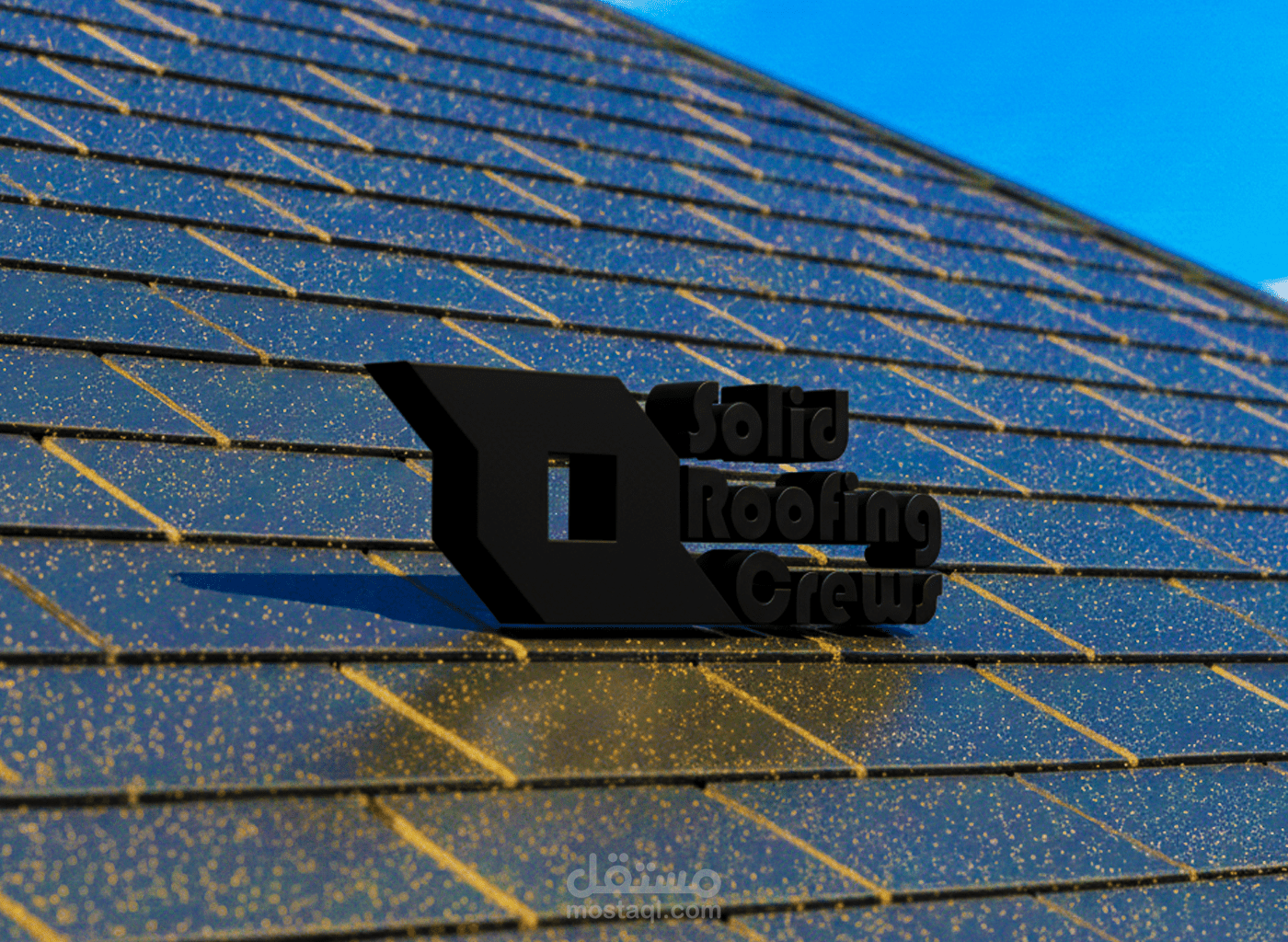
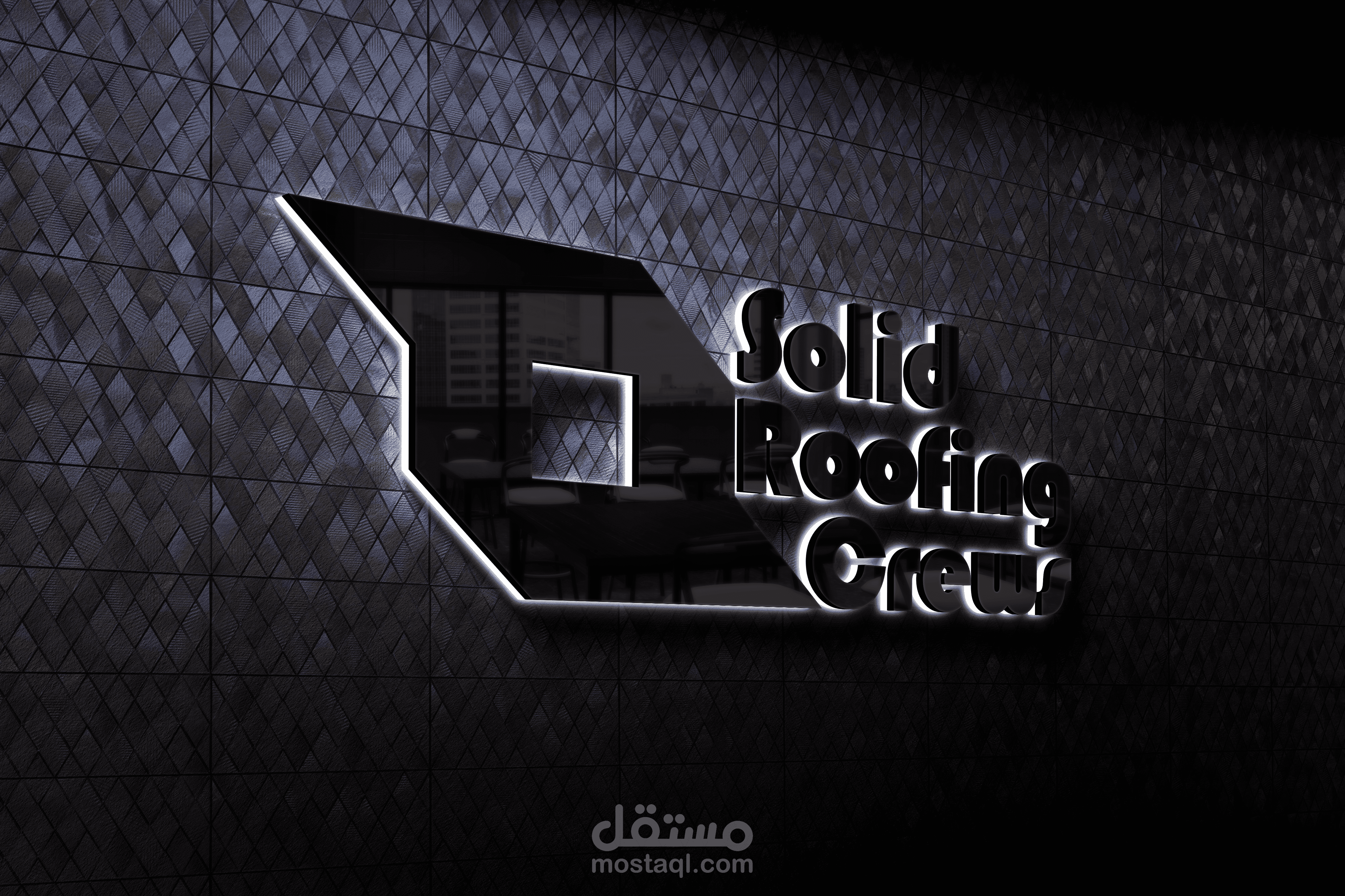
logo, Solid Roofing Crews
تفاصيل العمل

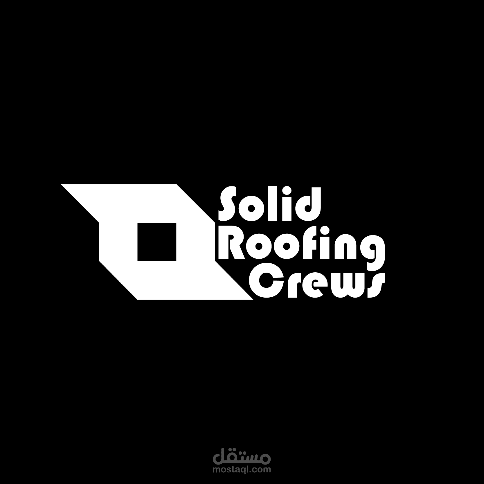
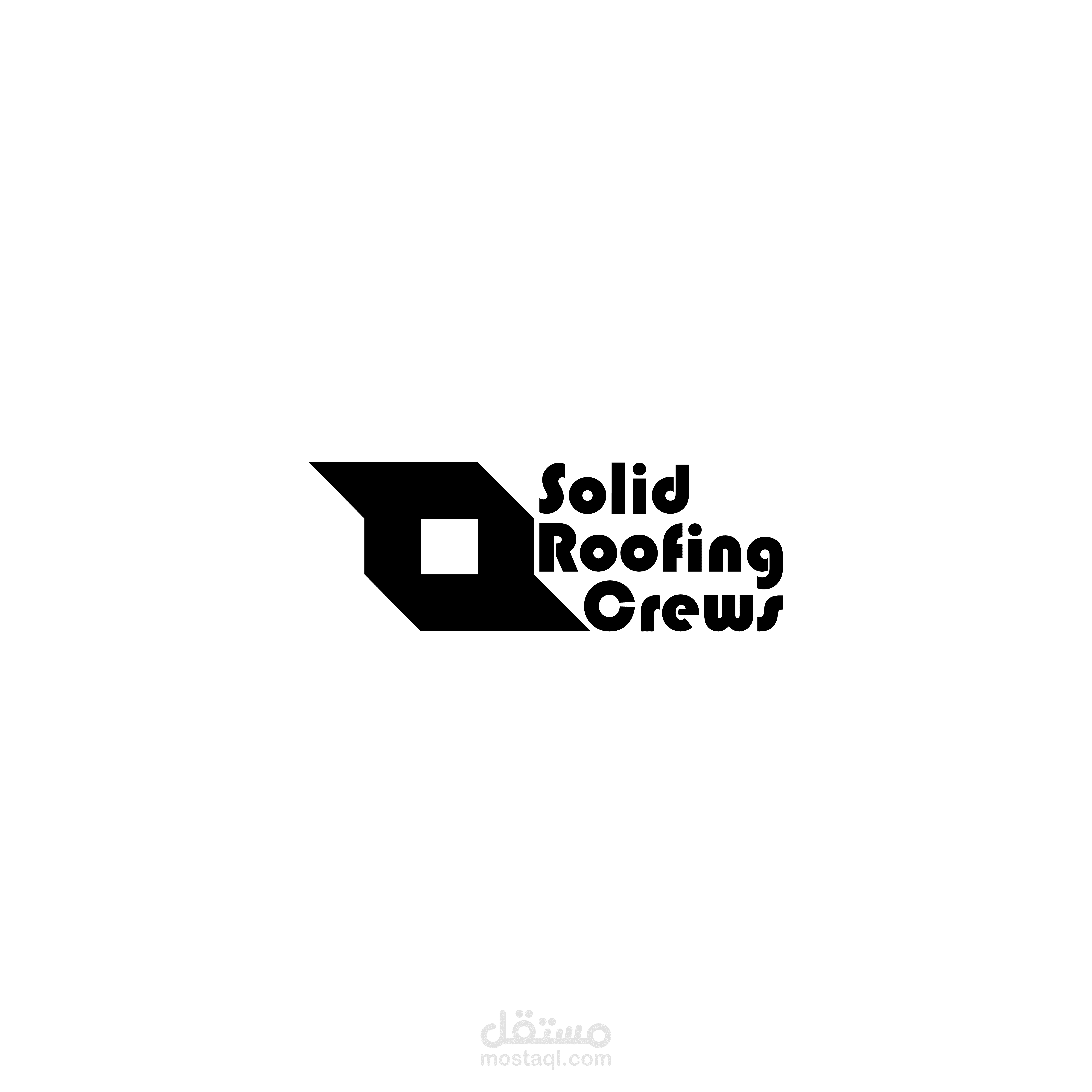
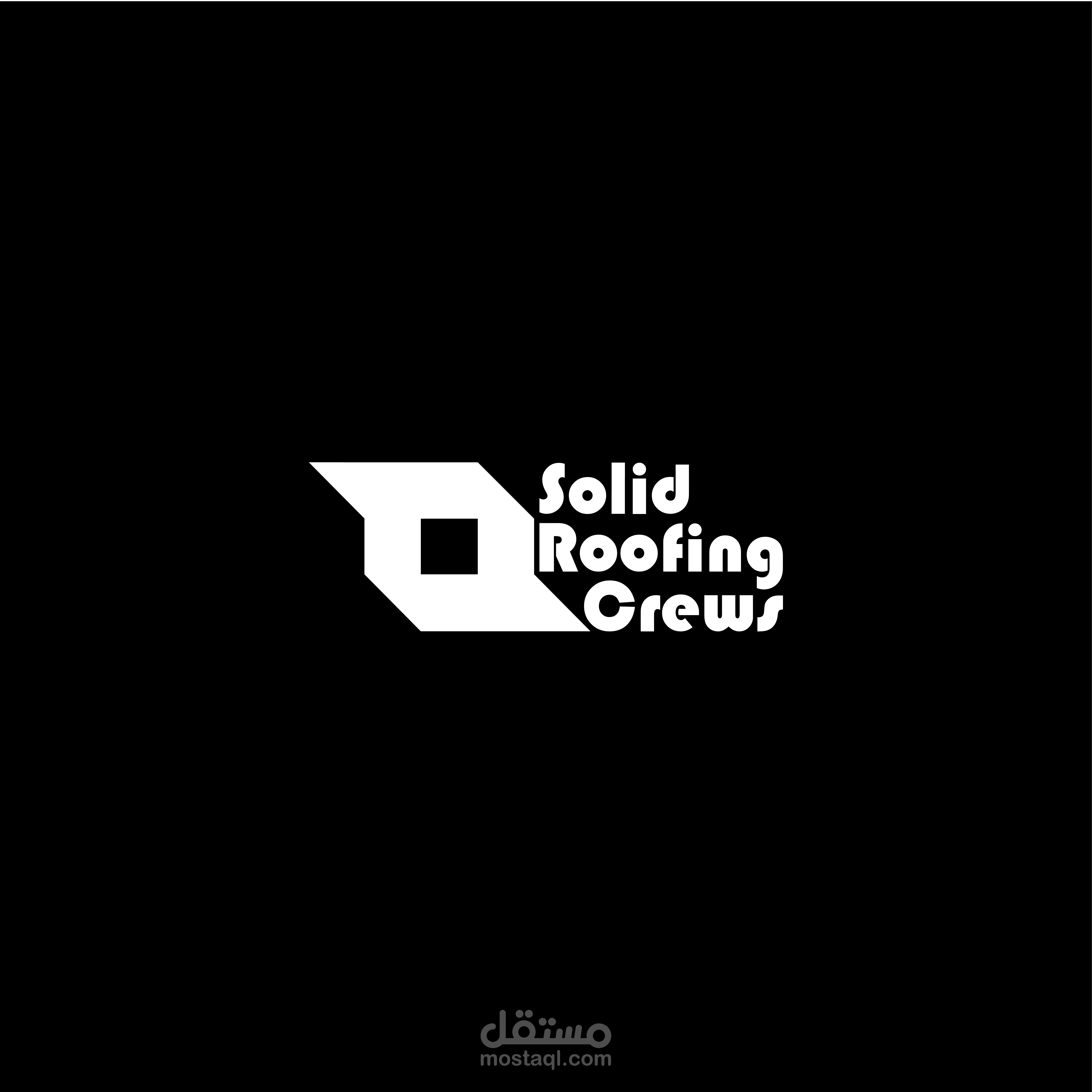
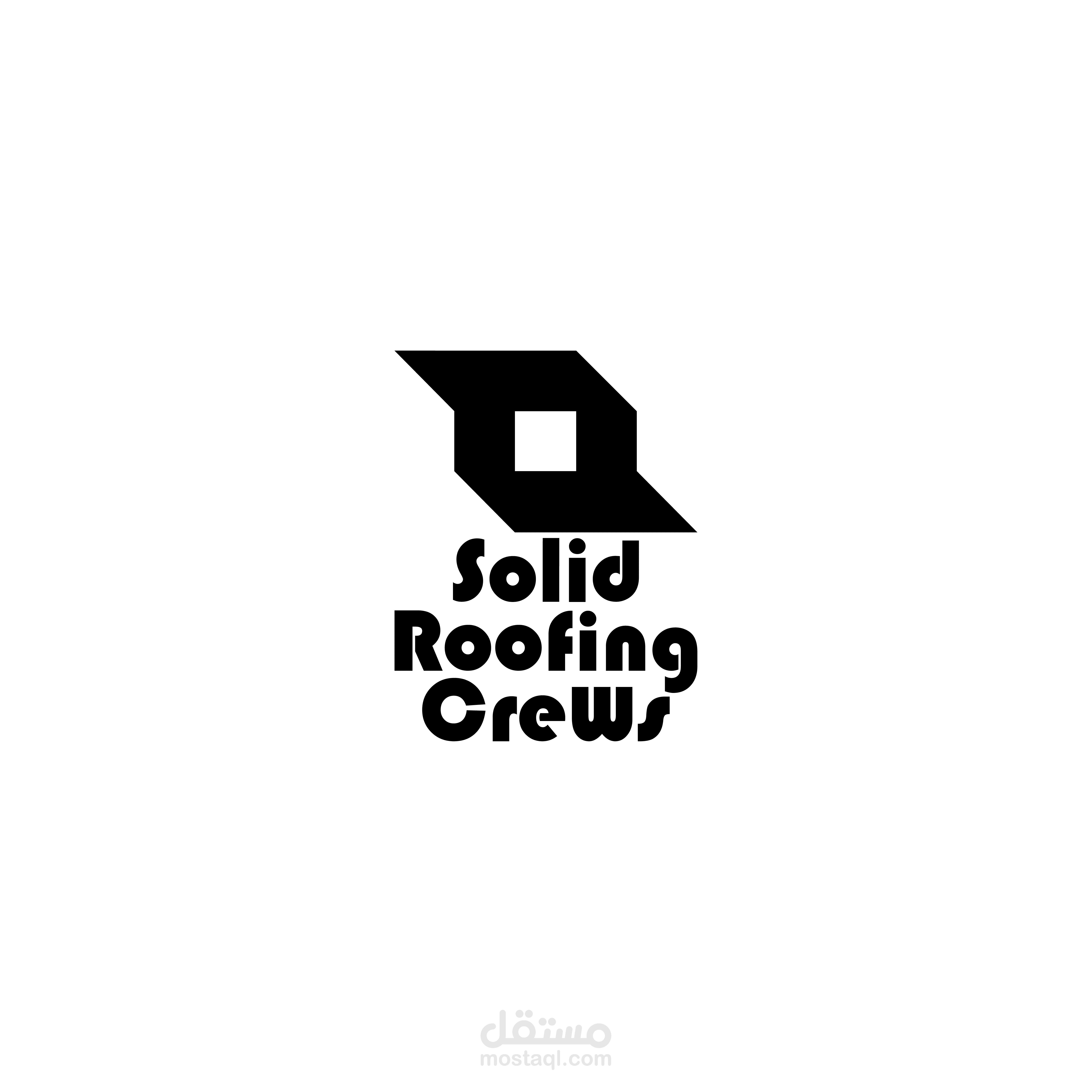
Brand Impression
The overall impression is one of boldness and efficiency. It avoids the "clutter" often seen in construction logos (like literal hammers or house outlines) in favor of a modern, professional identity that feels established and "solid."
Here is a breakdown of the design elements:
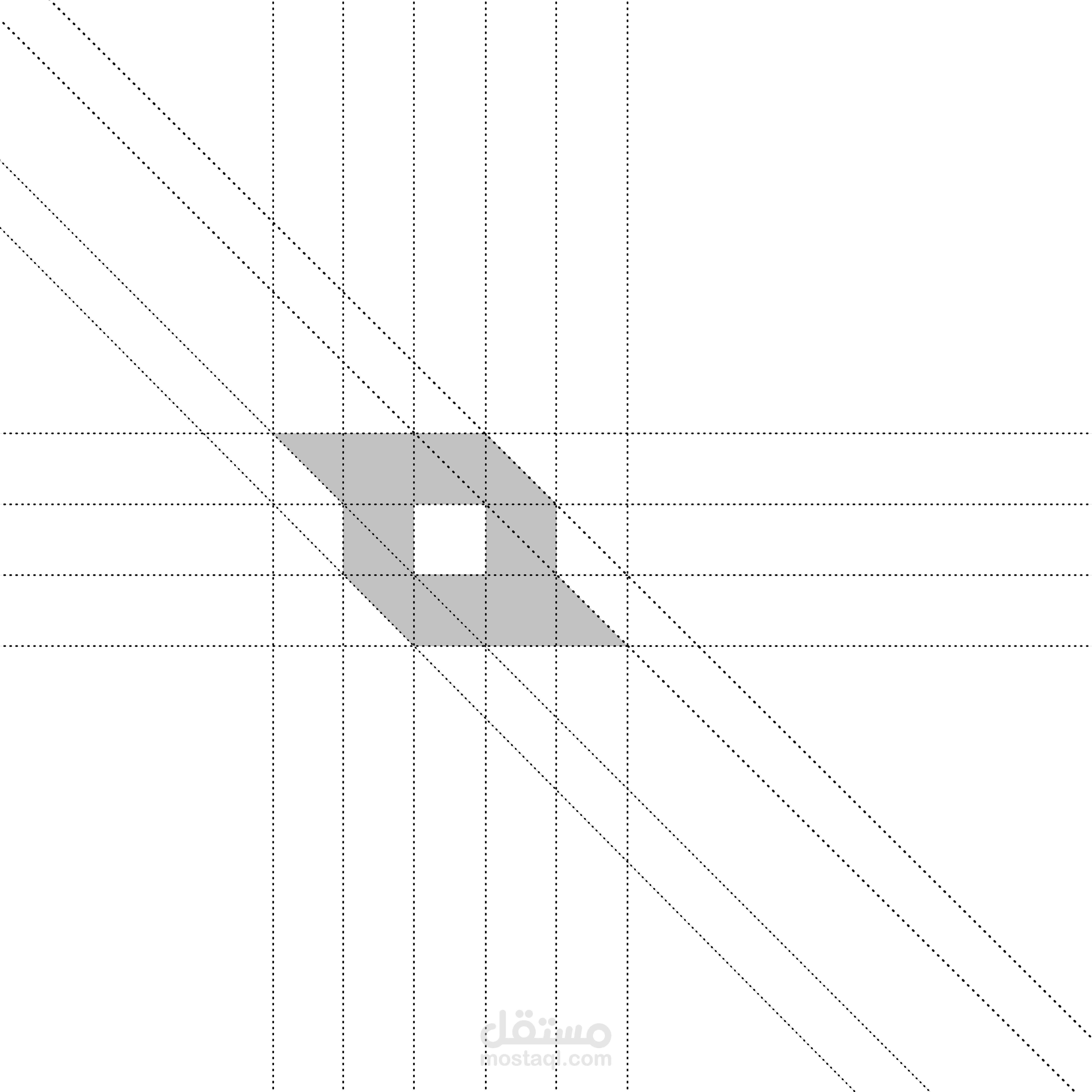
1. The Abstract Logomark
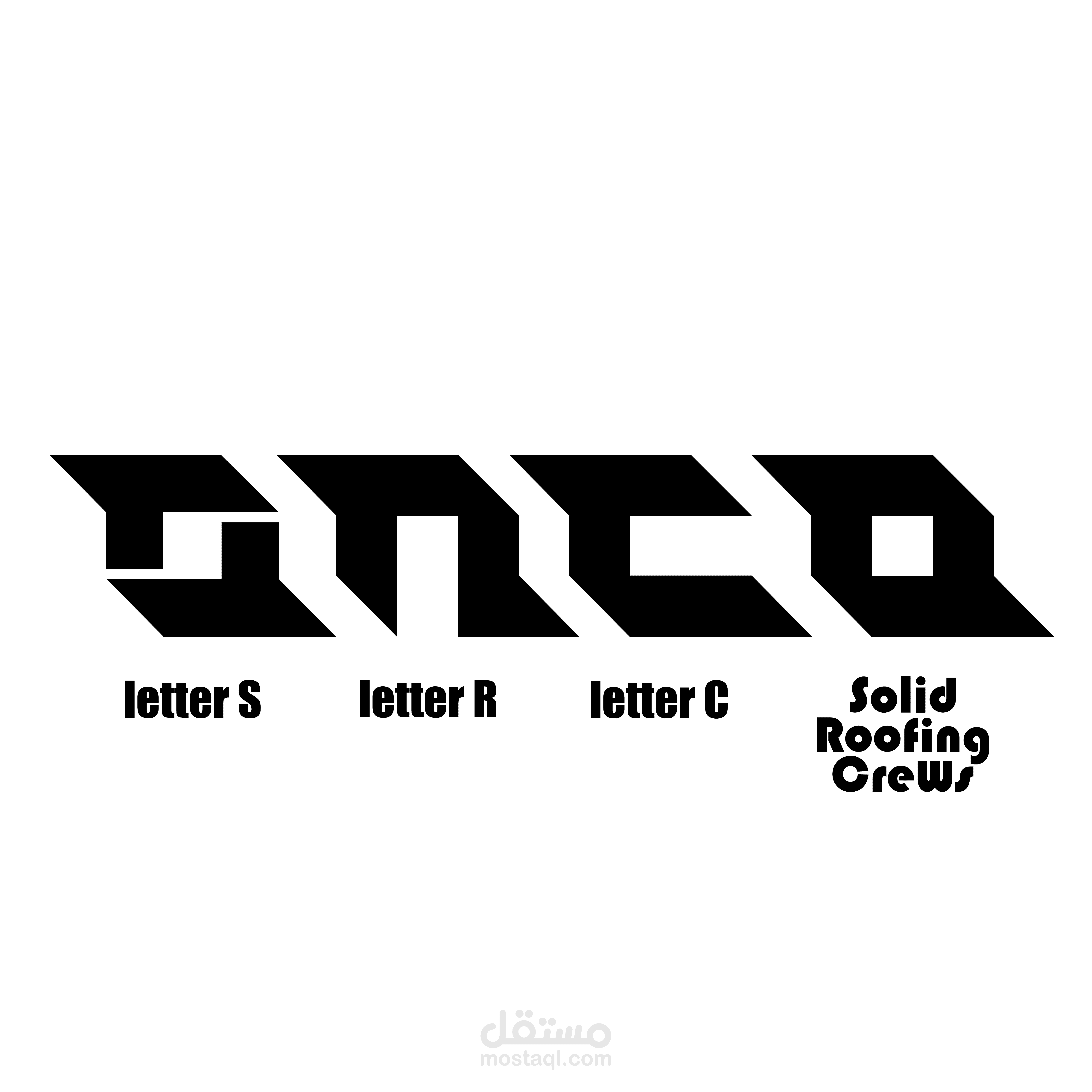
Geometric Construction: The icon to the left is an abstract, angular shape composed of thick black blocks with a central square cutout.
Visual Metaphor: The sharp, diagonal lines evoke the silhouette of a slanted roofline or a structural joint. The "S" shape formed by the negative space/angles subtly nods to the first letter of "Solid."
Weight: The heavy black fills give the mark a sense of sturdiness and reliability, which aligns perfectly with the construction and roofing industry.
2. Typography
Font Style: The text uses a heavy, rounded display typeface. The thick strokes make the name highly legible even from a distance (important for truck wraps or job site signs).
Character Details: The font has unique "retro-modern" touches, such as the circular cutouts in the lowercase "o," "d," and "e." These circular negative spaces contrast nicely with the sharp angles of the logomark.
Alignment: The text is stacked in three levels ("Solid," "Roofing," "Crews"), creating a compact rectangular block that balances the visual weight of the icon.
3. Composition & Aesthetic
Balance: The logo uses a horizontal layout where the icon and text are of similar height, creating a balanced, professional "lockup."
Negative Space: The use of white space within the black icon (the central square) and within the letters creates a cohesive visual rhythm throughout the piece.
Versatility: Because it is a flat, two-dimensional black-and-white design, this logo is highly functional. It will work perfectly for embroidery on hats, vinyl decals on vehicles, or stencils on equipment.