Graphic Designer & Facebook and Social Media Posts Designer
تفاصيل العمل
1. Visual Symbol (The Core Emblem)
The logo utilizes a circular frame divided into two purposeful sections to represent the brand's mission:
The Upper Half (Orange): Features a minimalist fork icon, which directly identifies the brand with food, dining, and the "Bite" portion of the name.
The Lower Half (Green): Contains a stylized leaf icon, symbolizing "Green" values such as freshness, natural ingredients, and health.
Circular Flow: The way the two segments wrap around one another creates a sense of harmony and a complete "farm-to-fork" cycle.
2. Typography & Wordmark
Integrated Graphics: In the primary wordmark, the letters "G" and "B" are creatively modified to include a small leaf and fork icon, respectively, reinforcing the brand identity even within the text.
Font Styles: The branding uses a modern, rounded font for clarity, while marketing materials (like the Facebook cover) use a casual handwritten script for "Green Bite" to evoke a friendly, personalized feel.
3. Color Palette & Psychology
Vibrant Green: This is the primary color, used to represent nature, organic growth, health, and vitality.
Energetic Orange: Used strategically to stimulate appetite and add a sense of energy and friendliness to the brand.
Versatility: The design is proven to work in multiple formats, including full color, monochrome black, and reversed white for dark backgrounds.
4. Marketing & Social Media Application
The promotional materials demonstrate how the visual identity translates into customer-facing content:
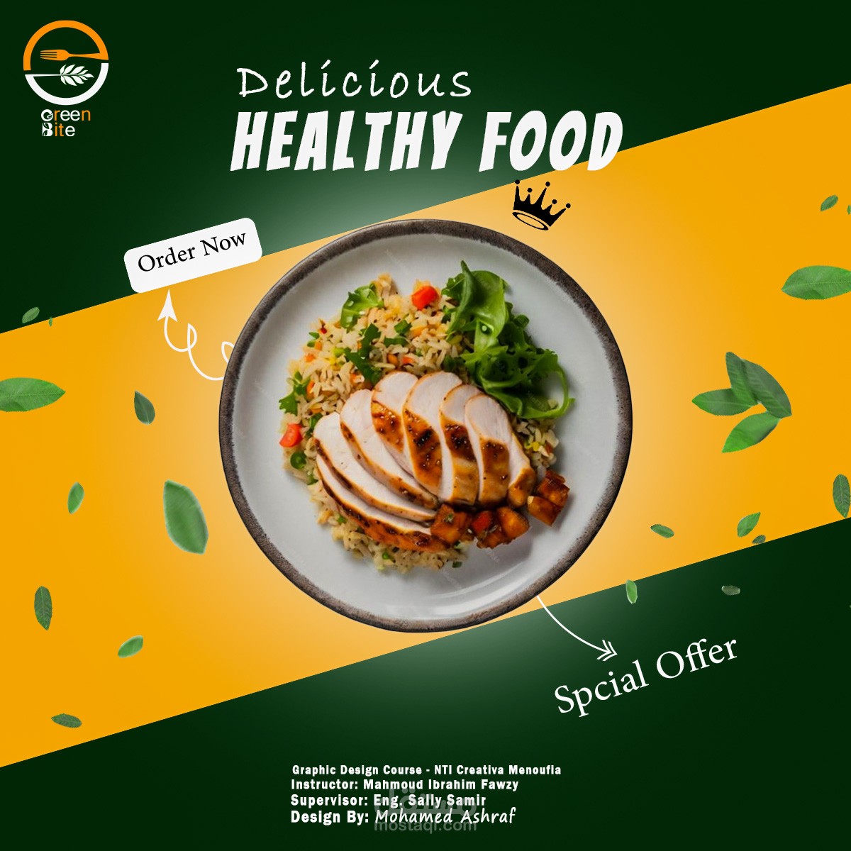
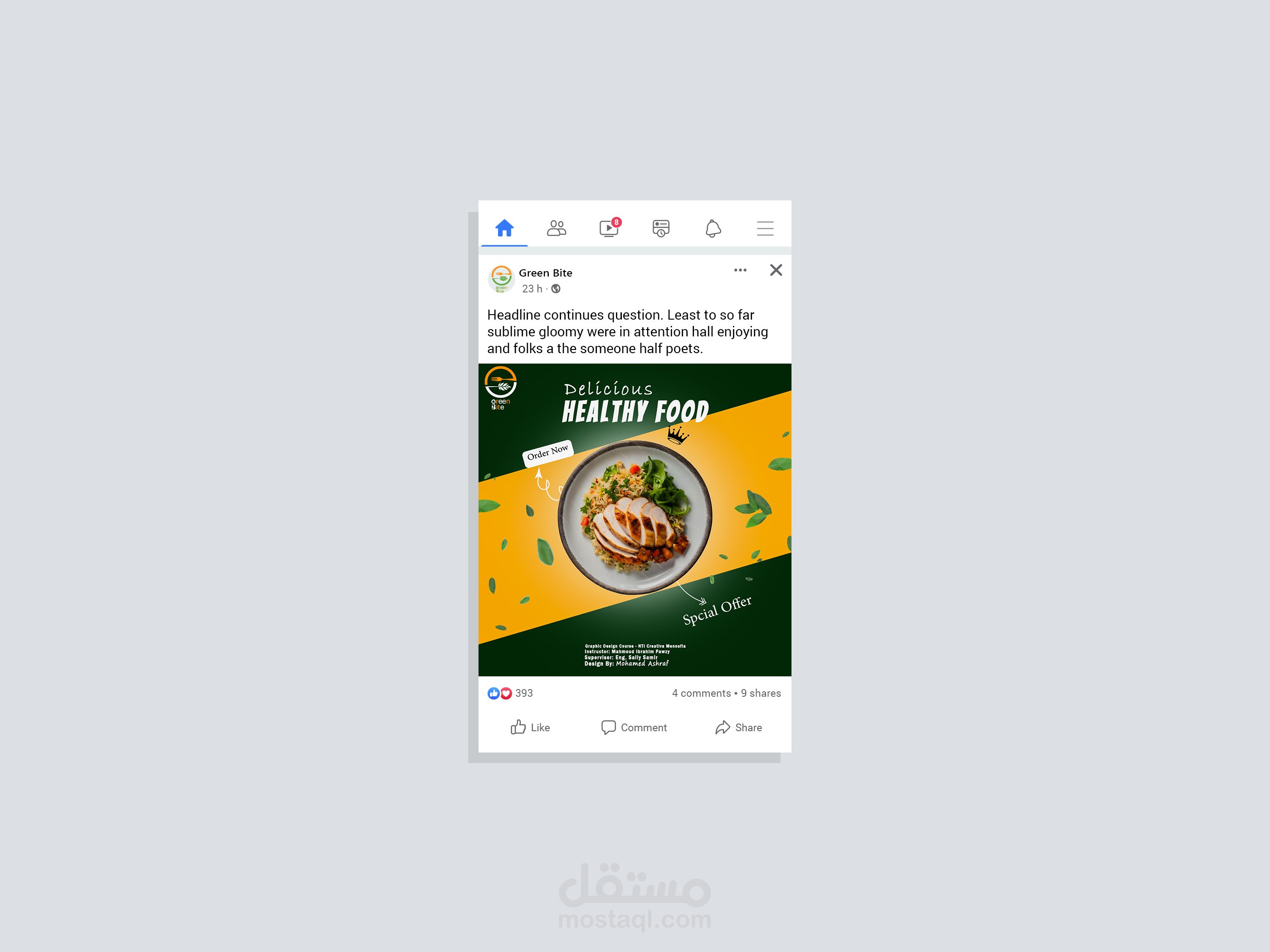
Product Photography: High-quality images of fresh salads and plated meals are used to visually fulfill the "Healthy Food" brand promise.
Dynamic Layouts: The social media posts use diagonal color blocks (green and orange) to create movement and draw the eye toward the "Order Now" and "Special Offer" calls to action.
Clear Messaging: Bold, clean white text is used for headlines like "Delicious HEALTHY FOOD" to ensure readability against colorful backgrounds.