Graphic Designer & Facebook and Social Media Posts Designer
تفاصيل العمل
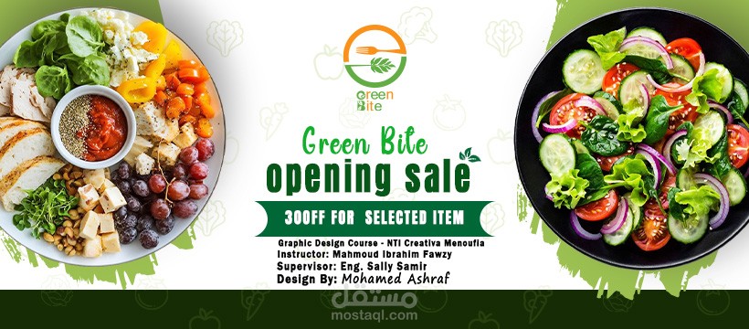
1. Core Visual Symbol (The Emblem)
The logo features a circular emblem split into two halves that represent the brand's core mission:
The Upper Half (Orange): Contains a minimalist fork icon, which clearly identifies the brand with food, dining, and the "Bite" aspect of the name.
The Lower Half (Green): Features a stylized leaf icon, symbolizing the "Green" aspect, which highlights fresh, natural, and healthy ingredients.
Circular Flow: The way the two halves wrap around each other creates a sense of harmony and a complete "farm-to-fork" cycle.
2. Typography and Wordmark
Creative Lettering: The letters "G" and "B" in the main logo text are customized with small leaf and fork icons to reinforce the visual identity within the name itself.
Stacked Layout: The words "Green" and "Bite" are stacked vertically in a rounded, modern font that feels friendly and accessible.
Ad Material Font: In the promotional cover, a more casual, handwritten script is used for "Green Bite" to evoke a sense of personalized, fresh service.
3. Color Palette and Psychology
Vibrant Green: Used to represent nature, organic growth, health, and freshness.
Energetic Orange: A common color in the food industry used to stimulate appetite and represent energy and friendliness.
Dark Green Background: The promotional material uses a dark green footer to provide professional contrast and grounding for the text.
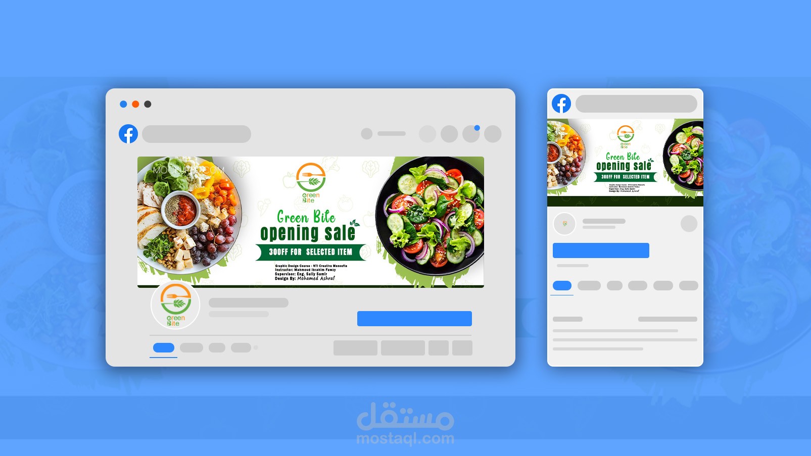
4. Application and Marketing
The promotional banner demonstrates how the logo works in a real-world context:
Product Photography: High-quality images of fresh salads and healthy plates are used to visually confirm the "Green" brand promise.
Clear Call to Action: Large, bold text highlights an "opening sale" and specific discounts, designed to grab immediate attention on social media platforms like Facebook.