Graphic Designer & Facebook and Social Media Posts Designer
تفاصيل العمل
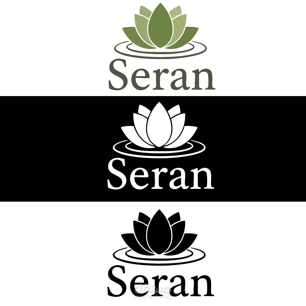
1. Visual Symbol (The Lotus)
The core of the logo is a stylized lotus flower resting on water ripples:
The Lotus: Traditionally, the lotus symbolizes purity, enlightenment, and rebirth. In a commercial context, it suggests a clean, natural, and rejuvenating brand identity.
The Ripples: The two circular lines at the base represent water, adding a sense of serenity, calmness, and a "ripple effect" of wellness or beauty.
2. Typography Analysis
Font Style: The brand name is written in a sophisticated Serif font.
Significance: The use of serifs (the small lines at the ends of the letters) gives the brand a classic, established, and trustworthy feel.
Casing: Using "Seran" with a capital 'S' followed by lowercase letters makes the brand appear approachable yet professional.
3. Color Palette
The logo is presented in three variations to ensure it works across all platforms:
Olive Green: This earthy tone is directly linked to nature, health, and organic life. It reinforces the "Green" or "Natural" promise of the brand.
Monochrome (Black & White): These versions prove the logo's versatility. It remains legible and high-contrast, whether it is used on dark packaging or white documents.
4. Overall Impression
The Seran logo is minimalist and tranquil. It successfully communicates a message of peace and high-quality natural care. The symmetrical icon creates a sense of balance that is very pleasing to the eye.

