Graphic Designer & Facebook and Social Media Posts Designer
تفاصيل العمل
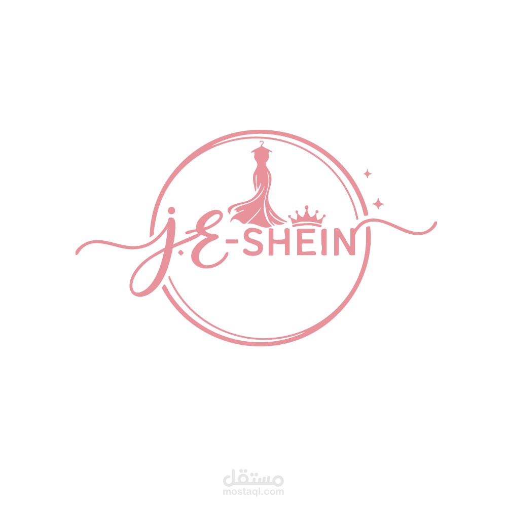
1. Visual Symbols (The Icons)
The logo incorporates three distinct elements to define its niche:
The Evening Gown: A flowing dress on a hanger is the central focus, clearly identifying the brand as a provider of women's fashion or formal wear.
The Crown: Positioned to the right of the dress, it adds a sense of "royalty," prestige, and high quality.
Sparkles: Small stars or sparkles suggest a touch of glamour, magic, and newness.
2. Typography & Lettering
Script Style: The "JE" is written in a handwritten, cursive script with long, flowing swashes that extend beyond the circular frame. This adds a personal, artistic, and sophisticated touch.
Sans-Serif Font: The word "SHEIN" uses a clean, modern, all-caps font. This creates a balanced contrast between the decorative "JE" and the professional brand name.
3. Color Palette
Soft Pink / Rose: The entire design uses a consistent shade of rose pink. This color is psychologically associated with femininity, grace, and softness, making it perfect for a women's boutique or clothing line.
4. Layout and Composition
Circular Frame: The elements are enclosed within a delicate double-lined circle, which helps unify the logo and makes it look like a "seal" of quality.
Breaking the Border: By having the script and the swashes break through the circle, the design feels more dynamic and less rigid, suggesting creativity and freedom.
Overall Impression
The logo is chic, stylish, and high-end. It successfully targets a female audience by combining classic symbols of beauty (the dress and crown) with a trendy, soft color palette.

