Graphic Designer & Facebook and Social Media Posts Designer
تفاصيل العمل
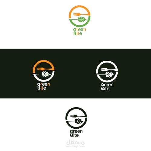
1. Visual Symbol (The Icon)
The circular emblem is divided into two halves that mirror each other, creating a sense of balance and wholeness:
The Fork (Top Half): A minimalist fork represents the "Bite" aspect and the act of eating or catering.
The Leaf (Bottom Half): A stylized leaf represents the "Green" aspect, emphasizing freshness, health, and natural ingredients.
Circular Flow: The way the lines wrap around to form a circle suggests a cycle of nature or a "farm-to-table" philosophy.
2. Typography Analysis
Font Style: A modern, rounded Sans-Serif font is used, which feels approachable and friendly.
Creative Lettering: The letters "G" and "B" in the wordmark are customized to include small icons (likely a leaf and a fork/food element), reinforcing the brand identity within the text itself.
Stacking: Placing "Green" over "Bite" makes the logo compact and easy to place on menus or packaging.
3. Color Palette
The design uses a vibrant and appetizing color scheme:
Green: Symbolizes health, nature, organic growth, and freshness.
Orange: Often used in the food industry to stimulate appetite and represent energy and friendliness.
Monochrome (Black/White): The variations show that the logo maintains its integrity and readability even without color, which is vital for professional branding.
4. Overall Impression
The design is modern and eco-conscious. It clearly communicates a niche in the healthy food or vegetarian/vegan market. The symmetry between the utensil and the plant element creates a very memorable and professional "mark."

