Graphic Designer & Logo Designer
تفاصيل العمل
1. Visual Symbol (The Icon)
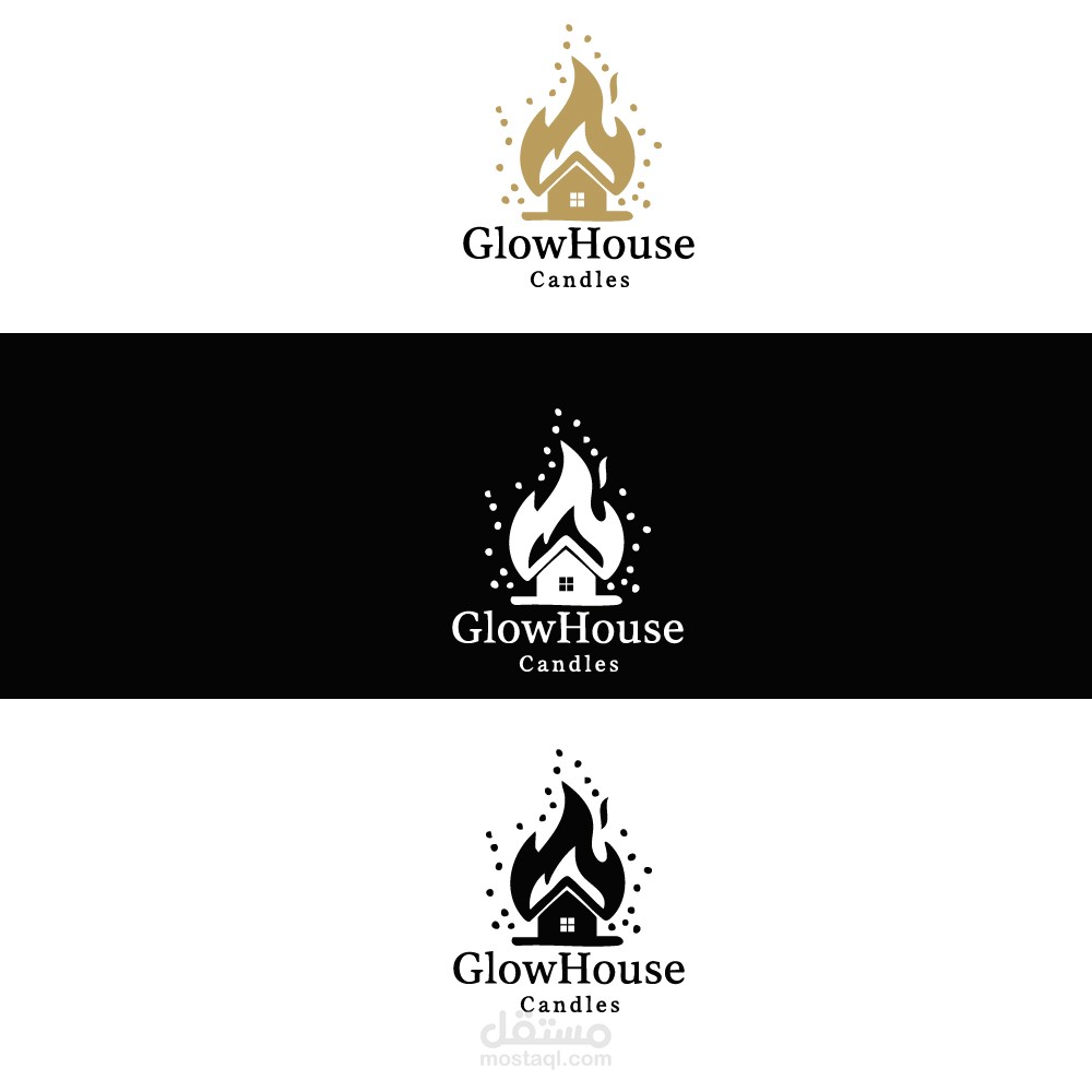
The design uses a clever "negative space" technique to merge three essential elements:
The House: Located at the heart of the logo, representing home, comfort, and the cozy atmosphere that candles create.
The Flame: Wraps around the house fluidly, serving as a direct symbol for "candles" and fire.
The Glow/Dots: The scattered dots around the flame suggest the diffusion of light and soft sparks, giving a sense of warmth and vitality.
2. Typography Analysis
The designer used a Serif font (fonts with small lines at the ends of characters).
Significance: This style evokes luxury, tradition, and reliability.
The distinction between "Glow" and "House" is made through font weight (Bold), which enhances readability and emphasizes the brand name.
3. Colors and Meanings
The logo is presented in three color variations to ensure versatility:
Gold/Beige: Evokes warmth, calmness, and natural products (like beeswax). It is a color often associated with "Premium" or high-end brands.
Black & White: These versions demonstrate the logo's strength and simplicity, ensuring it remains clear whether printed on paper bags, stamps, or small labels.
4. Overall Impression
Balance: There is a harmonic balance between the graphic icon and the text.
Message: The design communicates that these candles are not just a light source, but a part of the "soul of the home," adding a touch of warmth and beauty.

