Graphic Designer & Facebook and Social Media Posts Designer
تفاصيل العمل

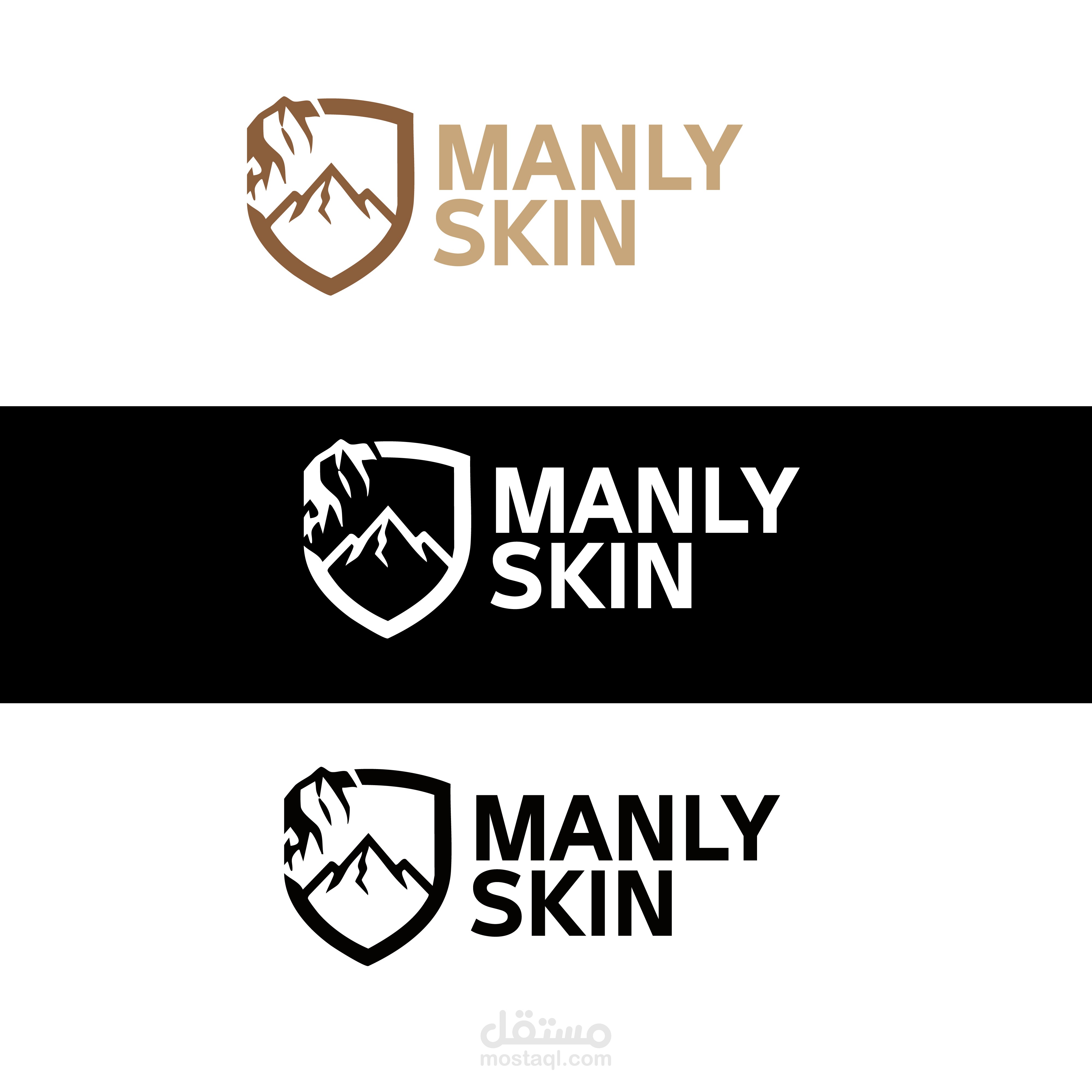
1. Visual Symbolism
Mountains:
The mountain illustration within the logo represents strength, stability, and endurance. It also refers to natural ingredients sourced from untouched environments, conveying purity and a refined ruggedness that suits men’s products.
Shield:
The shield-like frame surrounding the mountain is a classic symbol of protection. In the context of skincare, it communicates that the product protects the skin from harsh external elements.
Overlap:
The mountain peak extending beyond the shield adds dynamism to the design, making it unconventional and expressive of freedom and boldness.
2. Typography
Bold Typeface:
A strong, bold sans-serif font was used, aligning perfectly with the brand name “Manly” to reflect masculinity, clarity, and confidence.
Text Layout:
Stacking the words vertically beside the icon creates visual balance and forms a unified, easily recognizable logo mark.
3. Color Palette
Earthy Brown / Beige:
This color reinforces the connection to nature and the earth. It is a warm, trustworthy tone that avoids the bright, traditionally feminine colors common in skincare products.
Contrast (Black & White):
The high-contrast versions demonstrate the logo’s strength and versatility, ensuring clear visibility across various packaging types, whether light or dark.
4. Overall Impression
The logo avoids unnecessary complexity and focuses on refined ruggedness. It speaks to men who seek a product that is practical, strong, and effective