Lume candles
تفاصيل العمل

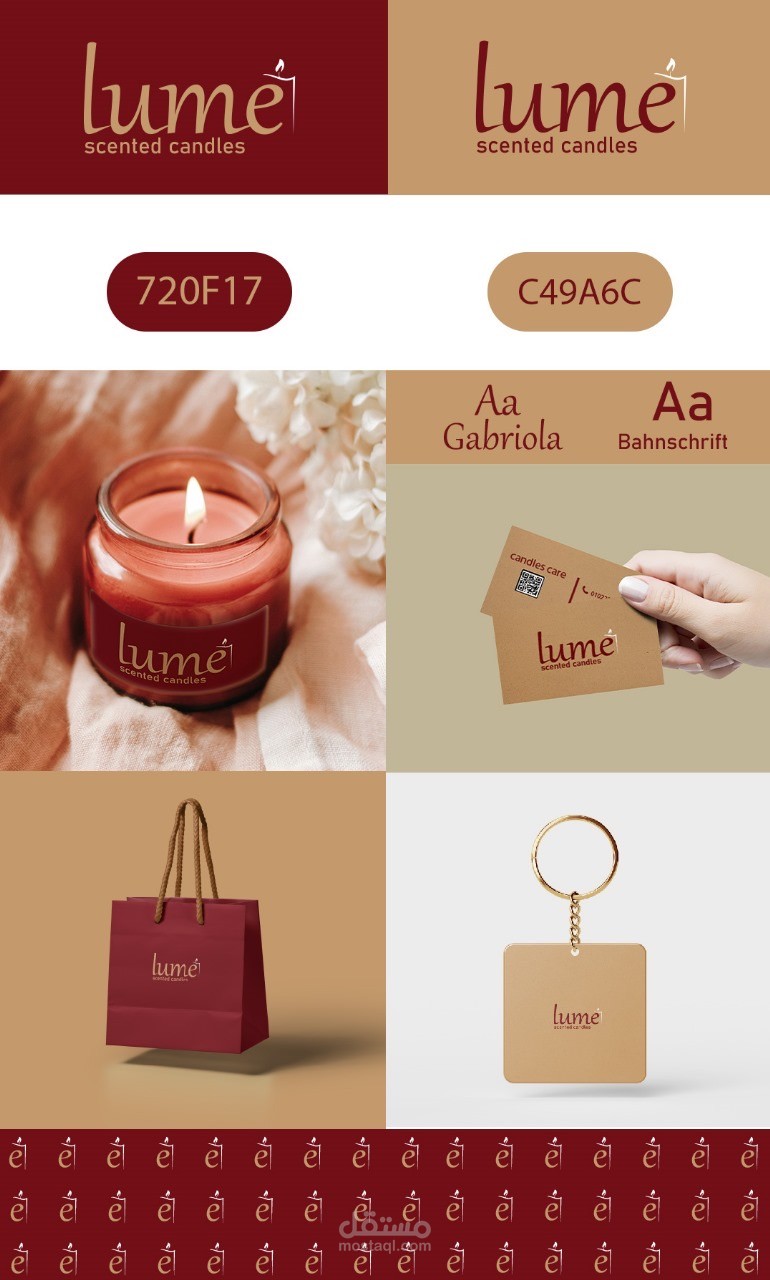
lumé is a warm, elegant brand identity created for a handcrafted scented candle line. The visual direction highlights softness, comfort, and a calming atmosphere—reflecting the sensory experience of the product itself.
Concept & Visual Style
The logo features a smooth, handwritten-inspired wordmark with a small flame integrated into the letter é, symbolizing light, warmth, and serenity. The overall style is minimal and refined, designed to appeal to a modern, lifestyle-focused audience.
Color Palette
The palette combines deep, warm tones with natural beige shades:
• #720F17 – a rich burgundy symbolizing warmth, passion, and aroma.
• #C49A6C – a soft beige reminiscent of candle wax and natural materials.
These colors create a sophisticated and cozy visual mood suitable for home-care products.
Typography
Two complementary fonts were selected:
• Gabriola – for the main logo and headings, adding elegance and softness.
• Bahnschrift – for supporting text and product information, providing clarity and modern balance.
Execution Process
1. Logo Development
The logo was crafted with smooth curves and an integrated flame detail to reinforce the candle concept subtly and creatively.
2. Brand System Creation
A cohesive set of brand elements was created, including color standards, typography rules, and a repeating icon pattern based on the flame symbol.
3. Mockup Applications
To demonstrate the identity in real-life contexts, the design was applied to:
• Candle jars
• Packaging and shopping bags
• Product care cards
• Keychain accessories
• Pattern backgrounds
These applications showcase the versatility and elegance of the brand across print and product materials.
Outcome
The final identity presents lumé as a warm, relaxing, and premium candle brand. The combination of elegant typography, warm tones, and symbolic logo design creates a memorable and emotionally appealing identity that enhances the product’s sensory experience.