cleo sunglasses
تفاصيل العمل

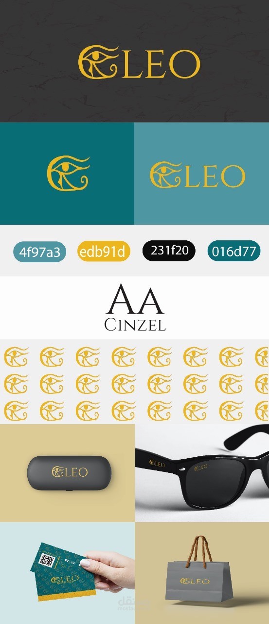

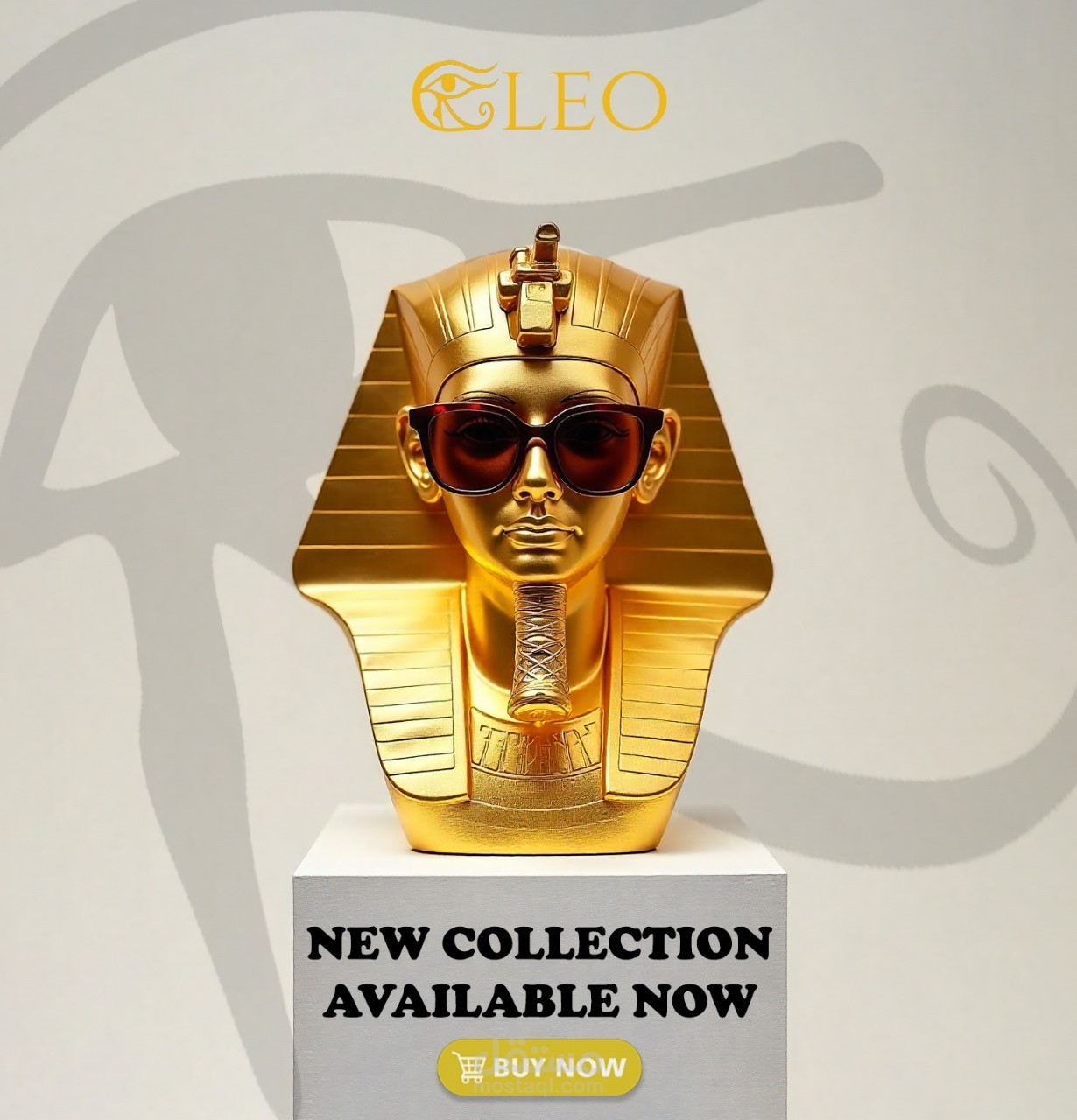

CLEO is a premium brand identity inspired by ancient Egyptian symbolism, with a modern and luxurious aesthetic. The concept centers around the Eye of Horus, representing protection, vision, and strength—values that align with the brand’s character.
Concept & Visual Direction
The logo combines a stylized golden Eye of Horus with an elegant serif typeface to convey heritage and sophistication. The color palette features deep teal, gold, and charcoal black, creating a balance between modern minimalism and timeless luxury.
Execution Process
1. Research & Concept Development
I began by studying Egyptian iconography and luxury branding principles. The goal was to merge a symbolic element with clean contemporary design.
2. Logo Design
• The symbol was manually refined to ensure smooth curves and balanced proportions.
• The wordmark uses Cinzel, a classic serif typeface that complements the ancient aesthetic while maintaining a premium feel.
3. Color Palette Creation
A curated palette was selected:
• Gold (#edb91d) for luxury & heritage
• Teal shades (#4f97a3, #016d77) for a modern, vibrant contrast
• Charcoal Black (#231f20) for depth and balance
4. Visual System & Pattern Design
A repeating pattern based on the logo symbol was created to be used across packaging, print materials, and digital applications.
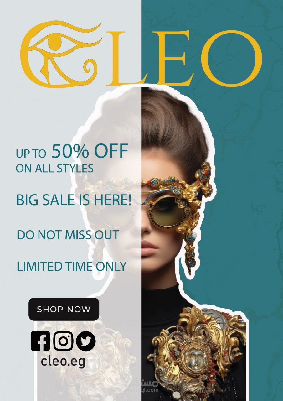
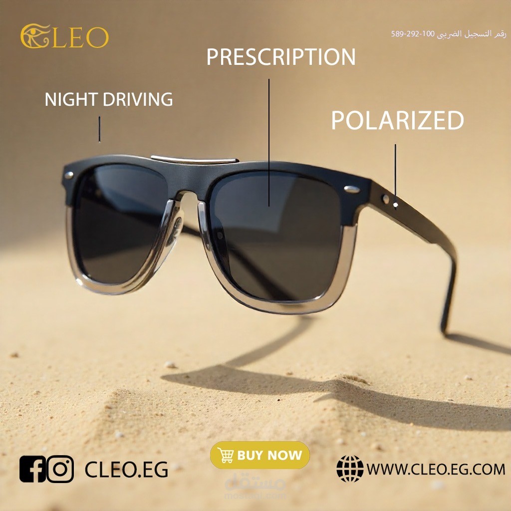
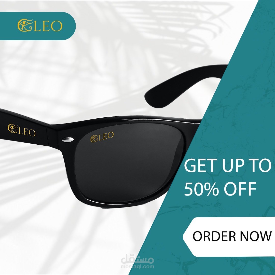
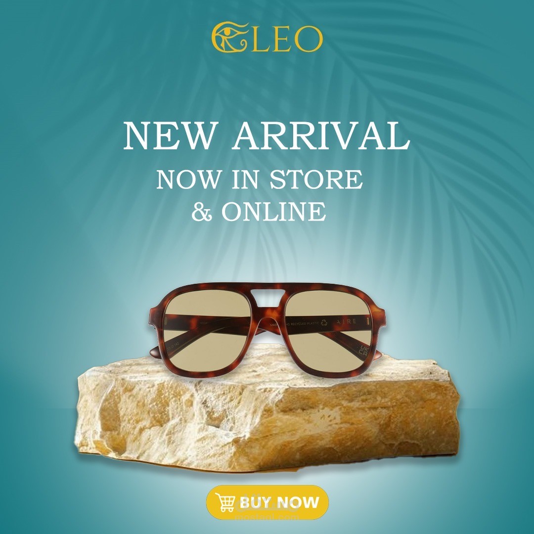
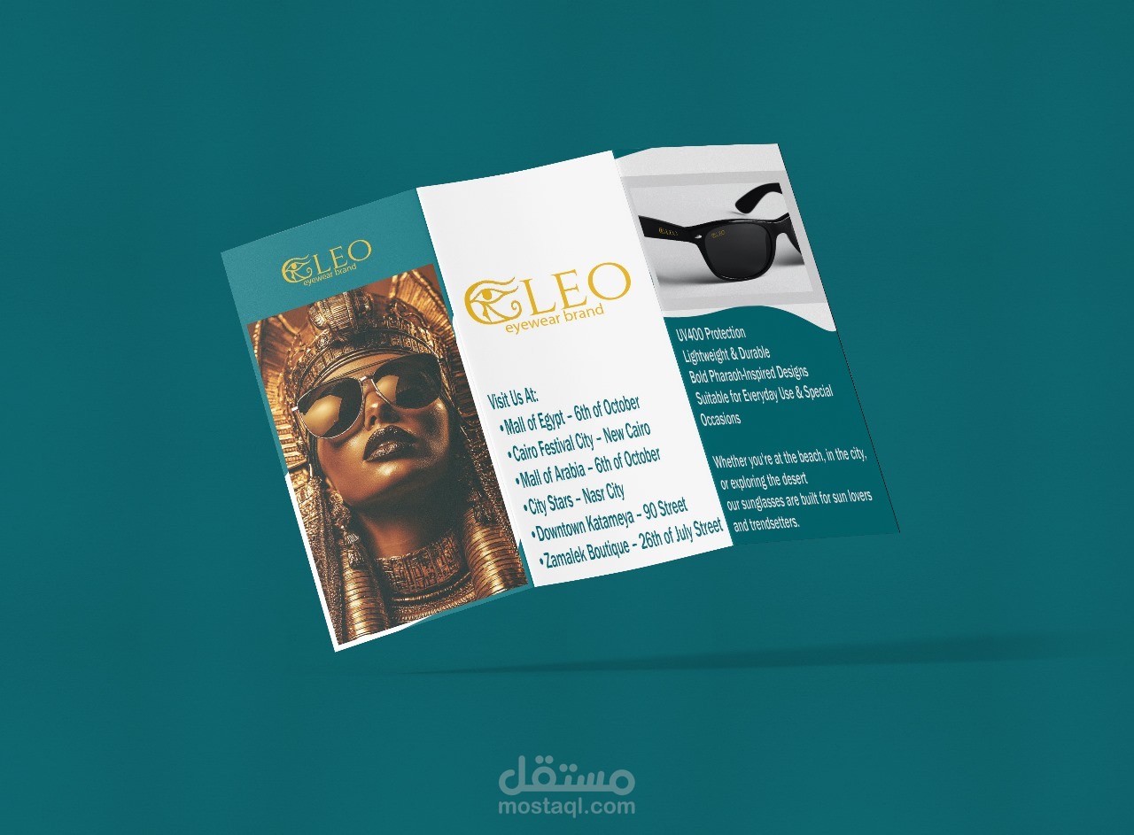
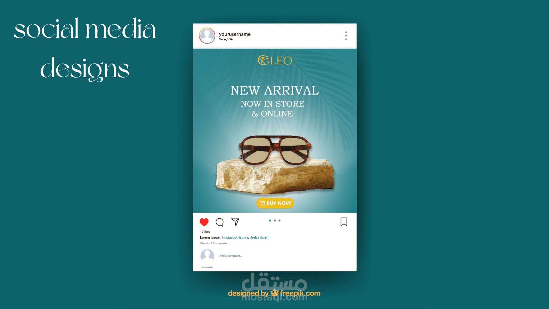
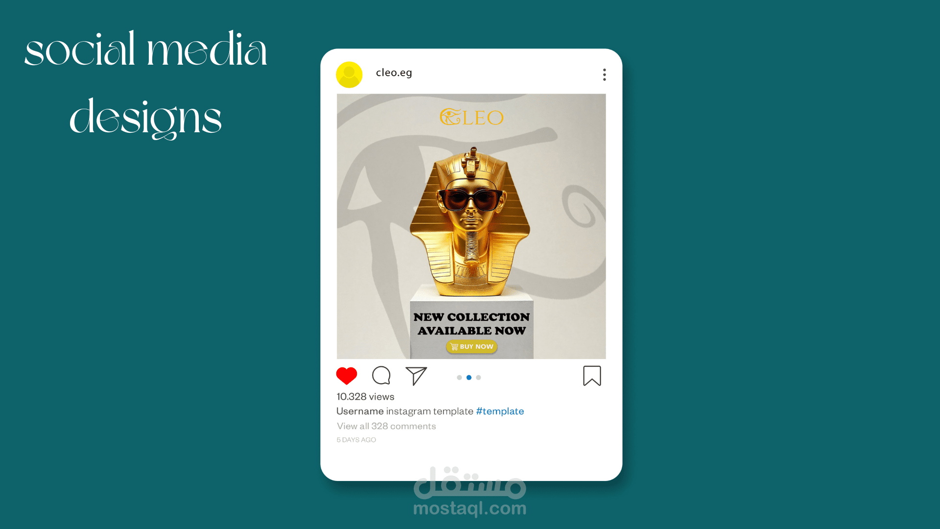
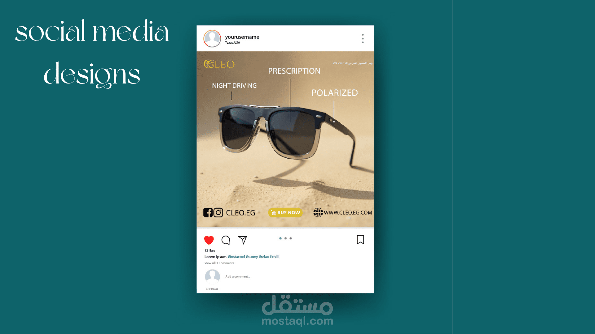
5. Brand Applications
The identity was applied to multiple mockups to demonstrate real-world usage:
• Sunglasses and case
• Shopping bags
• Business cards
• Stationery
• Packaging
These applications highlight how the brand maintains consistency, elegance, and visual impact across different mediums.
Outcome
The final brand identity presents CLEO as a sophisticated and culturally rooted brand with a strong visual presence. The combination of symbolism, modern typography, and balanced colors creates a memorable and versatile identity suitable for high-end products.