Airbnb Market Analysis (Tableau) - Personal Project
تفاصيل العمل
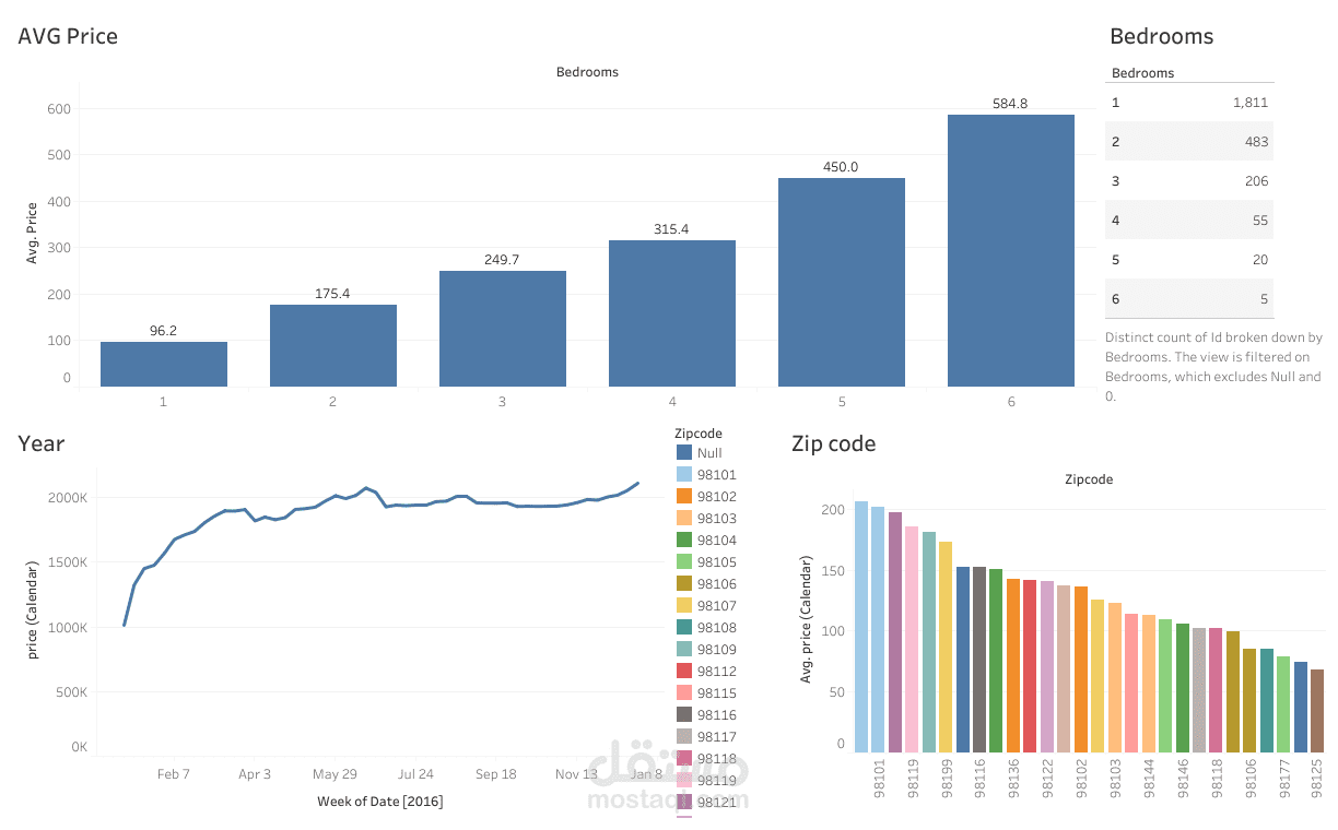
This project focuses on a comprehensive data analysis of Airbnb listings, culminating in an interactive Tableau dashboard. The primary goal was to glean meaningful insights from a large dataset to understand the market dynamics, pricing strategies, property characteristics and user behaviour within the Airbnb ecosystem.
The challenge was to navigate and interpret the vast amount of raw Airbnb data. To address this, Tableau was used to transform the data into an insightful dashboard through data connection and preparation, followed by dashboard design and visualisation. Various visualisation types were employed, including geographical maps for spatial distribution, bar charts for price comparisons, scatter plots for variable relationships and highlight tables for detailed information.
The dashboard also incorporated interactivity and filters. Key insights revealed include high-demand areas and their average prices, the correlation between review scores and booking frequency, the prevalence of different property types and the impact of amenities on listing prices.
This project showcases my advanced skills in data visualisation and analytical storytelling, providing a valuable tool for potential hosts, travellers and market researchers to understand short-term rental market trends.