Data Professional Survey Breakdown (Power BI) - Personal Project
تفاصيل العمل
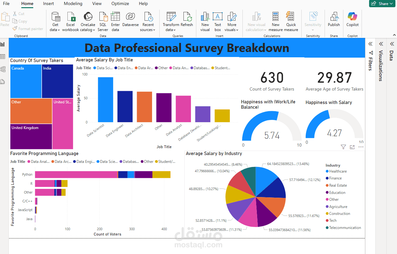
This project involved creating an interactive Power BI dashboard to analyse comprehensive survey data from data professionals. The main objective was to transform raw survey responses into actionable insights regarding career trends, compensation and professional preferences within the data industry.
The challenge was to make complex survey data easy to interpret. To achieve this, Power BI was used to create a dynamic and visually engaging dashboard. This included importing and transforming the data and designing a multi-faceted dashboard with various visualisations:
-Treemap: To show the distribution of survey takers by country.
-Bar Charts: To present the average salary by job title and favourite programming languages.
-Doughnut Chart: To illustrate average salary distribution across different industries.
-Gauge Visuals: To display average happiness scores for work-life balance and salary.
-Key Performance Indicators (KPIs): To highlight total survey takers and average age.
The dashboard also incorporated interactive filters and cross-highlighting features, allowing users to explore data by country, job title and other dimensions. This effectively revealed insights such as job titles with the highest average salaries, the most popular programming languages and variations in happiness levels among professionals.