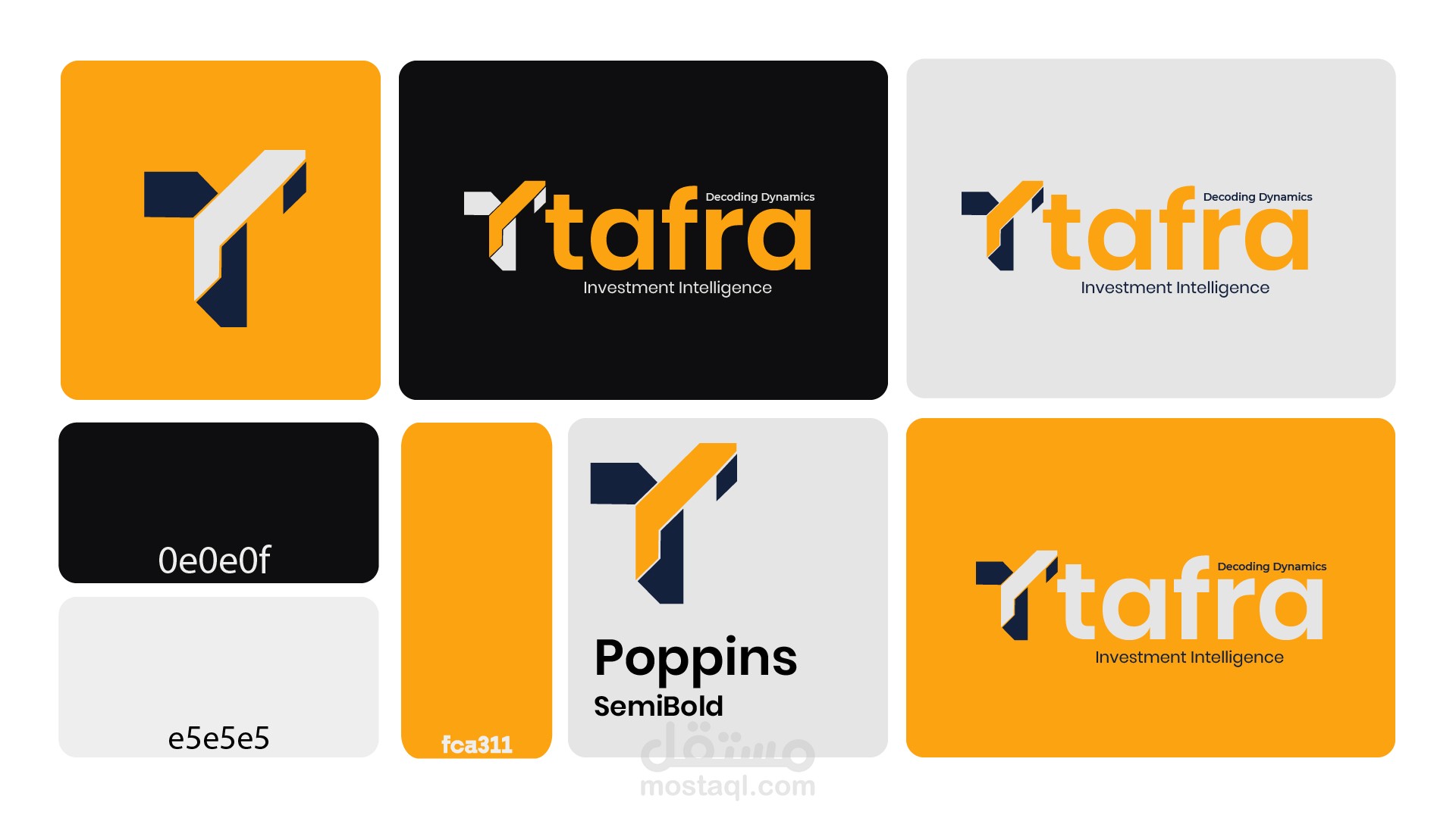
Tafra Logo design
تفاصيل العمل
The client requested a simple yet meaningful logo built around the first letter “T”.
I designed a geometric symbol that forms the “T” while subtly expressing growth, direction, and structured investment thinking.
The angular cuts represent strategic movement, and the orange–navy palette reflects trust and opportunity.
The result is a clean, modern mark with a clear idea behind its simplicity—perfect for an investment consultancy serving Arabs in Turkey.


