SWEET PASTRY & CAFE
تفاصيل العمل
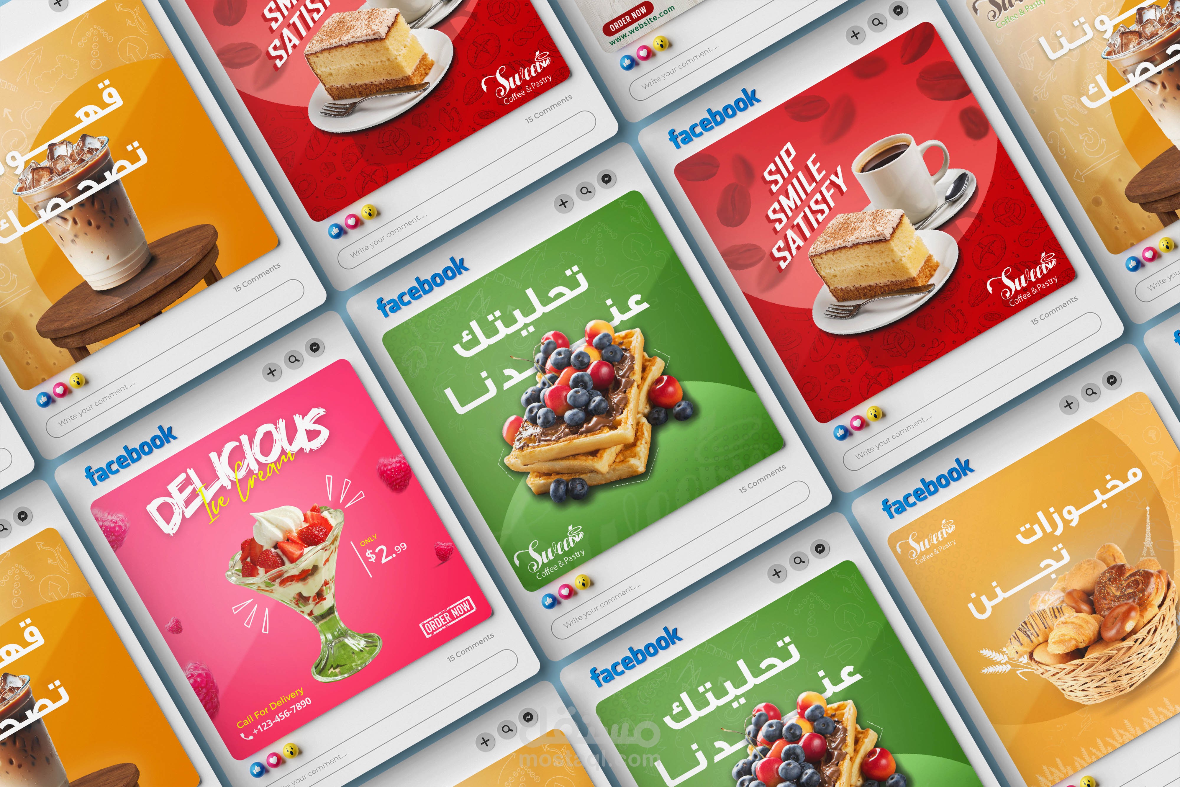

Appetite Appeal: The "SOCIAL MEDIA" section uses stunning, close-up food photography to maximize visual impact. The visuals are irresistible—juicy berries on waffles, decadent cheesecake, and perfectly layered coffee drinks—making the viewer instantly crave the products.
Vibrant Digital Contrast: The square social media posts skillfully employ highly saturated, solid-color backdrops (vibrant red, sunny orange, and lush green) that make the food "pop" and ensures they grab attention when scrolling through a busy digital feed.
Font and Hierarchy: A bold, blocky, and slightly distressed custom font is used for the main section headers (SOCIAL MEDIA, MENU, THANK YOU). This font choice gives the brand a memorable, slightly industrial, or playful edge, creating a strong visual hierarchy that guides the eye down the presentation.
Cohesive Aesthetic: The design successfully bridges the gap between digital marketing and physical presence. The lively, colorful digital ads are balanced by the grounded, natural tone of the physical Menu mockup, which favors a classic, simple aesthetic, suggesting quality and tradition.
In essence, this design identity is both trendy for the digital space and comfortably classic for the café setting, promising a modern yet cozy customer experience.